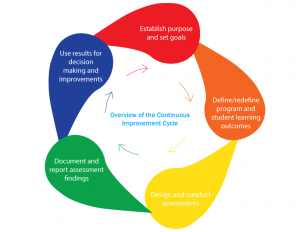
Often, the key to creating design material efficiently is in the process. My first assignment ever was to redesign some infographics that were going to be published in the academic handbook. I was asked to make them feel modern, while also keeping it “academic”.
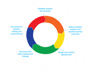
When I design a graphic, I usually aim to create as many variations as possible. The goal is so that I can provide my clients a choice, as well as showcase my work efficiency. If I can make five graphics in six hours, that might impress my supervisor or client. Below are some examples of the variations I created.
I then show my graphics to my supervisor, Isana. She would go over them with her supervisor, Dr. Cumming, for review. For these graphics, they picked the circular infograph above, but asked me to change colors. Because although they looked nice, the colors didn’t match the department’s aesthetic, which was a certain shade of blue.
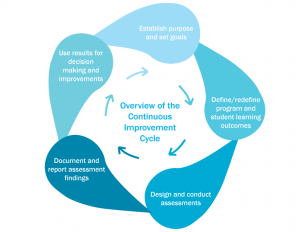
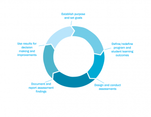
As a design intern, I have to work with the department’s design team. Typically, I would just ask my supervisor to give me the brand book to get the department’s colors, but they didn’t have anything like that. So I conferred with a fellow design intern, Michael, to decide on what the colors should be. Because he was also working on his own infographs for the handbook, we had to make sure everything between us was consistent. Michael had a color palette that Dr. Cumming liked, so we went with it. Here’s a look at the revised colors:
In summary, designing at AIR means constantly communicating with supervisors and fellow team members. The supervisors ultimately decide the final look, but the design team needs to make sure there’s a consistent look throughout the project. In the end, everything is part of AIR’s brand, and didn’t belong to any of the designers. I wasn’t doing any individual work, but I was okay with it.


