
If I were to describe the target audience for everything I have designed before my internship, it would be fellow college students. Or to put it more broadly, people who share the same interests as me.
But that may never be the case in the design world. Every client has their individual needs, and people can come from different backgrounds. For AIR, their target audience was college professors and faculty members. Thus, every design material from the department needed to appeal to them.
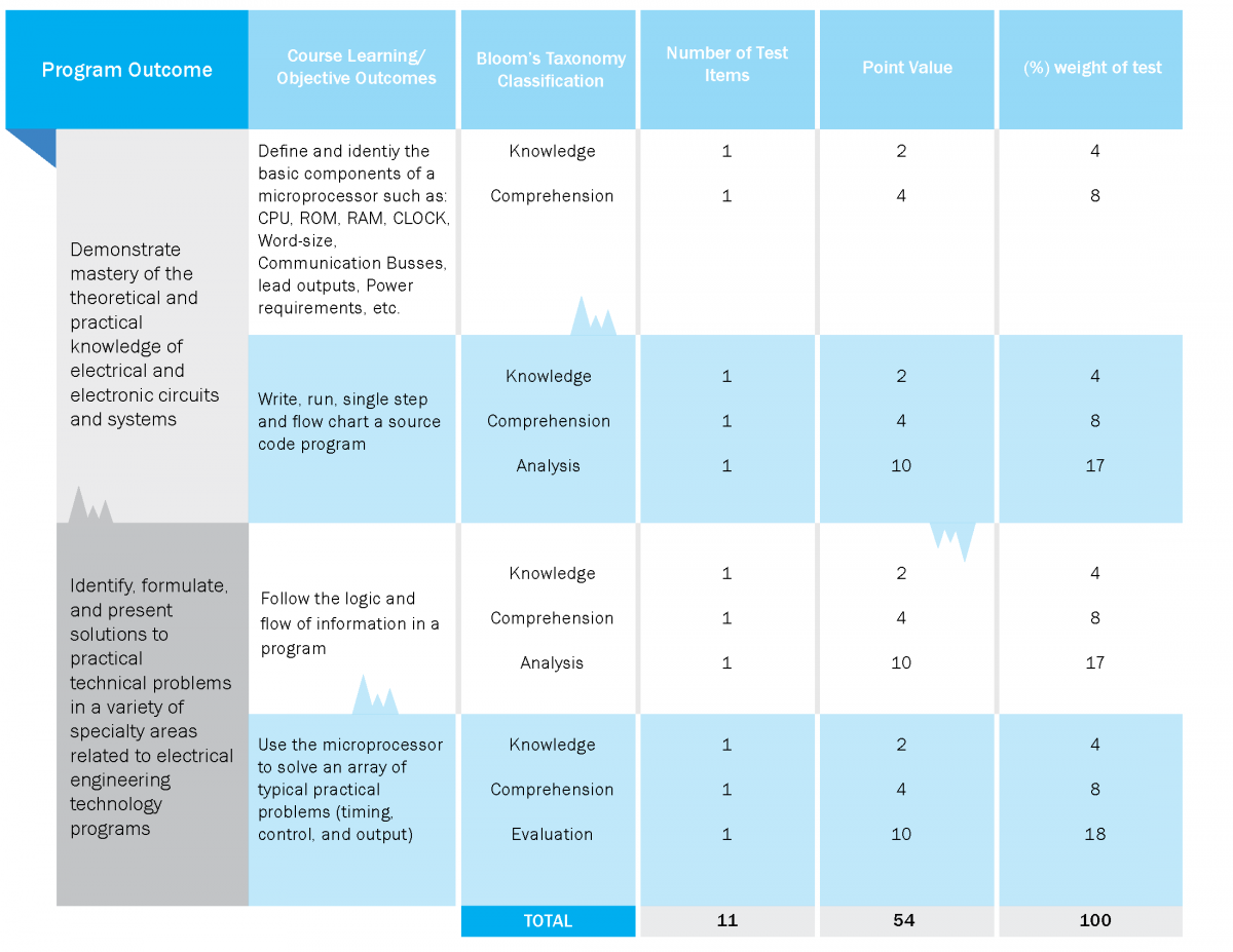
This was quite a challenge, as I’ve never had to design for a much older audience. For example, I had to account for professors that came from different professions. When I was asked to redesign a table containing information on the Electrical Engineering major, I thought to include visual suggestions of an electrical circuit. However, my supervisor told me to remove it, because the iconography would be confusing. She was worried about getting questions from professors who didn’t know anything about circuitry.
Another example I have would be how a professor would be receiving those print materials. Although the department does print-outs, most of their publications are online. So if a professor wanted to print out something immediately for a meeting, they would most likely borrow the school printers. And due to limited resources, those printers can only print in black and white.
With this in mind, every infographic from AIR must be readable in grayscale. There’s a way to do this in Illustrator, but the outcome never quite matches how it would look in print. Therefore, infographics must be printed-out in-office to test how it looks in black and white. Below are illustrations of what Illustrator conversion does to an infograph:
As you can see, the Illustrator conversion didn’t turn out to be completely accurate. Some of the colors came out too light. I had to print out the graphic in black and white to get a better picture.
Aside from visuals there was also the issue of accounting for level of familiarity. Like what happened in the Electrical Engineering table, I was designing a poster that was for a much older audience of college faculty members. The poster had a RSVP link, and my instinct was to write a shorthand URL for it. For example: “air.citytech.cuny.edu/RSVP”.
However, my supervisor said I needed to write a full URL. She explained that the target audience was so old, the shorthand doesn’t communicate to them that it’s a link to their website. I come from a background in web design, so this lesson in communication was very valuable to me.

