Final Edits and Reflections; #7

COMD 4900 Internship

Finishing Up Banners and Video and Reflecting

For this week I got some more input on the banners and the video that I was working on. My supervisor gave the feedback of changing the colors around on the banner. Instead of using two similar colors of blue together in the design, he suggested changing it to white in order to increase the contrast with the dark blue background.

The text changed is the “You Click”, “Learn More” and the logotype. My supervisor was accepting of changing the color of the logo itself to white in order to make it stand out more within the design and the new addition of white makes things stand out much more when compared to the older design.

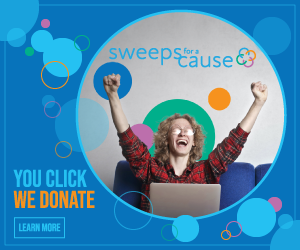
728 pixels by 90 pixels banner ad with light blue text
728x90px banner ad
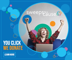
Sweepstakes Leaderboard ad with white color text
728x90px banner ad with white text replacing the light blue text previously used

The other banner received similar changes as well, but there were some other major changes made to this one alongside with changing the color of text. Here I decided to get rid of the image of the man celebrating and instead of him add in some text about the $1,000 donation to charity. The $4,000 text was increased in size and moved to the left. The “You Click, We Donate” tagline was sent to the right alongside with the button to learn more and both were changed to a white color. The logo was then placed under the charity text and the text of the logo was changed to white as well. I also wanted to have the prize be more impactful and I figured the best way to do that was by increasing the size of the prize money text.

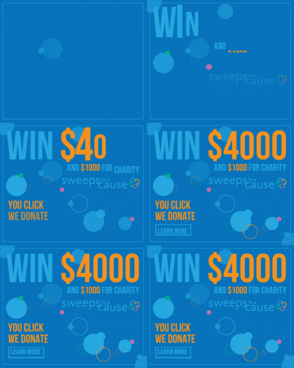
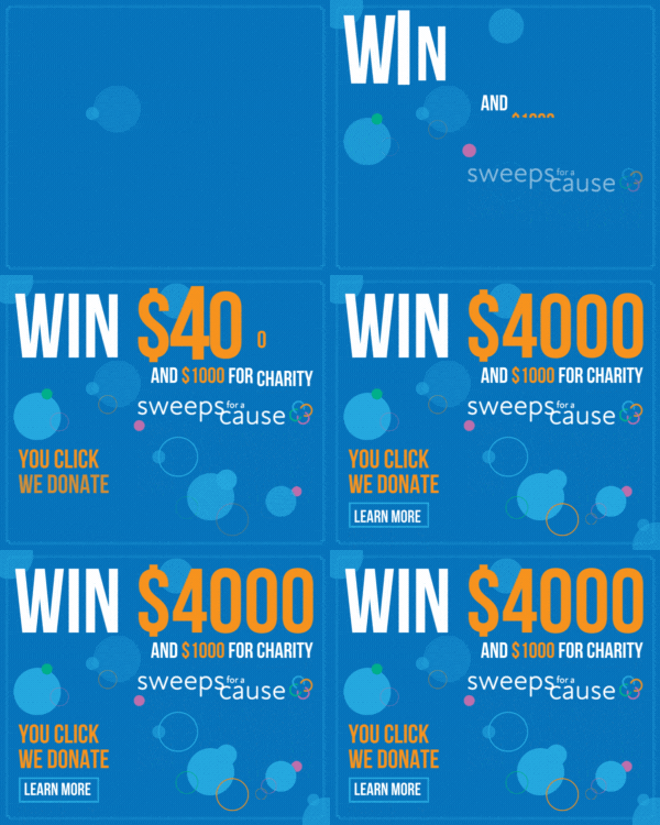
The final banner also received similar changes to the other banners. The light blue color was changed to white on the tagline and on the logo. In this case there weren’t many other changes made to it apart from the blue.

The same treatment was done for the GIF as well.

As for the final video, I increased the time of some parts of the video in order to be easier to read, as I had the video play a little too fast for people to read.

The Video

Reflecting on the internship experience

Working for Giving Forward was very interesting. The actual design process was done in tandem with reaching out to influencers, crafting messages that could be sent out to as many people as possible all in an effort to get more people to sign up for the sweepstakes and donate money to charity.

The experience of having to do some PR for the company was all very new to me and I didn’t expect to have to do this type of work for the organization. I volunteered to create the banners, a gif, and also a video and my progress with them was discussed on a weekly basis with one on one meetings with my supervisor and the feedback given helped to shape what they required of me and how we should move forward.

Weekly meetings with my supervisor and the leader of the organization also provided some insight and strategies for how to tackle the problem of getting people to sign up, and there was also a street event set up where the non-profit partnered with the New York Blood Center to promote blood donations for World Blood Donor Day. There was a meeting discussing that event and where it would be located, and I joined the team there to give out drinks and promote the sweepstakes and the NYBC blood drive as well. It had very little to do with my major but it was a change from what I was used to and allowed me to experience how some fundraisers and charity organizations do some of the work to spread awareness about their causes. These meetings also held me accountable to what I was working on for the organization, with revisions being made to my work and discussing what my plan would be for the week.

Having to attend the weekly meetings also provided me with a chance to showcase what I was working on, and it was during these meetings that we received feedback on our work and what we should fix or change.

The amount of work done for the internship was something that I didn’t expect to have to do, such as sending out messages to influencers and doing some on the ground work handling out flyers and drinks to passerby. But it showed me that sometimes there are things that happen outside of the scope of my abilities that I have to tackle and learn from.

Interning with this non-profit has been a great experience. I was given free rein to create whatever graphic work I needed in order to spread the sweepstakes as much as possible. The assets provided and the initial interview all showed me that there are different uses for graphic design. The work I created for the company is something that I’m proud of and it is something that can be used by the organization in their efforts to raise money for other non-profits and charities that need it. And since I can also enter the sweepstakes, there’s a chance that this unpaid internship might become a paid internship if I’m lucky enough.

PDF’s and audio of this page

Final Edits and Reflections; #7 ā€“ English PDF

Final Edits and Reflections; #7 ā€“ Spanish PDF

Translation and audio generated by software

Working With Supervisors and Meetings; #6

COMD 4900 Internship

Weekly Meetings, Teamwork, and Time Management

For this week there were a few hiccups with the structures of meetings. My supervisor had contracted COVID and so he was out of commission for a while, unable to attend meetings with the group of volunteers and individual meetings with us as well. But he gave us a look into the work being done for other projects that are running concurrently with the sweepstakes as well as informing us of what the next project might be.

One of the options that was discussed was increasing the prize money from $4,000 to $10,000 for the next sweepstakes. Our supervisor gave us some insight into how that would need to happen, including how he needed to have the proper paperwork in order to send it to a bond broker. It was interesting to learn about that since I had no idea about how a sweepstakes worked behind the scenes, and it’s interesting to learn about the legal requirements that need to be met in order to have a prize of that quantity.

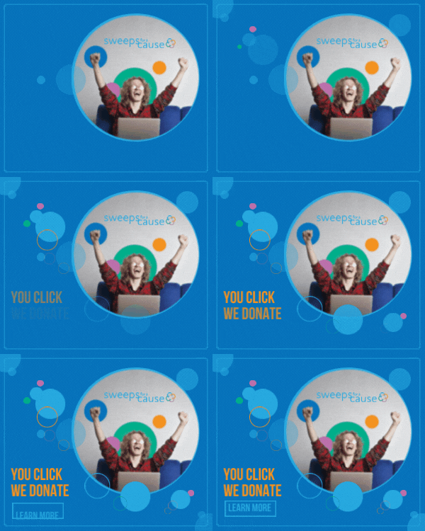
As for the project and assignments I’ve been given, there has been some work done on the animated gif for one of the banners. The banner that I wanted to animate is this one:

Sweepstakes banner 300 pixels by 250 pixels
300x250px banner ad

I wanted to keep it simple in the animation since a bigger effect could mean a larger file size, so I wanted to have a simple fade in to the elements in the design. The text would fade in first, and the other circles and rings would follow soon after. My plan was to use Adobe Animate, but I didn’t have much experience with the software and the learning curve could prove to be steep. But I gave it a try with the help of the Creative Cloud tutorials as well as some YouTube videos on how to navigate the software and how to create simple animations. What I completed was the following:
Sweeps Banner version 1

There were some small issues with this though. The logo for the organization is barely noticeable and the text is much too small to be legible at a quick glance. The size of the banner also plays a part in making things harder to see, and having an image scaled down to that size doesn’t work too well. Some changes had to be made.

First, I needed to get rid of the image and rely on type hierarchy and the circles and rings to create an impactful design. I also want to add something other than a picture to draw people in. Using the prize money of $4,000 would be better in this situation as I can easily have that be a larger part of the design and also have something that people can look at and be curious about. I also want to include the charity donation of $1,000 as well to create a sense of goodwill and make it seem less like a scam website or something along those lines. So I made some changes:

Sweepstakes gif version 2

This new version incorporates the money prize, the logo and the tagline all together in a more engaging way. The animation done here is more dramatic in order to bring more attention to the prize money, and the contrast in colors helps to show the most important parts of the campaign. This was submitted to my supervisor for review but he will most likely get back to me once he recovers from COVID.

The work that was done so has been very productive. All of my projects are coming along well, with edits now being made by my supervisors. There have been suggestions made in the staff chat that also contribute to what something looks like, and many other members of the organization offer feedback. The video I am working on, for example, has been viewed by a lot of other people and there have been comments made on it.

I like that there is this group feedback because it gives me a lot more options to consider when I need to make any edits. For example, the banner here had the changes made after showing it to the rest of the team. That’s when my supervisor wanted to use the Win $4,000 and the $1,000 charity donation on the banners as well. The communication between all of us is very good and we keep up with the conversations we are having with regards to progress and updates.

Finishing Up the Video and Reflections; #5

COMD 4900

Final Video Edits and Reflections

For this week I sent the first version of the video to my supervisors for review. The version I had sent them was met with some adjustments they wanted to be made.

First, they wanted me to include the following information on the video:

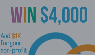
Win $4000 prize and $1000 donation

The $4,000 prize and the $1,000 donation was to be added to the video, not just at the end of it but also along with the other elements of the video. One suggestion they had was to add it like so:


Modifications requested

The information they wanted on there was to be added at my discretion and I had to revise my work in order to include it in the video and to go along with the theme of what someone could spend the $4,000 prize money on.

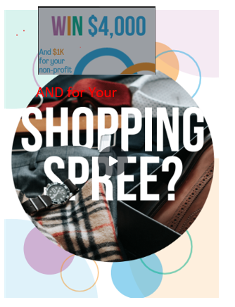
So I decided to have the video continue with that question by adding the information like this:

Extra Information added

I re-worded the information to better fit the question that is being posed in the graphic elements in the video. I already had the initial question of “How would you spend $4,000?” so I felt like having “Win $4,000” right after that would be redundant. My supervisors wanted the $4,000 prize to be seen as much as possible to incentivize people to sign up for the sweepstakes and also having the additional $1,000 for charity could also help with attracting people. Another objective of this video was to have it be a part of the outreach message to influencers and could help give a quick explanation of how the sweepstakes works. It would be an additional item that could be sent out to multiple influencers at once.

After working with the organization for a few weeks its become apparent to me that they are very committed to reaching out to many different people with large followings in order to maximize the reach of their platforms. Their online platform has multiple avenues that they provide people with as part of joining with them, and the efforts that are made by the teams is quite incredible. They are constantly looking for more people to be a part of the organization and the contact lists that they have number in the thousands.

But of course there are some things that have also stuck out to me in a way that has made me think carefully about what my role has been. The work that I was given was all about creating content that can be sent to influencers to have them help with spreading the sweepstakes around to their followers. It felt as though most of my work has been done solely towards this goal of increasing the number of people who are signing up, which I believe is a part of graphic design. I have to create something eye-catching and interesting enough for people to stop and to look at and hopefully increase the interest in the sweepstakes, something which is at the core of graphic design. We have to be able to have people remember the work and to have them perceive the meaning and intentions behind the art.

This project was different from what I had previously done in school mostly because it feels as though I may have been creating something that I myself would later have to promote and send out to other people as opposed to just submitting it to my supervisor and leaving it at that. I had to be able to use my work in conjunction with my writing skills to increase the effectiveness of the outreach for the sweepstakes, and that alone made it challenging for me. I had to step out of my comfort zone and essentially cold-call people with large followings across the internet, which is something I never thought I’d have to do. But it has been a great learning experience and I can’t wait to see what the results might be from this.

Sweepstakes Video and Meeting Updates; #4

COMD 4900 Internship

Updates on the Sweeps for a Cause Project

For this week we discussed increasing the numbers of donations given to the sweepstakes and how we can continue reaching out to influencers. One option that was discussed during the meeting was to have some video element that could be created and sent out to the influencers. One other volunteer responded saying that he was working on an introductory video that could help any influencer that was willing to work with us navigate the Good Buzz platform that the organization had, as it was a little difficult to navigate through at first.

From that project I volunteered to create a video for Instagram that could also be used to send to influencers as well that detailed how the prize of $4,000 could be merchandized as well as how to enter and how to donate.

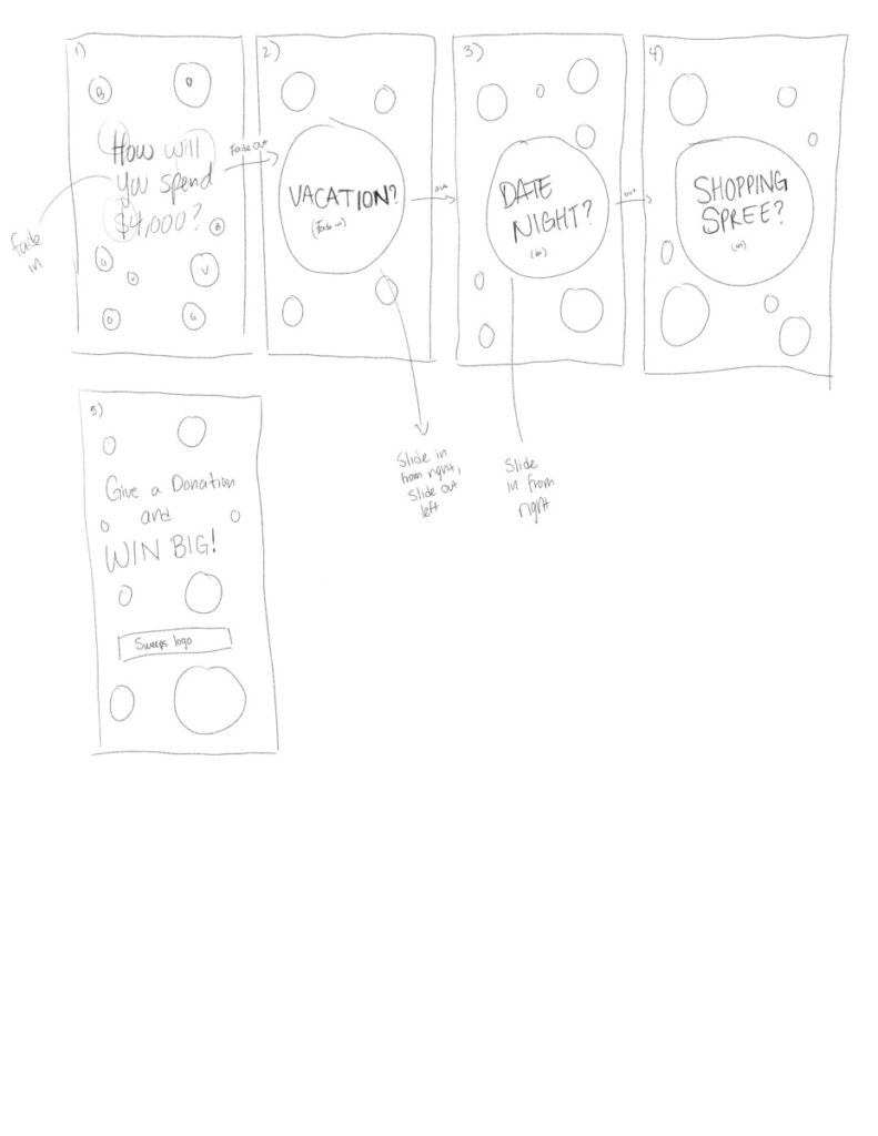
Sketches for the video, a storyboard in progress


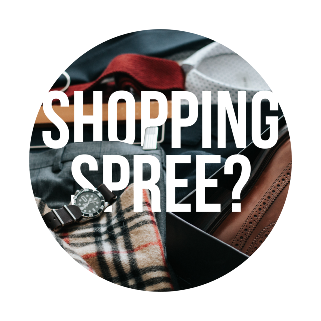
For the video I want to have the options for spending the $4,000 prize in a few different ways. I use a vacation, date night, and a shopping spree are what I want to use for the video. I also want to have the circles and rings that are found on the logo of Sweeps for a Cause in the design in the background.

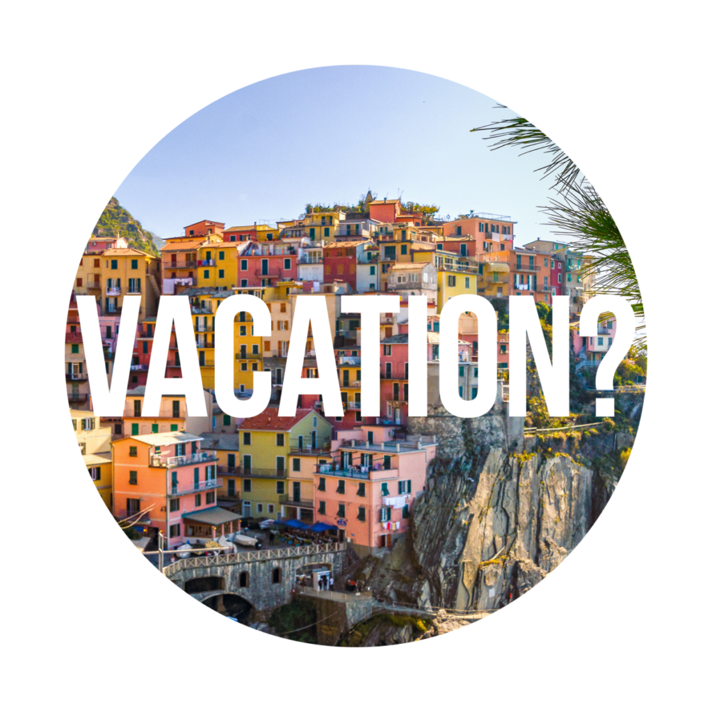
The first iteration of the vacation design

For the first version of the design I used a circular crop of a picture that was provided by the organization. I added the word vacation to it but it felt like it wasn’t interesting enough to use. So I decided to use another picture and another approach to adding the word vacation.

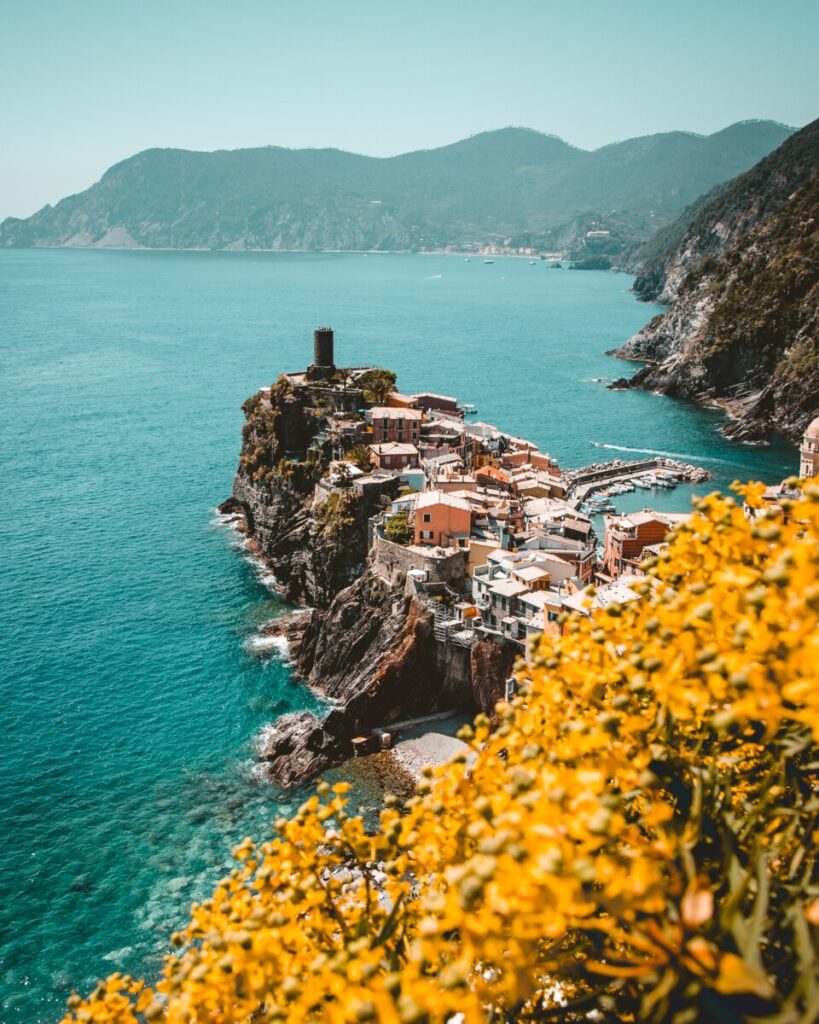
Vacation picture found on Unsplash by photographer Josh Hild


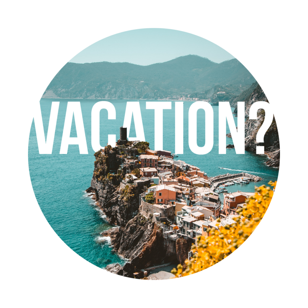
As mentioned before, this was the picture that I planned on using for the video and for other social media graphics. I chose this picture because it has strong contrast with the yellow of the trees and the blue ocean, and also because it has a strong diagonal moving across the image that I want to use as part of the final piece.

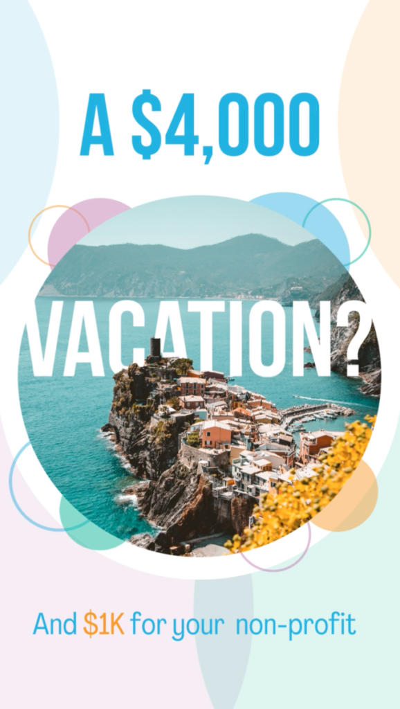
Using the new picture and new type treatment


For the newer version of the design I had the text behind the landmarks in the picture, creating a feeling of a diegetic design. I also had the text reach all the way across the circle, blending into the background to create a more dynamic and interesting type treatment. I had to be careful with placing the text since I still wanted the word vacation to be legible, but there were some sacrifices that needed to be made with the letter “A”, since I had to have it partially hidden but have there be enough of it visible to be recognizable as an “A”.

From this design I continued on to the other two designs for “Date Night” and “Shopping Spree” using a similar method.

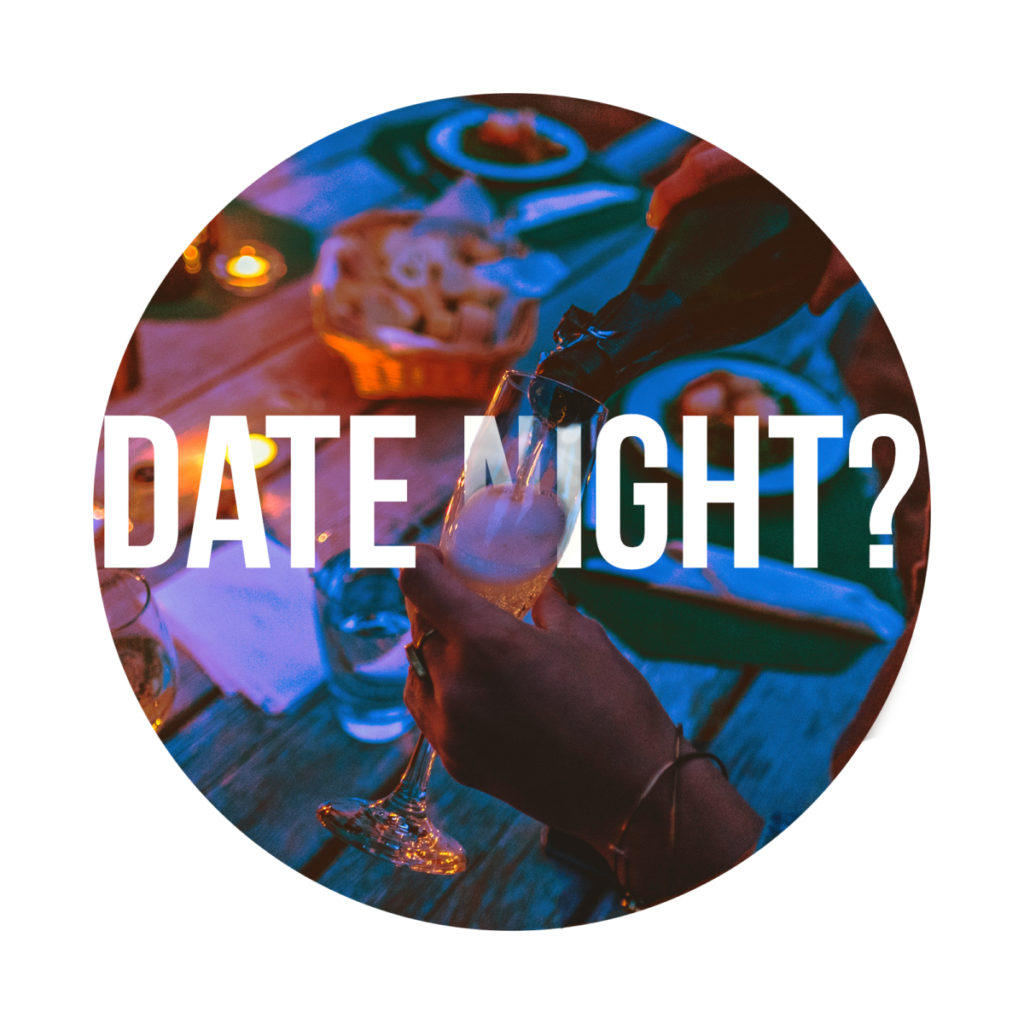
The design for date night

The image here was provided by the organization in the assets we were given for design. For this version I had a similar type treatment where parts of the word are covered by the image of the champagne glass and the stream of champagne. However there were some changes here with the type. Instead of having the word be completely covered by the image, I reduced the opacity of the letters that were being covered by the image, such as the glass over the letters creating a sort of opaqueness to the text.

Design for shopping spree

And the final part of the video, the shopping spree. Much like the others it has the same type treatment to it, this time having the watch and the pants covering the text. This picture was also provided by the organization for us to use.

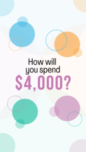
Now to bring it all together. The video was to be created using Canva in order to have other volunteers provide feedback and make any changes if needed. By using the built in mobile video templates for the size it made it easier to have the correct dimensions for an Instagram reel. I wanted to leave the background white with the colors of the logo used for the circles and rings that would fade in and out along with the text to create movement. The first shot will show the tagline of “How will you spend $4,000?”.

The Video


Working on Social Media Projects; #3

COMD 4900 Internship

World Blood Donor Day and Sweeps for a Cause

For this week, we had to work to spread awareness of World Blood Donor Day on June 14th by collaborating with the NY Blood Center.

We had to spread the information on our social media and my supervisor wanted us to meet in midtown Manhattan and to hand out cards with the information for donating blood and entering into the sweepstakes. The week prior we were tasked with creating the content to spread on social media, and I decided to create an Instagram story that I planned on posting on my own social media account.


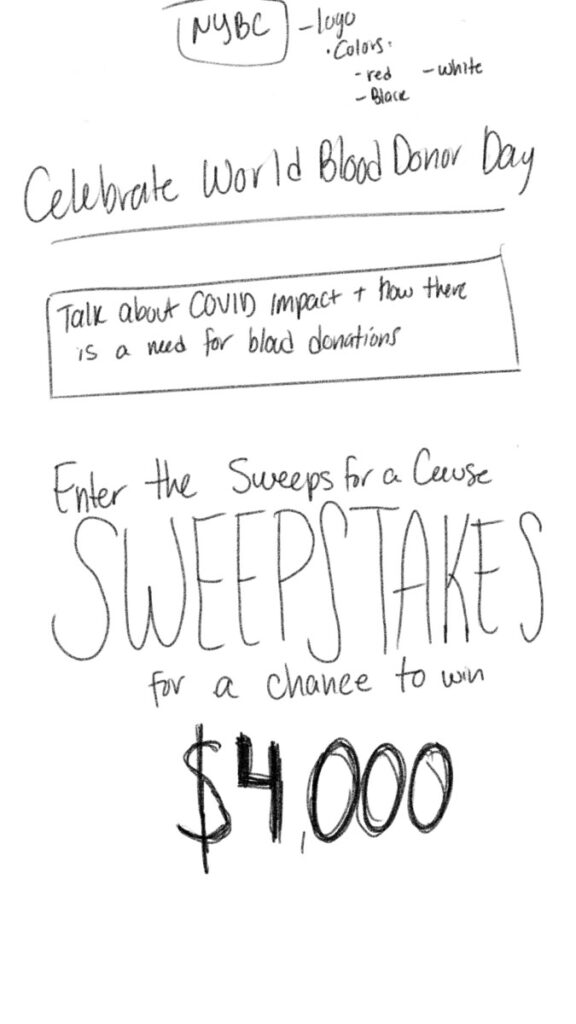
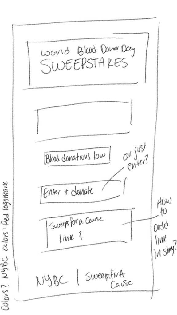
NYBS Sweeps_sketch_v1
The first sketch of the Instagram story


The information that was provided by the non-profit was used here to help promote awareness of the event, and in this sketch I wanted the words sweepstakes and the $4,000 prize to stand out in the design.

World Blood Donor Day sketch 2
Second sketch with different placements for the information


I also worked on a second version of the sketch with different placements for the information. In this version I changed the location of the NYBC logo and the nonprofit logo to the bottom part of the design in order to have the main information be prominent. I also left out a space with a place to add a link to the main page of the sweepstakes, but Instagram wouldn’t allow links to be posted in stories unless a person is verified. So instead I had to place a sticker that would let viewers know that the link to the page is in the profile bio.

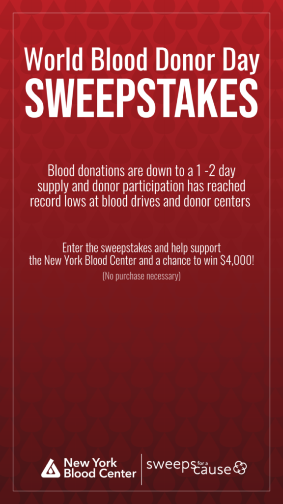
Finished Story
The final version of the story design, only missing the sticker that would be added within Instagram


The final design had the logos of the NYBC and Sweeps for a Cause on the bottom as planned, with the World Blood Donor Day and sweepstakes on top to lead in. I added information about the scarcity of blood that is available as well as the grand prize for the sweepstakes. Once added to Instagram I planned on placing a sticker on the large open space near the bottom to direct people to my bio for the link, as I wasn’t able to place a link directly into the story itself.


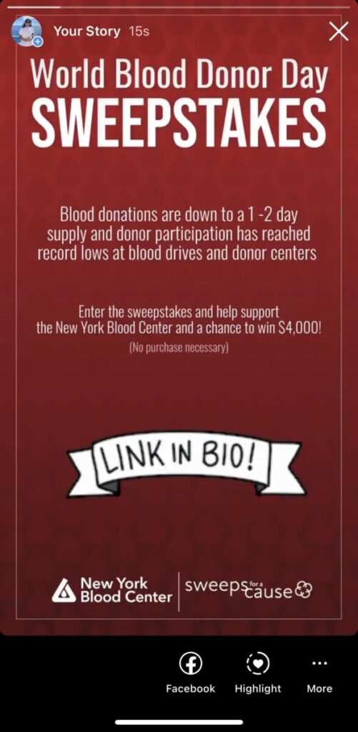
NYBC Instagram story
The final uploaded on Instagram


The final design, complete with the sticker that would lead people to look for the link to the sweepstakes.

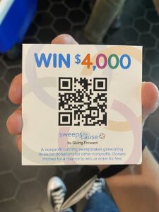
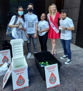
While the instagram design was done to promote the event online, my supervisor Ā also wanted to have a group of volunteers go out and hand out free drinks to people walking along midtown Manhattan and hand out cards for the sweepstakes and for a blood drive for the NYBC. So I also volunteered to go out and help draw people in for the sweepstakes and to donate blood.

After spending about 2 hours handing out drinks and trying to catch peoples attention we managed to have a few people stop for interviews and helped others get access to the blood drive and the sweepstakes by using the QR codes on the cards we were handing out.

Working for this organization has been a great experience so far. I have to work on my projects and at the same time do some outreach to influencers and celebrities by sending them messages open social media and through email in order to have them join our sweepstakes and promote it so it can reach many others. My time has to be divided between design and PR, which is an experience that I am not used to. However the design work I am doing is similar to what I have done in school so far, but there are real world implications if I don’t deliver on time and I am held accountable for any changes that must be made.

One of my supervisors has a lot of experience running a nonprofit and the knowledge he has on advertising is incredible. He was able to stop people on the street effortlessly and even had people stop for an interview for the organization’s online platforms. He recommended some books about how to be an effective communicator and he even had advice about how to present myself to others not just on the street but on a professional level as well, such as always being ready with what I want to discuss and always having a backup plan in case something goes wrong. Overall it was a great time spent working with him and handing out cards and drinks for a good cause.

Ethics in Graphic Design 2

COMD 4900 Internship

Ethics in Graphic Design

2a) Past work and giving credit

Based on the AIGA readings, there have been some considerations taken into account. I plan on using certain images for the internship in the promotional designs I want to use, and one of the articles discusses stock photography.

“The use of pre-existing imagesĀ is another possibility for the designer. Use of stock images avoids the many contractual issues that may arise when photography is done on assignment.”

AIGA Business Ethics: Use of Photography

The images I source come from unsplash.com, where they provide images that are free to use in our designs and works. I’ve used that site many times to find images to use in my work and every time a picture is downloaded they encourage us to attribute the artist by giving a shoutout on social media or by adding some text to the work files. And the image data also has the name of the photographer on it to make it easier to give credit.

Now in the past I have always had that information in the back of my head, but I haven’t really done much attribution when finishing my designs, but I always saw it as a school project and since I wasn’t making any money out of it or selling any designs I always saw it as OK to not give attribution, especially since I don’t really post it anywhere online either. But moving forward it would be prudent to give credit where its due, and especially if I plan on using these types of images for professional work.

Vacation Destination Picture
A picture found on Unsplash that I plan on using for the internship by photographer Josh Hild


Crawford, Tad. ā€œUse of Photography.ā€ Design Business and Ethics, American Institute of Graphic Arts, New York, NY, 2007, pp. 90ā€“95.

Research foundations: Find & attribute images. LibGuides. (n.d.). Retrieved June 9, 2022, from https://libguides.seminolestate.edu/researchfoundations/findimages

2b) Fairey Copyright Case

The Fairey case was intense, with the arguments from the AP and the photographer Mannie Garcia being quite convincing, such as the picture being very creative on Garcia’s part and contained “original features” that made Obama look heroic, and when Fairey used this picture as a reference he did so improperly. But I feel like the biggest problem was when Fairey tried to hide the evidence of his mistakes, especially since he knew that he had made a mistake by thinking the image he chose was another one. By fabricating evidence and hiding what he had I feel like he made a huge mistake that, if they hadn’t settled, could have resulted in some serious repercussions for him and quite possibly for other designers as well. Fairey’s decision to come clean once it was discovered he had been lying is respectable, since he did not want his employee who had discovered his attempt to hide the evidence to go along with the lie and instead asked the employee to release the information. That was a great ethical decision that redeemed him somewhat in my opinion, although he should not have done so in the first place.

The case itself shows just how complex copyright can get, with many requirements needed to be met in order to have a copyright be enforceable, while at the same time showing how designers also have their work be protected by copyrights as well. An article by Columbia Law School highlights just how close it could have been for both sides if they had continued litigation. Fair Use was an argument by Fairey that pointed out that the image used didn’t necessarily have original features, that instead it used a very popular pose that was used by photographers to capture pictures of presidents before, while the AP argued that no picture was free from being affected from the photographers personal influence.

The settlement that they came to stated that Shepard Fairey wouldn’t use anymore AP images without first buying a license for the photos and the AP would work with Fairey and have the rights to create merchandise with the Hope poster. It worked out well for both parties in the end, but it was a case that highlights how nuanced copyright and fair use laws can be and how it can lead to a great deal of problems for all parties involved.

Citations:

Fisher III, William W., Frank Cost, Shepard Fairey, and Meir Feder. “Reflections on the hope poster case.” Harv. JL & Tech. 25 (2011): 243.

ā€œObama Hope Poster Lawsuit Settlement a Good Deal for Both Sides, Says Kernochan Center Director.ā€ Columbia Law School, www.law.columbia.edu/news/archive/obama-hope-poster-lawsuit-settlement-good-deal-both-sides-says-kernochan-center-director. Accessed 9 June 2022.


Projects for Sweepstakes; #2

COMD 4900 Internship

Projects For the Organization

After a few meetings with my supervisors I have taken on some projects in order to help promote the sweepstakes taking place. I decided to create some banner ads that promote the sweepstakes, an animated gif, and also a short video for Instagram as well.

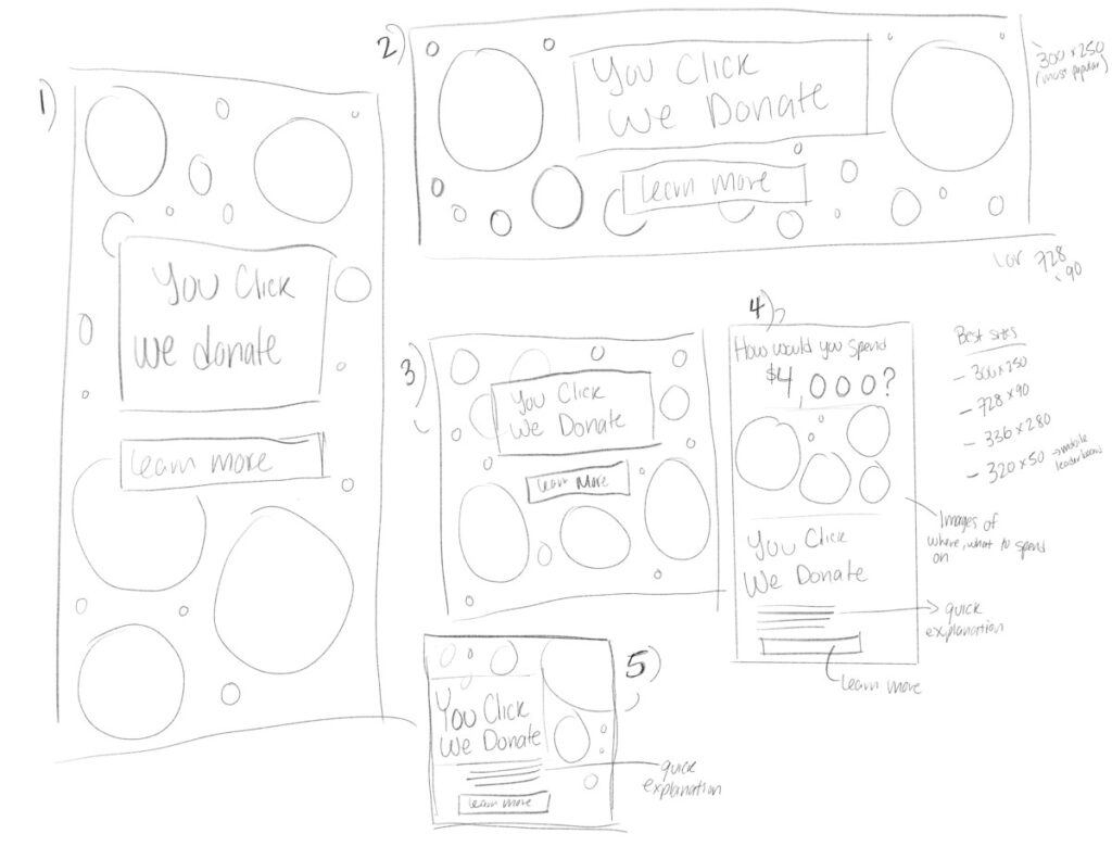
For the banners I wanted to create 3 sizes. One would be 300×250 pixels, one would be 120×600 pixels, and one would be 278×90 pixels. These 3 sizes I feel give great coverage across multiple applications on the web. However my supervisors wanted the banners to be animated in some way, so there would be an additional requirement to be met with the ads.

banner ad sketches
Sketches of different sizes for the banner ads


For the banners I wanted to use the circles and rings that are present throughout the branding of the organization and the sweepstakes platform. The main draw is the tagline of “You Click, We Donate” that my supervisors wanted to be used. Alongside that I also wanted to include the $4,000 prize as well in order to offer a reason for clicking on the banner. But upon consideration I instead opted not to use it as some people might feel as though it is a scam if they come across the banner. The tagline itself will create interest in the sweepstakes and I will instead have that be the main center of attention.

Among those sketches above I settle on the bottom design for the 300x250px size as it lets me show the tagline taking up the majority of the space and the remainder can have the circles and rings to create a sense of movement when I decide to animate it into a gif.


For the final work I kept the colors of the organization in mind when creating the circles and rings. The image of the man with his arms up in celebration was added into the design as well to add another element that wasn’t just the text and circles. I had the “We Donate” part of the work be a bold orange color thats used in the organization branding and I chose it for the strong contrast with the blue background. The reason for this was to have the onus on the organization of donating money, while all the user has to do is click. I wanted to make the tagline that was given stand out within the design and help to drive more traffic to the website and the sweepstakes.

After this project was handed in for review I needed to begin to work on an animated version of this in gif form, but that may take a little longer as I haven’t had much experience in creating gifs and will need to learn how to do so properly. But for the gif I have the idea of having them be simple, with minimal moving elements, possibly only having parts of the design fade in and end with the call to action of “Learn More”, but I will have to develop that as I move forward with the project.

Having this internship be completely remote is both a blessing and a curse. It tests my commitment to the hours I work for the internship everyday. Since I only have to attend meetings every week, there is a lot of pressure to make sure that my time management is on point. I chose to work for 6 hours a day, from 12pm to 6pm, Monday to Thursday and then 5 hours on Friday (10am to 3pm) since I have to work on Friday nights. The responsibility I have to stay committed to delivering work on time will be tested, but I’m confident that I will stick to it.

Interning at a Non-profit Organization; #1

COMD 4900 Internship

Interviewing and my role within a non-profit organizationĀ 

For the internship I was put in contact with my supervisor and I would be interning at a non-profit organization. After a remote interview, he talked to me about how this non-profit that generates income for other non-profits by having content created for them and then promoted for them as well. They have a platform where they Ā generate revenue through running a sweepstakes where people can donate money and be eligible to win a $4,000 grand prize as well as having $1,000 donated to a charity of their choice when/if they win.Ā 

This organization primarily partners with other non-profits and holds events that help these other non-profits generate donations and funds through cause marketing. Cause marketing involves a relationship between a for-profit business and a non-profit organization for a common benefit. This works well for businesses as it makes them seem charitable and socially responsible and non-profits are able to get funding.

Ethics in Graphic Design 1

COMD 4900 Internship

Ethics in Graphic Design

The internship I am in is a non-profit organization where they generate income for other non-profits through cause marketing. They work with for-profit businesses to help get money to other non-profits that need it. I currently have the task of creating some graphics to draw in influencers and other people with large social followings in order to promote a sweepstakes they are running, where the grand prize is $4,000 and a $1,000 donation to the winners charity of choice.

1a) Trademarks and Logos

The work being done for the organization relies on reaching out to influencers and doing so in an engaging way, using design to draw them in and help spread awareness of the sweepstakes. For the most part, all design assets like logos and style guide are made available for me to use in the designs I come up with Ā in order to accomplish those goals. The ethics lessons I read about make sure to highlight the importance of copyright, fair use, and the use of photography in our work. In the case of the internship, all of the provided logos do have a style guide that lays out how to use the assets in my designs. The copyright in this case hasn’t been an issue so far since all of the assets provided can be used how I want to, but I must follow the style guides laid out by the organization. The use of outside images is encouraged so long as we are able to use them properly and with the right attribution.

In the internship there are images provided that we can use in our work alongside the branding items we were given. We are encouraged to use these elements in our work in order to create designs that we can send to influencers to increase awareness of the sweepstakes.

Crawford, Tad. ā€œUse of Photography.ā€ Design Business and Ethics, American Institute of Graphic Arts, New York, NY, 2007, pp. 90ā€“95.

Crawford, Tad. ā€œGuide to Copyright.ā€ Design Business and Ethics, American Institute of Graphic Arts, New York, NY, 2007, pp. 80ā€“87.


1b) NDA’s/Confidentiality Agreements

There were no NDA’s or confidentiality agreements for me to sign, but there are meetings that must be attended every week. The only contract I had to sign was an agreement that was given to my supervisor for the internship and it outlines what is expected of me while working for the organization. There wasn’t any discussion about confidentiality with trade secrets but there must be some protected information when it comes to donor lists, contacts, email lists and confidential documents that a non-profit wouldn’t want to have shown, yet none of these have come up during my interview and subsequent on-boarding process.

Stim, R. (2013, May 14). Using Nondisclosure Agreements to Protect Business Trade Secrets. www.nolo.com. Retrieved June 2, 2022, from https://www.nolo.com/legal-encyclopedia/nondisclosure-agreements-29630.html

Protecting trade secrets and confidential information: TIPS for nonprofit organizations: Insights. Venable LLP. (n.d.). Retrieved June 2, 2022, from https://www.venable.com/insights/events/2019/10/protecting-trade-secrets-and-confidential