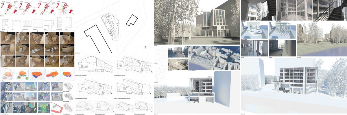
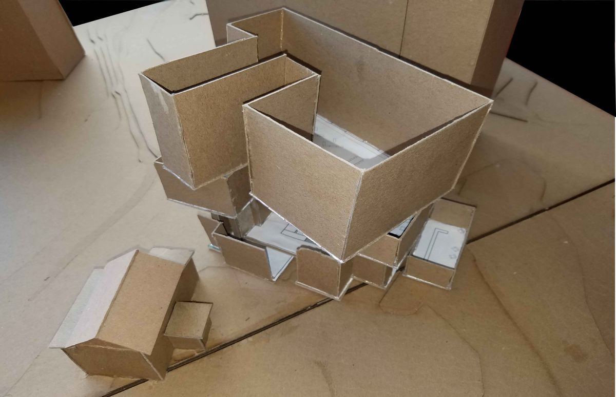
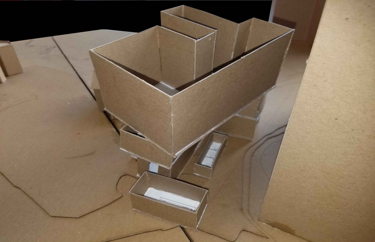
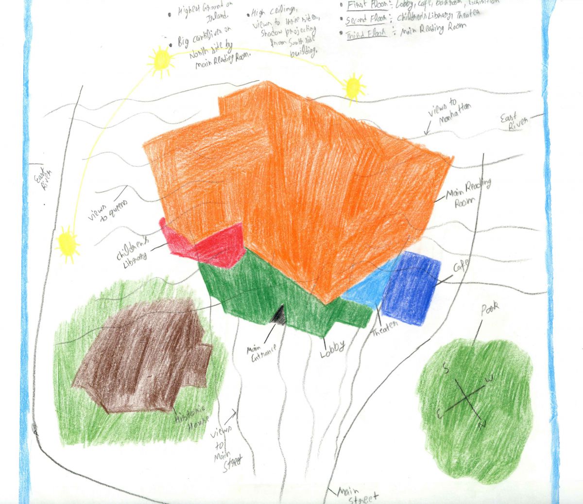
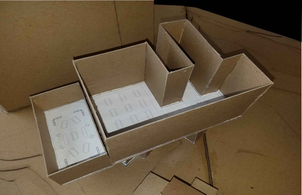
Assignment Z: Final E-Portfolio Compilation
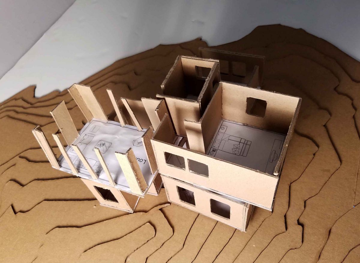
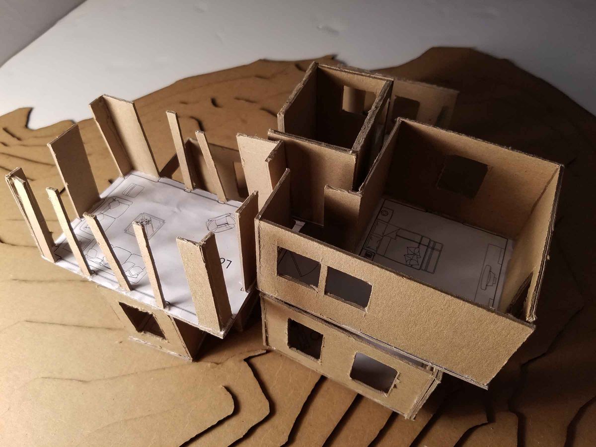
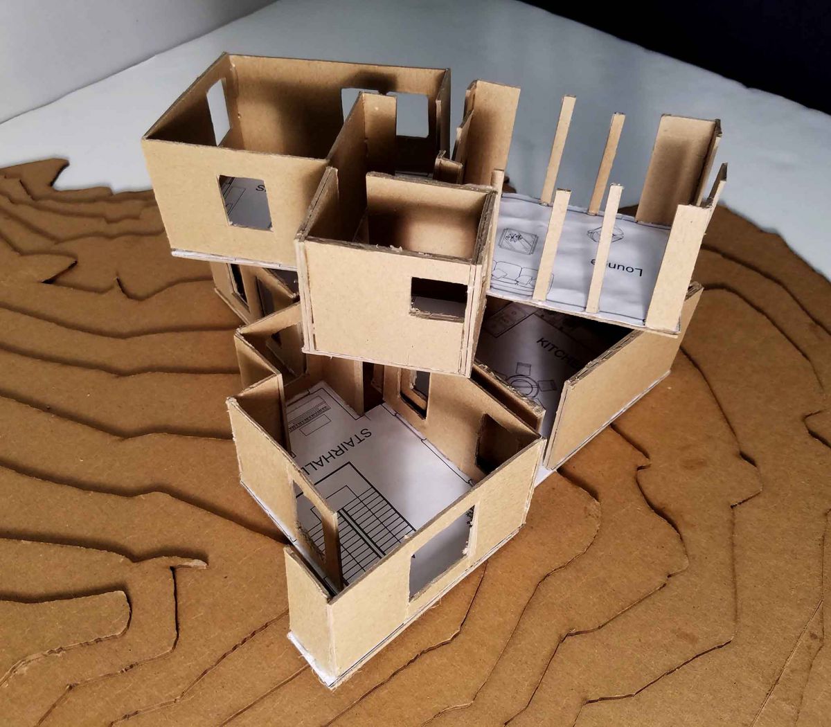
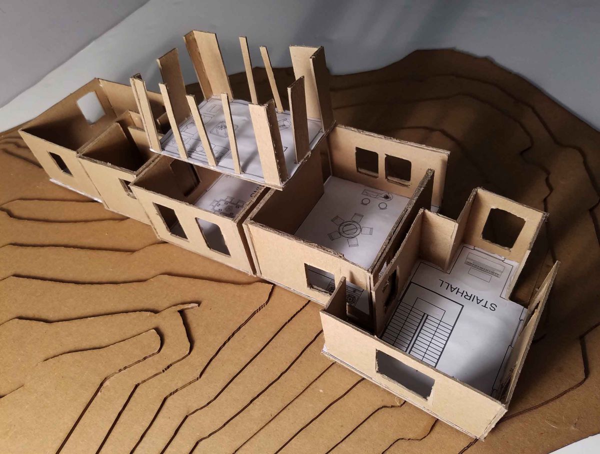
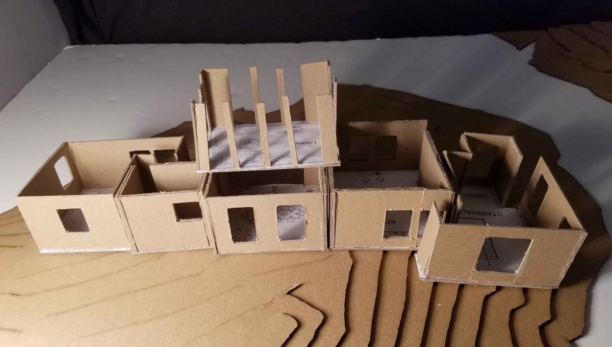
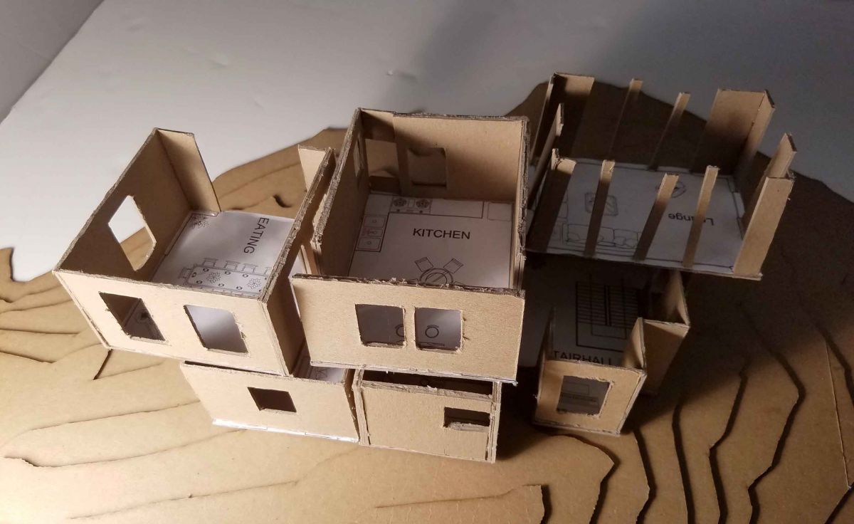
Assignment Y: Mock-Up Presentation
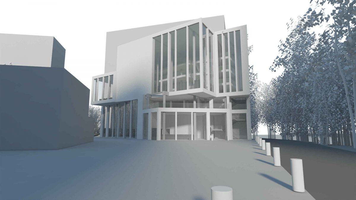
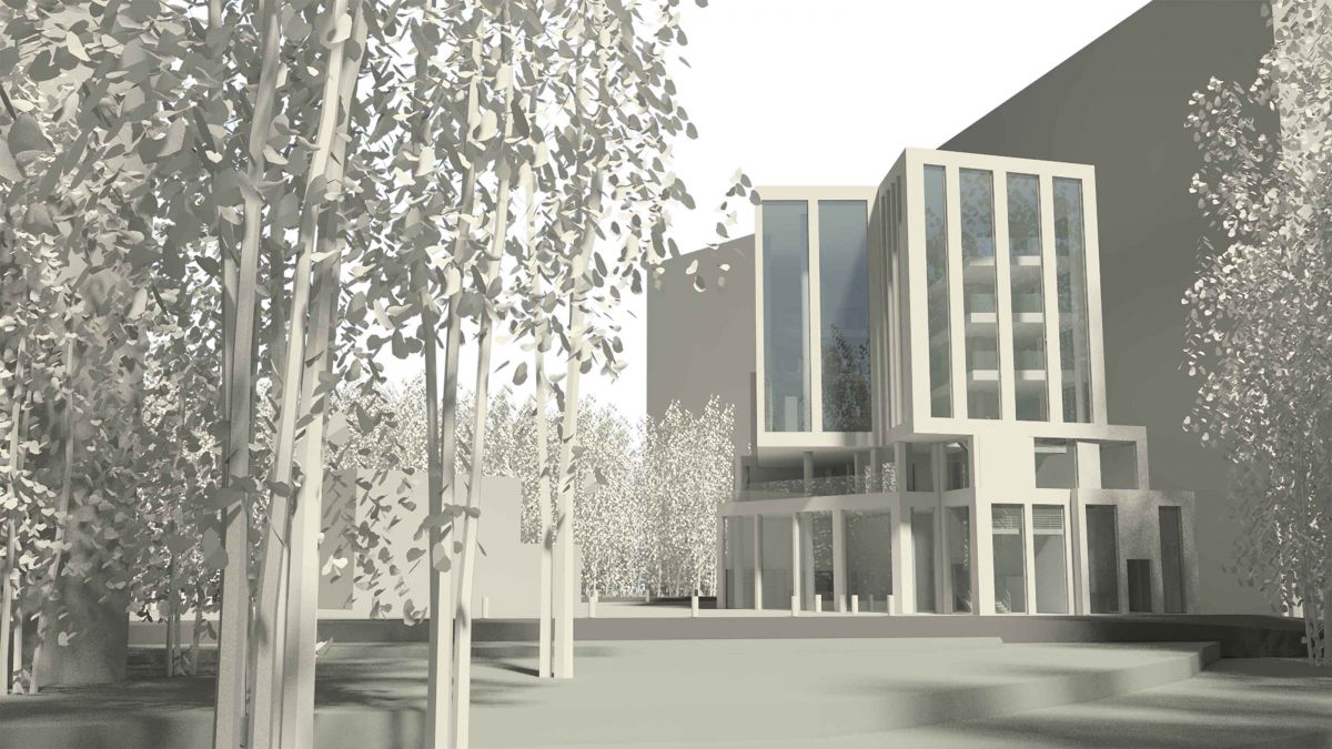
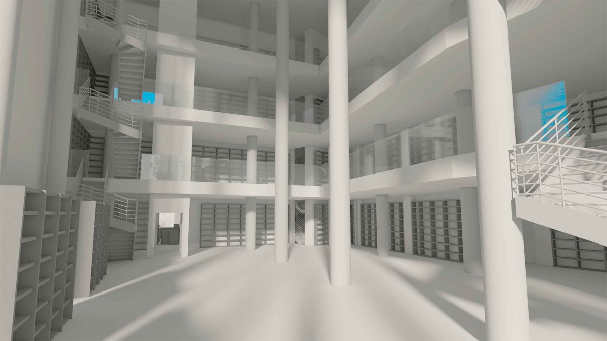
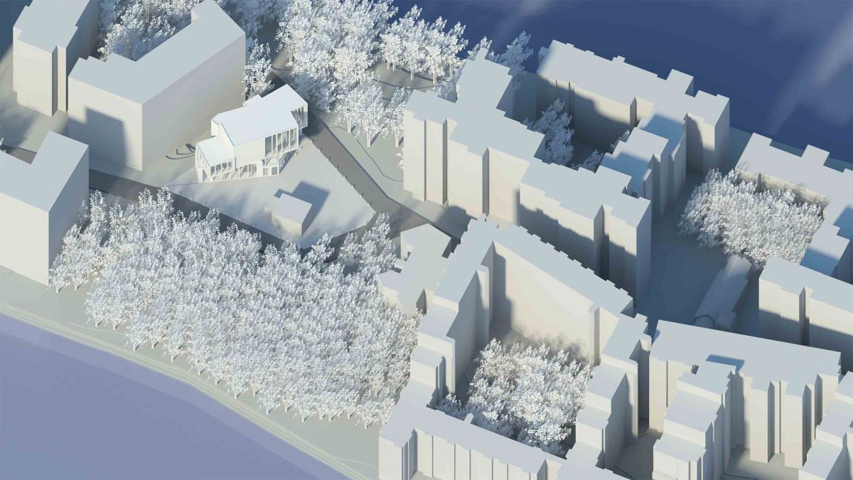
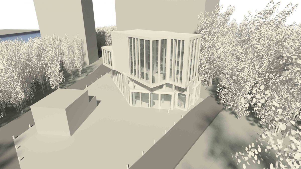
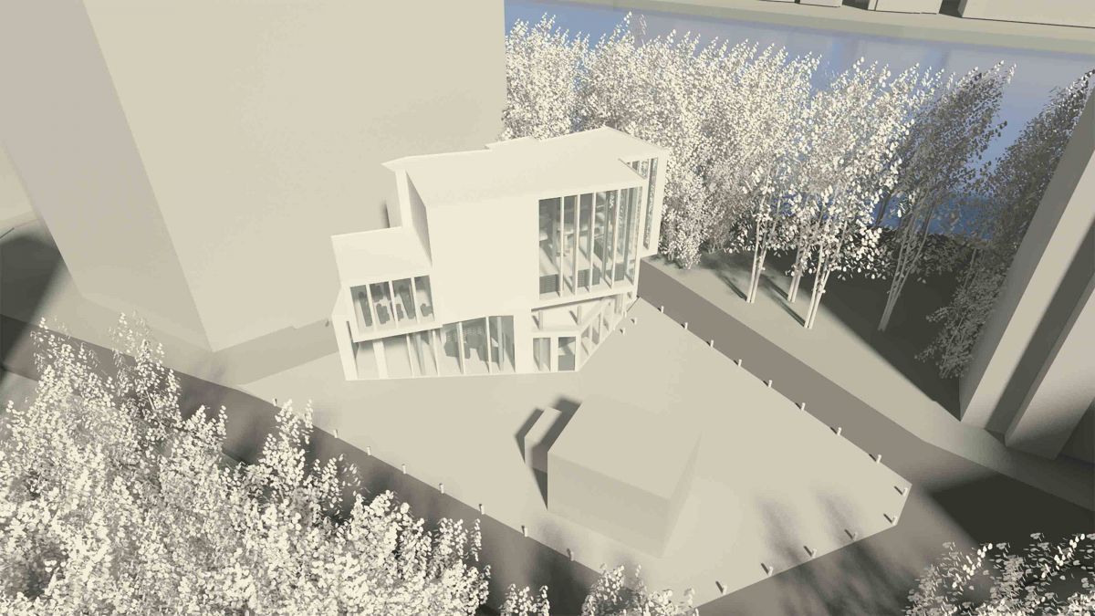
Assignment V: 3D View Development of Final Parti Selection
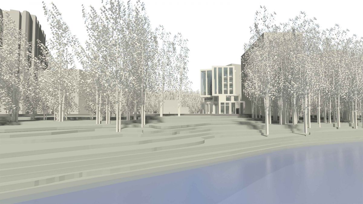
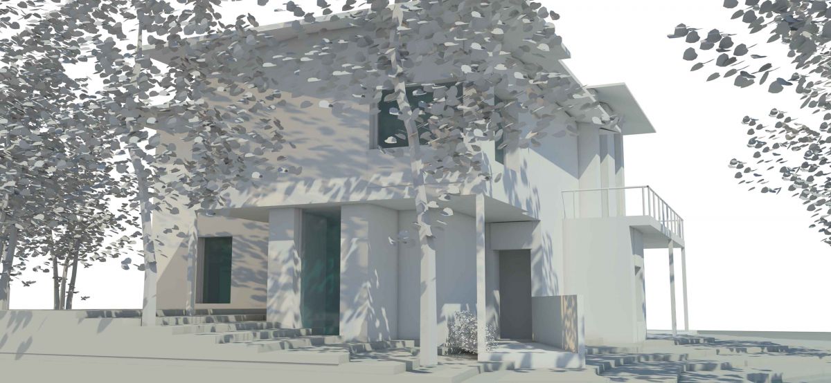
Approach View
Green View
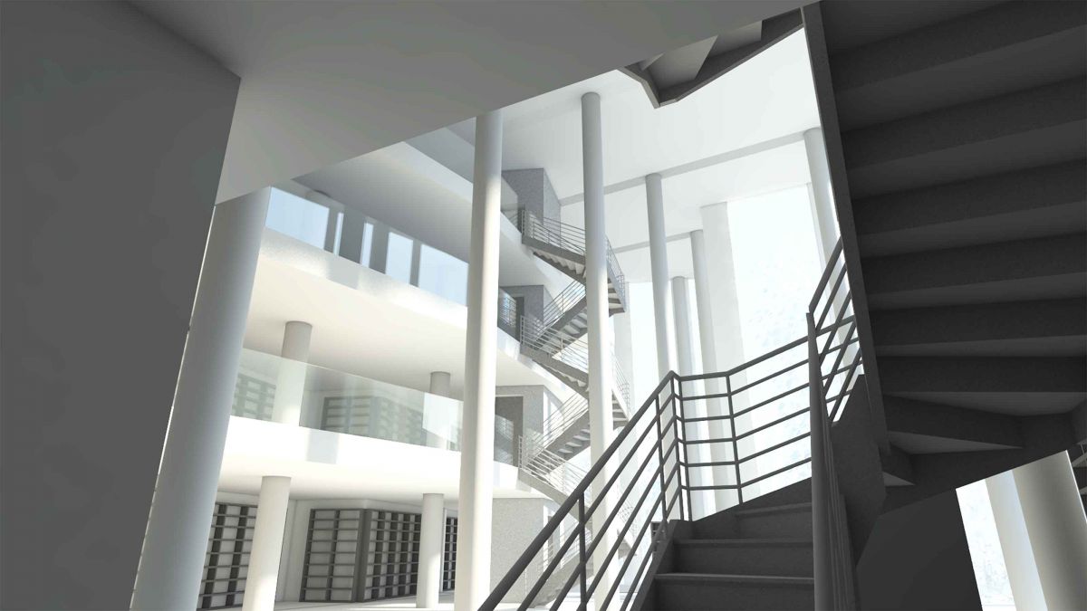
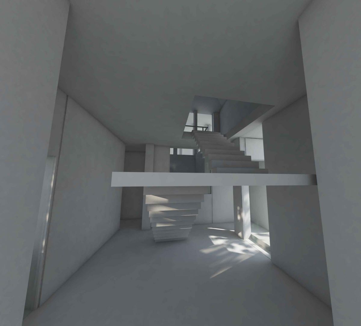
Interior View #1
Interior View #2
Interior View #3
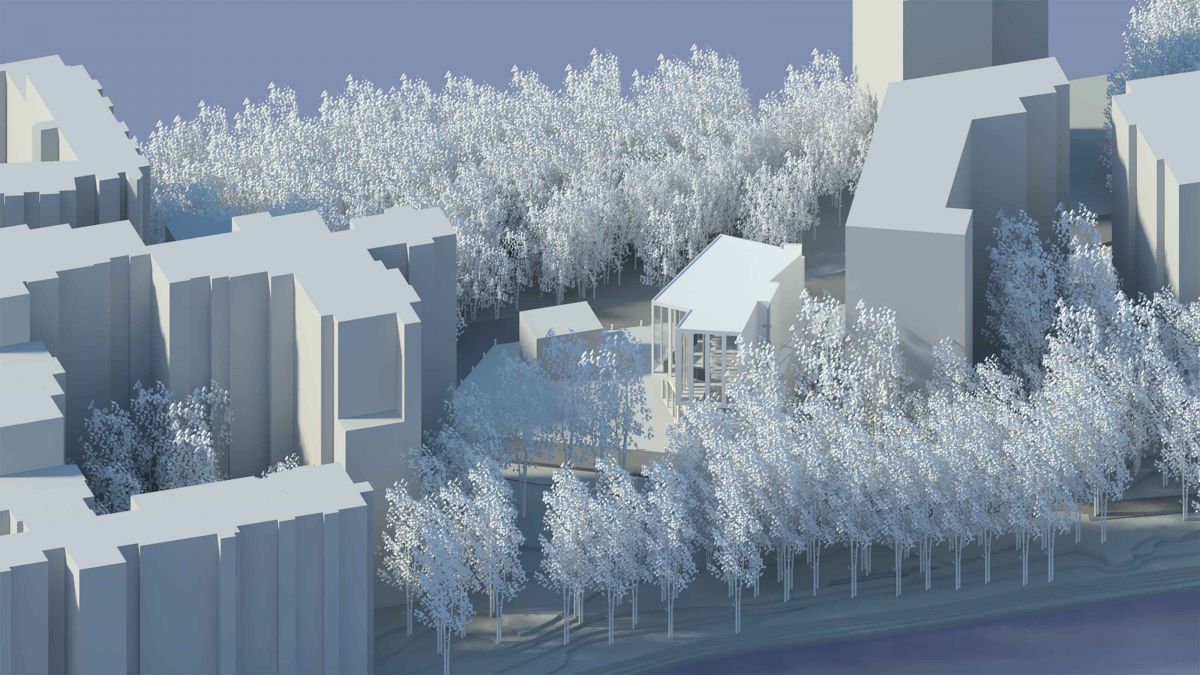
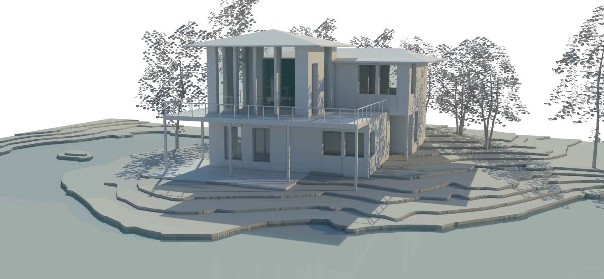
Isometric View Looking South East
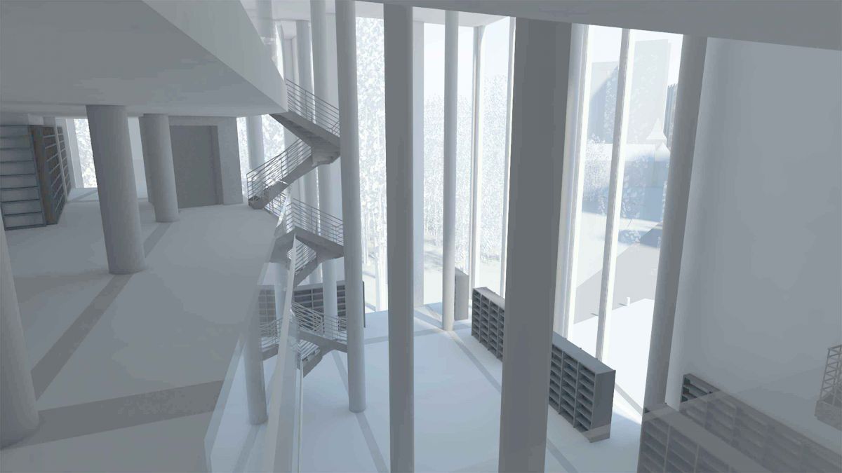
River View from 2nd Floor Mezzanine
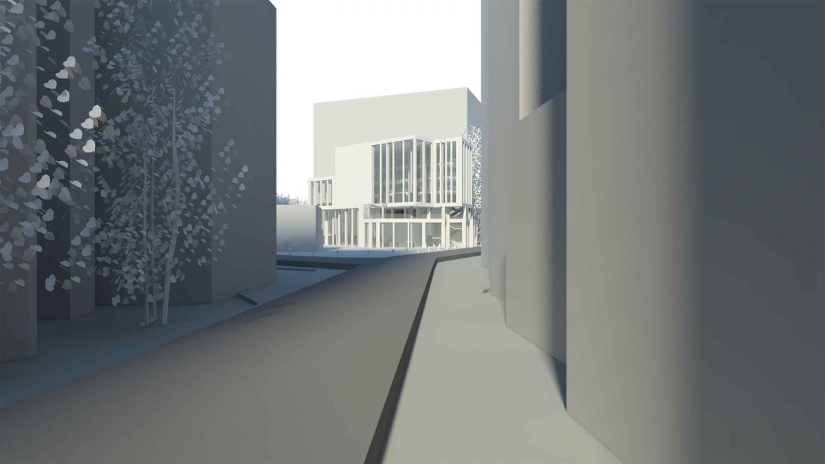
Street View
Waterside View
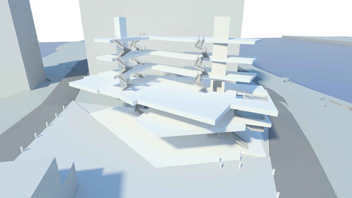
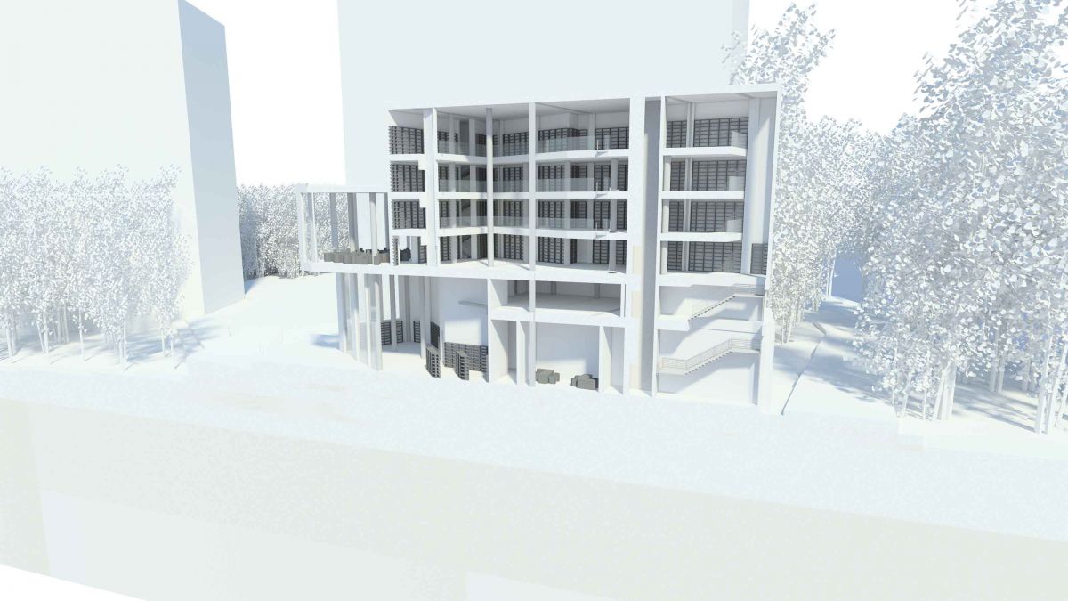
Vertical Circulation
Structure
Assignment U: Plan Drawings
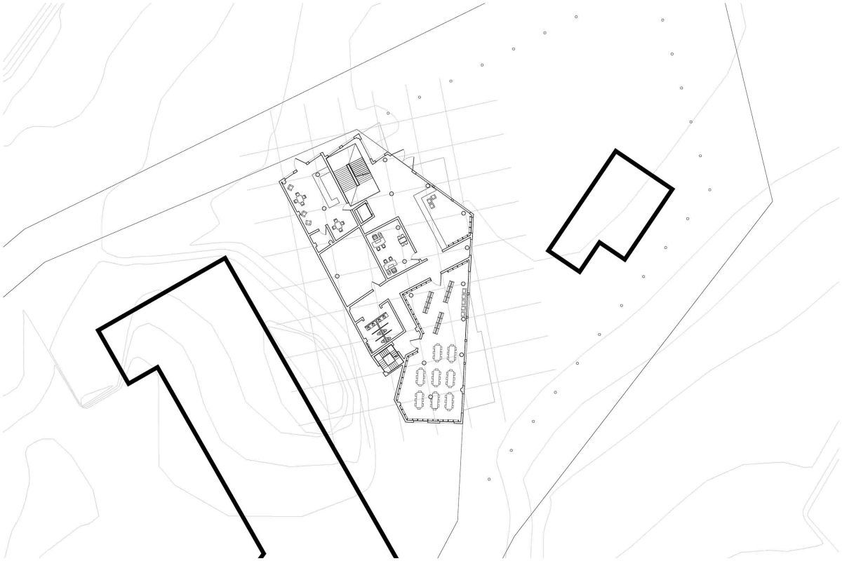
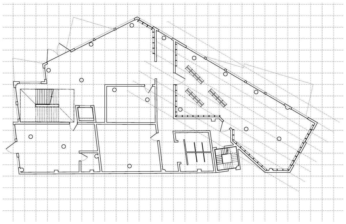
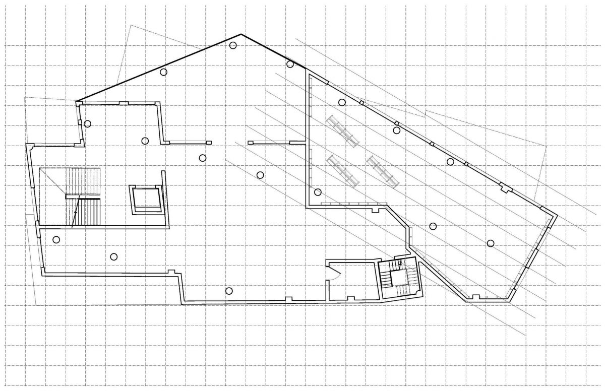
First Floor Plan on Site
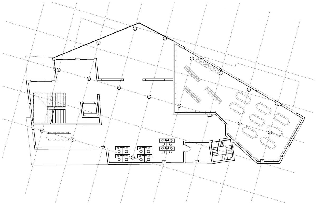
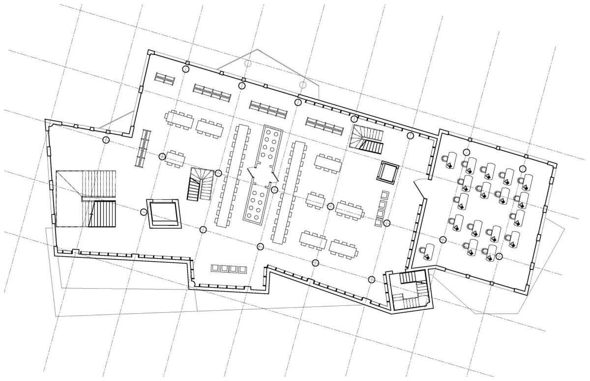
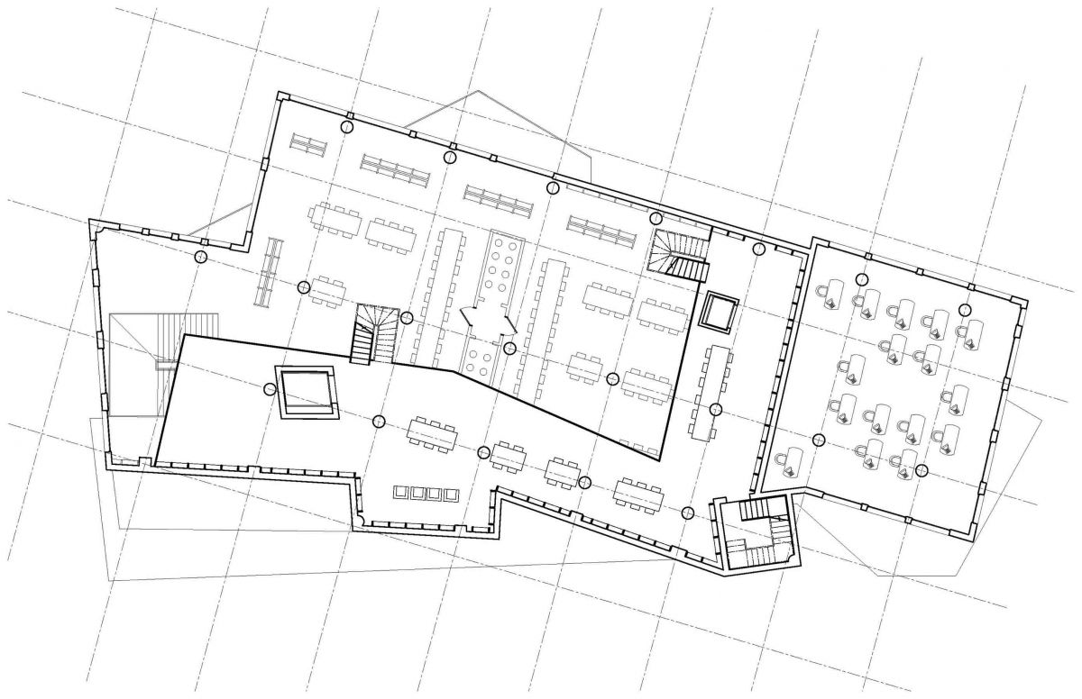
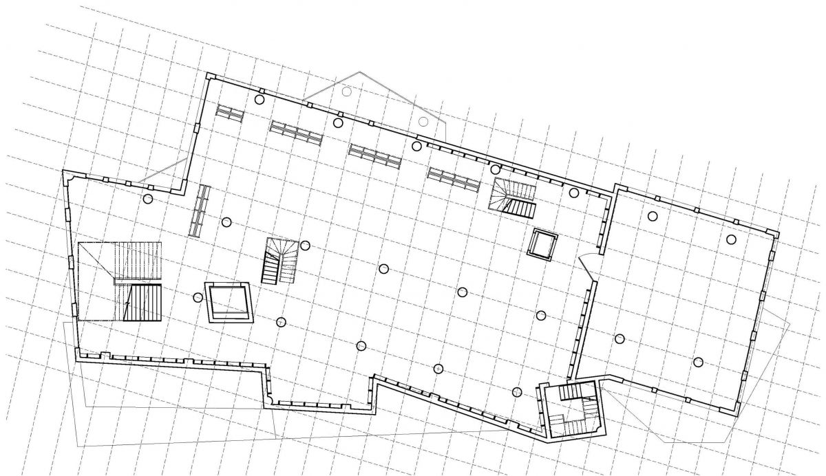
Second Floor Plan on Major Grid Lines
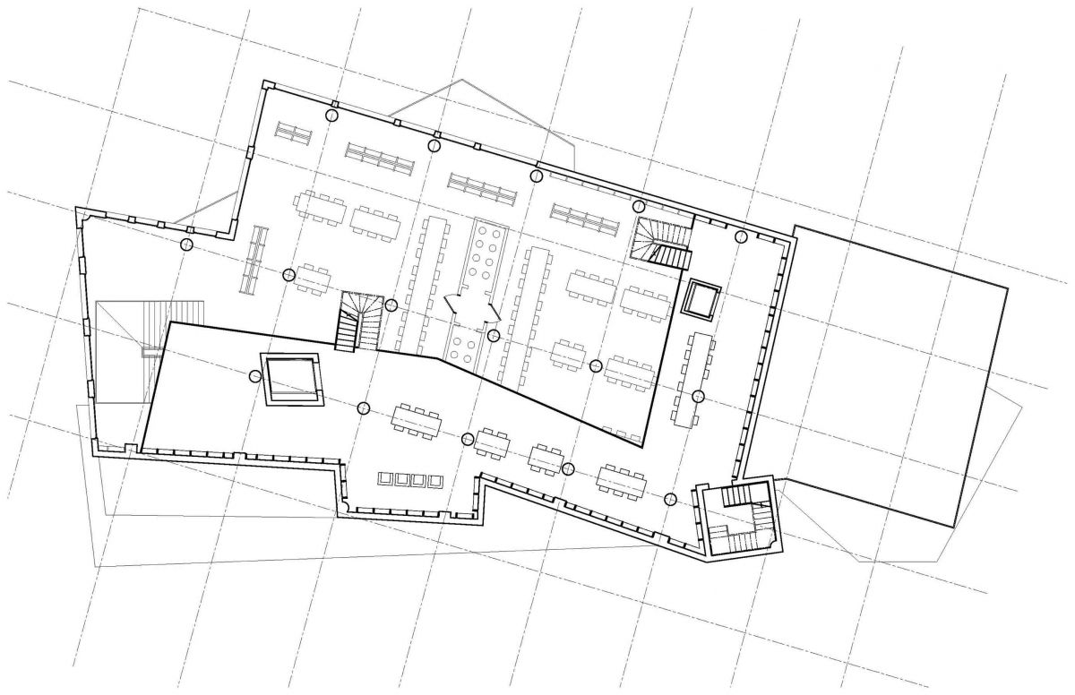
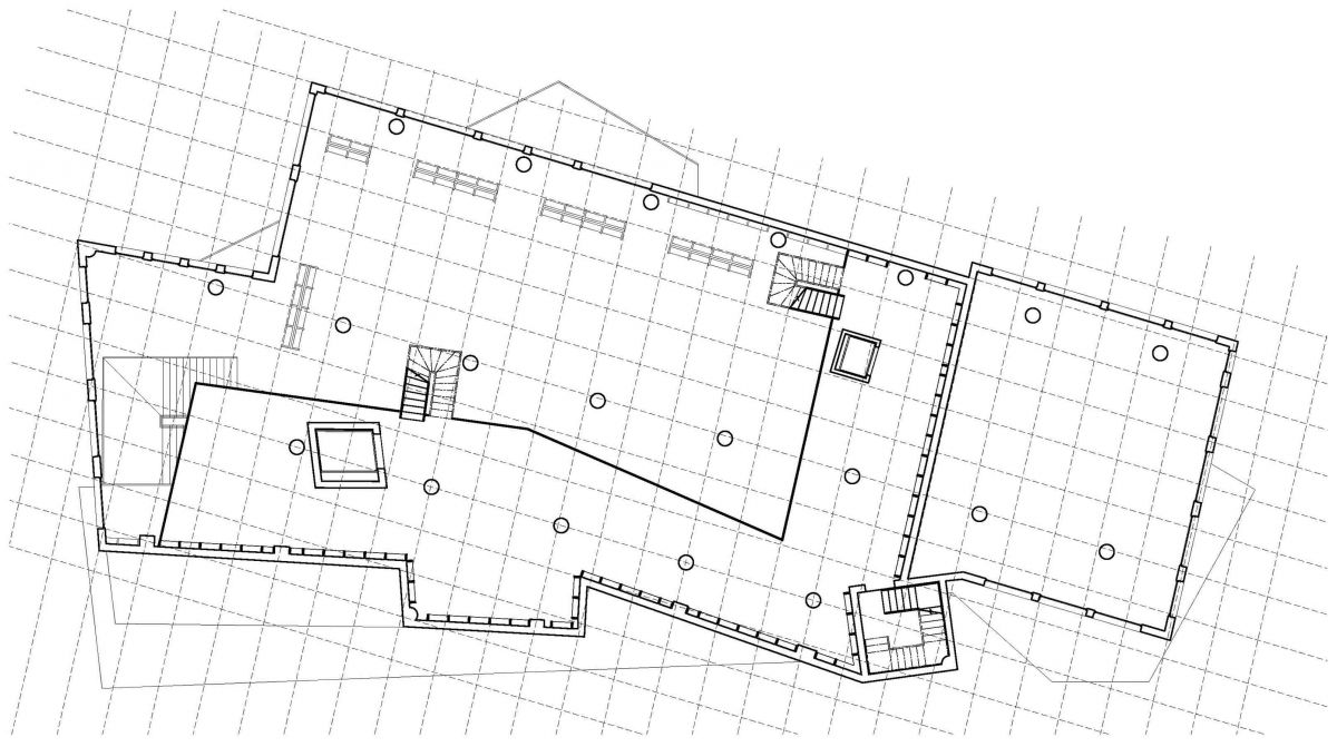
Third Floor Plan on Major Grid Lines
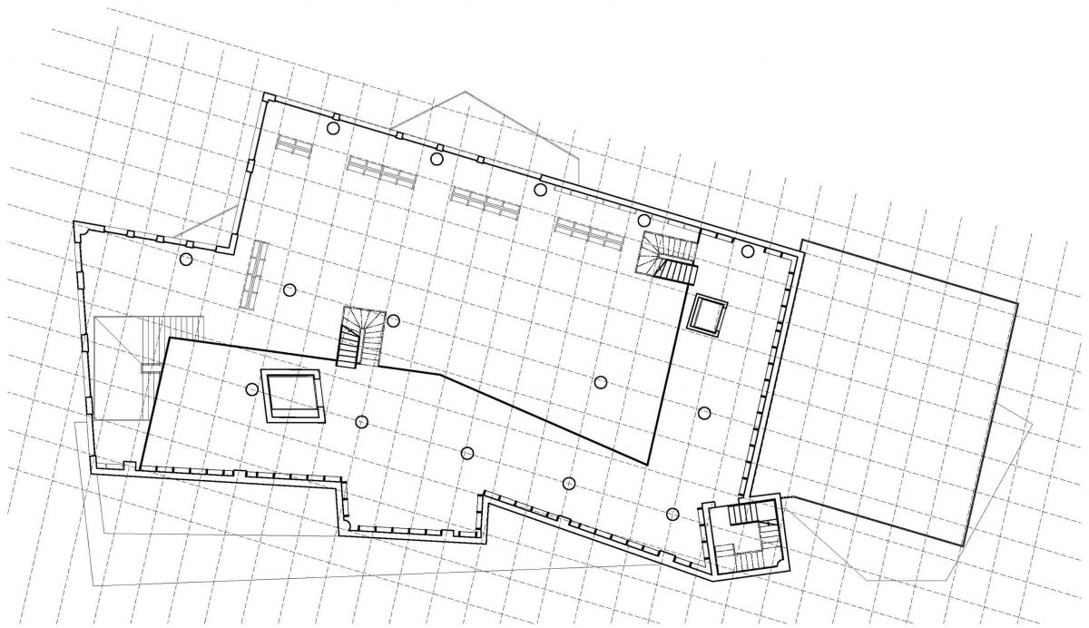
1st Mezzanine Plan on Major Grid Lines
2nd Mezzanine Plan on Major Grid Lines
3rd Mezzanine Plan on Major Grid Lines
First Floor Plan on Minor Grid Lines
Second Floor Plan on Minor Grid Lines
Third Floor Plan on Minor Grid Lines
1st Mezzanine Floor on Minor Grid Lines
2nd Mezzanine Floor on Minor Grid Lines
3rd Mezzanine Floor on Minor Grid Lines
Assignment T: Site Axon and 3D Site Section Development of Final Parti Selection
Axonometric #1
Axonometric #2
Axonometric #3
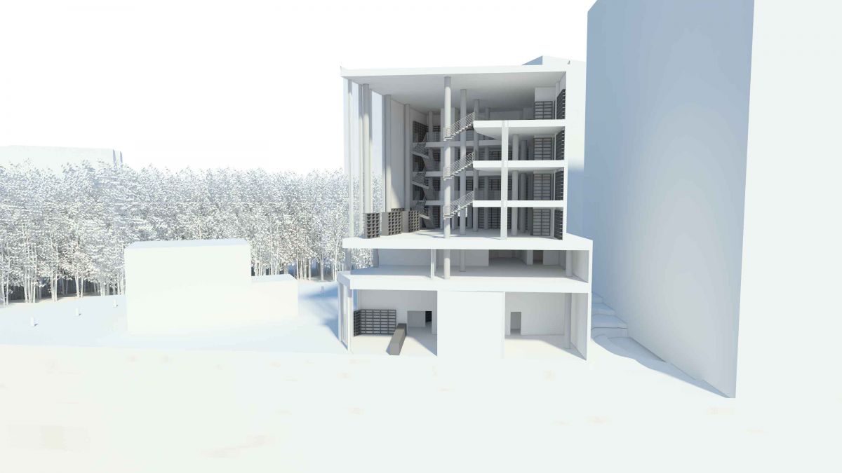
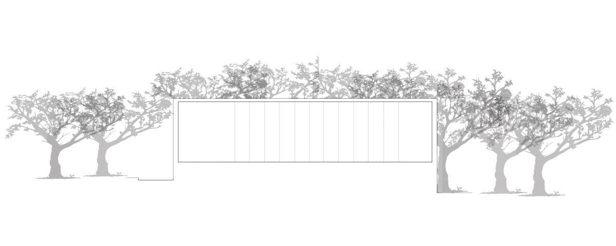
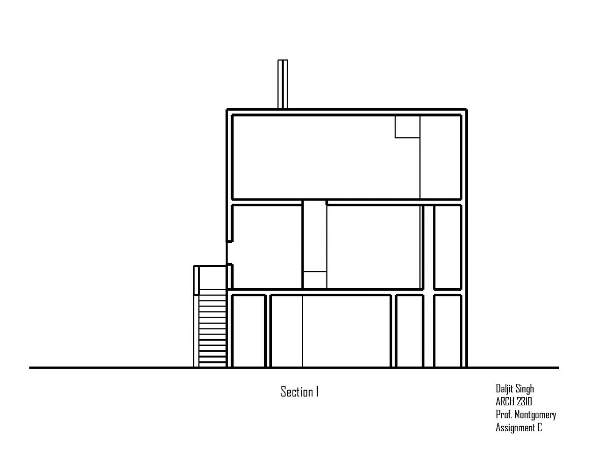
Section #1
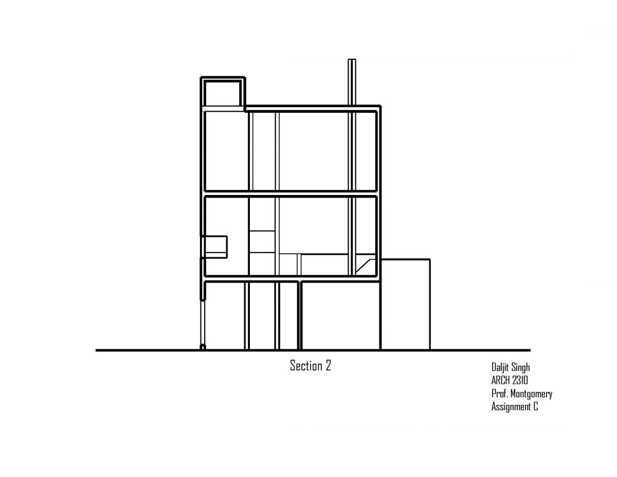
Section #2
Assignment S: Parti Concept Refinement
Assignment R: Parti Concept Refinement
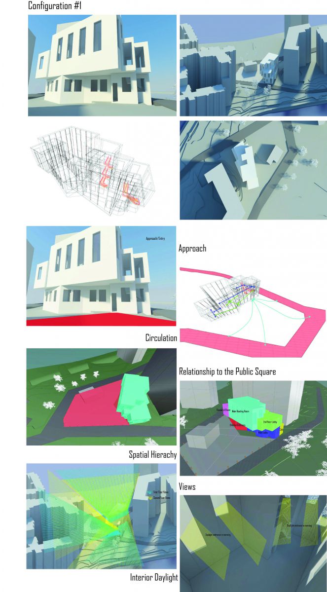
Configuration #1:
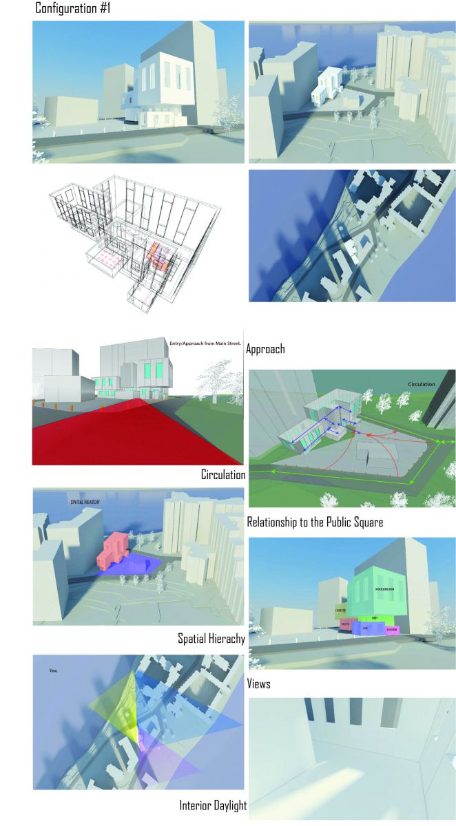
Configuration #2
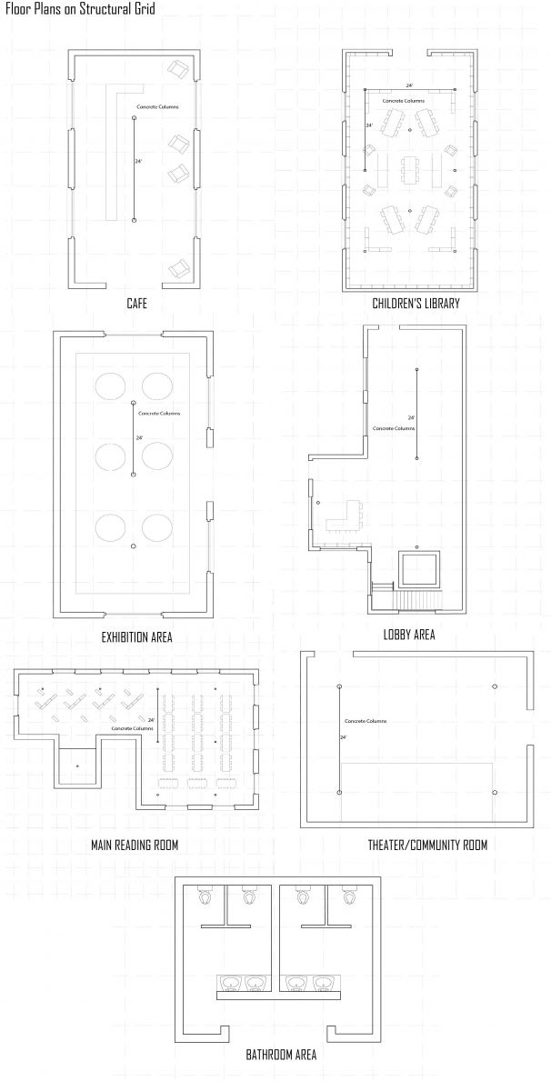
Plans with Structural Grid
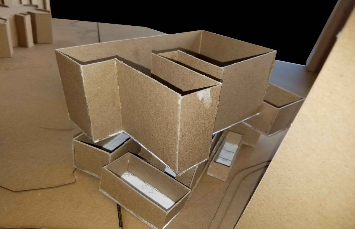
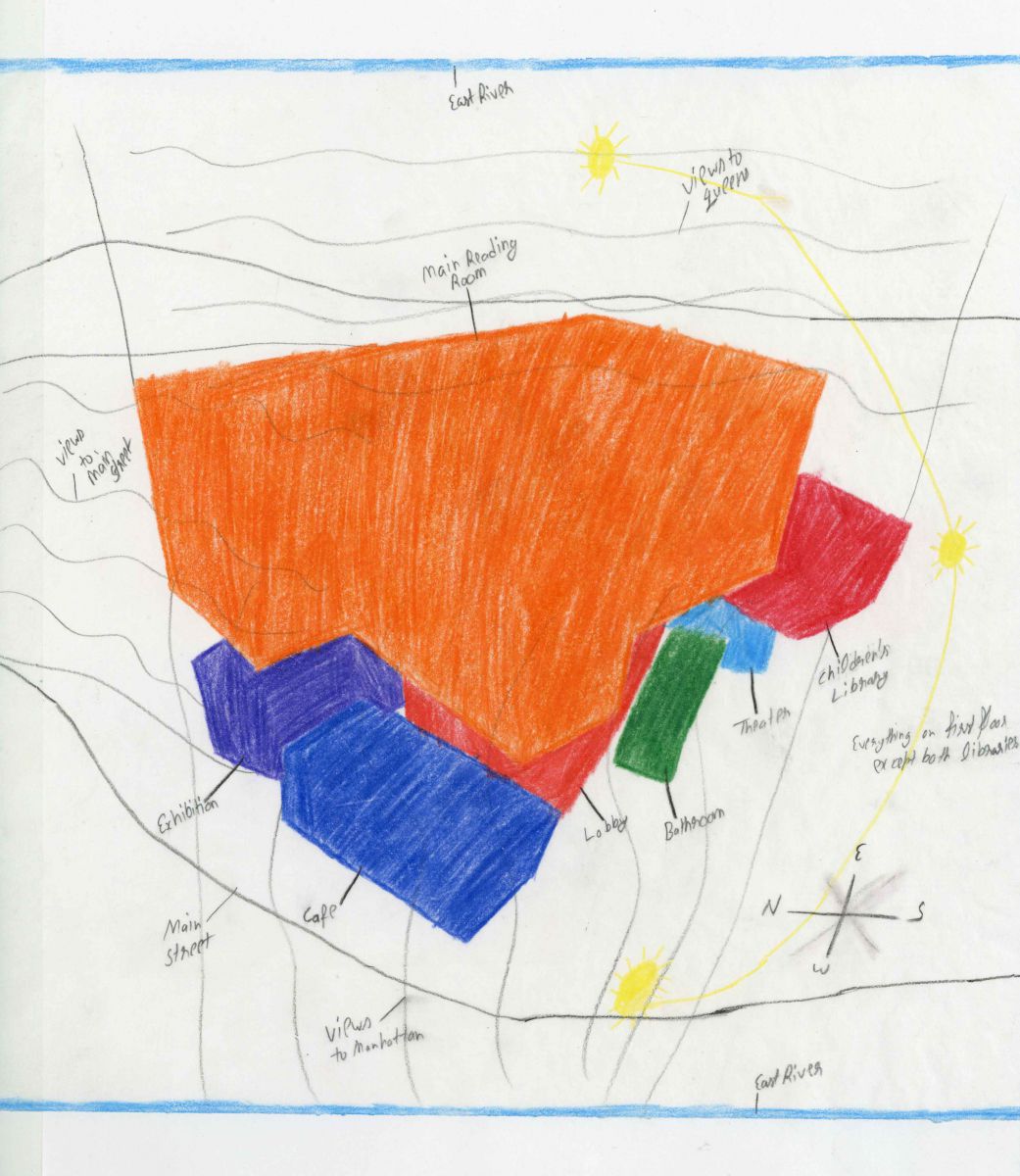
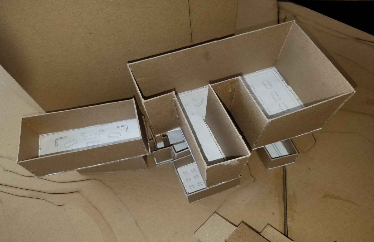
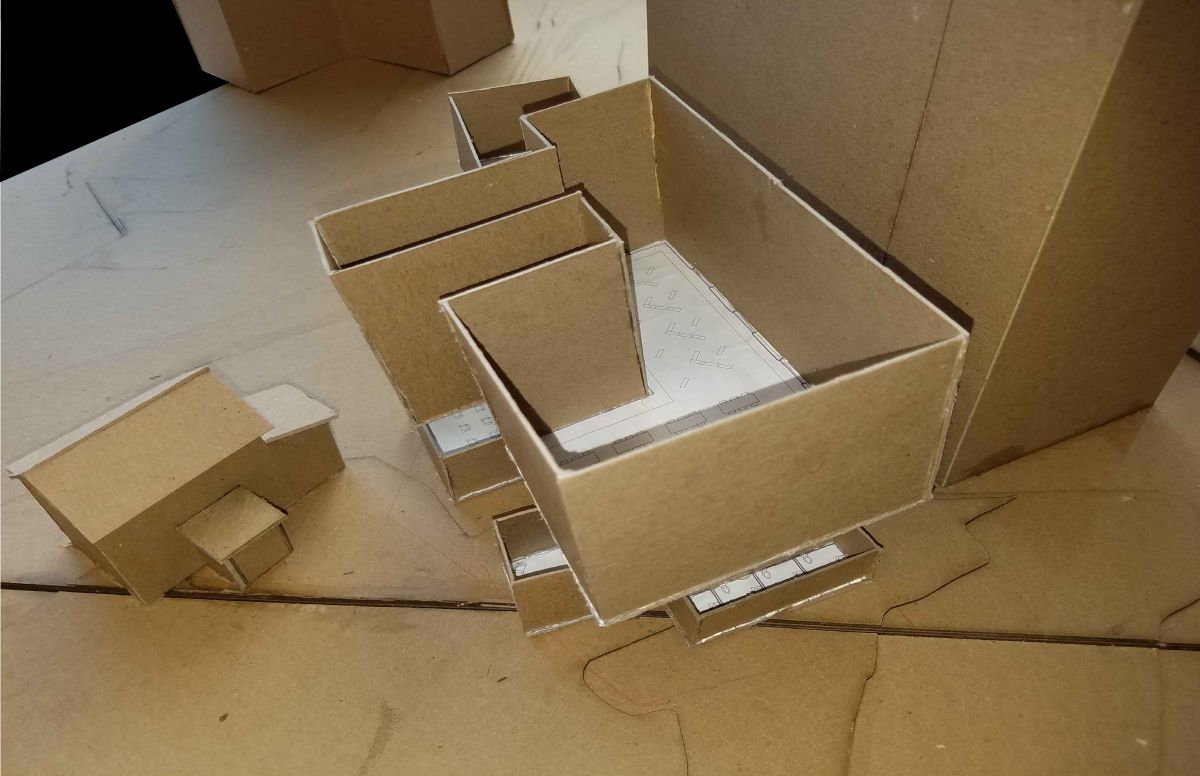
Assignment Q: Parti Development
Configuration #1
Configuration #2
Configuration #3
Configuration #4
Configuration #5
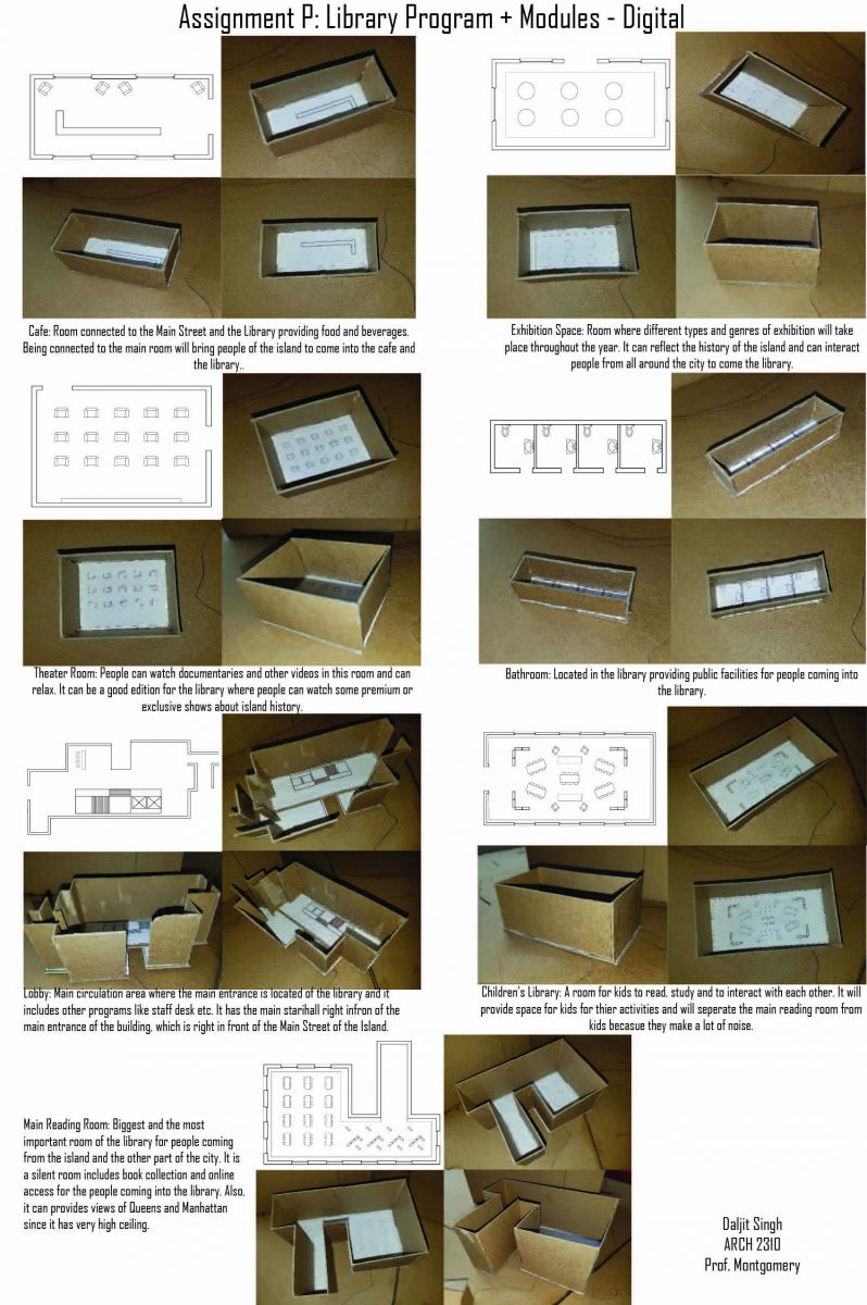
Assignment P: Library Programs + Modules – Digital
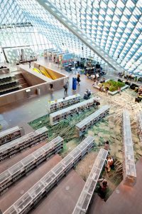
This is a Seattle Central Library designed by Rom Koolhaas and Joshua Prince-Ramus in 2004. I choose this library because of its proportion, façade and interior setup. As we can see, whole building is covered with the steel mesh and glass curtain wall. The proportion of the building is rectangular stretched from one side of the building, which makes one side of the building cantilever and other side to look heavy and condensed. Inside the building, bookshelves are made out of plastic material and transparent. Also, the arrangement of bookshelves looks completely random and the other parts of the room has different programs included in it. Floor finish has some nature pattern depicted on it and there is a small section dedicated to the nature. Because the building has glass curtain wall all around it, the amount of light coming in is abundant.
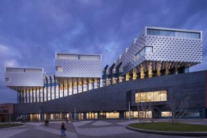
This is a Eemhuis Library designed by Neutelings Riedijk Architects in 2006. I choose this building because of the use of stairs being the main focus or the center of the library. Stairs connect every part of the library to the other part of the building. Bookshelves, computer desks, and reading room being connected to the stairs directly and combined together. Also the design and light reflecting from the ceiling is very definitive and strong. Wall on the left side of the library is divided and let the rich light come inside the library on different angels on different time of the day, which also varies how the ceiling decoration shines.
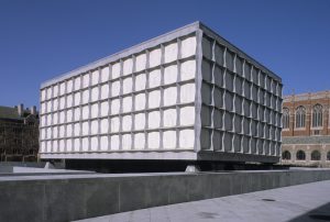
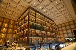
This is a Beinceke Library designed by Gordon Bunshaft in 1963. This library is a part of the Yale University and looks completely isolated from the surroundings because it has no windows or openings in its façade. Only light that can go inside the building is from the main entrance. Roof is being supported by beams connected to the outside structural walls. Nothing is supporting the roof in the middle and it allows inside space to be completely empty and open. As we can see, books five floors of bookshelves completely filled with thousands of books on all sides. It allows the proper use of space and can leave rest of the space in the building for other programs.
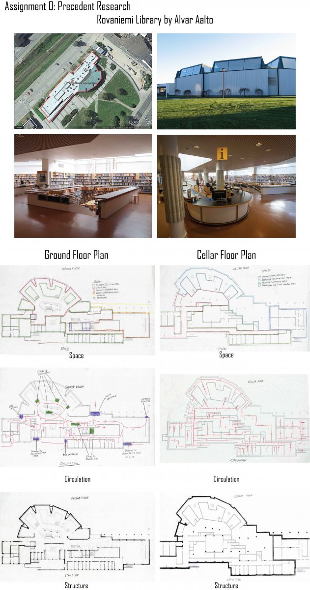
Assignment O: Precedent Library
Assignment N: Site Analysis
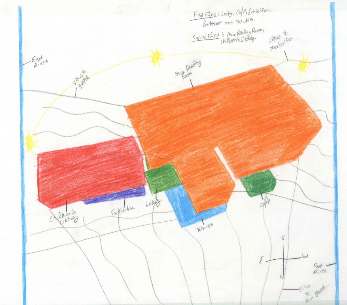
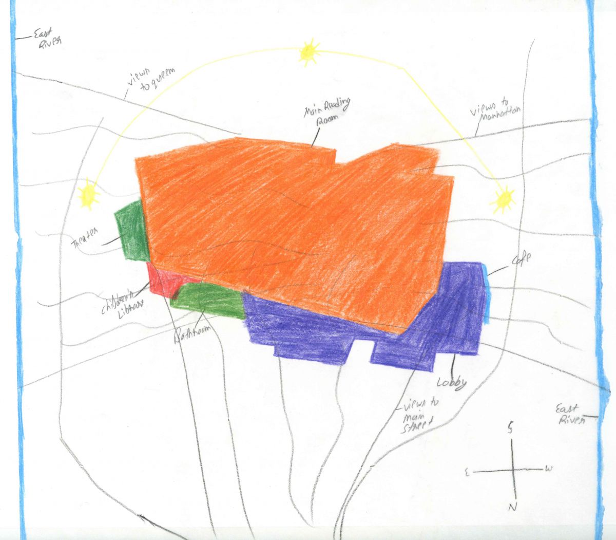
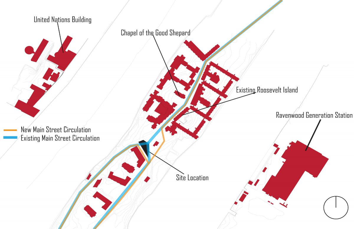
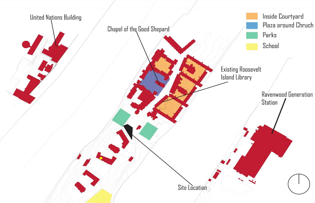
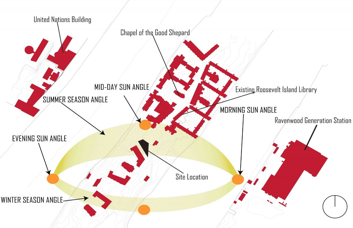
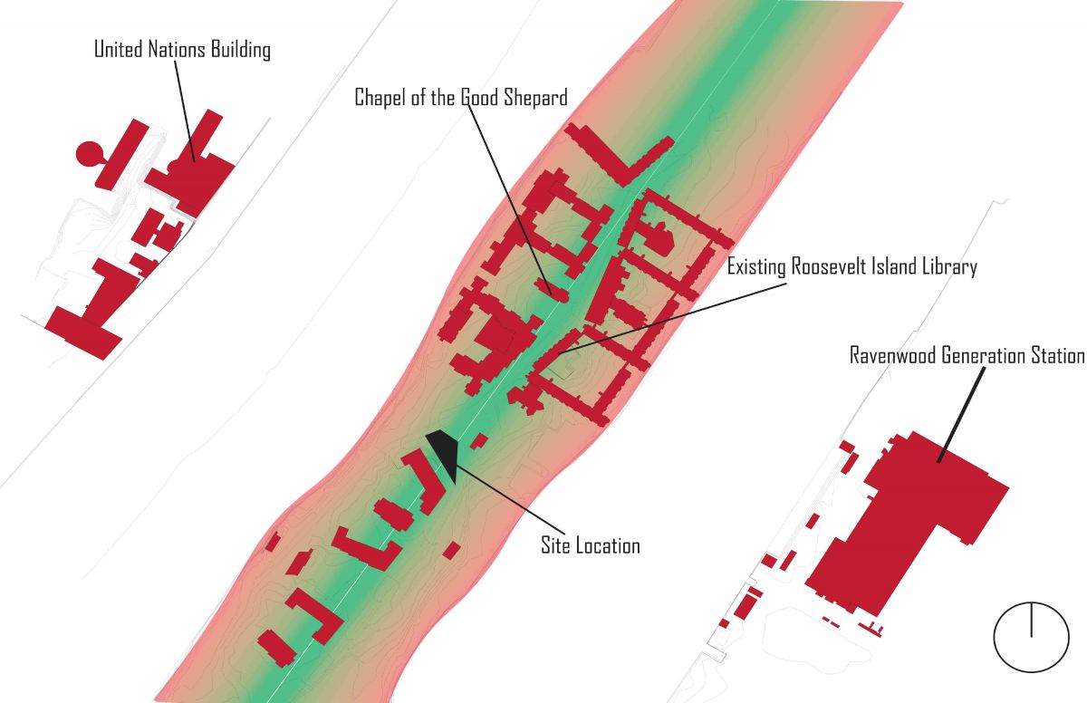
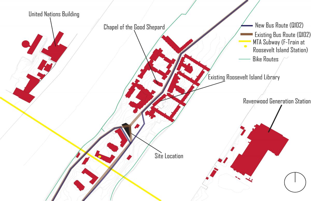
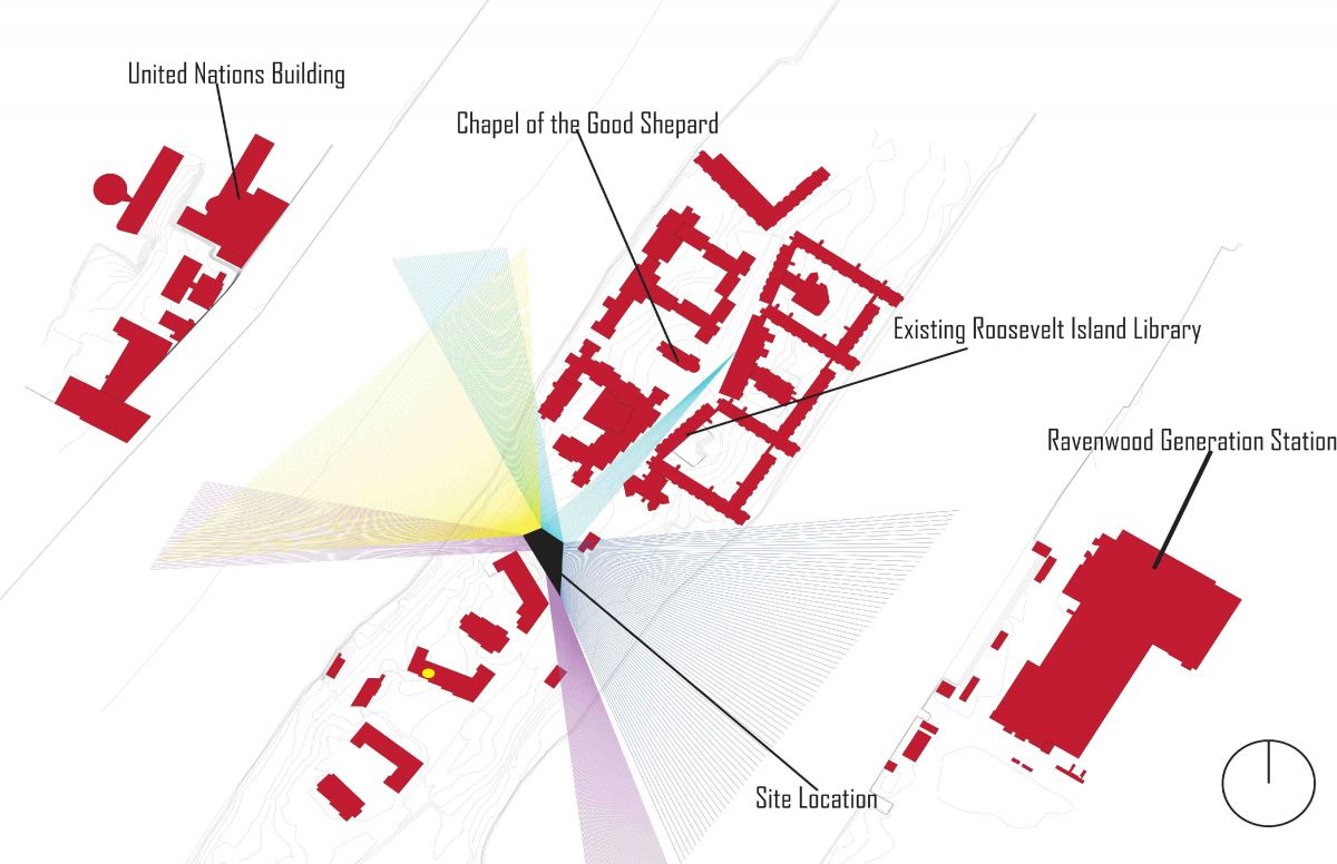
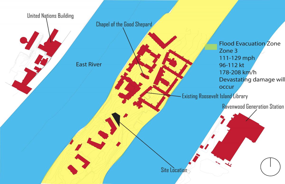
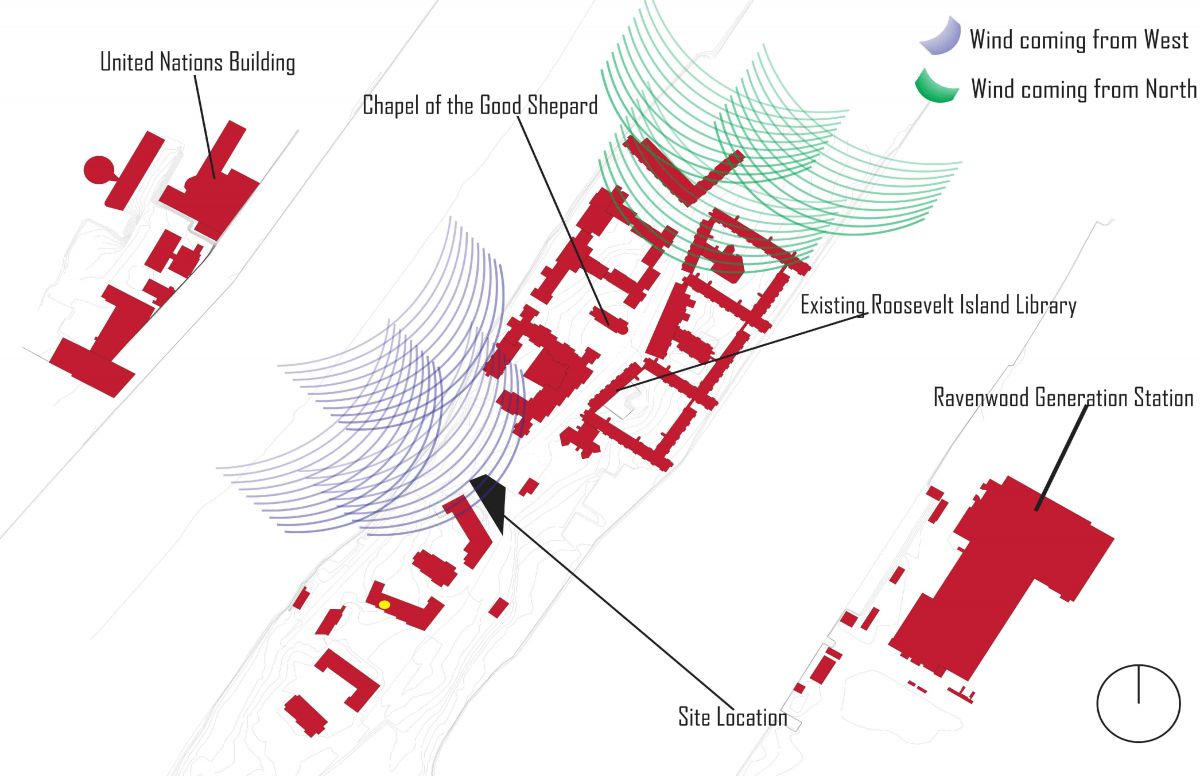
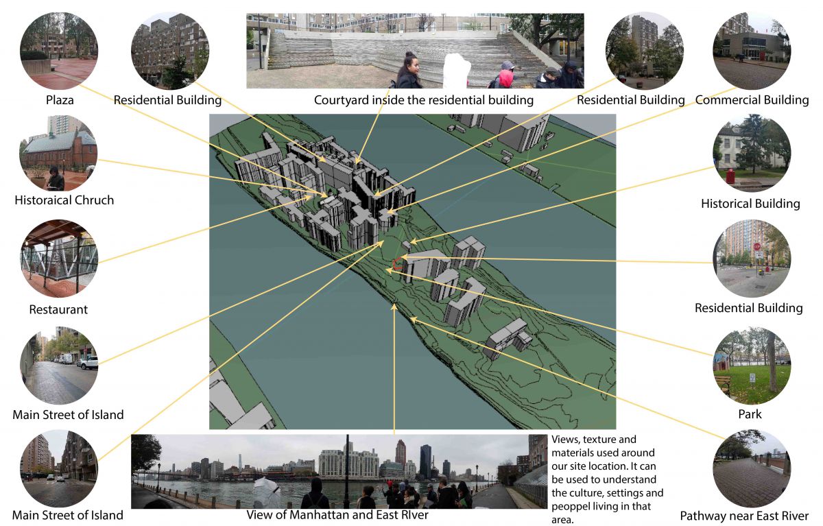
Site analysis on Roosevelt Island, NY after the site visit of the island. Here is my research and on site analysis for our next site location for my library project.
Circulation
Places
Sun
Topography
Transportation
Views
Water
Wind
Surrounding Area
Assignment L & M: House Model Final Presentation
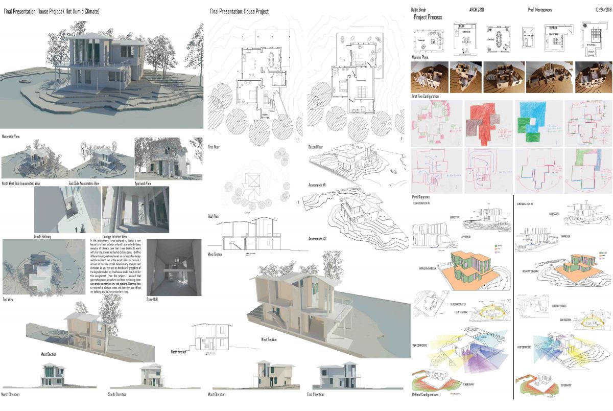
These are the final boards of all the work, I did in past few weeks on my house model. Module plans, physical modules, drawings, renderings, pictures, sketches and configurations that I have done for my house model.
Assignment K: Final House Design Development
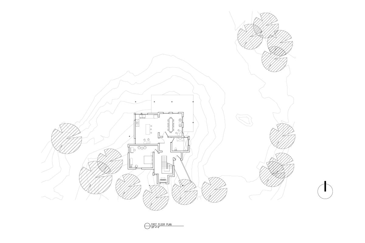
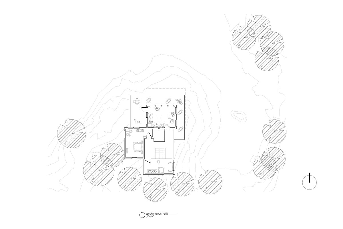
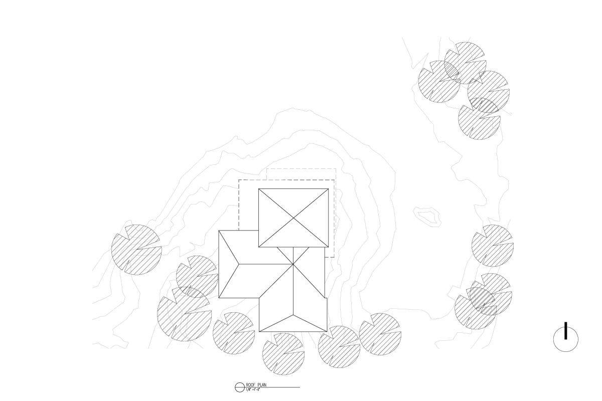
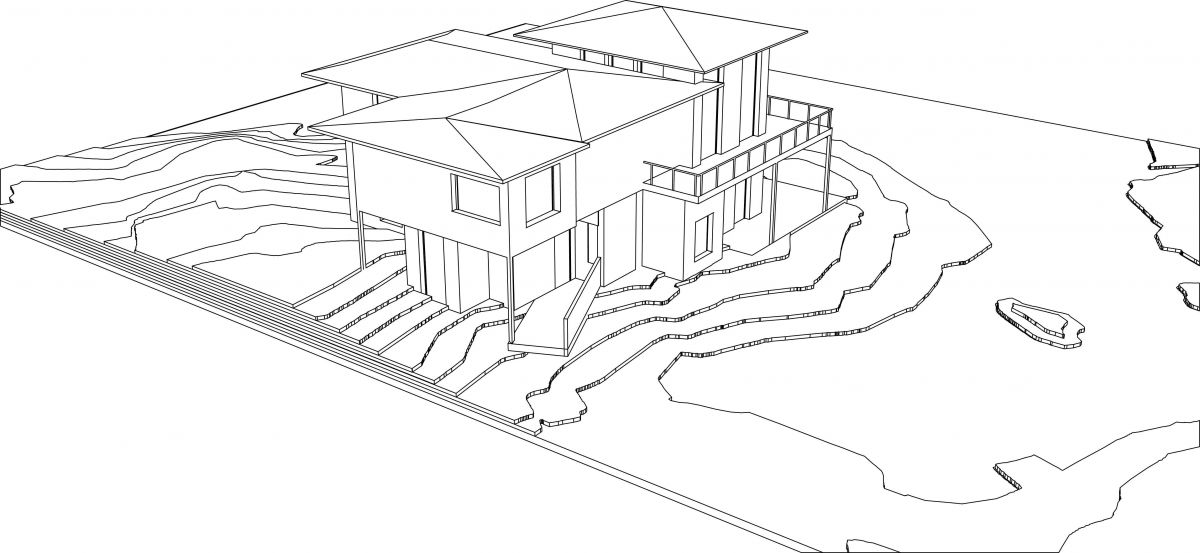
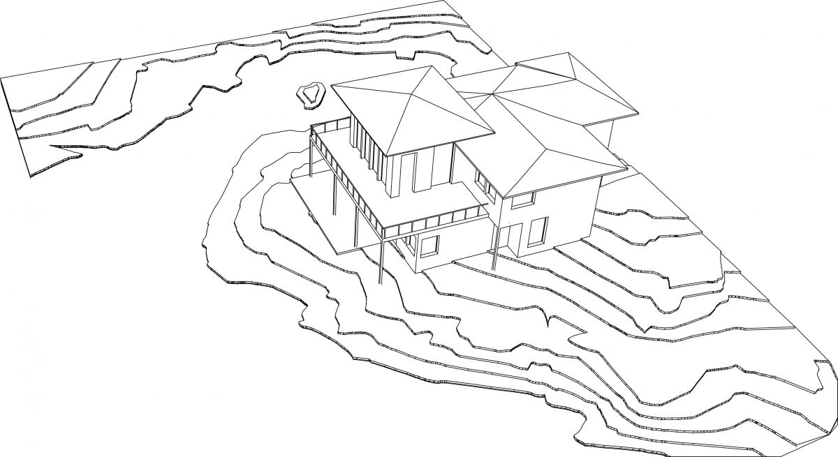
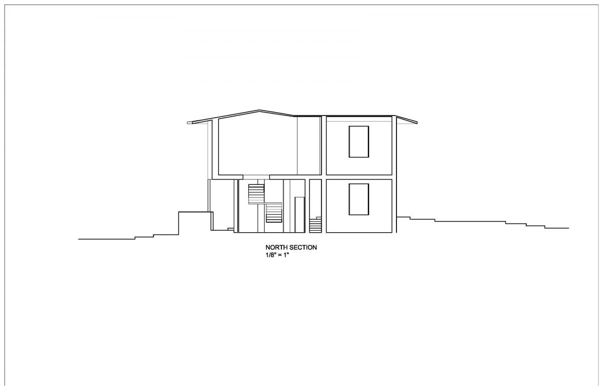
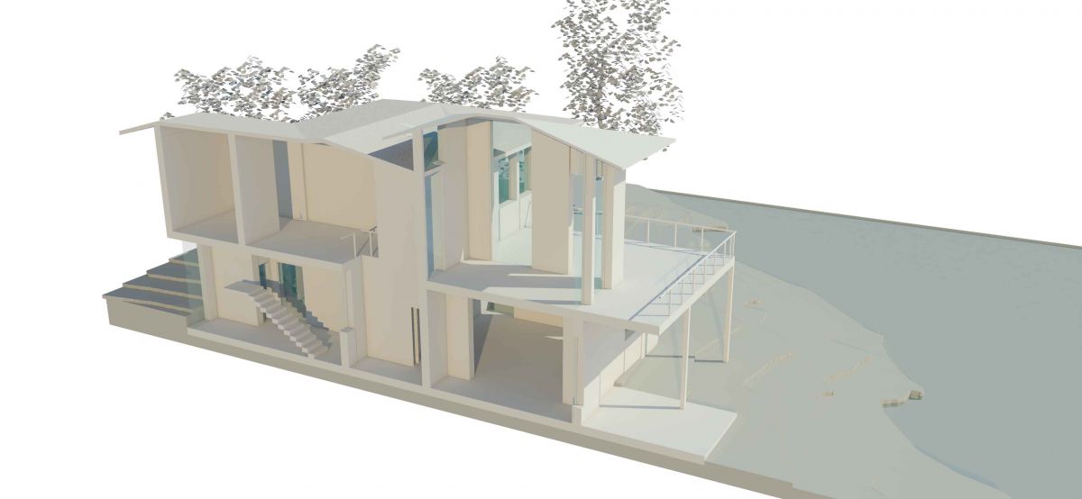
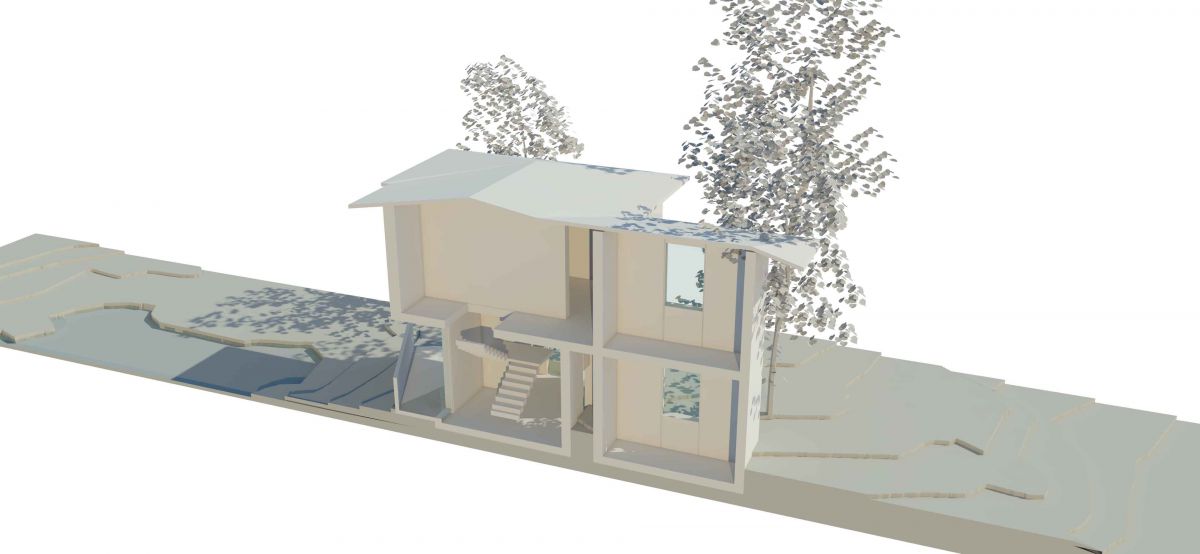
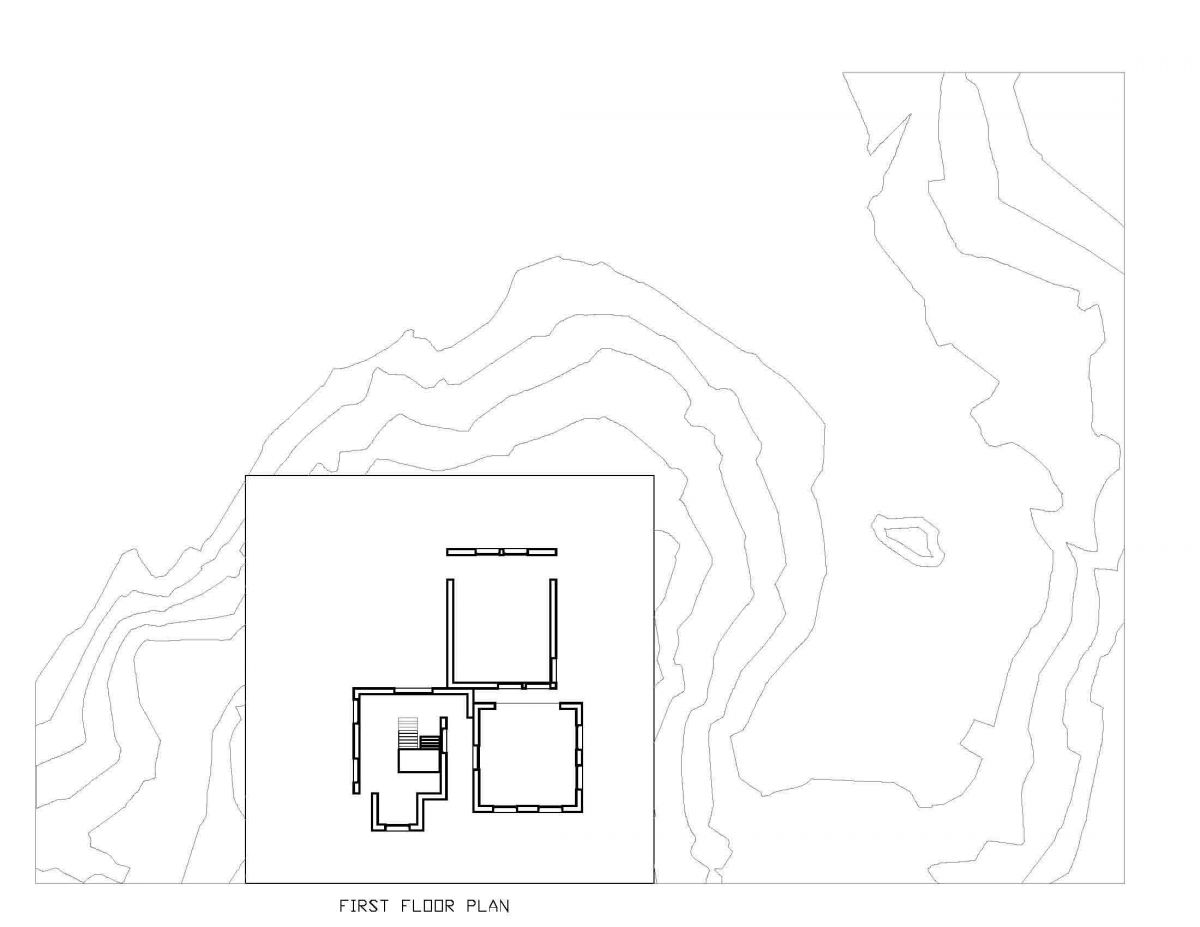
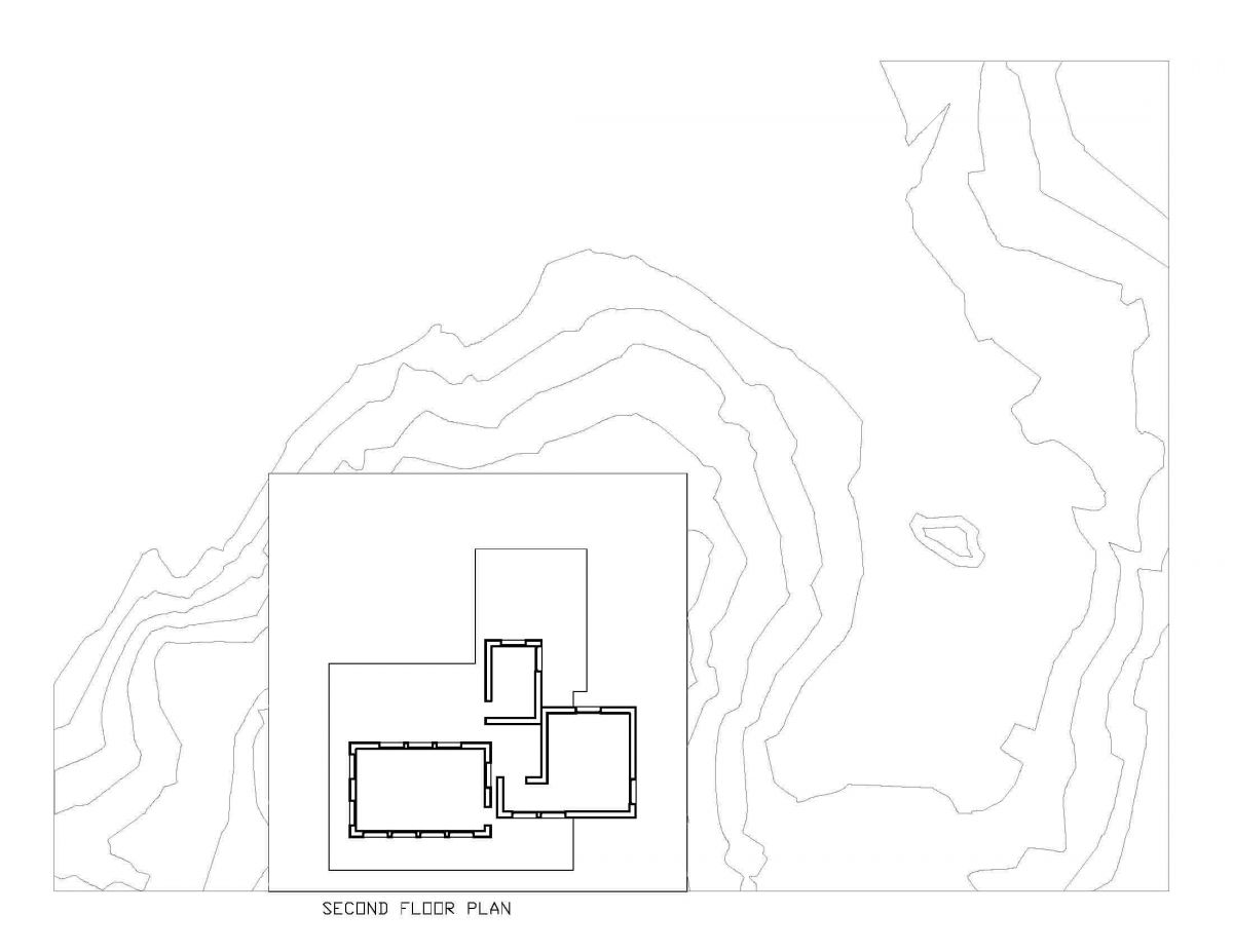
For this assignment, I did floor plans, line sections, 3D sections, and axonometric drawings of my final house design model that I developed in last few assignments. This drawings and graphics helps me and you to understand the design of the house in depth.
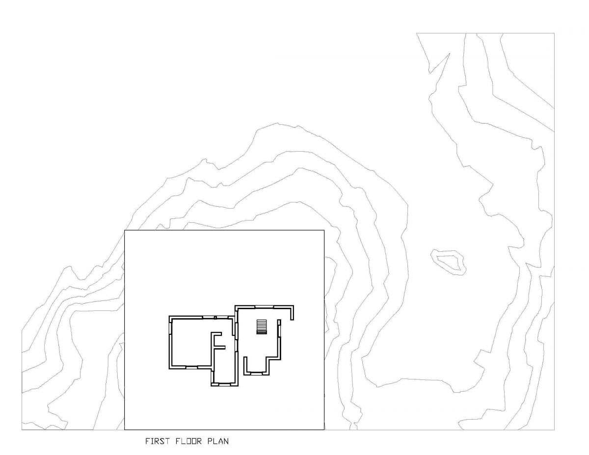
First Floor Plan
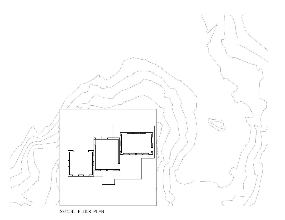
Second Floor Plan
Roof Plan
South East Axonometric
North West Axonometric
West Section
North Section
3D West Section
3D North Section
Assignment J: Digital Model Development
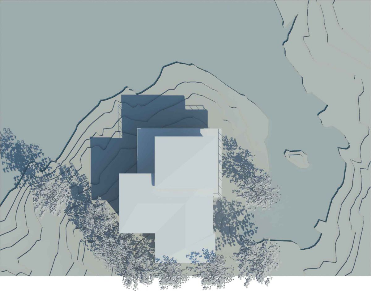
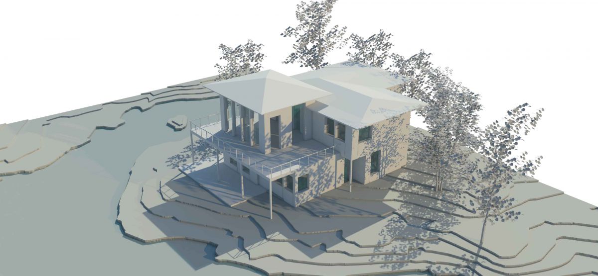
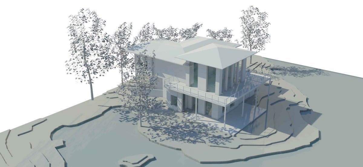
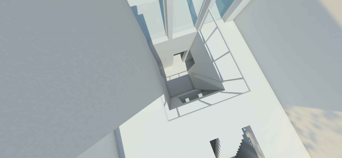
These are the rendered views of my final house model that, I have created. I modeled my final house design in a software called Rhino, which is based on my previous studies and configurations that, I did for this project.
Top View
Axonometric View #1
Axonometric View #2
Approach View
Waterside View
Stair Hall
Lounge Area
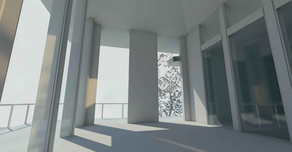
Inside Balcony Area
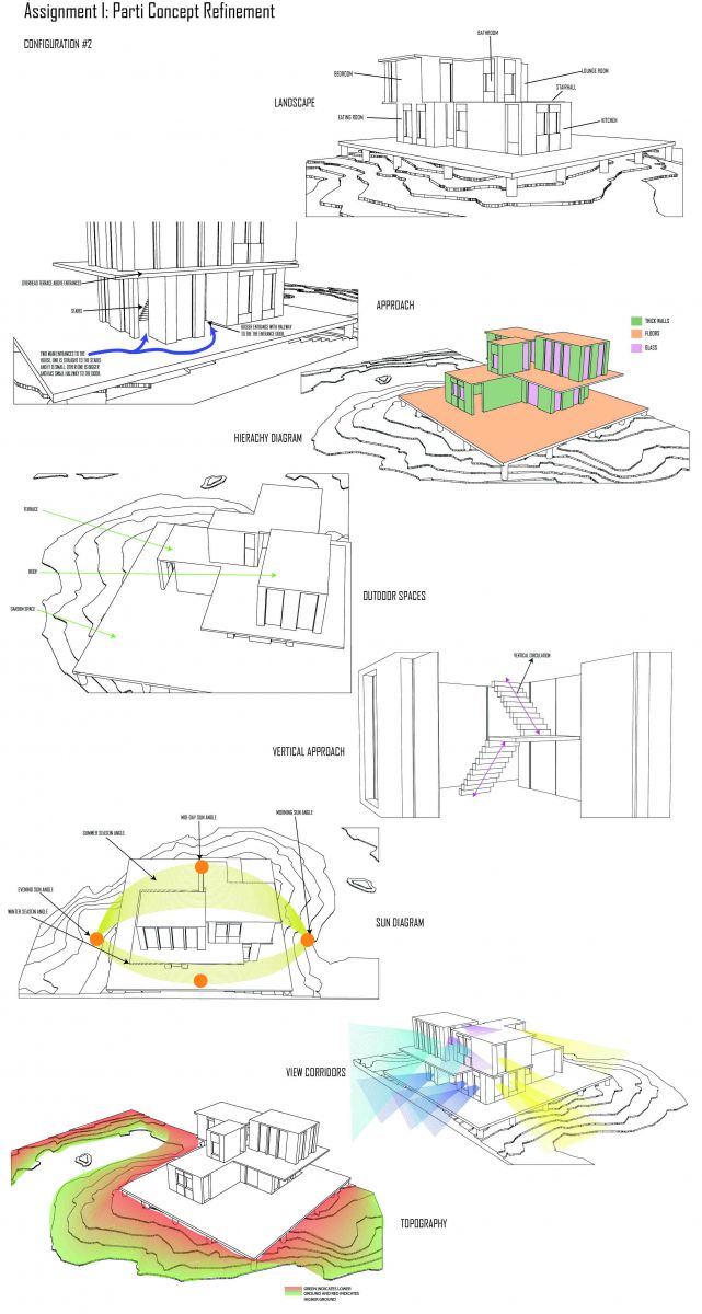
Assignment I: Parti Concept Refinement
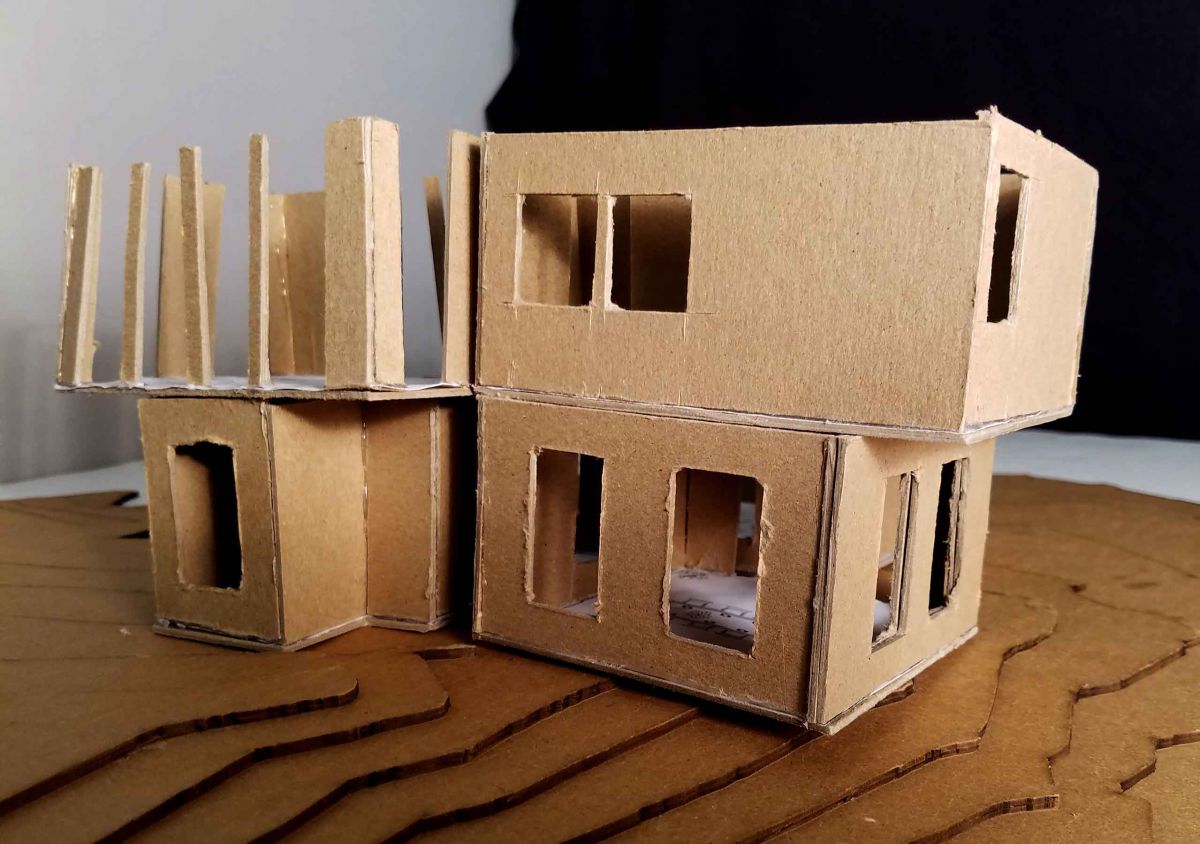
For this assignment, I choose two favorite configurations from the last assignment and modeled them in Rhino. I modified and used different techniques to workout some ideas for my final house model. It allowed me to understand, how they will stack together and where the different features of the house can exist within and outside the house.
Configuration #1
Configuration #2
Assignment H: Modules for Living and Parti Diagrams
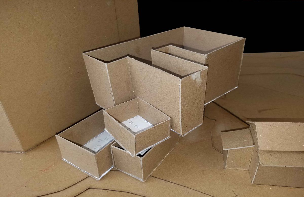
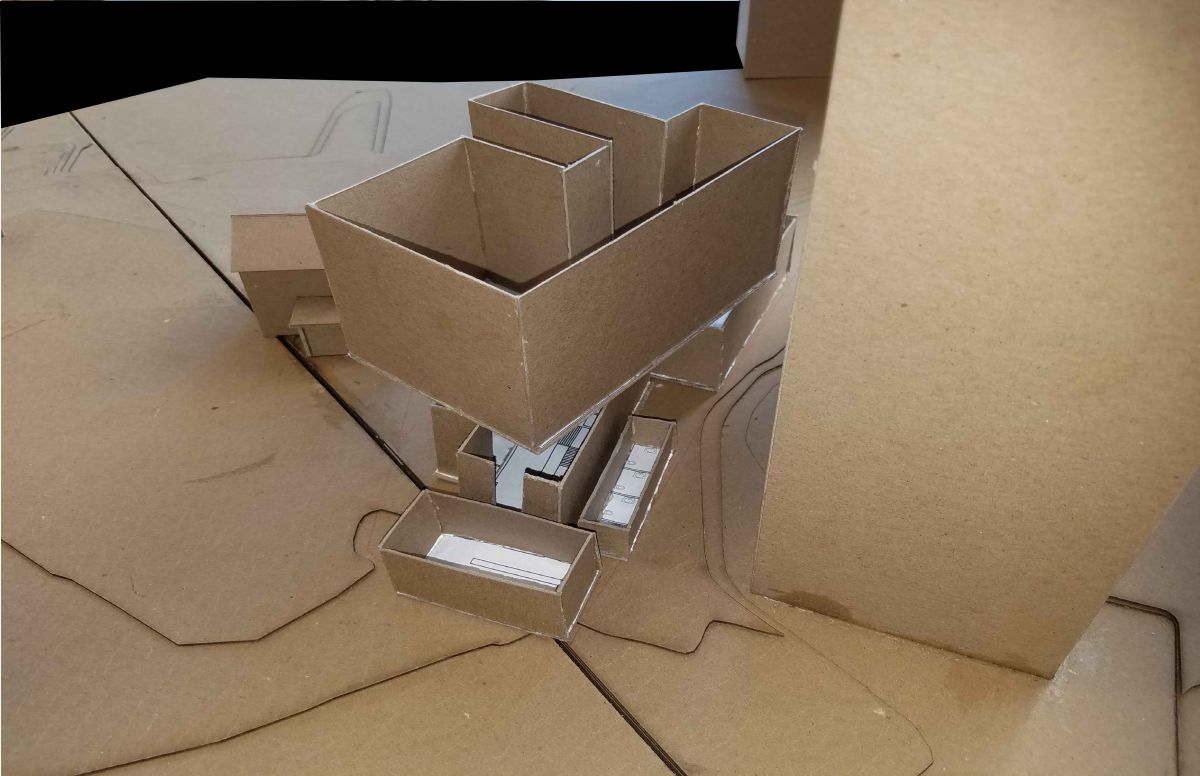
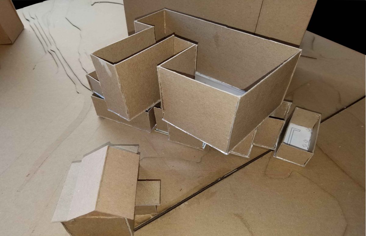
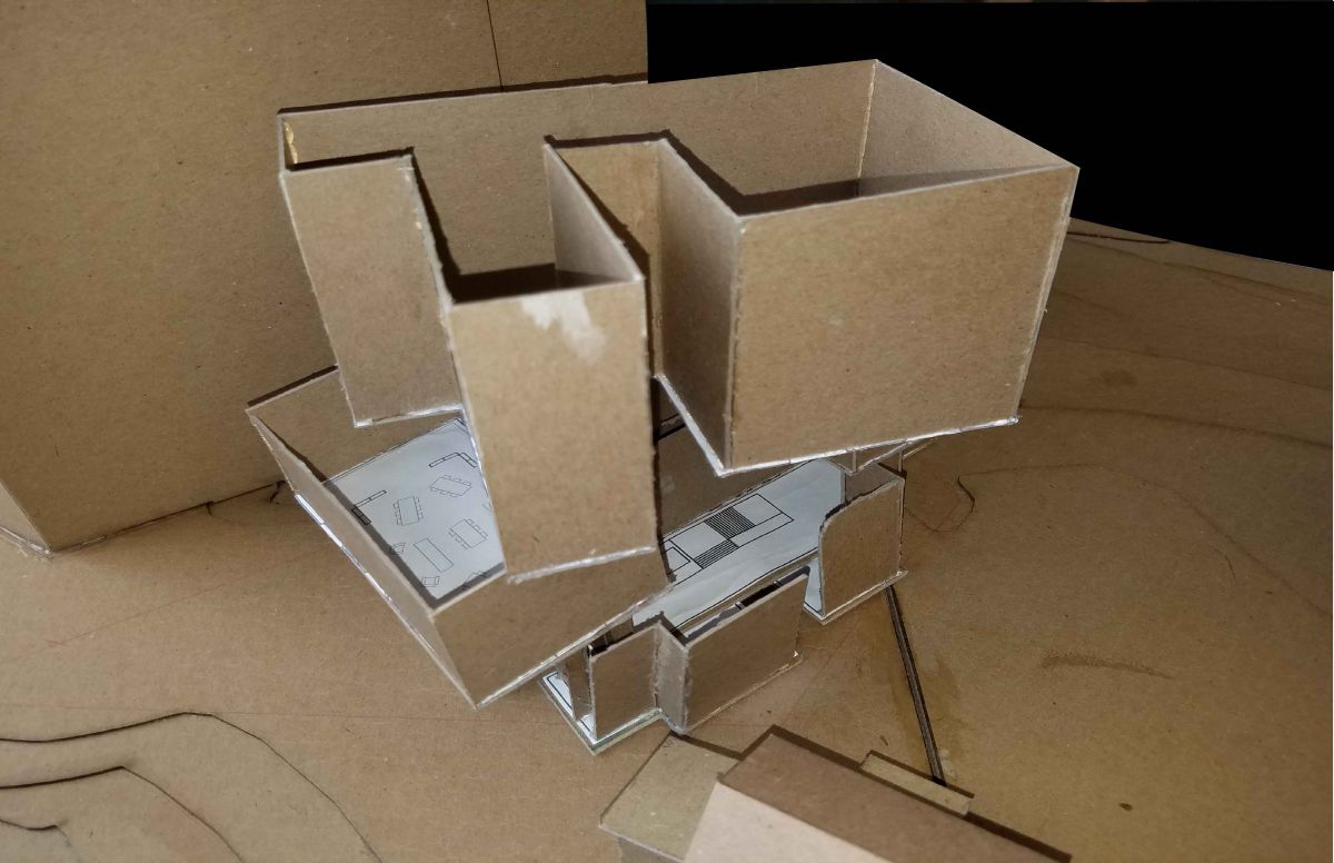
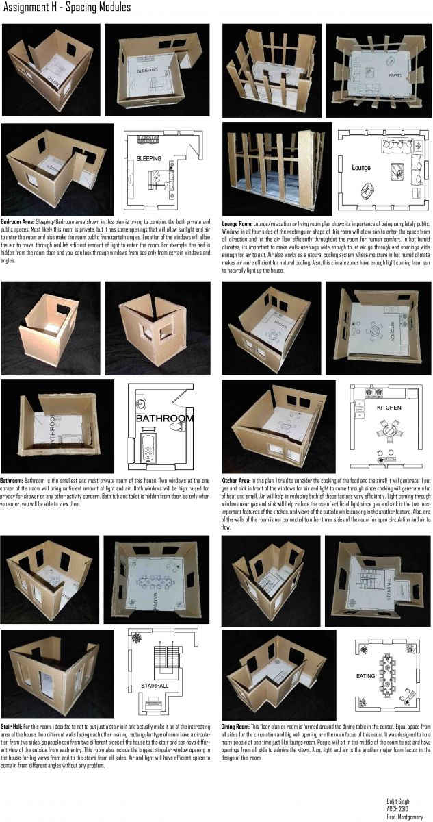
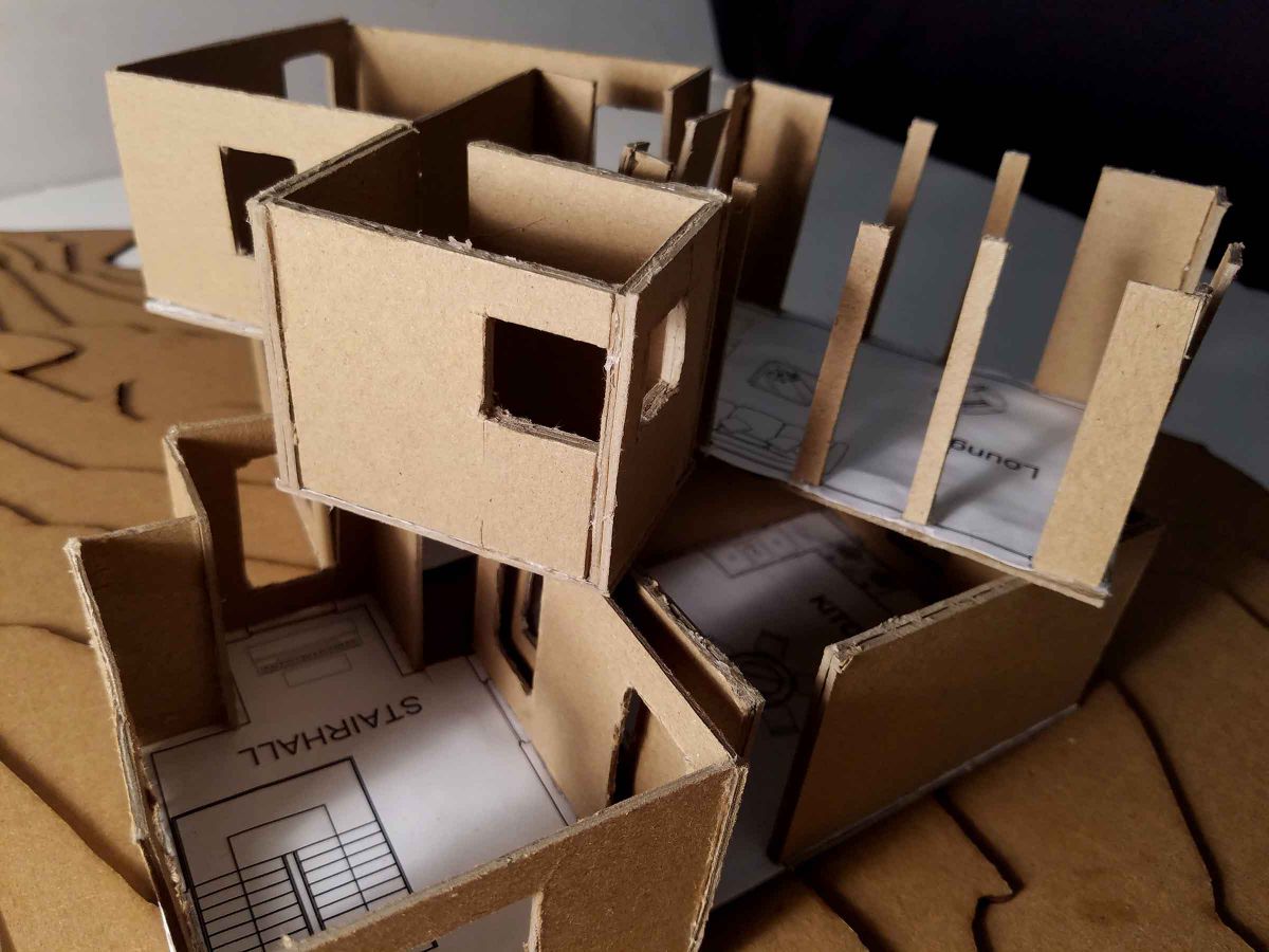
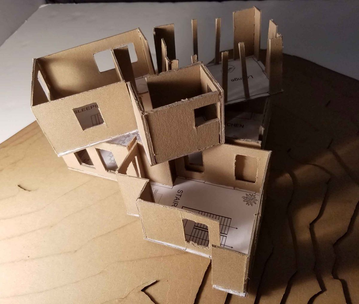
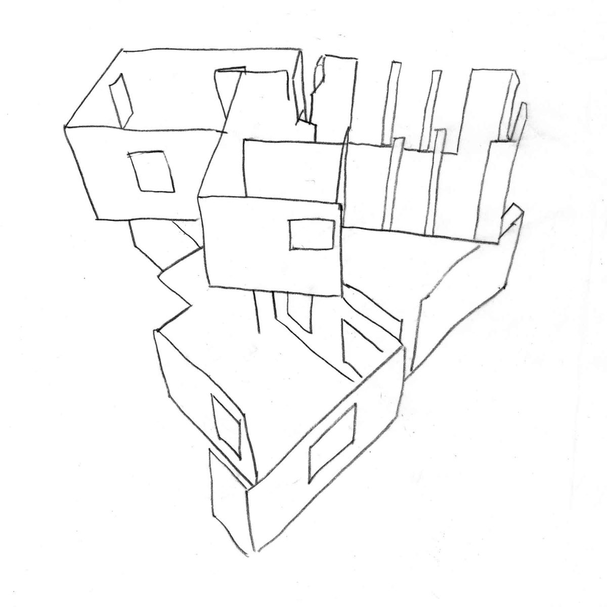
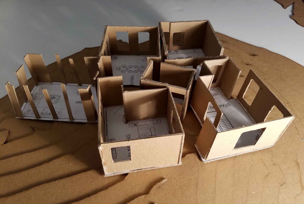
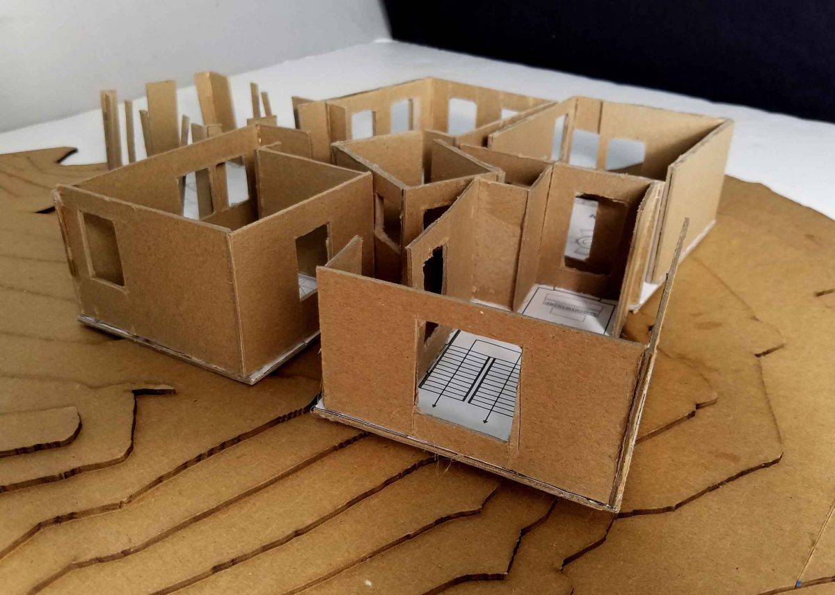
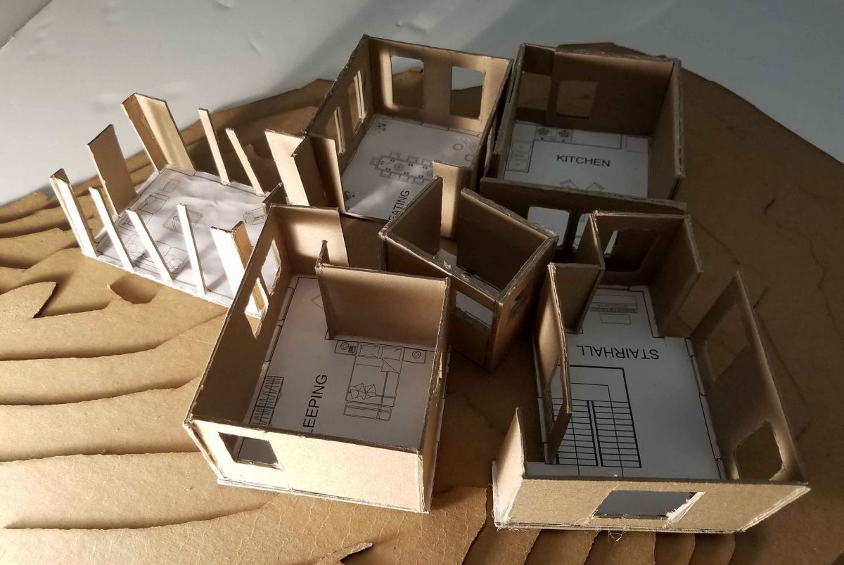
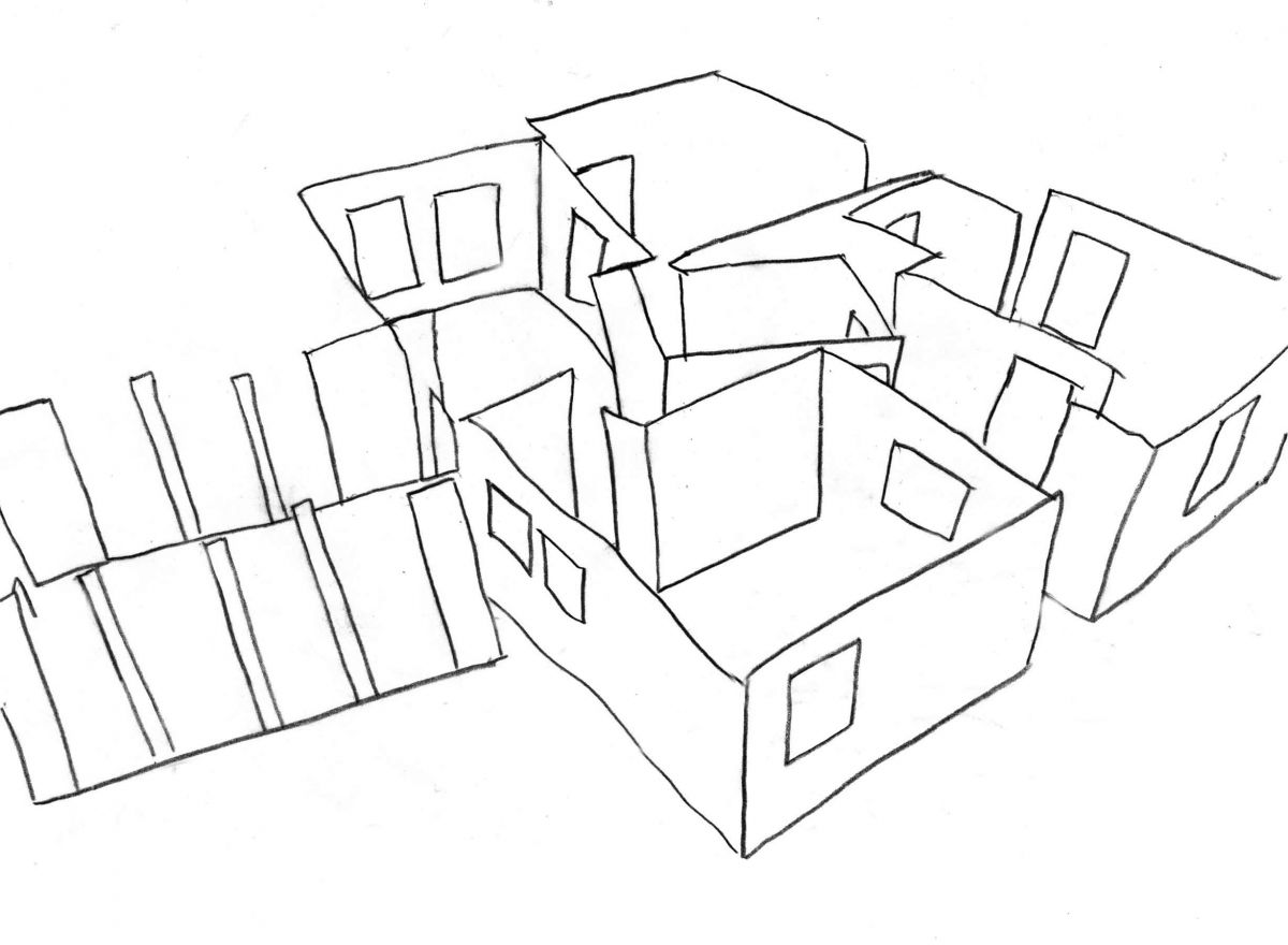
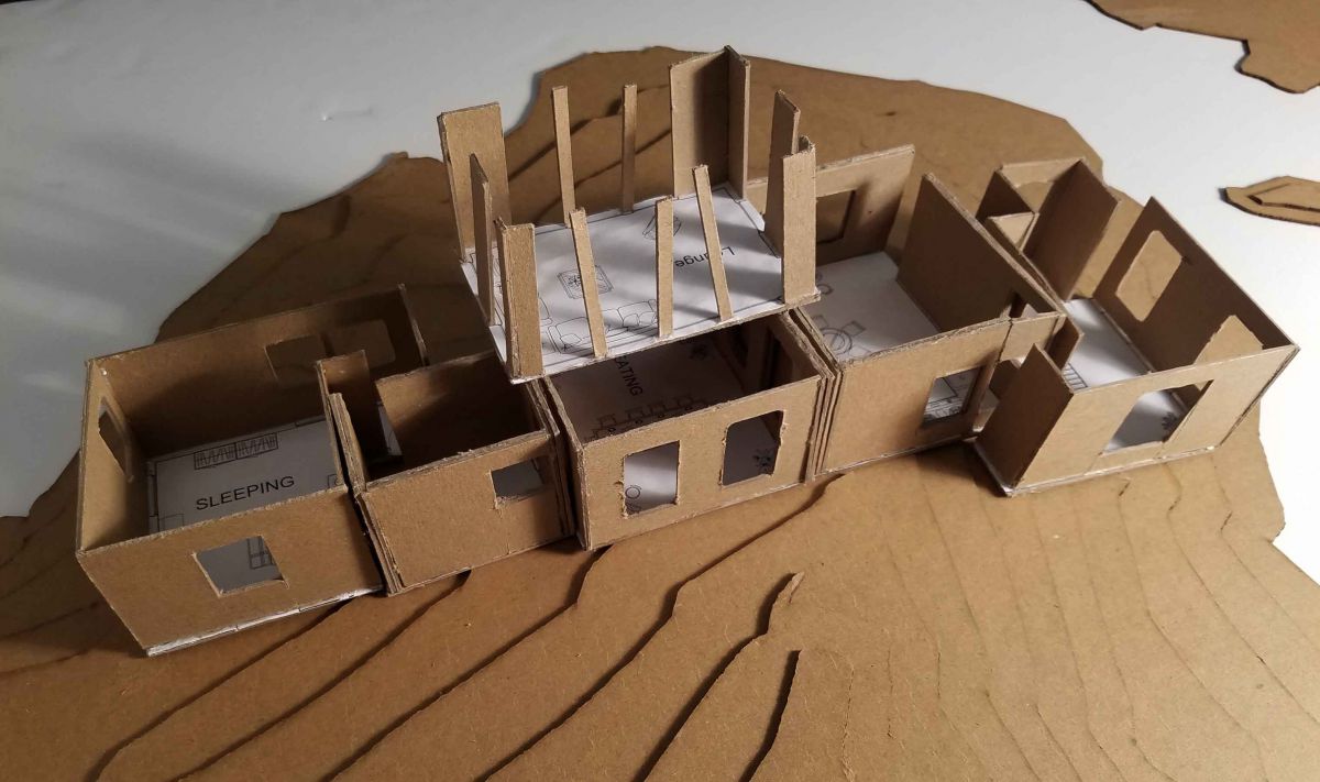
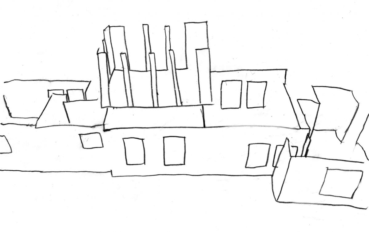
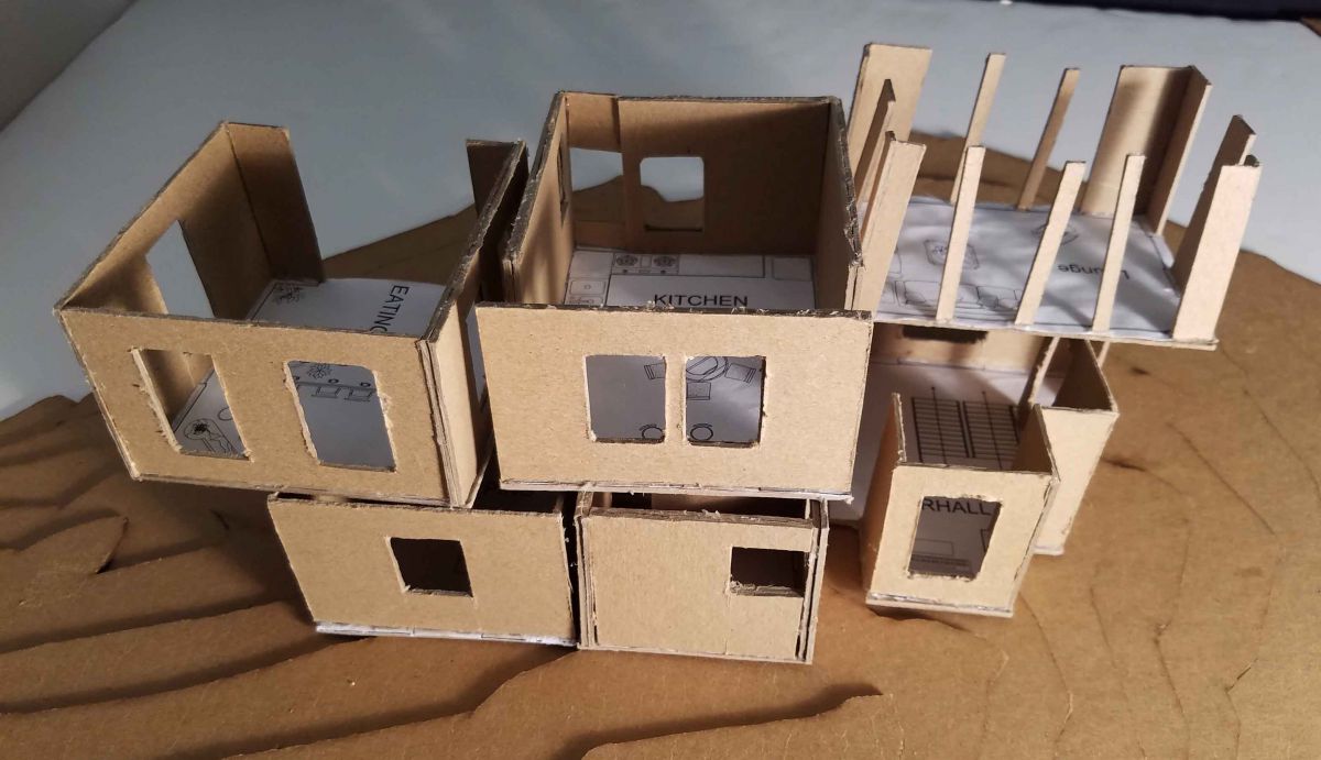
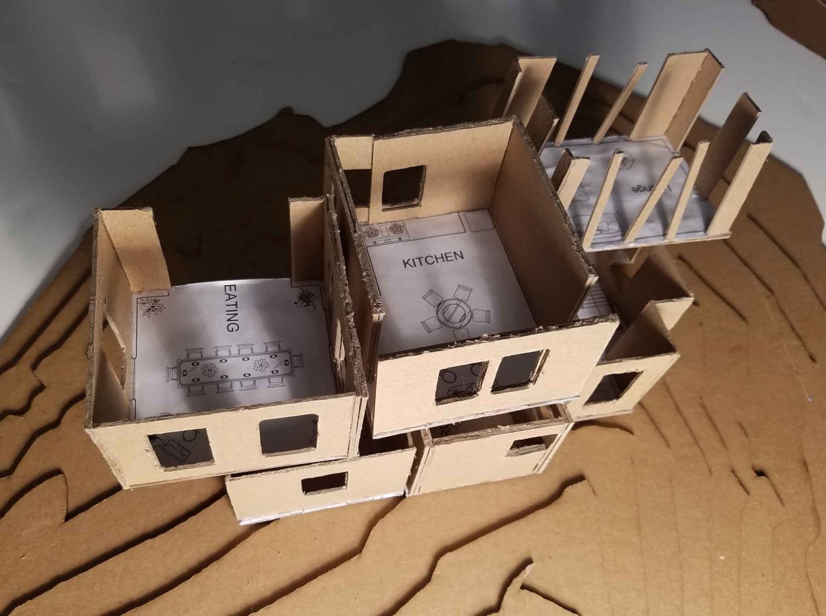
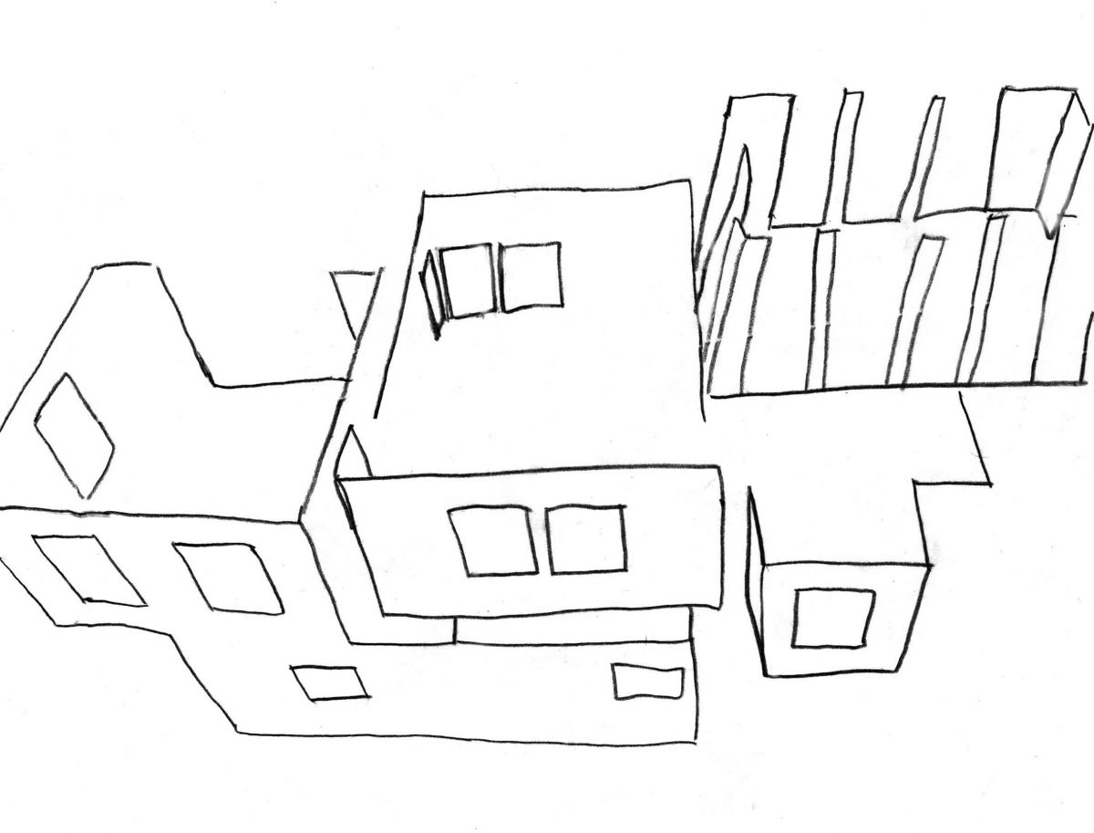
I did some floor plans bases on my previous assignment and built physical modules to experiment them differently. I stacked them up differently every time to gather ideas for my future house design and how different rooms will connect to each other, how circulation will happen. Also, how wind flow, sunlight, views, proportion, topography and setting will effect my design.
Module Configuration #1
Module Configuration #2
Module Configuration #3
Module Configuration #4
Module Configuration #5
Assignment G: Site Base Drawings
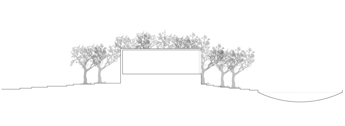
In this assignment, we practiced how to generate proper sections digitally and how to apply proper line weight through software. We practiced and refreshed our skills of different software’s we use to generate these sections and other kind of drawings, too.
Section #1
Section #2
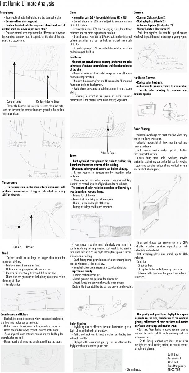
Assignment F: Sustainable Design Research
For this assignment, I did research on how buildings or houses in Hot Humid Climate will provide comfort using natural elements and by minimizing environmental impact from the building. I did research on wind flow, its direction and efficient use of it. Also, I did research on the use of sunlight in interior space, shading, topography, views, trees and structure.
Assignment E: Final Presentation of House and Space
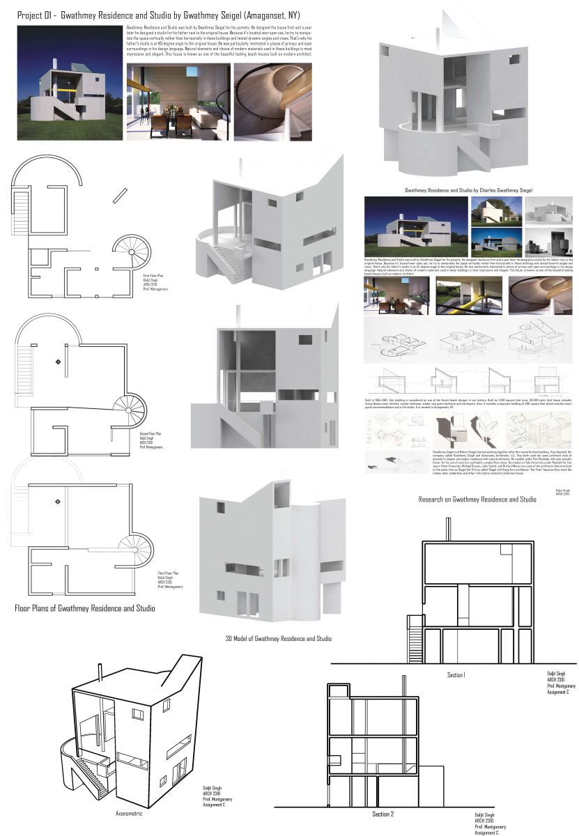
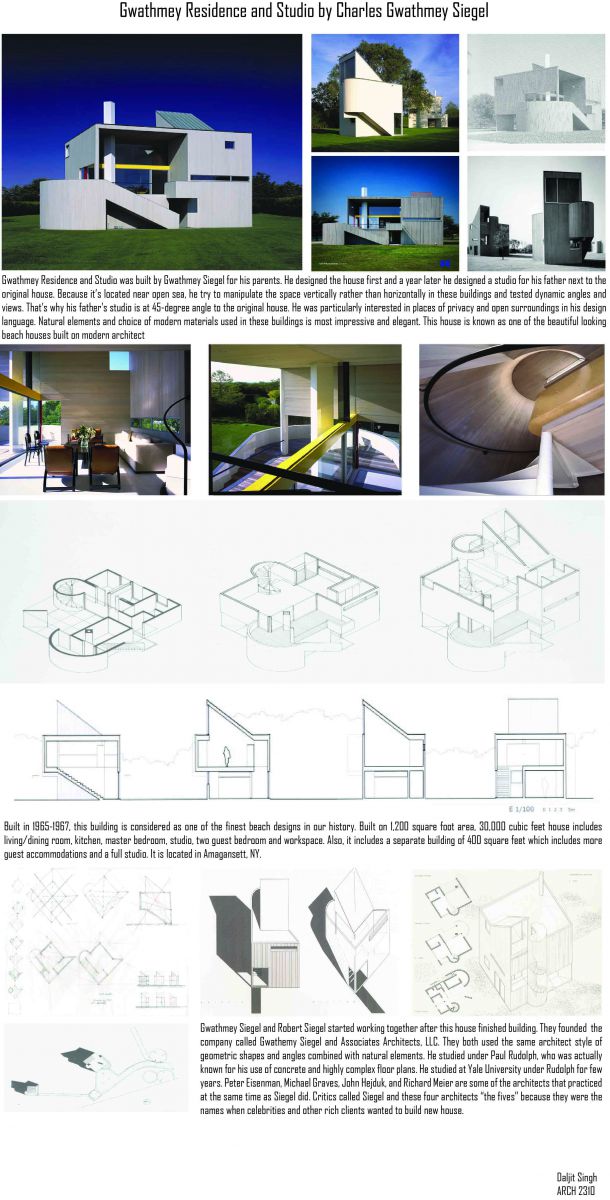
I did the 3D model of Gwathmey Residence and Studio House by Charles Gwathmey which we studied for past few assignments.
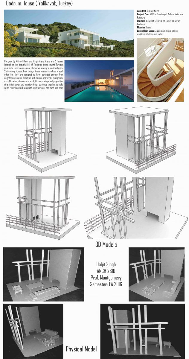
Assignment D: Residential Space Model and Views
In this assignment, I did the physical model and the 3D model of interior space and views for the Bodrum House by Richard Meier. This assignment allowed me to further understand how interior space and views can be connected to exterior space and views which we started exploring in Assignment B with this same interior design.
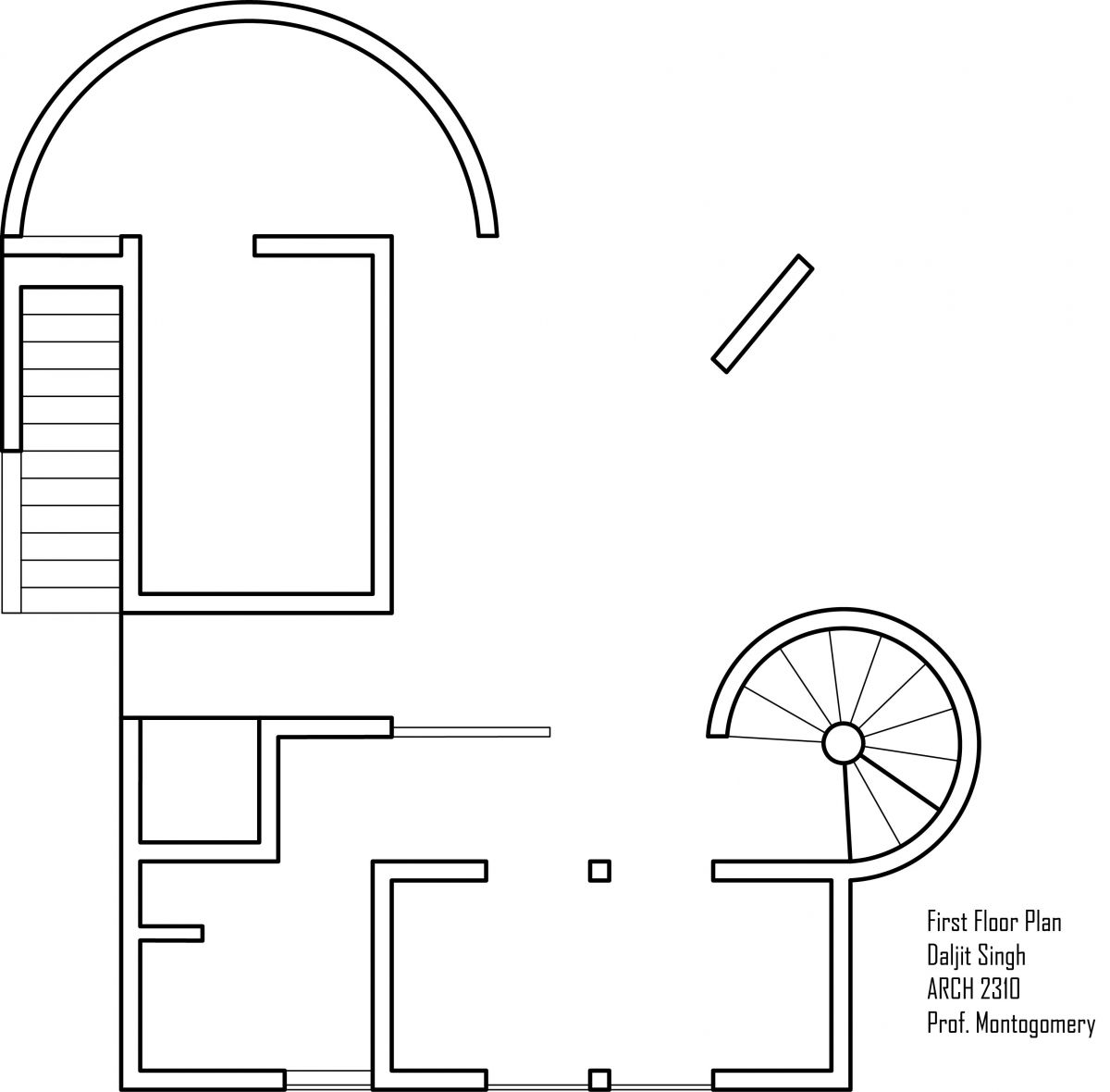
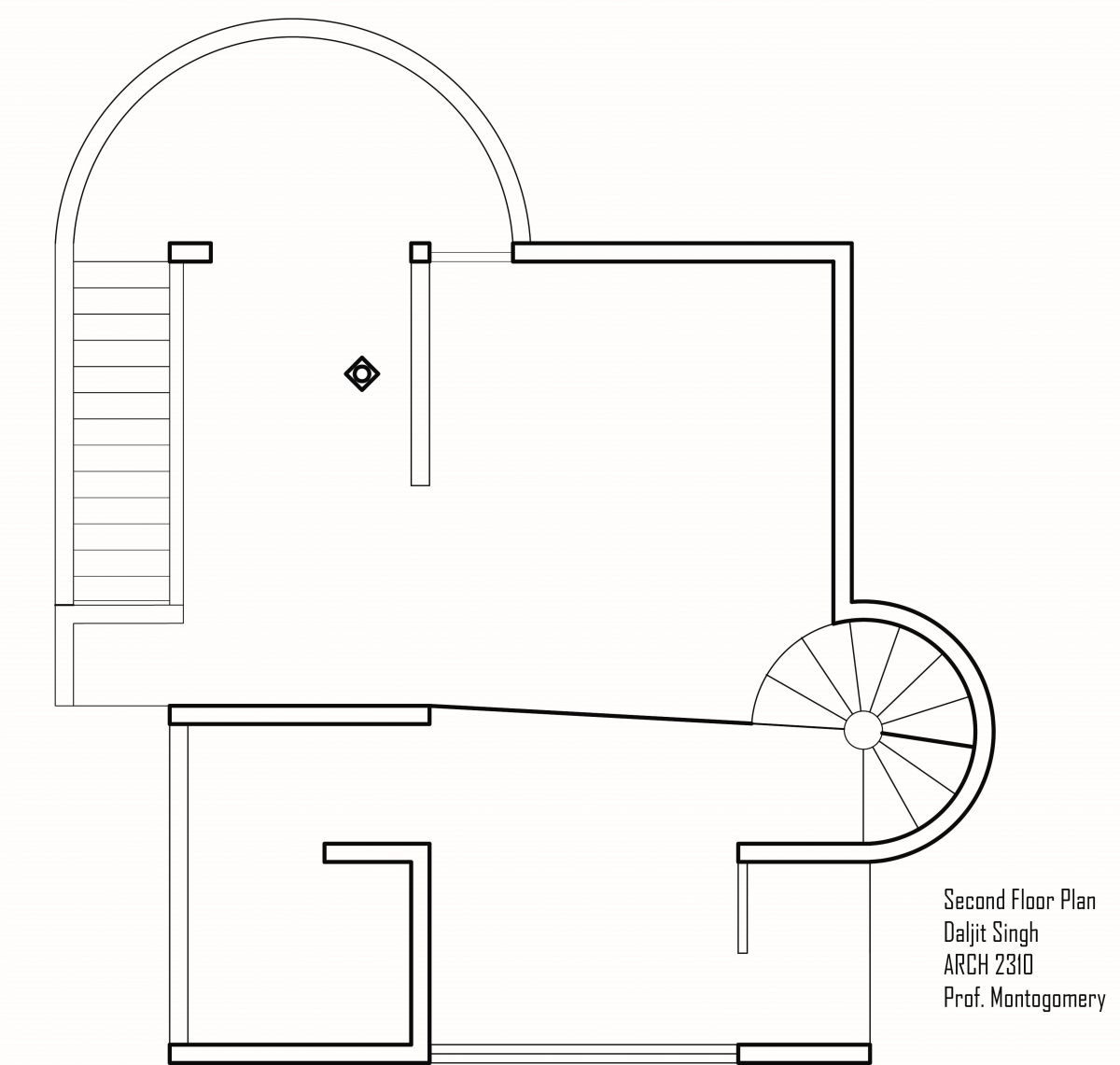
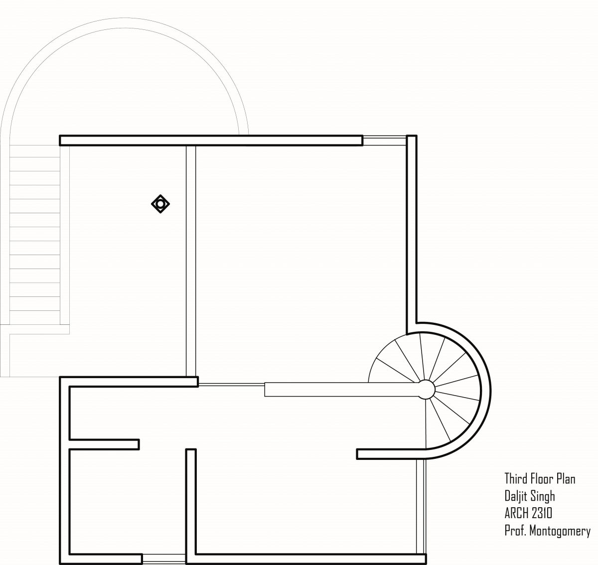
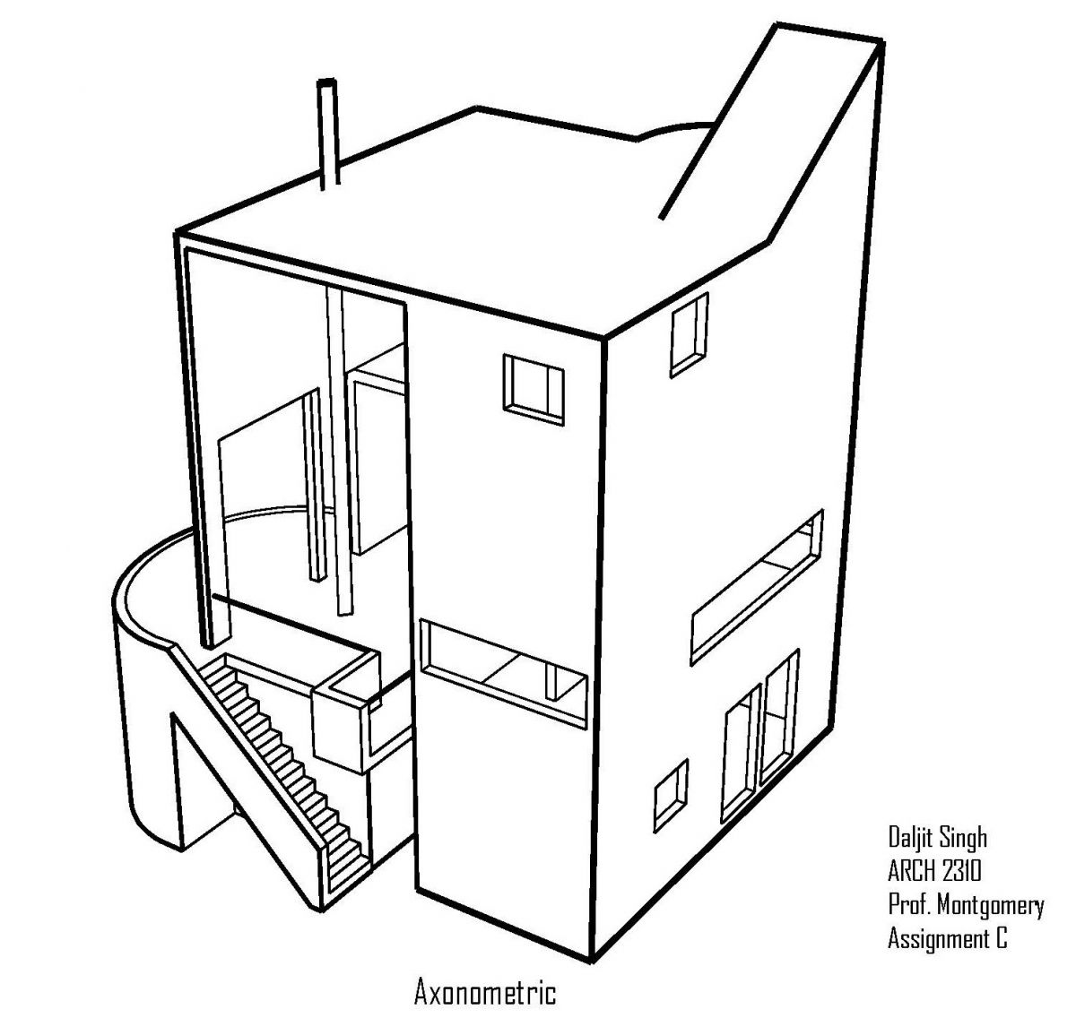
Assignment C: House, Plans, Axon and Section Diagrams
In this assignment, I did the drawings of the house that i did research on for the assignment A. These drawings allowed to analyze the house more specifically in areas like structure, circulation, openings, space use and so on.
First Floor Plan
Second Floor Plan
Third Floor Plan
Axonometric
Section #1
Section #2
Assignment B: Residential Space Analysis
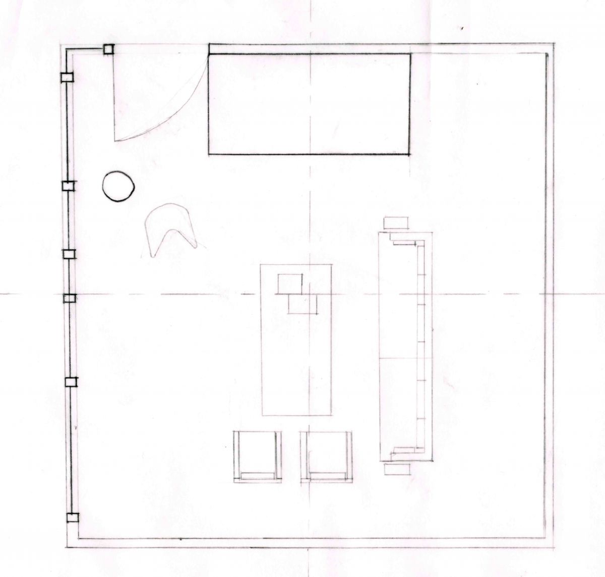
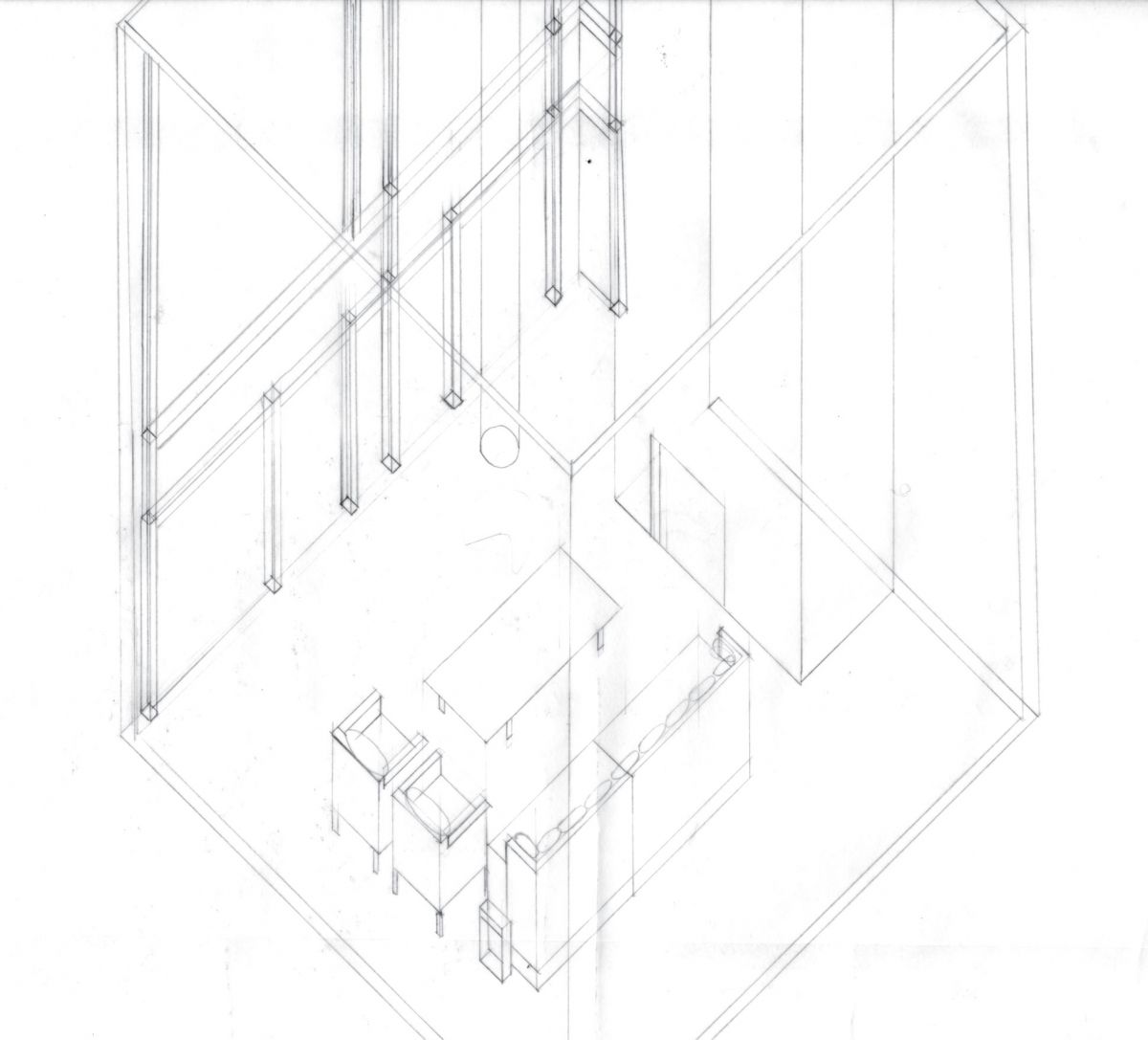
For this assignment, I did the drawings of interior design of the house called Bodrum House by Richard Meier. Simple elegant interior design taking advantage of surrounding space and light.
Floor Plan
Axonometric
Section
Assignment A: Architect Design Analysis
I searched about Gwathmey Residence and Studio by Charles Gwathmey Siegel which he built for his parents in his early architect career. In this house, his attention was to separate public and private space, while playing with light and proportion.
