Visual Quote Concepts
In this first concept I thought of an idea of making the lettering slanted like clock hands. I also added the lines on the right side of the border to make it resemble the textures of dollars. I also chose the yellow and purple in time and money because they were complementary colors.

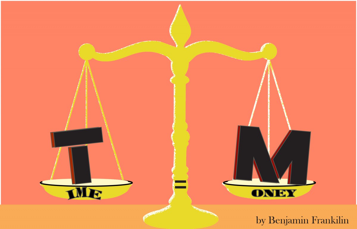
I came up with this idea by showing that time is equal to money. The scale is the equilibrium of the time and the money. I chose a warm light colors to give the time equal money a brighter impression.
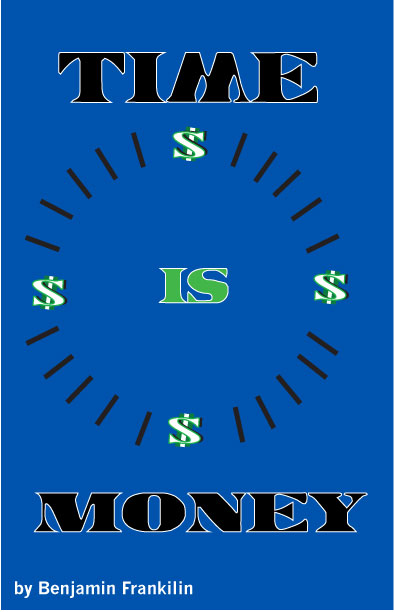
I created this concept on an idea of a money clock. It shows that there’s money every 15 minutes on the clock, and that making money has no time since there’s no hands on the clock. I used the blue in the border so that the light green in the dollar signs pop out more.
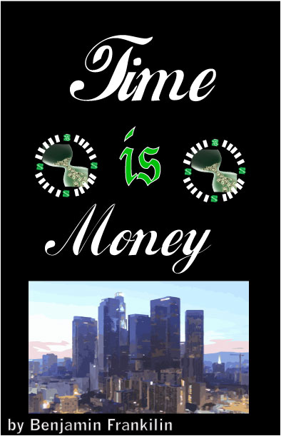
I chose the hour glass of money to express money is being wasted when you don’t use your time wisely. I chose New York city to be represented in the photo to show how this city is based on money. I chose the knockout design to make the bright colors show more.
Logo history report
The founders of Google are Larry and Sergey, who created the idea of Google at a Burning Man festival in the Nevada Desert. The logotype was created in September 4,1998, and designed by Ruth Kedar based on Catull typeface.  Sergey Brin created Google’s first logo on a computerized version of the Google letters using a free graphics program called GIMP. The logo has been modified from the first one by the color changes and typeface. The font of the second logo is thicker and uses a serif typeface that is called Baskerville Bold.The colors used in designing the second logo for Google are primary colors. For the second logo they used the primary colors as patterns, which were green, red, yellow, and blue. However, they removed the patterns by only adding one green color in the lettering, which signified that Google Company doesn’t follow the rules. I believed Google influenced other company’s like
![]() Facebook and yahoo to make there logo more interacting, and comical. Two years after Google company search engine was established, the company’s logo drew a lot of attention at the Burning Man’s festival. On their trip to the Burning Man festival, they wanted to send a message to their viewers that they were there. So the founders placed a stick figure behind the second “O” in Google, to let their viewers know that they were away on their trip. The image was known to be a funny message, and gave the founders an idea of creating a search engine that showed comical doodles. These Google doodles are know apart of their website logos which is now intended to celebrate famous
Facebook and yahoo to make there logo more interacting, and comical. Two years after Google company search engine was established, the company’s logo drew a lot of attention at the Burning Man’s festival. On their trip to the Burning Man festival, they wanted to send a message to their viewers that they were there. So the founders placed a stick figure behind the second “O” in Google, to let their viewers know that they were away on their trip. The image was known to be a funny message, and gave the founders an idea of creating a search engine that showed comical doodles. These Google doodles are know apart of their website logos which is now intended to celebrate famous 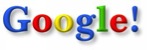 events of people or places that shows great importance. Two years later in 2000, the founders asked a current interning Webmaster, Dennis Hwang, to produce a doodle for Bastille Day. Since then he was appointed chief doodler and doodles has been shown more frequently on Google’s homepage. Over time the demand of Google doodles increased, and now it is a responsibility for a team of Google’s illustrators to create these doodles to entertain the viewers. Googlers decide celebrate interesting events to create the doodles, and receive the ideas from the company’s workers and/or viewers. The company has created over 1000 doodles on the
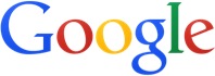
 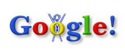 Googlehomepage. The third original logo was changed in the company by taking out the shadow in the lettering of their logo and made the second “o” in Google orange; also they removed the exclamation mark from Google.
On this page, give an overview of your academic goals and the contents of this section.
Use the sub-section pages to add a selection of your best academic work and experiences, such as research papers, presentations, internships, student clubs, photographs, creative writing, or other coursework that you are proud of.
NOTE: If you are not ready to use these pages, simply change their visibility in the Dashboard by choosing Pages > Edit > Visibility > Private.

