The overall point of having an album cover is to visually represent the content of the album, and to more or less stand as a visual summary of the work and the artist. Now generally, the management team of the musical act would either hire a photographer, a couple graphic designers or if they’re feeling really artsy, maybe some traditional illustrators to do paintings for them. Now if you’re ‘up-and-coming’ and don’t exactly have much of a team together, nor the artsy know how; have no fear. With our help you can do this on your own, just please make sure to take our advice so you don’t end up with something gaudy. . . or amateur –looking.
In the days of the physical record stores, The album art needed to be eye catching enough to pop off the shelf. However with the advent of the digital age, the majority of people who are gonna see your album art may not be exposed to the larger standard 12cm x12cm CD image size, therefore be careful how intricate your cover design is. Make good use of negative space to give a sense of shape, Failure to do so may make your design loose visual clarity at thumbnail size. Exibit A.
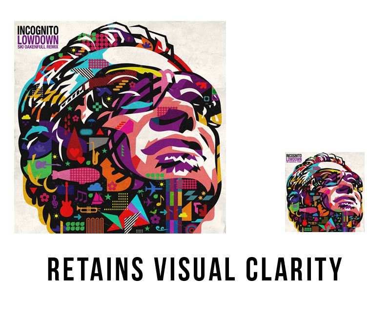

The Incognito album cover has the right idea, although it is quite intricate and has a bit of detail, the chaotic detail is confined to the shape of the artists head, leaving a good amount of whitespace around so that from afar, or from a smaller size it looks even more interesting and is easier to read.
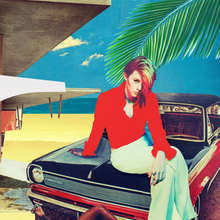
By contrast, Maroon 5’s album cover has a lot going on design wise; the characters for the most part are all in the same color scheme, purples, blues, pinks, dark reds e.t.c basically all of the ‘cool’ colors; Which is great. However, nothing stands out at all when viewed at a thumbnail size, it just looks like a cold mess. . . which is a perfect visual representation of the state Maroon 5’s music nowadays.
Bottomline: dont make your potential fans sick of you before they’ve bought your album.
Which brings us to the next bit of advice, sometimes less is more. Minimal design can be just as striking and attention grabbing as the imagery above, maybe even more so; especially when mixed with a good use of vibrant colors.
If your design is simple, the colors can shout; if the design is complex, the colors should use their inside voices. Remember this above all, People associate color with emotion, so if you want to quickly give an overall feel of the theme of your album, make sure you’re using the appropriate dominant color. It cannot be expressed how important color choice is, it can hold a huge sway over your album sales, especially if you are an unknown making your debut. For quick reference here are some emotions associated with basic colors.

It should also be mentioned that contrary to popular belief, you might not need to have your artist name or album title on the cover. If your cover image is visually striking enough, having your artist name or band name on top of all that may visually distract from it. Don’t worry though, people would still know it’s your album, retail stores, blogs, online distributors and review sites would display your name next to the album cover anyway. If your CD package comes with a sticker that does have the artist name on it there is no problem in letting that do the work of informing the public.
If you are an independent artist and this is your first album, do not make the mistake of putting any social media links on your album packaging. Facebook and Instagram may not be forever and the day may come when they’re just plain old, outdated and no one cares anymore. On top of that, they could be taken down entirely, so there goes your fan site. If you must include a URL, make sure it’s for your own site that you control, plus it would look way more professional.
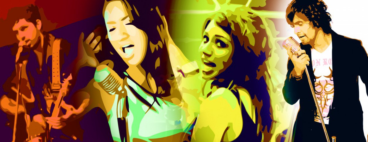
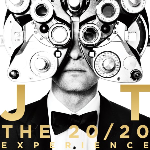
Finally, it seems that album covers featuring faces or full images of the artist get more attention. This notion is unfounded and they’re hasn’t been any clinical studies done, however it is believed that it increases the buyers ability to visually connect with the artist, pending if the shots were done right. Maybe it’s because people tend to connect with each other through eye contact? So a head shot can be powerful and beautiful when done well; but be careful as most music artists cop out and do this you may run the risk of blending into the fray and seeming generic.
Examples of visually interesting head-shots.

Whatever you decide to do for your album cover keep in mind that color choice is paramount and can literally make or break your album; know that It’s okay to be minimal and just have text with a singular image, or no image at all. Do your best to capture the essence of your album in a singular image and if in doubt cop out with a head shot, but make it interesting. So go ahead and get cracking, no pressure.

