I used black and white to create a sense of positive and negative shape. The checkerboard background and the cats drawn against them help in structuring this piece.

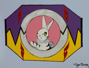
This is the tigerbunny morpher for my personal flag. The primary color palate used was purple, yellow, and red while incorporating pink and blue. The colors are high in chroma to stand out but the soft blue background balances it out.

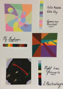
3 boxes, 4″x4″ each representing a different aspect of mood and place. The first uses a light value key to represent warm, summery colors. The round shapes a meant as beach balls. The second image represents a comfortable room, my bedroom around late noon as the light from the setting sun shines through my window. The colors are in a medium value key with a few light and dark accents. The final image was to represent nightlife. The first thing that came to mind was fireworks and I used dark colors in the background and small bright accents to help create the effect of the fireworks explosion against a dark sky.


