My 3 Favorite Projects; Dimitri Duncan

photo 1 
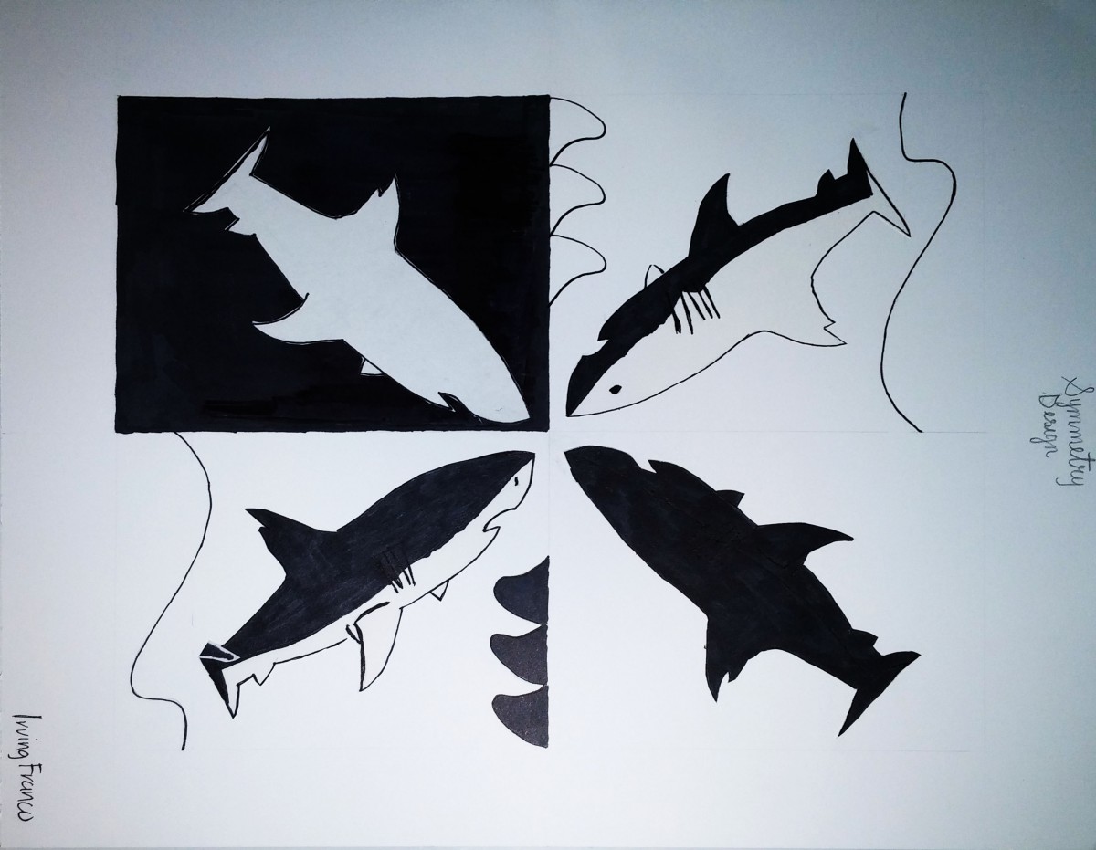
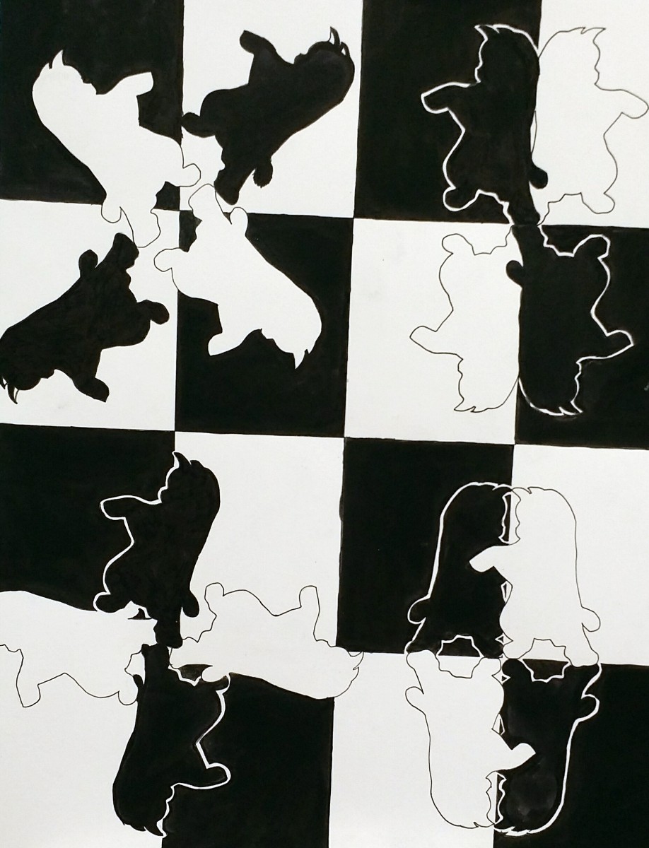
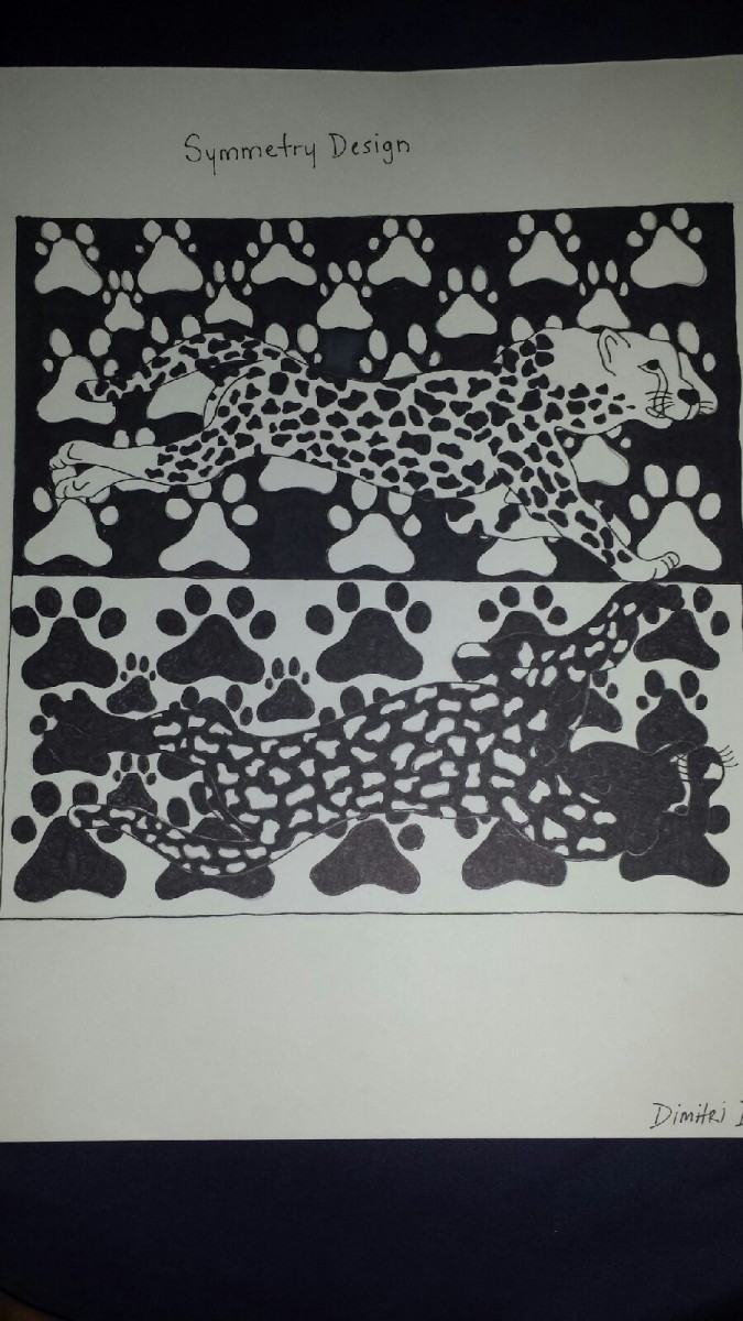
This assignment was the symmetry design project, based on the principles of symmetry. The structure of the project was to make a symmetric design of an animal, I used a panther and the the panthers paws to make the shapes and panthers body look like another shape, giving the symmetrical feel to it. I used the design elements of shape, color and space; while using the principles of rhythm, balance and unity. Finishing the project, I learned the ways of repetition and overall symmetry.

photo 2 
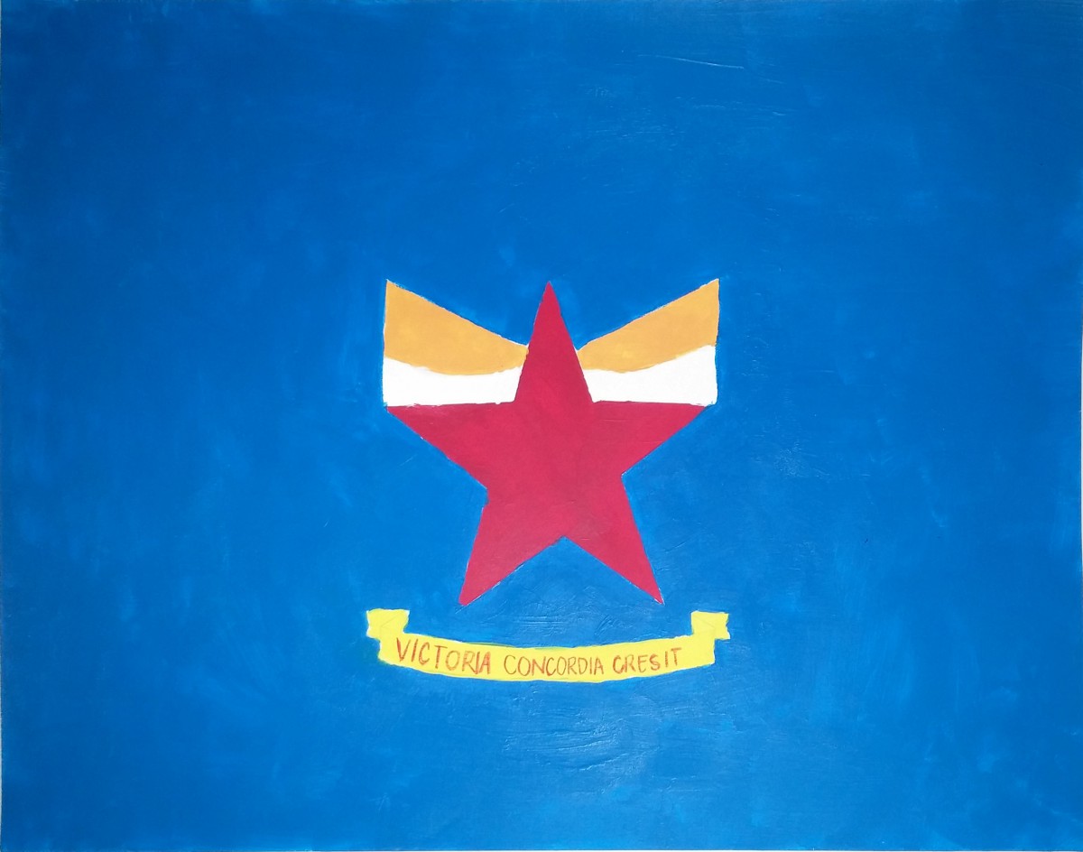
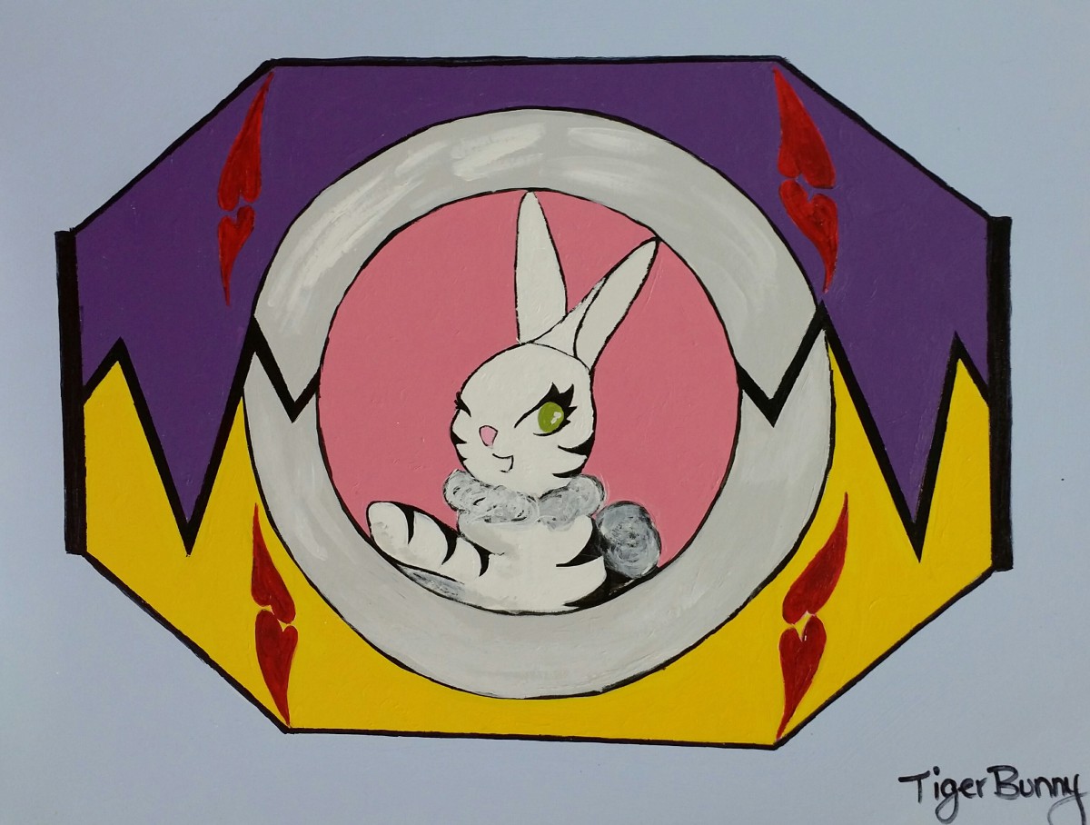
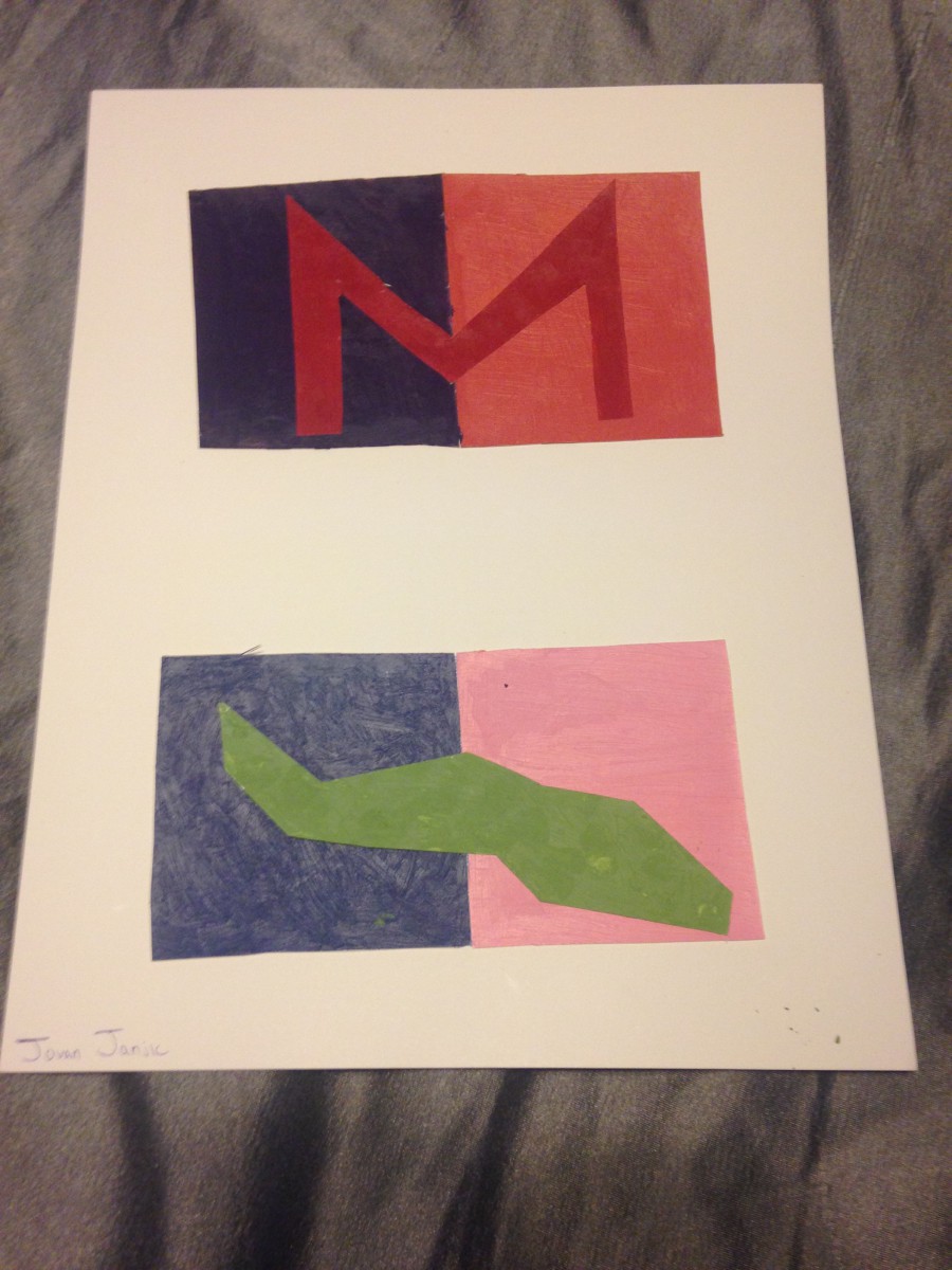
This is my personal flag, that represents me. I structured the flag to be symbolic; to based it off my characteristics, personality and my affiliations. I used the midnight blue color for the background as my personal favorite color, also using the superhero style shape and gothic letter font. I used the superhero and gothic letter style because i’m a fan of superheroes and the gothic letter font represents my interest in art. The basketball with the headphones represents my love for music and basketball; both as a way of relaxation for me, with basketball as my favorite sport. For the project, theres lots of balance, pictographs and shapes, with high chroma colors. I learned how to use sensitvity to hue and alot of balance.

photo 3 
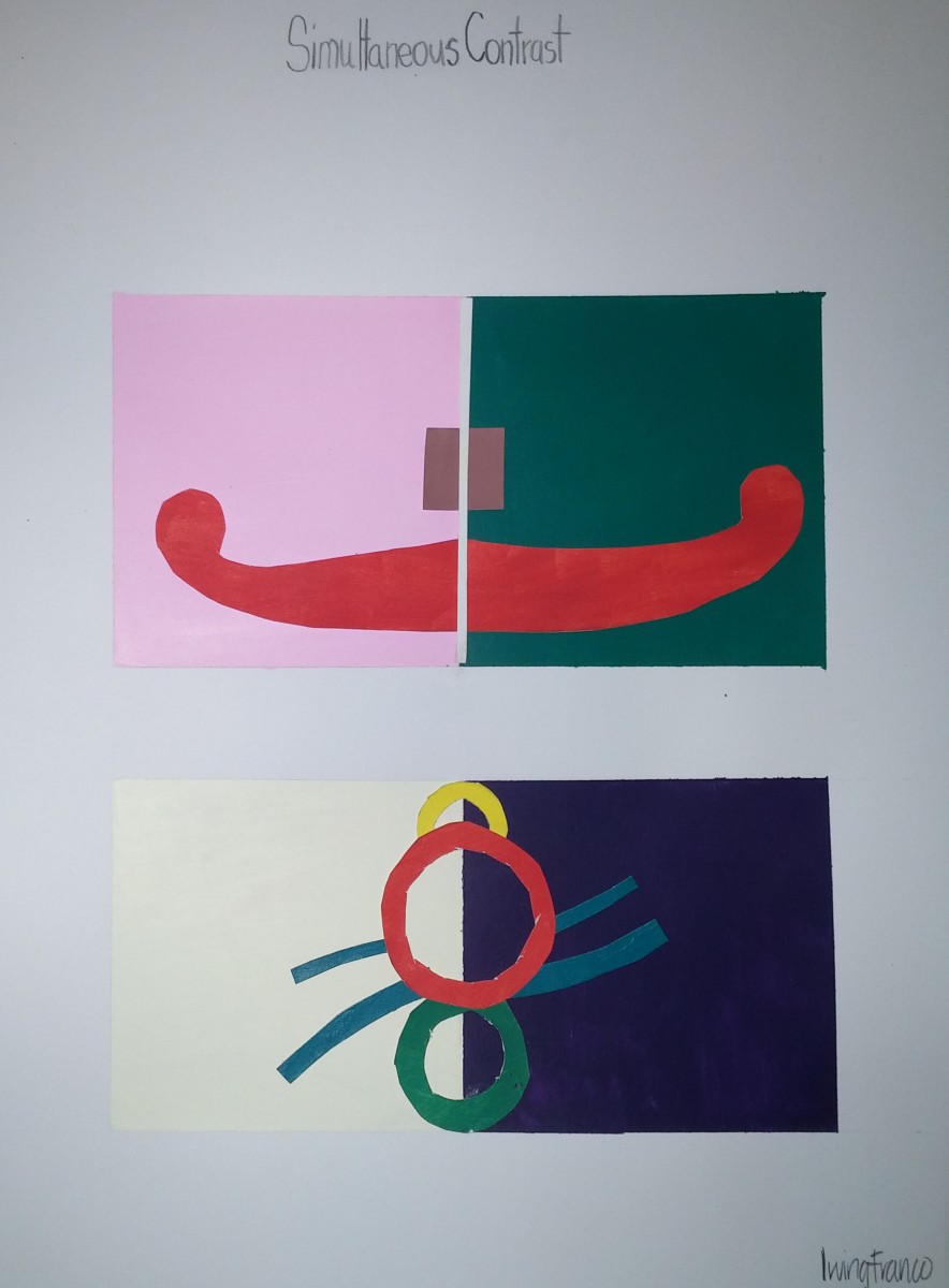
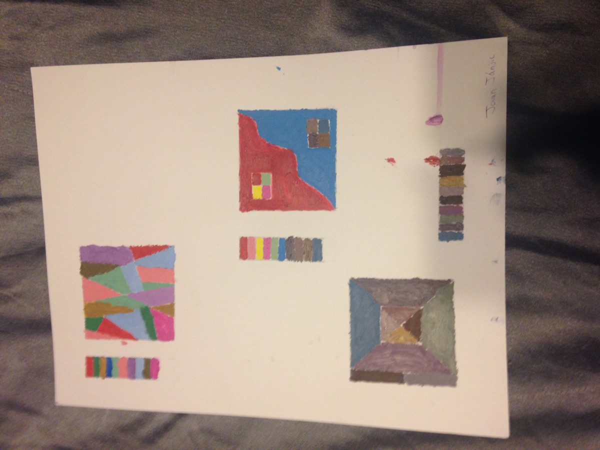
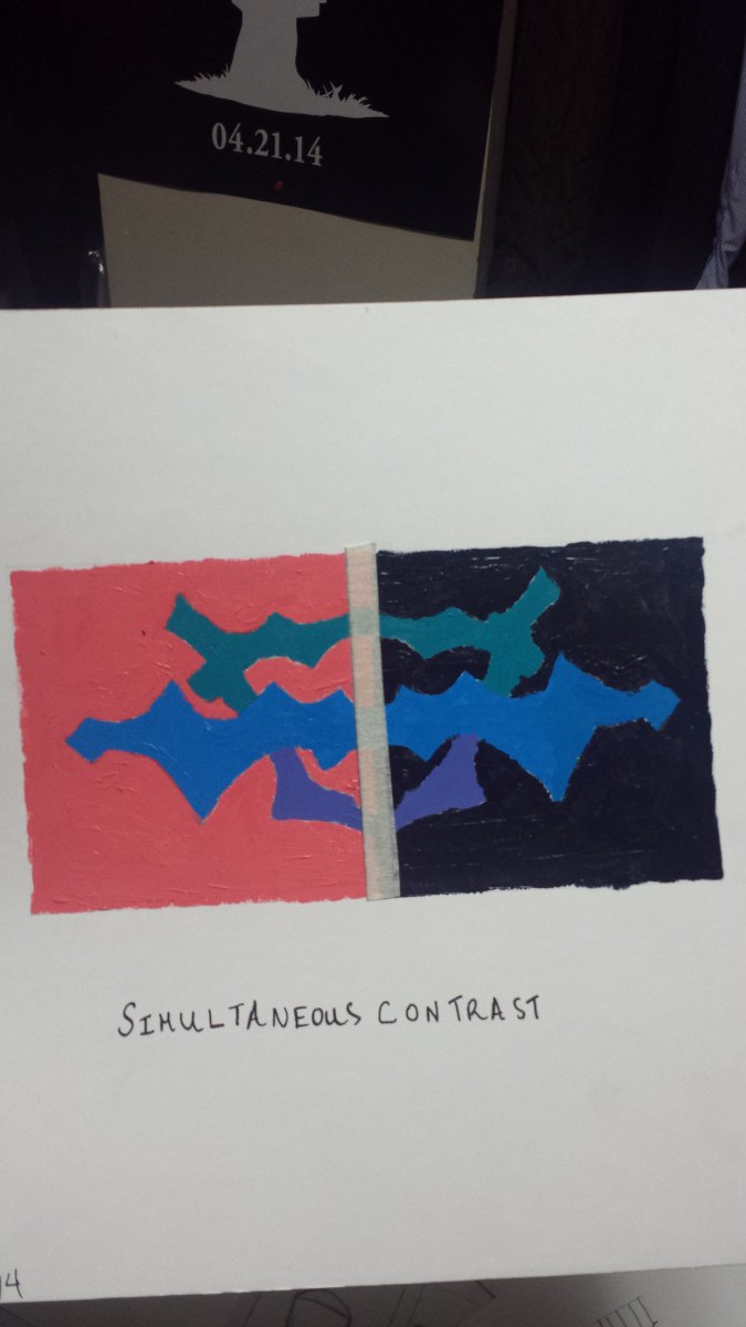
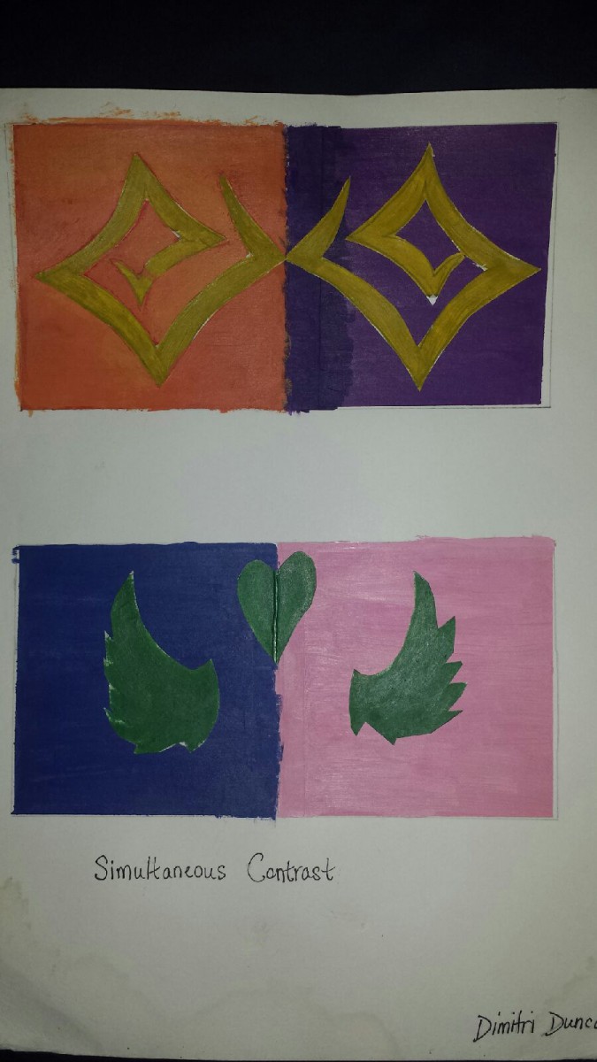
This assignment is about simultaneous contrast. It about making one color pop out by contrasting with its complementary colors. The principles in the project was shape, symmetry and chroma-type colors. The principles are emphasis and repetition.I learned the ways of using high-chroma colors and low-chroma colors, plus the importance of making your project standout.


Irving Franco Top 3

Simultaneous contrast identified by Michel Eugène Chevreul refers to the manner in which the colors of two different objects affect each other. The effect is more noticeable when shared between objects of complementary color.

For this project we had a 4Ă—8 rectangle and cut it in half. On the left side we had to choose a warm color and for the right side we used a cool color. Warm colors are usually light hue, like red, yellow and orange. They call them warm colors because they remind people of the warmer weather. The same principle applies to cool colors. Cool colors tend to range from green through blue and violet.

For the warm colors we hand to make them as light as possible, to do this we picked a color, in my case magenta and yellow and tint the color to make it lighter. For the cool color which were green and violet we had change the shade of it to appear darker but we weren’t allowed to use black. In the middle we used a center of emphasis in a different color to show simultaneous contrast. You can see how the background color affects the shape on top.

SymmetryDesign

Symmetry is the quality of being made up of exactly similar parts facing each other or around an axis. For this project we had to use an organic shape and use visual thinking to come up with a pictorial symbol and graphic symbols for said organic shape. The pictorial symbols were a photograph, illustration, image related, concept related and an arbitrary design.

We had to use our organic subject, in my case a shark to create a symmetrical design that also included positive and negative shape.

PersonalFlag

At the center of my personal flag you will find a star with a crown. The star represents my family members and how they push me to become a better person. They encouraged me to go back to school and make sure I am doing my work. The red in the star symbolizes the courage needed to become king. Under the star and crown there is a banner that reads Victoria Concordia Crescit which translates “Victory Grows Through Harmony” in latin. That is the motto of my favorite soccer team Arsenal FC. I relate with this motto because I believe that help can only make you stronger. I used a triadic color scheme of yellow, blue, and red which are the colors of the Colombian flag. There is simultaneous contrast with the red in the star and the red in the banner. You could say the design is symmetrical.

My Top 3 Projects, Paul Richards

IMG_1806For this i used unity to create a sense of wholeness and completion. By doing this i achieved balance to give an overall sense of equality in visual weight to make it symmetrical

IMG_1808Line was heavily used for this project. I like my use of Emphasis with the Permanent Marker for the circles: which represented the olympics in somewhat of a Ying/Yang look. The second is swirls to represent confusion with pattern. The third are a buildings windows with the window sill being emphasized. The last is supposed to be Anger; showing storm clouds with a little pattern and repetition

IMG_1807this his was my favorite out of all 3. I used plenty of color to represent emotion and my family members and also my heritage. The Black and white basketball player and basketball hoop was to show a sense of Rhythm with all the other colors surrounding it. The black and white represents the peace that the game of basketball gives me.

My top 3 Projects

Pos and Neg Space

I used black and white to create a sense of positive and negative shape. The checkerboard background and the cats drawn against them help in structuring this piece.

Personal Flag

This is the tigerbunny morpher for my personal flag. The primary color palate used was purple, yellow, and red while incorporating pink and blue. The colors are high in chroma to stand out but the soft blue background balances it out.

Color Palette/Value Key

3 boxes, 4″x4″ each representing a different aspect of mood and place. The first uses a light value key to represent warm, summery colors. The round shapes a meant as beach balls. The second image represents a comfortable room, my bedroom around late noon as the light from the setting sun shines through my window. The colors are in a medium value key with a few light and dark accents. The final image was to represent nightlife. The first thing that came to mind was fireworks and I used dark colors in the background and small bright accents to help create the effect of the fireworks explosion against a dark sky.


My 3 favorite projects – Jovan Janjic

Photo Dec 17, 11 30 12 AM Photo Dec 17, 11 30 20 AM Photo Dec 17, 11 30 26 AM


I really enjoyed working on these. The color wheel assignment was to get us to use our paint to get all the primary and secondary colors. I learned what two colors to mix in order to get a certain color. And that mixing more of one color will produce different results. Getting the right hue was hard, but very gratifying once accomplished.

The 3 room assignment involved using our knowledge of hues and patterns in order to convey a certain feeling associated with “nighttime”, “comfortable room”, and “nature”.  I learned that your choice of hue is crucial when attempting to give off a certain impression on the viewer. This assignment tested our knowledge of values and visual texture.

The last assignment involved us making two contrasting colors and constructing a pattern with a different color on top of it. I learned that contrasting hues with a pattern on top allows one to learn how certain colors work together.