Simultaneous contrast identified by Michel Eugène Chevreul refers to the manner in which the colors of two different objects affect each other. The effect is more noticeable when shared between objects of complementary color.
For this project we had a 4×8 rectangle and cut it in half. On the left side we had to choose a warm color and for the right side we used a cool color. Warm colors are usually light hue, like red, yellow and orange. They call them warm colors because they remind people of the warmer weather. The same principle applies to cool colors. Cool colors tend to range from green through blue and violet.
For the warm colors we hand to make them as light as possible, to do this we picked a color, in my case magenta and yellow and tint the color to make it lighter. For the cool color which were green and violet we had change the shade of it to appear darker but we weren’t allowed to use black. In the middle we used a center of emphasis in a different color to show simultaneous contrast. You can see how the background color affects the shape on top.
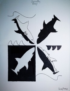
Symmetry is the quality of being made up of exactly similar parts facing each other or around an axis. For this project we had to use an organic shape and use visual thinking to come up with a pictorial symbol and graphic symbols for said organic shape. The pictorial symbols were a photograph, illustration, image related, concept related and an arbitrary design.
We had to use our organic subject, in my case a shark to create a symmetrical design that also included positive and negative shape.
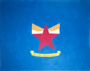
At the center of my personal flag you will find a star with a crown. The star represents my family members and how they push me to become a better person. They encouraged me to go back to school and make sure I am doing my work. The red in the star symbolizes the courage needed to become king. Under the star and crown there is a banner that reads Victoria Concordia Crescit which translates “Victory Grows Through Harmony” in latin. That is the motto of my favorite soccer team Arsenal FC. I relate with this motto because I believe that help can only make you stronger. I used a triadic color scheme of yellow, blue, and red which are the colors of the Colombian flag. There is simultaneous contrast with the red in the star and the red in the banner. You could say the design is symmetrical.


