“Master conjurer of the instantly familiar.”
Paula Scher (born October 6, 1948, Washington, D.C.) is widely known across the design industry as a renowned Brand Identity Designer, Painter, Art Educator and the first female Principal at award-winning creative agency, Pentagram. Described as the “master conjurer of the instantly familiar,” Scher’s iconic, smart, and accessible designs are part of the American vernacular.
I first discovered her trailblazing, bold typographic style a few years ago while researching the topic Sexism, Diversity and Inclusion in Advertising and later had the privilege to attend one of her AIGA keynote lectures in 2019. Scher was a refreshing surprise, a closer look at her life’s work revealed the magnitude to which her influence in design has impacted a new generation of creatives. In this article, we will explore her background and some of the projects that have been honored and awarded by the most reputable design organizations. For instance, Scher was named to the Art Directors Club Hall of Fame in 1998, and in 2000 she received the Chrysler Award for Innovation in Design.
Early Career
In the Netflix series Abstract: The Art of Design Scher describes herself as a high school misfit, engulfed by the world of art. Scher studied at the Tyler School of Art, in Elkins Park, Pennsylvania and earned a Bachelor of Fine Arts. She explains that during these formative years at college, she unexpectedly fell in love with Typography and was influenced by contemporary culture; Zig Zag Rolling Papers, Zap comics and Underground newspapers, magazines and record covers.
Coincidentally, Scher began her career as an art director in the 1970s designing record covers in CBS Records’ advertising department. Her design aesthetic combined typography that was either related to the illustration or contrasted it. 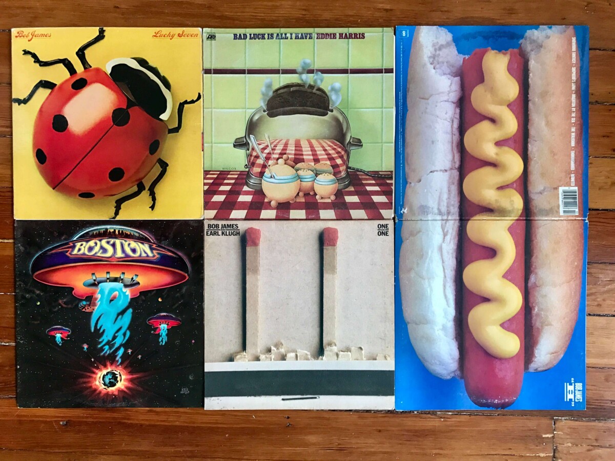
In the mid-1990s her eclectic approach to typography became highly influential. Her iconic, landmark brand identity system was commissioned by The New York Public Theatre, a program that would eventually influence much of the graphic design created for theatrical promotion and for cultural institutions.
The original identity created a graphic language that reflects street typography in its extremely active, unconventional and almost graffiti-like juxtaposition.
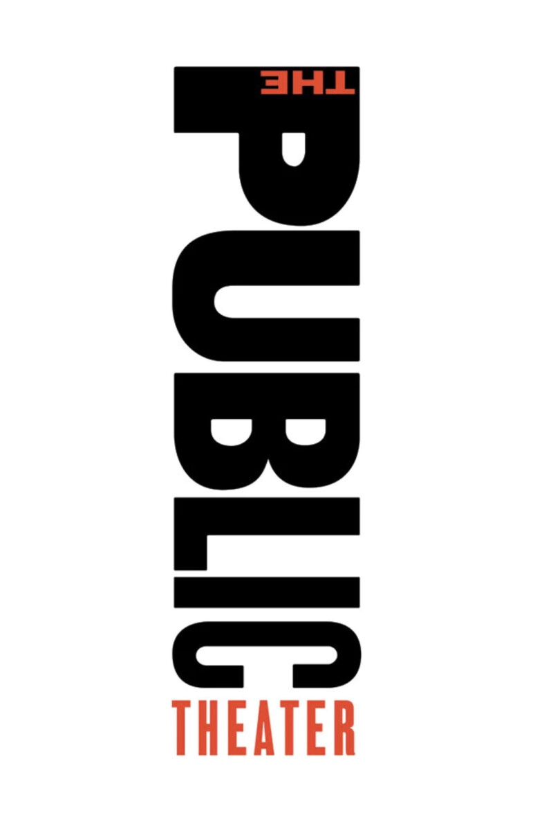
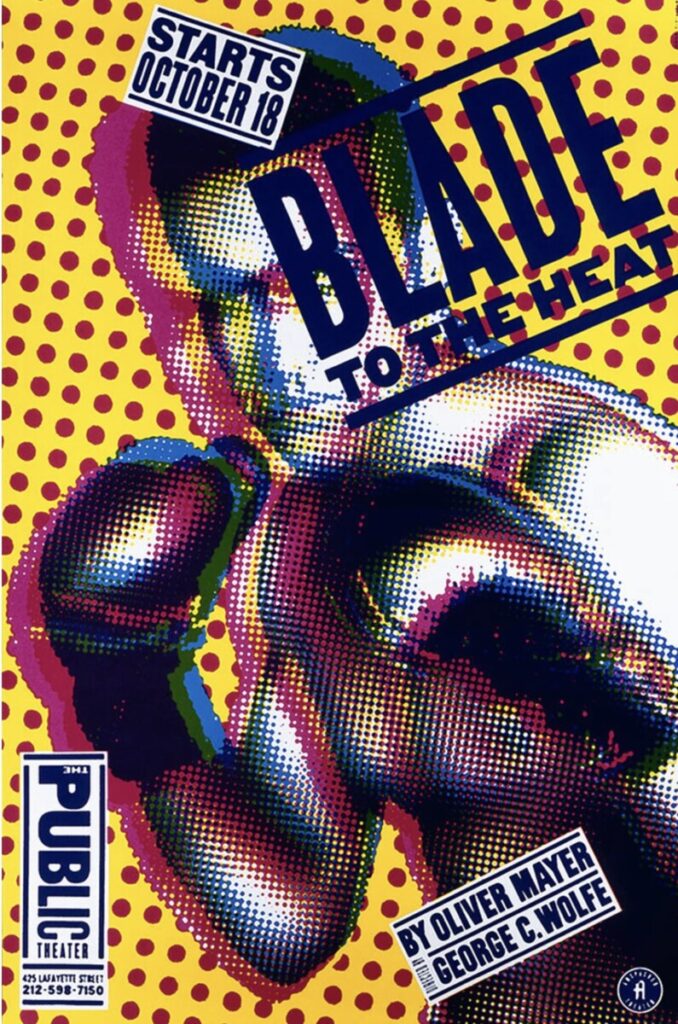

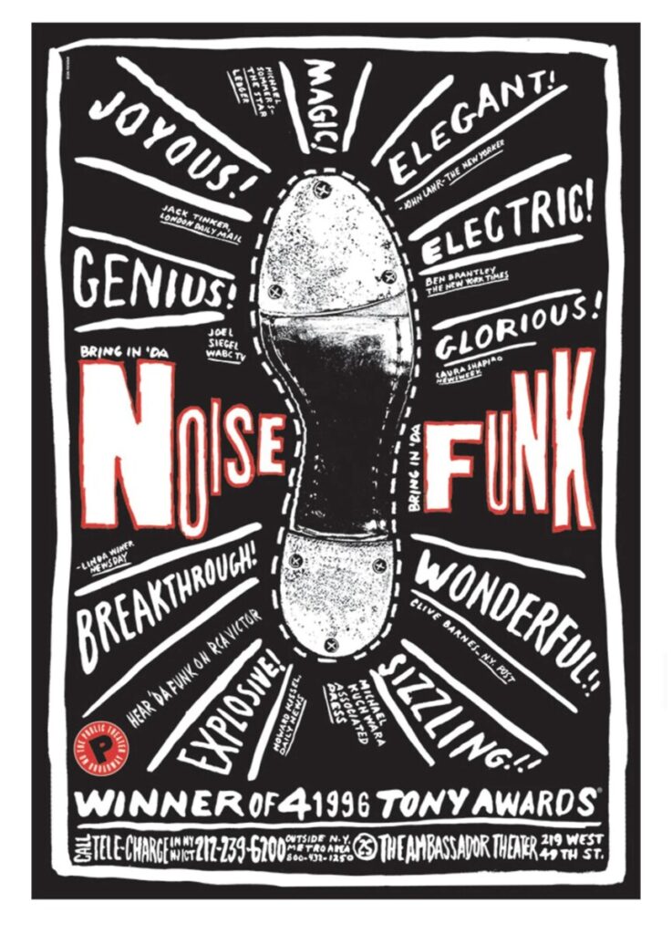
Using unorthodox spacing, mixing font colors and weights, The Public’s radical typographic style popped up everywhere, from magazine layouts to advertising for other shows.
Branding & Identities Systems
Scher has developed identity and branding systems, promotional materials, environmental graphics, packaging and publication designs for a broad range of clients that includes, among others, Bloomberg, Microsoft, Adobe, Bausch + Lomb, Coca-Cola, Shake Shack, Perry Ellis, the Walt Disney Company, the Museum of Modern Art, the Sundance Institute, the High Line, Jazz at Lincoln Center, the Metropolitan Opera, the New York City Ballet, the New York Philharmonic, the New Jersey Performing Arts Center, the New 42nd Street, the New York Botanical Garden, the United States Holocaust Memorial Museum, the Philadelphia Museum of Art, the Robin Hood Foundation, and the New York City Department of Parks and Recreation
MoMA
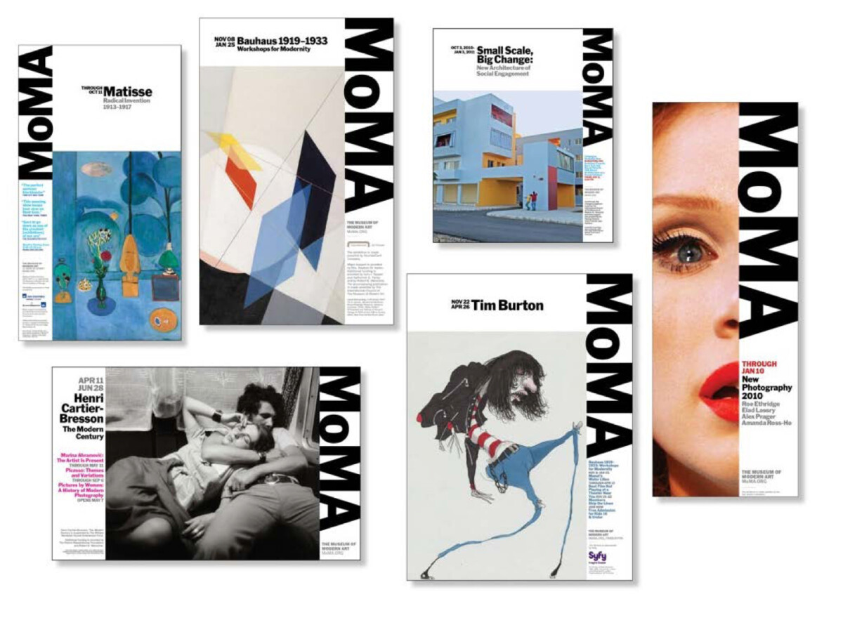
In 2008, Paula Scher took on a re-brand of The Museum of Modern Art in New York City.
The MoMA logo was already iconic, but it was not enough to continually carry the spirit of the institution. Paula Scher designed a complete methodology for the new system to work at any scale, from an exterior banner to a print advertisement in the newspaper. She designed a strong grid to uniform placement of images and types. When seen in multiple, as in a series of posters or banners installed on the street, the design creates patterns—of type and image, and of color and black and white—that are visually powerful and dynamic.
Microsoft
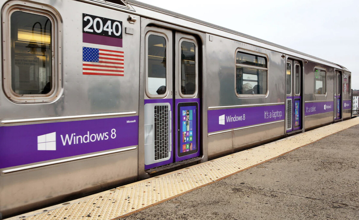
In 2012, Paula Scher began working with Microsoft to reimagine the Windows logo.
Microsoft wanted to update their interface aesthetic in alignment with the release of their new operating system, Windows 8. As technology developed over the years, the logo had transitioned away from its founding roots. Early in the development process, Scher asked Microsoft, “Your name is Windows. Why are you a flag?
Scher decided to return to the original approach and use a simplified window, displayed in perspective, to emphasize the connection between the two. She opted for a hand drawn perspective rather than a computer generated one and kept the logo very simple so it was versatile and could be put in motion, rather than drawn to appear in motion. This project demonstrates Scher’s ability to work with a variety of styles from dynamic and bold like the Public Theater, to clean and minimal like the Windows logo. Her versatility and ability to develop unique design solutions based on the specific consumer market distinguish Scher as an influential graphic designer.
Articles Cited
Bigman, A. (2018, March 10). Get to know Paula Scher, Titan of postmodern design. 99designs. Retrieved December 7, 2021, from https://99designs.com/blog/famous-design/paula-scher-titan-of-postmodern-design/
Paula Scher Biography. Artnet.com. (n.d.). Retrieved December 7, 2021, from http://www.artnet.com/artists/paula-scher/biography
Paula Scher. Paula Scher | Biography | People | Collection of Cooper Hewitt, Smithsonian Design Museum. (n.d.). Retrieved December 7, 2021, from https://collection.cooperhewitt.org/people/18043689/bio
Paula Scher: Biography, designs and facts. Famous Graphic Designers. (n.d.). Retrieved December 7, 2021, from https://www.famousgraphicdesigners.org/paula-scher
Pentagram’s Paula Scher. Pentagram. (n.d.). Retrieved December 7, 2021, from https://www.pentagram.com/about/paula-scher
Wikimedia Foundation. (2021, November 29). Paula Scher. Wikipedia. Retrieved December 7, 2021, from https://en.wikipedia.org/wiki/Paula_Scher