Nestlé Logo Evolution
Meet Heinrich Nestlé, the German born pharmacist turned confectioner who built the world’s largest food business which employs more than 340,000 people in more than 86 countries worldwide.
Heinrich’s rise to global prominence started in the 1830’s as an apprentice to J. E. Stein, owner of a Frankfurt pharmacy and was later officially authorized to perform chemical experiments and sell medicines in 1839. During this period of professional growth and exploration, Heinrich settled in French-speaking Vevey, and eventually changed his name to Henri Nestlé, in order to assimilate himself into his new Swedish life. In 1843, Henri bought into the region’s manufacturing and selling of nut oils, liqueurs, rum, absinthe, vinegar, carbonated mineral water and lemonade.
Henri continued to invest in his manufacturing of food products and eventually founded Nestlé S.A. in 1866. His breakthrough product was later discovered in 1867, a viable powdered milk product, marketed as an alternative for infants who were unable to breastfeed. As production and demand increased, Nestlé quickly became one of the first Swiss manufacturers to build a brand with the help of a logo— one fashioned after his family crest.
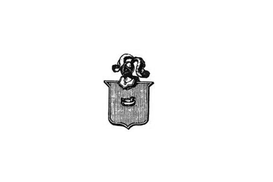 The earliest version of the Nestle family crest (1868-1938) featured a central element; a bird in a nest located inside the shield, at the top of the shield a knight’s helmet is adorned with two lush feathers.
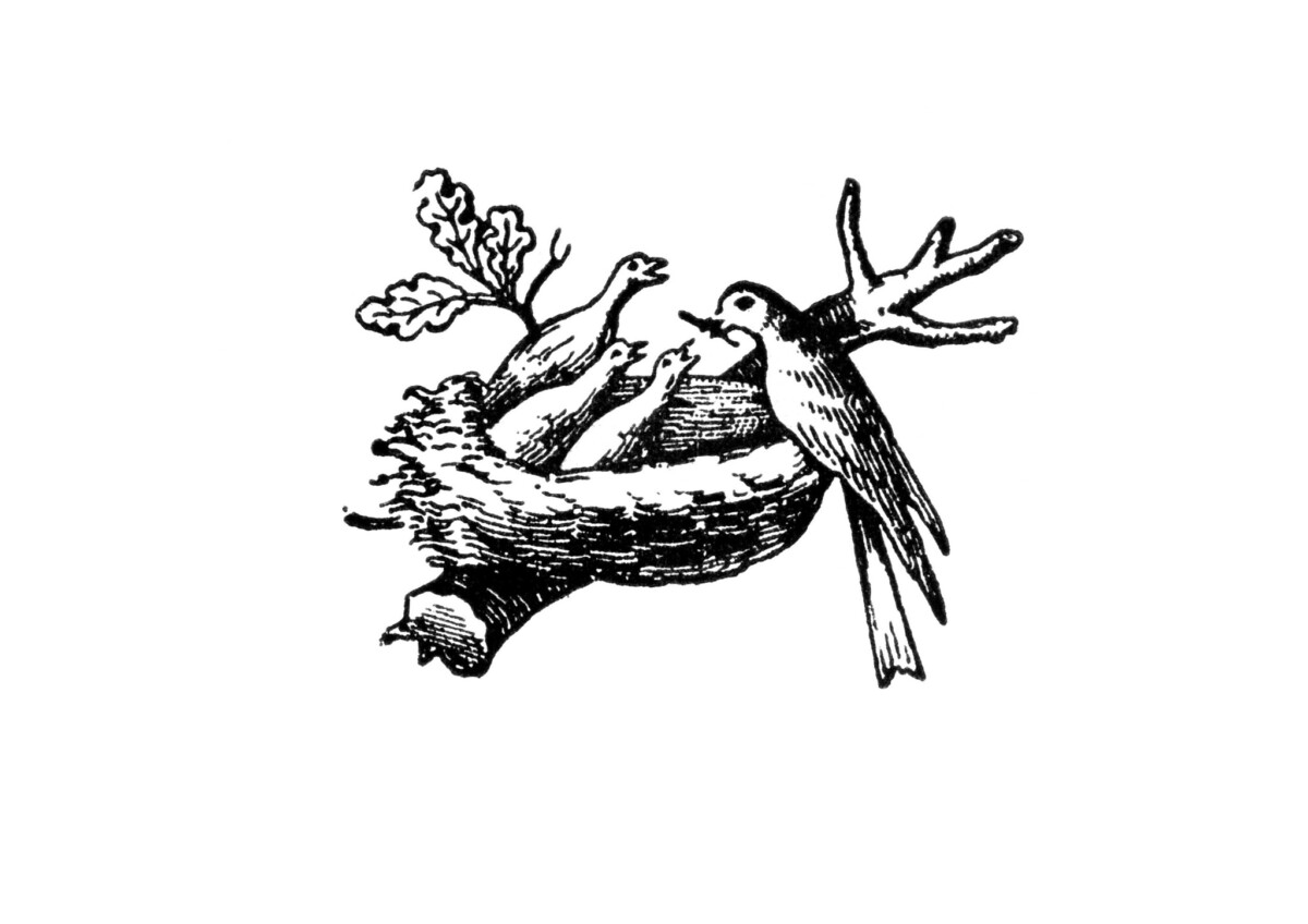 In 1868 the family’s crest is used a source of inspiration for the designers commissioned to develop an iconic logo treatment. A 15-year patent was obtained for the new logo which consisted of a nest, three chicks and their mother who held a worm in mouth. This interpretation emphasized the company’s brand purpose — the production of nutritional products for infants. When he retired in 1875, the memorable nest emblem was trademarked in Vevey, Switzerland by the new owners of the Nestlé S.A.
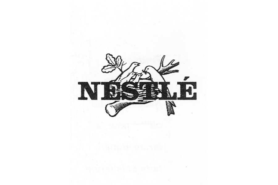
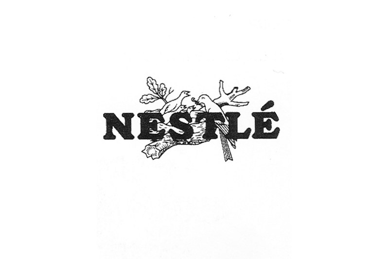 Six decades later 1938, the nest emblem received its first major design upgrade. The new logo featured a combination of the “little nest” and capitalized “Nestlé” wordmark in serif typeface. The Nestlé lettering and emblem are combined to form an umbrella brand for the 6,000 brands, and huge catalog of products including dairy, chocolate, ice cream, coffee, bottled water, infant food, confectionery and pet foods.
 In 1966, the combined trademark was modernized in celebration of the company’s 100th anniversary. Some of the notable changes include a conscious removal of unnecessary details in the line art of the birds and nest. The contrast between the “Nestlé” typeface and emblem presented a cleaner, distinguishable design aesthetic.
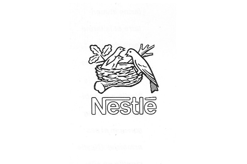 In 1988, Nestlé subsidiaries are given standardized names in combination with “Nestlé”. The logo has been reduced to young birds signifying the modern family with two children. the worm from the mother’s mouth has also been removed, an indication of the companies new directive to diversify its product line and market opportunities. The “Nestlé” wordmark was moved beneath the “little nest”, representing a foundation and strategic umbrella trademark.
 The logo is simplified once again in 1995, as an attempt to make it more contemporary and coherent across print and digital devices. Additionally, the “Nestlé” wordmark incorporates a modified form of the classic Helvetica typeface, and is now in title-case with no fill color. The capital letter “N” is graphically highlighted with one of its legs lengthened horizontally, which gives the impression of the old brand moniker of a mother protecting and nurturing babies. The logo’s color palette is simple, based on a combination of white with brown, gray and black.
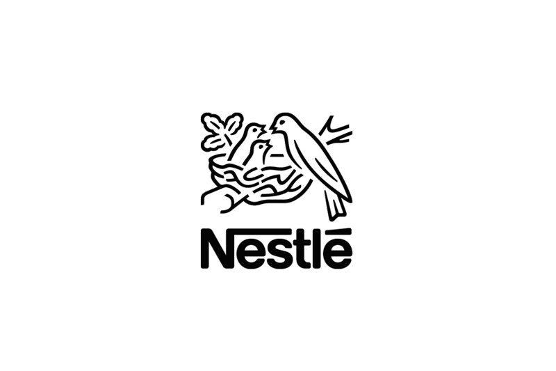 In 2015 Nestlé celebrate its 150th Anniversary. Once again the logo has been simplified, this time, the illustration of the branch, nest and mother now features open paths. This can be seen as visual representation of the organizations bold global ambitions published in celebration of 150 years; to be more transparent and develop open relationships with the communities where it operates, and wider society.
Logo Timeline
1866-1868 1868-1938 1938-1966 1966-1984 1984-1995 1995-2015 2015-PRESENT
Articles Cited
‘Good food, good life’ celebrating 150 years of Nestlé. Nestlé Global. (n.d.). Retrieved November 16, 2021, from https://www.nestle.com/aboutus/history/nestle-company-history/nestle-150-years
History of the Nestlé logo. History of the nestle logo – creation, Old Logos, Henri Nestle. (n.d.). Retrieved November 16, 2021, from https://www.etiziano.com/I_love_logo_design/history_of_the_nestle_logo.html
Nestle logo. Famous Logos RSS. (n.d.). Retrieved November 16, 2021, from https://www.famouslogos.net/nestle-logo/
Nestle logo. Logos World RSS. (n.d.). Retrieved November 16, 2021, from https://www.logos-world.net/nestle-logo/
The Nestlé Logo Evolution. Nestlé Global. (n.d.). Retrieved November 16, 2021, from https://www.nestle.com/aboutus/history/logo-evolution
Wikimedia Foundation. (2021, November 8). Henri Nestlé. Wikipedia. Retrieved November 16, 2021, from https://en.wikipedia.org/wiki/Henri_Nestl%C3%A9