All posts by Deriann.H

final blog- final presentation and overall thoughts


Internship at brooklyn college


Looking back on my time as an intern at Brooklyn College, I’m filled with memories of challenges, teamwork, and personal growth. It’s been a journey of learning and collaboration, and I’m excited to share what I’ve gained. From day one, I was given various tasks to tackle, from research to design. Each task was a chance to learn something new and improve my skills. One thing that stood out during my internship was how much we worked together as a team. Collaborating with my colleagues made the workload lighter and the outcomes better. We supported each other through ups and downs, making the experience more enjoyable and rewarding.

Through teamwork, I also learned how to communicate better. Whether it was sharing ideas or asking for help with something, I discovered the importance of being clear and concise. These communication skills have proven to be valuable not just during my internship but in all aspects of my life. Another big takeaway from my time at Brooklyn College was improving my research skills. Working on projects helped me understand how to apply what I learned in school to real-world situations. It was a hands-on experience that taught me how to analyze data and apply them to your work. Throughout the course, I gained valuable insights into the intricacies of the job market and the ethical considerations within the Graphic Design industry. One particularly engaging exercise involved simulating the financial challenges faced by a character surviving on a paycheck, which provided a practical perspective on budgeting and financial management—a skill essential for any professional. Another highlight was the discussion on ethics, where we explored the boundaries of ethical conduct in the workplace. For instance, the scenario highlighting the risks of going behind the boss’ back without proper oversight underscored the importance of transparency and accountability in professional settings. It served as a sobering reminder of the potential consequences of unethical behavior, including the risk of being blamed and terminated from employment. These exercises not only deepened my understanding of the industry but also equipped me with practical knowledge and ethical principles essential for navigating the complexities of the Graphic Design profession.
 

blog post 17- museum assignment

During my spring break, I had the delightful opportunity to visit the Cooper Hewitt Museum, where I immersed myself in two captivating exhibits. Among them was “AN ATLAS OF ES DEVLIN,” a showcase highlighting the extraordinary artistry of Es Devlin. Renowned as both an artist and stage designer, Devlin has lent her creative vision to a multitude of iconic projects, including collaborations with acclaimed musicians, the NFL, the World Expo, and more.

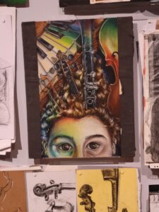
The first artwork i will be talking about is called Archived Unboxed where it’s a pile of old artwork by the artists. These works were created when Devlin was a student artist before she became who she is now. This artwork was created using pastels and it depicts a human face partially covered by musical instruments. The instruments seem to emerge from the person’s hair, suggesting a deep connection between the individual and music. It used a variety of colors such as greens, yellows, blues and reds for vibrancy. The textures in the artwork are well-rendered, with the curly hair, smooth surfaces of the instruments, and the varied textures of the skin and background contributing to a rich visual experience. The piece is a detailed representational drawing, focusing on realistic depictions of both the human face and the musical instruments. The composition is intricate and layered, with the central focus on the face and instruments. The diagonal lines of the piano keys and the vertical positioning of the instruments draw the viewer’s eye across the piece.  I chose this artwork because it combines my love for music and visual art.

The second artwork by the artist:

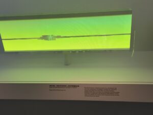
This was made by using a translucent LED and was used in U2’s “For U2’s Innocence + Experience” Tour. This model represents the visual element of U2’s “Innocence + Experience” arena tour. The installation used a transparent LED block to create a dynamic visual experience, dividing and unifying the crowd with animated sequences. The primary color of the model is a striking neon green, which dominates the visual field and creates a futuristic, almost ethereal glow. The color choice likely enhances the immersive and engaging atmosphere intended for the live audience. The artwork is an abstract model designed to illustrate a larger installation piece. It conveys the conceptual and technical aspects of the stage design used in a concert setting. I selected this piece because of its innovative use of materials and its connection to a live performance setting. The model effectively communicates the conceptual vision behind a large-scale, immersive concert experience. My response is one of admiration for the technical ingenuity and creative vision that went into the design. The use of light and color to transform a performance space is both fascinating and inspiring, demonstrating how visual art can enhance and transform a musical experience.

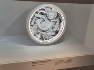
The final art is called “Sculpture. Songs For Sorrow” and it is made from printed paper and fiberboard. The sculpture is predominantly monochromatic, using shades of black, white, and grey. The lack of color emphasizes the intricate details and depth created by the layered paper. This is a representational sculpture, with a strong focus on detailed cut paper elements. The representational nature is evident in the recognizable human figure and the clockwork-like components. The piece has a rich texture due to the multiple layers of cut paper. The interplay of shadows and light across the different layers adds to the quality, inviting viewers to explore the depths of the sculpture. The circular composition is balanced and draws the eye towards the central figure. The surrounding elements create a sense of motion and complexity, leading the viewer to explore the details. selected this piece for its intricate craftsmanship and the unique use of cut paper to create depth and dimension. The monochromatic palette allows the viewer to focus on the details and the interplay between the layers. My response is one of admiration for the complex work involved and the thoughtful integration of elements that complement the music album it was designed for. The sculpture’s ability to convey emotion and complexity through such a delicate medium is both impressive and moving.

blog 16- appreview- garagband

for my second app review, i chose to do Garageband.

Because i’m interested in all types of creative outlets, i wanted to talk about this app that i first made music on. GarageBand greets users with an easy to use interface that invites exploration and creativity. Whether you’re a novice musician or a seasoned producer, the app’s layout is designed to be accessible and easy to navigate. With its familiar design elements and straightforward controls, GarageBand makes it easy for users to dive into the world of music production without feeling overwhelmed.

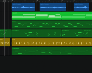
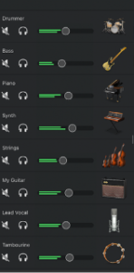
One of the highlights of GarageBand is its impressive collection of virtual instruments. From pianos and guitars to drums and synthesizers, the app offers a diverse range of high-quality sounds that users can incorporate into their compositions. Whether you’re laying down a melody, crafting a rhythm, or experimenting with new sounds, GarageBand’s virtual instruments provide endless possibilities for musical expression. My current favorite is violins and harps along with guitar.

GarageBand’s virtual drummer and smart instruments offer an innovative way to enhance your music productions. The virtual drummer feature allows users to create realistic drum tracks with customizable styles and performances, while smart instruments enable users to play chords, melodies, and rhythms using touch gestures on their device’s screen. These features provide a fun and intuitive way for users to experiment with different musical ideas and arrangements.Once your masterpiece is complete, GarageBand makes it easy to share your music with the world. Whether you’re sharing your tracks via social media, exporting them to your device’s library, or collaborating with other musicians in real-time, GarageBand offers a variety of options for sharing and distributing your music to a wider audience. As a closing, i will post a sample i made in Garageband:


blog post 15 app review- procreate

For my review, i wanted to do procreate.

At the heart of Procreate’s appeal lies its vast array of brushes. With over 200 default brushes to choose from, artists have an incredible amount of flexibility at their fingertips. Whether you’re aiming for the organic texture of a pencil or the bold strokes of an ink pen, Procreate has a brush to suit every style and need. What’s more, the ability to create custom brushes opens up endless possibilities for experimentation and personalization. For example, i have a personal brush set from one of my favorite artists who created pens for his work on Spider-man and Batman Beyond.

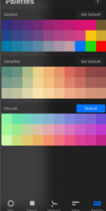
Procreate makes color matching a breeze with its intuitive selection tools. From sliders to palettes to eyedropper tools, finding the perfect hue for your artwork has never been easier. The option to create and save custom color palettes ensures consistency throughout your work and streamlines the color selection process, allowing you to focus on your creativity without worrying about technicalities. You can even move an image to the color palette section and it will copy the colors from the image.

Procreate’s symmetry tool ensures that your artwork is perfectly balanced and aligned every time, whether you’re working on mandalas, patterns, or character designs. The ability to hold down the pen to create perfect shapes with just a simple gesture further streamlines the drawing process, allowing artists to focus on their creativity without getting pulled down by technicalities.

Procreate offers a wide range of effects and editing tools to enhance your artwork and add depth to your creations. Whether you’re looking to blur backgrounds, sharpen details, or experiment with layer blending modes and filters, Procreate provides the tools you need to achieve your desired visual effects with ease without frustration with just a drag on the bar with your finger or pen.

In conclusion, Procreate is a must-have app for digital artists looking to push the boundaries of their creativity on the iPad. With its extensive selection of brushes, intuitive interface, and powerful features. Whether you’re a hobbyist or a professional, Procreate empowers you to create art that inspires and captivates audiences worldwide. Here’s an art idea i made from it:


blog post 14 (internship 10)- role model

During my internship, one person who stood out as a role model to me was Malisa. I admired her immensely, especially during the cover assignment. Her covers were clean, sleek, and sophisticated -exactly the kind of professional design you’d expect to see in a book about cover design or in informational booklets from schools.

What impressed me the most was the variety and quality of her renditions. She explored different colors and layouts, each one beautifully crafted and inspirational. Malisa’s work wasn’t just technically clean; it also had an aesthetic appeal that elevated it to another level. Her designs have set a high standard for me and others, and I aspire to reach that level of expertise in my own work.

blogpost 13( internship 9)- self evaluation

For my self-evaluation, I’ll be focusing on my latest and most challenging project to date: the one-pager. Despite being a group effort, this project was a real test for me.

Typography and I have never gotten along well, and this project was no exception. Handling type was a major headache. Arranging the text so it looked good was a challenge, and figuring out kerning and spacing was so stressful that I had to take breaks to clear my head. This definitely wasn’t my best work. Working on the cover designs was somewhat easier because I primarily focused on creating images. However, since the one-pager was mostly text, it was a much bigger struggle for me.

Thankfully, after receiving a lot of feedback, I managed to improve the document and meet the supervisor’s requirements. Even though I didn’t always understand certain terms, I made sure to ask for clarification. This was a significant step for me, as I usually struggle with communication. I’m proud that I sought help when I needed it and communicated better than I have in the past. Overall, this project pushed me to improve and highlighted areas where I can grow. While it was incredibly challenging, I believe that with time and continued effort, I can get better at handling type and other difficult aspects of design. This experience taught me valuable lessons and reinforced the importance of seeking feedback and communicating effectively.


blog post 12 ( internship 8)

This project marked our first significant group collaboration, and it was an intense yet rewarding experience. Isana asked me to work overtime to build on the efforts of Tarique, Melisa, and John. Our goal was to create a one-pager summary for an upcoming meeting, which turned out to be more challenging than I anticipated.

Isana and I communicated through text messages and Zoom calls, where I shared updates and edits on the project. There were numerous revisions and adjustments needed, and some initial miscommunications added to the problem. However, we managed to talk about everything during our second meeting on the same day. At one point, I encountered technical issues with the file, which John helped me troubleshoot via text. Although I eventually resolved the problem myself, his support was still good.

The project had its successful moments. I completed most of the requested changes, and the document was shaping up well. Unfortunately, I couldn’t finish the final set of edits because my mom was sick. As a result, Manjie and Melisa stepped in to complete the remaining tasks and finalize the chosen covers with edits.


blog post 11 (internship 7)

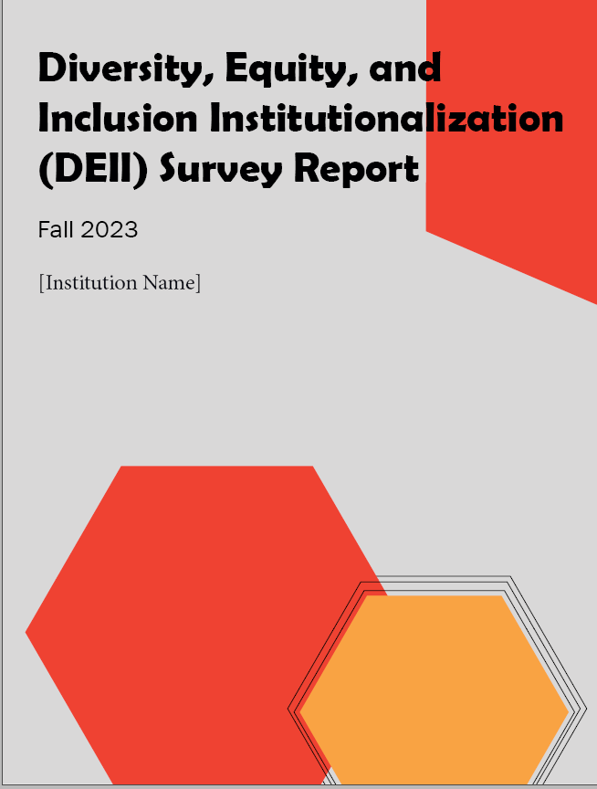
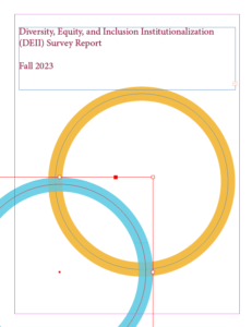
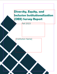
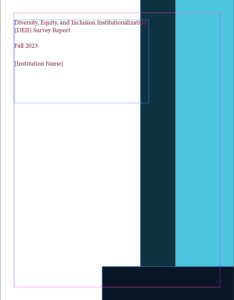
Today, I wanted to share some progress on our latest project: designing the cover for the Diversity, Equity, and Inclusion Institutionalization (DEI) Survey Report for Fall 2023. After receiving feedback on my initial burgundy-themed sketches, I experimented with new colors and designs to better capture the meaning of our report.

During our recent feedback session, I learned that one of my cover designs was considered a bit too busy. However, the box-themed cover from my initial batch was praised for its simplicity. Despite this, I still have a fondness for the more elaborate designs as they were fun to create, so I plan to save them for future projects.

After our Zoom meeting, I took a break to grab some breakfast and change into more comfortable clothes. Feeling refreshed, I set to work on refining the square cover design. To keep myself entertained while working, I watched “Wonka,” which turned out to be both interesting and a bit sad. However, I managed to stay focused and completed the task on time.

blog post 10 ( internship post 6)

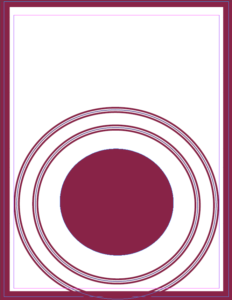
Today, we had a meeting about our new project, which involves creating a cover for a report booklet. The dimensions needed to be 8.5 by 11 inches, and I initially struggled to come up with an appealing design. My first few sketches incorporated the school’s burgundy colors, assuming that was the desired aesthetic. However, the result felt plain and uninspired.

During our weekly meeting, I shared my initial ideas, and Isana suggested exploring other color options. This feedback sparked a new wave of creativity, leading me to develop three additional sketches.


The first new sketch features a bold, circular design with dynamic blue accents, offering a fresh contrast to the burgundy. The second design incorporates geometric patterns, providing a modern and structured look. The third design uses vertical stripes in various shades of blue, creating a sleek and professional appearance.

These new concepts emerged from extensive research on report cover trends, aiming to balance innovation with the school’s brand identity. I’m looking forward to presenting these ideas and getting feedback in our next meeting. This project has been a great opportunity to push my creative boundaries and develop more visual work.

blog post 9 zoominar – zoomin with creatives networking event 2

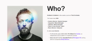
My second networking event was on Zoom, titled “Zoomin with Creatives.” We had three speakers lined up, one of whom was Todd Goldstein. He’s quite the multidisciplinary artist, dabbling in music, animation, and graphic design. Interestingly, Todd’s academic journey started with English literature, but he soon found his passion for design, leading him back to school. He landed an internship at Pentagram NYC after attending Parsons. Todd’s work speaks for itself – from collaborations with Warner Brothers to crafting the iconic Saturday Night Live opening titles. Not to mention, he’s behind the Warner Records logo and the branding for Green Jones.

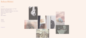
Next is Rehan Miskci, an artist specializing in photography. Starting her academic journey with interior design during her undergraduate years, Rehan later pursued her passion in New York City, obtaining a master’s degree in photography and visual arts. What distinguishes Rehan’s work is her unique approach to photography. She doesn’t simply capture moments; she transforms them into immersive experiences. Leveraging her background in interior design, Rehan uses her photographs with a strong sense of space and composition, resulting in images that resonate with depth and intrigue. For Rehan, photography is about more than just taking pictures—it’s about creating environments within the frame.

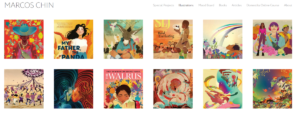
The third speaker, Marcos Chin, has a deeply personal journey that fuels his artistic endeavors. Born in China, Marcos relocated to Canada at the tender age of two, seeking refuge from the civil unrest alongside his parents. While his mother navigated the world of data entry and his father toiled in factory work, Marcos found solace and inspiration in the vibrant world of MTV, which served as a welcomed escape. This early exposure sparked his passion for art, leading him down the path of commercial illustration and digital creation. Marcos’s hard work reached heights, including a notable poster for Marvel Studios’ “Shang-Chi,” along with impactful contributions to the LGBTQ community. His collaborations span a diverse range, from partnering with Banana Republic for Pride-themed apparel to creative ventures with Starbucks, Truly Hard Seltzer (including collaboration with Dua Lipa), and even Dave Chappelle.

Each of the speakers shared a unique story about how they found their way into the world of art. Marcos stumbled into illustration without knowing it was a career option, simply because he loved to draw, even with limited resources. While he initially aimed to make money, his passion for illustration grew over time. Todd’s journey was driven by a constant desire to create and produce. Despite starting with music, he eventually found his calling in visual arts after taking several art classes. Rehan initially pursued photography but discovered the diverse opportunities within design, eventually finding her niche in visual storytelling and spatial exploration.