final quotePDF
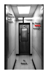
In this project i decided to use a chalkboard type font and the color red to make it stand out. I shifted the text to make it easier to read as well as use Photoshop on the picture to make it look like an empty hallway. In my other drafts i tried out many other things, i also provided the pictures myself so i had an idea of what i wanted to do with them.
The hardest part i this project for me was coming up with a quote that fit my image of the picture. If i could change something from this image then i would make the text a lil bit bigger. Overall i enjoyed doing this project to the end.


