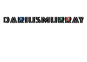
This logo represents me Because the simple bold black text cropped out with 3 colors is indicative of the basic style that I emulate in my work. In much of my art I tend to keep things simple by incorporating as few colors as possible. Also by bolding the letters and then cropping the edges, it gives the appearance that the words are more impactful than they actually are. Plus your focus is easily drawn to the colorful circles which could easily be replaced with other visuals.


