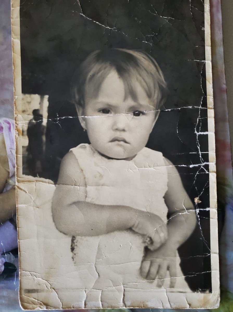
The photos above are photographs of my mom when she was just 1 year old.
The left picture is clearly the original one and the one on the right is the same picture after having worked on it.
A City Tech OpenLab ePortfolio
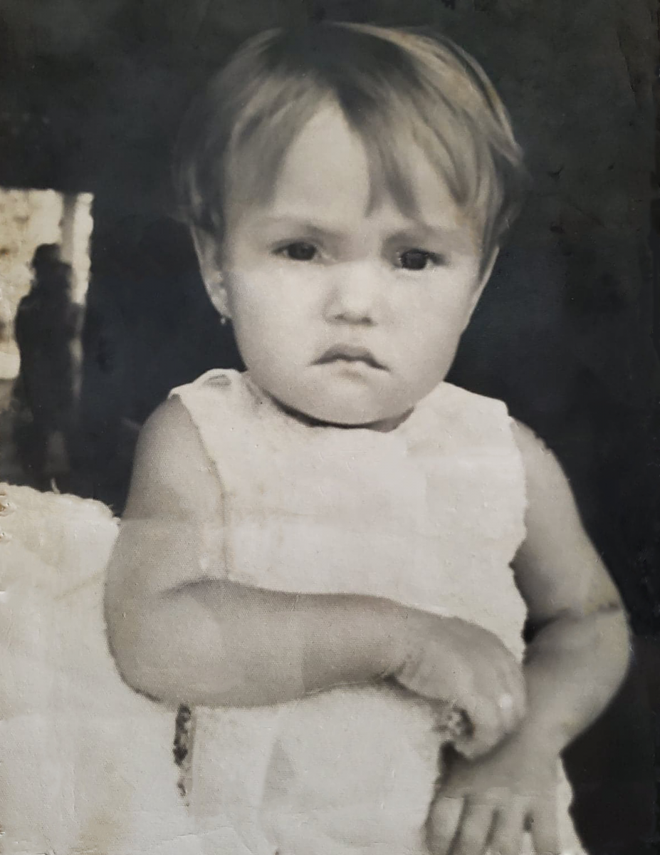
The photos above are photographs of my mom when she was just 1 year old.
The left picture is clearly the original one and the one on the right is the same picture after having worked on it.
Two pieces that caught my attention out of my peers are the book covers redesigned by Steven Taveras and Camile Ragland.
Steven’s book cover is miles better in portraying an interesting book cover over the original book cover for Nest. It’s interesting and both set of eyes on the cover convey different things. The ones looking out from behind the shades are clearly a person looking outside to see what is out there. Clearly the other set of eyes is what’s concerning the person on the inside. Yellow glowing eyes are never a sign of anything good. This, grouped with the font in which the title is written in makes it clear that this book has some danger, thriller, or mystery element to it. I honestly cannot think of anything that would make this cover better.
Camile’s book cover is playful as it should be. It’s a book about time travel. Time travel is one of the most fantastical notions in fiction. She takes this even further by having a clock where a lot of the numbers have spilled out from it. The title also act as the hands of the clock which is clever use of space and drawing the public’s attention. The original book cover pales in comparison to Camile’s new redesign. It’s also simplistic while being interesting which is hard to accomplish. I honestly don’t think it needs any work. On a personal note, I would use a different font for the title, but it’s a preference and as such not a critique.
Alesana is a post-hardcore band. Their albums are usually centered on some story they come up with or based on myths and tales. The album that I thought needed a new cover was Confessions. This was a concept album that told a love story and time travel which is why there’s a tesseract on the book cover. This one is the original cover and It always felt lacking to me and didn’t capture the essence of the music as well as some of their other album covers.

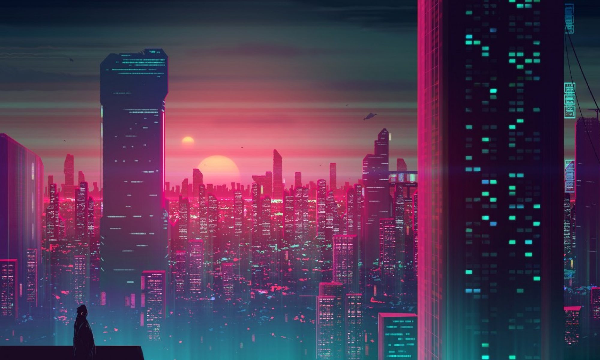
This one right below is the one I made. I kept the idea of the tesseract by interlacing squares that hone into the middle of the image. To not get playful with the album cover when the album talks about time travel was a disservice. Hence, why I warped the image. I never really liked the way their band name was splattered onto the hardwood floor of the above image. Their old band logo was perfect in my opinion so I found it and put it on the cover.


![]()
![]()
![]()
The OpenLab is an open-source, digital platform designed to support teaching and learning at City Tech (New York City College of Technology), and to promote student and faculty engagement in the intellectual and social life of the college community.

