The assignment was to create three different concepts that convey the meaning of the quote, we chose, visually. The quote I chose was by Oscar Wilde, ” To live is the rarest thing in the world. Most people exist, that is all.” Oscar Wilde was know for his writings that have impacted many readers around the world. Many of Wilde’s quotes are thought provoking and just wants you to find the meaning for yourself. This is why I chose this quote by Wilde because it is sometimes true for everyone as we never really adventure for ourselves but just walk among everyone else.
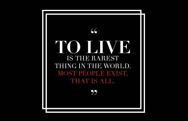
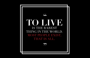 The first concept is simple and clean. I wanted the view to fully understand the meaning rather than be shown actual visuals. I decided to emphasize ” to live ” so it would catch our attention first and than lead on to read the rest. Also I chose to put outlines around the quote so it would just same as floating in the middle and to not just keep it black and white, I decided to emphasize the last words in red, so the viewer can really take it all in.
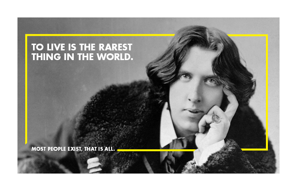
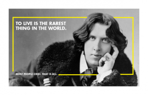 My second concept was to focus on the details. I wanted to showcase the author in a way that wasn’t to overwhelming. So I kept his picture small and with white border to keep the eyes focused on the center. Then I created a yellow border to make the viewer read from the top left and bring back around to the bottom left and author.The font used is Futura Bold because I wanted the quote to stand out from the black and white image.
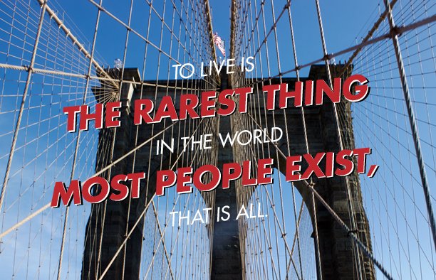
 In my final concept I wanted to showcase the quote itself in front of this photo of the Brooklyn Bridge, I took. I placed the quote in the center and kept the photo symmetrical , so from each corner you bought into the center of image. I used both Futura Heavy and Light oblique. I wanted to break up the quote into five lines each with three words to kept it balanced. The first, third, and fifth lines are light oblique and white to weigh out the heavy bold oblique. I wanted the second and fourth to stand out because I believe that those lines are the ones impact the viewer more and gets the meaning across. As well I layered those lines in three colors so it would seem to pop out. The quote and image come together well.