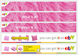
Animated gif banner ads have been the web standard for many years – made in photoshop. The ads are simple animations. The process often goes from drawing to photos and back to digital intermediate.
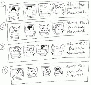
A basic 4 frame banner – uses a horizontal text hightlight animation. How would you add interactivity to this?
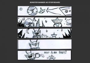
A 5- frame banner ad “alien pit-stop”. How could this be more effective? What is motion arrows could help get this joke across?
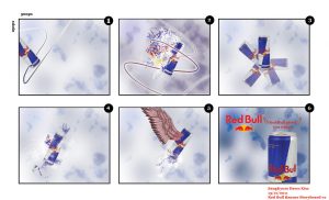
A Redbull concept storyboard. What is essential to successful execute this concept? What is the storyboarder banking on?
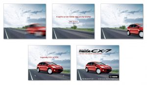
What does this ad need to be more effective at such a low frame count? What is counter-intuitive about this ad?
What visual technique is used here? How is interactivity achieved?
Does this story model apply to the ads above? If so how do each of them incorporate it?

