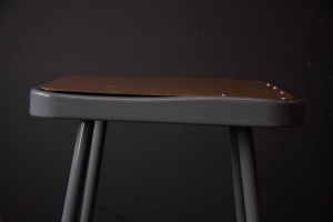
This photo below is what I believe to be my best photo because for one thing, the chair has an asymmetrical composition to it, making it please for the eye to see. It also follows a pattern from left to right. While there are no nails on the left, there are nails on the right. Finally, it follows a curved line, and has a strong sense of lighting, making it have a lot of negative space.
-
Recent Posts
Recent Comments
Categories
- Homework
- HW-Exhibit Review
- HW1-photo description
- Learning Logs
- LL1-The Thing Itself
- LL2-Composition
- LL3-Scavenger Hunt
- LL4-Depth of Field
- LL4-pattern, view point, rule of thirds
- LL5-Shutter Speed
- LL6-Lighting Direction
- LL7-Portrait Basics
- LL8-Portrait Lighting for Mood
- LL9-Painting with Light
- Uncategorized


