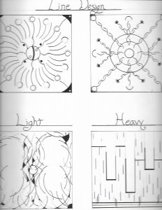
This was an awesome project were we had to use lines, in order to create a light or heavy feel to the four compositions. This project definitely tapped into my geometric and symmetrical style, so in many ways I could say it was another favorite of mine. The shapes and figures used were to give an effect of weight, I did not understand the concept until I started to create my composition and everything started to fall into place.
The visual effect of positive and negative space in the composition started to give life to my project. As I carefully constructed the shapes, I had to keep in mind that each category of light and heavy figures need to be catered to in the same manner of its titles.


