Category Archives: Uncategorized

Perspective City

iiiii

This was one of the most challenging projects, but I made it through. At time I wanted to give up and I doubted myself over the lack of perfection I m usually able to deliver but ART is not perfection…  ART is a constant learning process that only the strong can endure.

Perspective Chair

jjjjj

This project was cool, I was able to brush up on my object creation skills but this time we had to create object within a Box. This project taught me to stay in your designate area and also proportion  control.

Geometric Shapes

cal-graphic

This was one of my favorite projects I had to create this semester. I love working with geometric shapes as well as working with symmetrical shape or objects. This composition was similar to the Line Design project I created earlier in the semester, where I had to take lines and create a composition of symmetrical figures. I catered to this project with the same technique as the line design, showing light to heavy contrast as well as having a perfect balance of Negative and positive contrast.

Since I am use to creating works similar to this one, this was a perfect way to demonstrate my techniques.

Line Design

ooooo

This was an awesome project were we had to use lines, in order to create a light or heavy feel to the four compositions. This project definitely tapped into my geometric and symmetrical style, so in many ways I could say it was another favorite of mine. The shapes and figures used were to give an effect of weight, I did not understand the concept until I started to create my composition and everything started to fall into place.

The visual effect of positive and negative space in the composition started to give life to my project. As I carefully constructed the shapes, I had to keep in mind that each category of light and heavy figures need to be catered to in the same manner of its titles.

Color Blending

graphic-design-hw

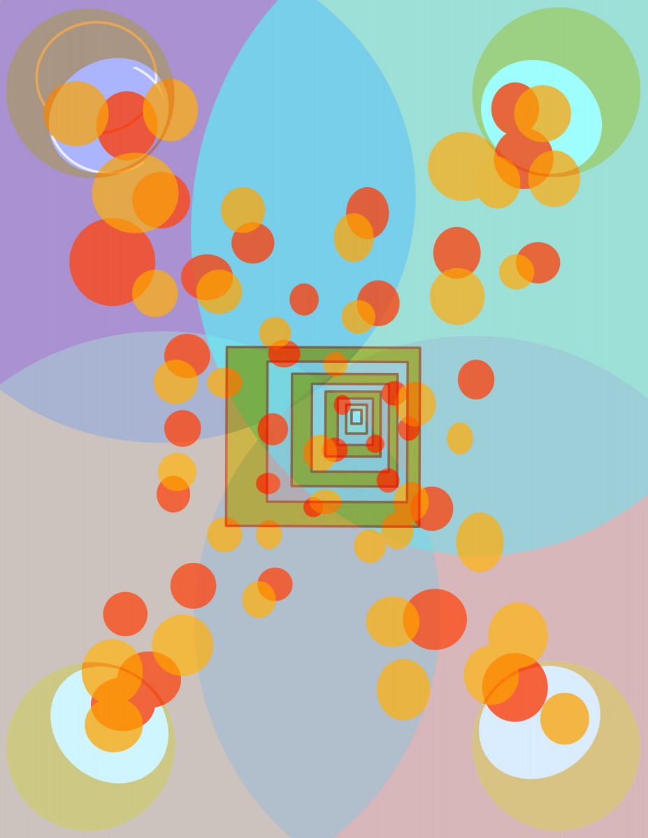
Well as you can see, I love shapes and symmetry so in this project we had to add color and play with shapes in order to create our compositions. This project was meant to be digital and I felt as if I did a good job. The over all shapes worked with my composition, the over lapping shapes have low opacity so the shape behind it can create or reflect a merged color combo.

The color pallet used were a medium  hues of blue, green and yellows. This composition was suppose to look like light gels, when combined with other low hue colors, the shapes would reflect a combined hue.graphic-design-hw