Category: DIGITAL MEDIA FOUNDATIONS
Categories
Gordan Park’s Photo

Parks produced a lengthy collection of portraits of New York jobs as part of the Standard Oil initiative. The images demonstrate his mastery of straightforward and truthful portraiture, as well as the period’s distinctive industrial geometry. They frame photographs of men and women constructing the city within the dark sweep of its most basic components, elegantly comparing individuals with the angles of bridges, beams, and houses and highlighting the rhythmic repetition of concrete pipes and steel girders.
Categories
Exhibit Blue Photos

Picasso (Buste de Femme) 1902, and Utagawa Yoshiharu (Large Elephant from a Foreign Country 1862) are the two pictures I have selected from the exhibit. Let’s start with Pablo Picasso’s first photograph. This picture I have chosen has been part of the Blue Era, a concept for Pablo Picasso’s works. These paintings, made in various shades of blue by Pablo Picasso, represent emotions such as instability, poverty and sorrow. This oil is a lithograph, which is made on a steel or metal plate with oil and water. Let us dive in this way forwards In the first it depicts a prison woman who evidently has a depressive emotion. I love how Pablo Picasso uses various colors and blue colours. You can really see the perspective of the lady’s head looking down, as it is so much in the portrait of the lady. By using a stance and the look of the woman, the portrait painting and blue j are really an expression of emotion
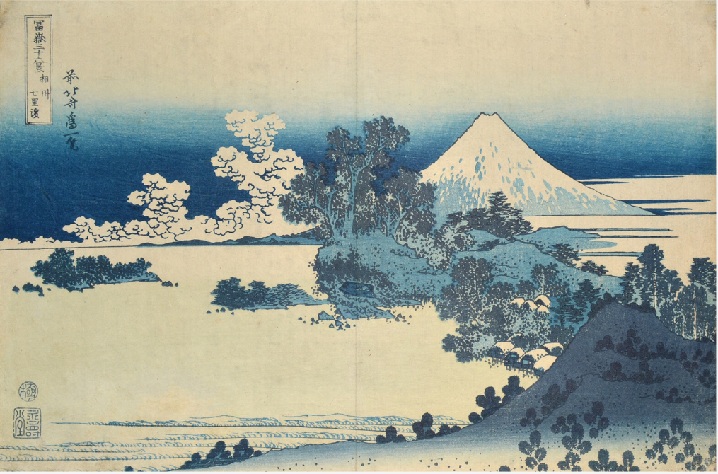
Going on to the second pic, I have chosen Katsushika Hokusai in Sagami, c. 1830 – 1834fromtheseries 36 Views of Mount Fuji, b. 1760 – 1834. This image was made by means of woodblock printing, a technique for printing text, pictures or patterns used mostly in East Asia and originating in China as textile and paper printing. It is precisely 14.5 cm. This print is 9.5 cm. This piece of art was designed to depict Mount Fuji and rendered in the composition of the work with Prussian Blue. Prussian blue is a dark blue dye made by ferrous ferrocyanide salts oxidation. The job was done in a smooth fashion. The texture and make-up of the work was overall incredible and very clean and elegant. I choose this work mainly because of the beauty and beauty of Katsushika Hokusai representing the active volcano of Japan Mt. Fuji. The way the blue changes and the colours are fluid and clean in general. I enjoy optimistic room overall and it also makes you concentrate on the picture of the mountain, the trees and clouds around.
1. The sound of the screaming babies in the French Supermarket Commercial was very distressing to me. It irritated me to hear the babies screaming in the advertisement. It ruined the whole Supermarket commercial, and it made no sense that the babies were screaming so loudly.
2. This commercial was a bit more than a typical ad because it focused on the shoes people wear, and we had a clear understanding of the overall message of this AD. For a sneaker business advertisement, it does get right to the point.
3. I assume the advert was successful and they want to highlight the underbody rather than the upper body because they want to sell sneakers, they want to get the viewer’s attention, and they want them to remember that this ad is just about shoes. The ad did an excellent job of getting straight to the point and making the audience want to buy some shoes. The supermarket was ineffective because of the whole kids thing going on in the background; it was distracting and made no sense.
My first research paper for Digital Foundation Media can be found here. I picked Shell as my logo history research paper.


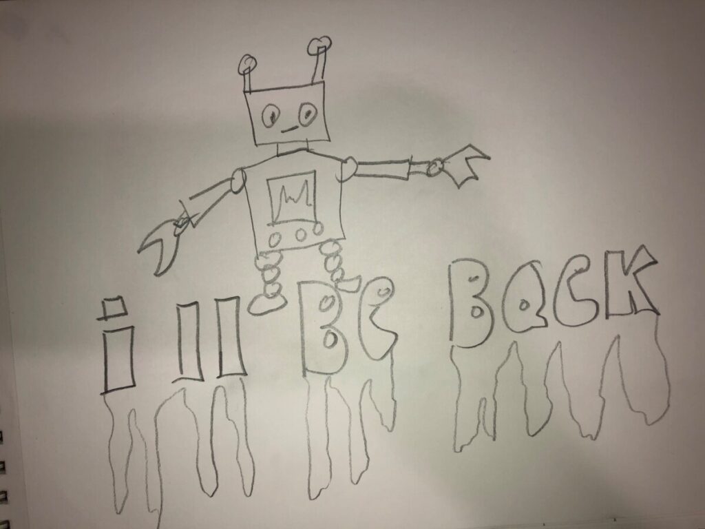
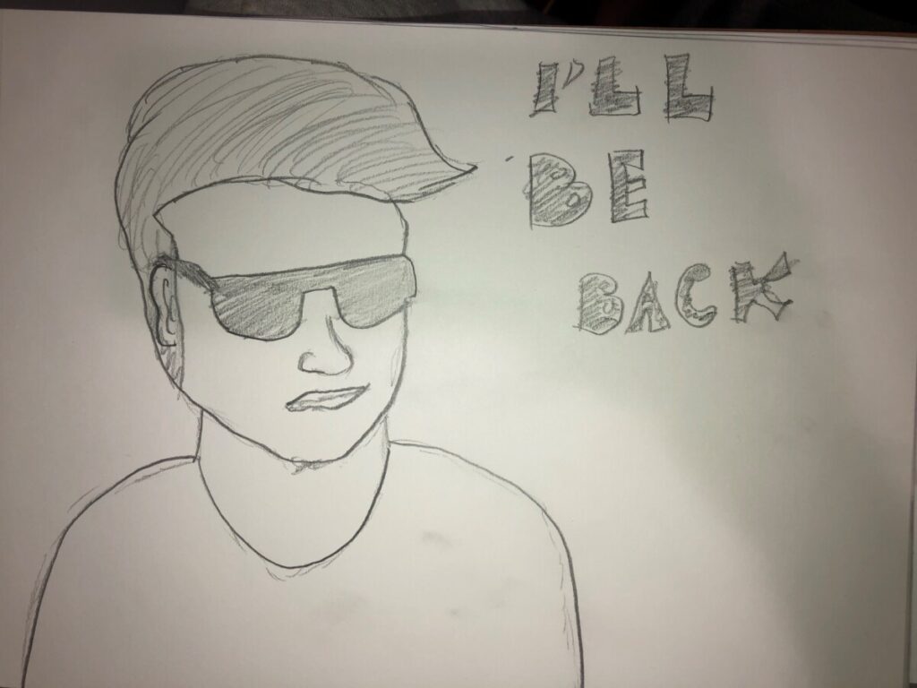
First and foremost, let me mention that the quote I choose is from the film The Terminator, and the actor who says the lines is known as Arnold Schwarzenegger. He’s a movie legend and one of my favorite stars of all time. I picked this quote for my Visual Quote design because the “I’ll be back” quote is one of my favorites. I created this drawing in Illustrator and had a great time doing it. I used Berlin Sans FB Demi Bold in 72 pt for this concept, and here is my Visual Quote Sketch.

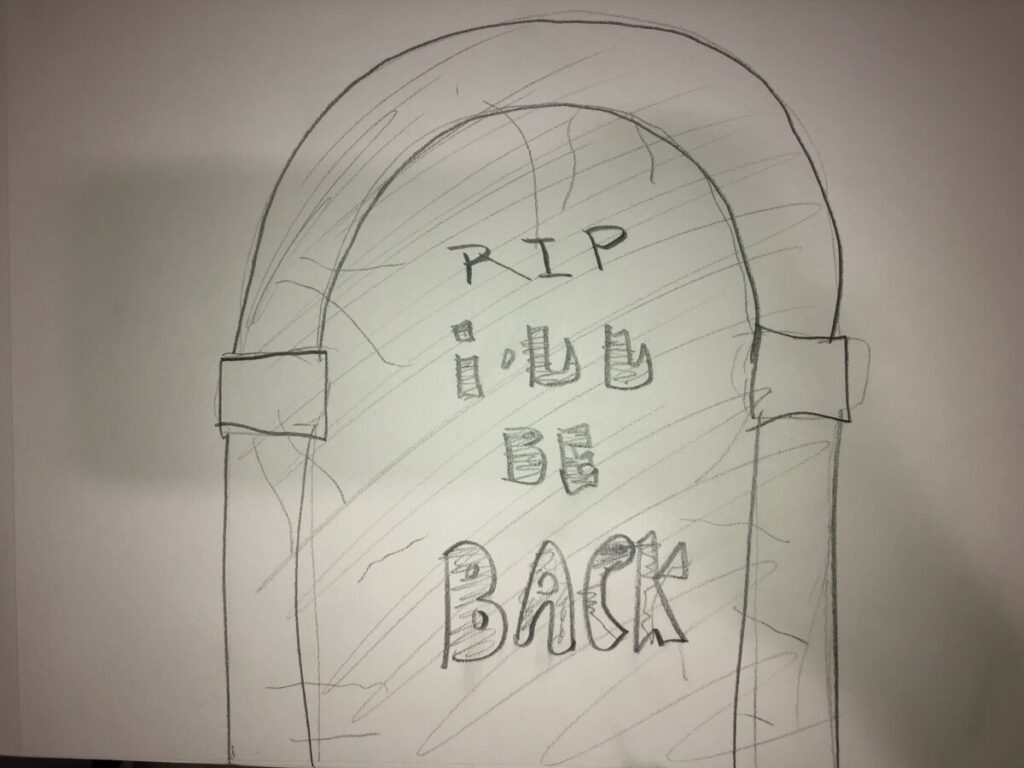
Moving on to my second Visual quote, the design I choose for this one is a gravestone since Arnold Schwarzenegger would return from the dead, even though it takes years. I really like how the style came out, and how the light brown and gray color scheme made it stand out even more. The typeface I used for this illustration was Engravers MT standard in 60 pt. The Sketch really inspired me to create a better illustration in Illustrator. My concept sketch is included below.
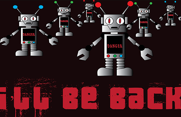
Finally, my final Visual Quote depicts a swarm of robots charging toward the human they were assigned to kill. This is my favorite design out of the three I’ve created for this project since creating the robots was so much fun, and I truly enjoyed myself doing this design. The typeface I used for this illustration is 3 theHard way RMXfenotype fenotype, with a weight of 60 points. On my drawing, I made the robot a bit too cheerful, which wasn’t what I was going for. Instead, I tried to make the robots look mean with a mean face, and I added the danger inside the robot to let anyone who sees this design realize that these robots aren’t good robots. Below you can view my sketch for this design.