Create a typographic composition that explains your designer to your classmates
Create structured layouts and elegant details for a typographic poster/broadside.
Use grids to organize content, build hierarchies, and generate visual elements.
Explore alignment, balance, grouping, color, type choice, and tension to hone your individual approach to typographic thinking.
Sketch 4 typographic posters
-
- sketch size: approx 5×7″
- use grid paper
-
- use your designer’s quote
- in the style of your designer
- asymmetrically balanced with clear hierarchy
text only
-
- emphasize must be on the quote
- designer’s name
- general location and/or date of the quote
1. Use the rule of thirds or the golden mean
Divide the frame into thirds or fifths, both horizontally and vertically.
Place the subject/key element at the intersection points of the lines.
Use your designer’s typefaces

2: Show clear hierarchy
Draw the viewer’s eye to the most important element of the composition.
Your quote is the “hero,” which words should you highlight?
Keep all variations to a minimum. If you make a change for emphasis, make it dramatic.
for an example, see: Plain Typography
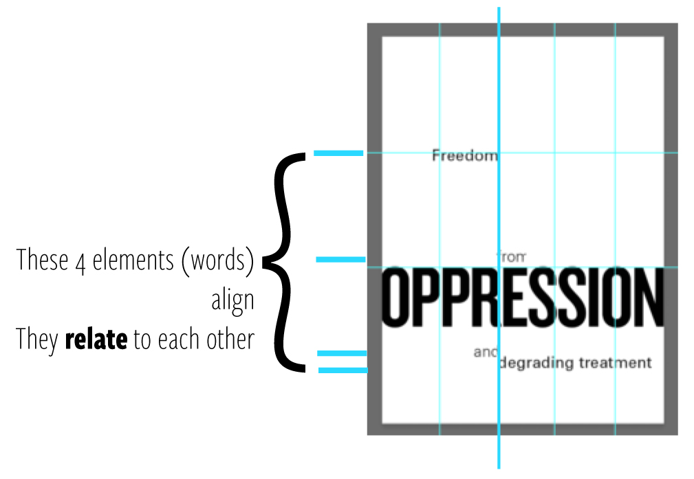
3. Use alignment to tie elements together
In the 1950s, designers in Switzerland reduced typography to minimal ingredients.
Josef Müller-Brockmann, Emil Ruder, and others used just a few sizes and weights of type to express meaning and hierarchy. They used space as an active element.
This Swiss methodology is still helpful today. Start a project with a single typeface.
Reference:
Use alignment to tie the elements together
Use grids to make wide and narrow columns


