goal: explore composition
Choose a well-designed letterform
Crop tightly to reveal elegant form and counter-form
results: figure ground composition
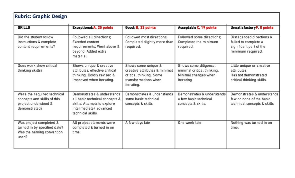
grading: see rubric at the bottom of this post
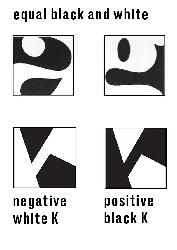
example:
Steps to completion
-
- sketch
- digitize
- compose positive and negative
- name
- upload
Process
step 1 Sketch: create figure-ground studies
-
- Choose a very bold non-decorative typeface (see example below)
- Work fast, and do NOT use a ruler
- You must use form, do NOT use line
process
-
- Crop one letter in a square to create an asymmetrical figure-ground composition • Use a thick black marker on tracing paper to draw shapes—NO LINES • squares should be about 2 inches • create 20 figure-ground compositions using 1 letterform
- Choose 2 sketches that show a figure-ground relationship.
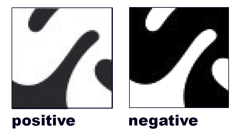
- Enlarge and refine. Create both the positive and negative version of each (see the examples below)
- Photograph all sketches and upload to a frame in Miro
- Also upload a screenshot of this assignment
criteria
-
- Use only 1 letter in a square
- Compositions must be asymmetrical
- Solid form only, not line or outline
- Marker
- Strike a balance between positive and negative space (equal white and black in each square)
-
Examine the form and counter-form, (the positive and negative shapes) Isolate just enough of the letter to hint at its identity
- Use “well-designed” typefaces that show the designer’s concern for proportion.
-
No computer work!
resources
-
- Search for bold, dense fonts on Adobe or Google Fonts: https://fonts.google.com/?thickness=9&preview.size=57 Use the “thickness” category when searching
- Or use the text samples below
trace letters using your computer.
*It may help to enlarge the letterforms on your computer monitor and trace

letterforms
-
- Use letterforms with “mass” for more black area
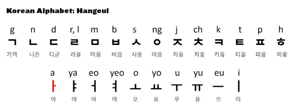
- Explore letters from other languages
step 2 Digitize
When you have a figure/ground sketch, recreate it as a 5 inch square in Illustrator
process
1. Photograph your sketch (keep it as straight as possible)
Keep your borders square and parallel
2. Open your photo in a 5 inch square in Illustrator
This is your first layer:
-
-
- (open layer palette from ” window”>in layer palette
- click the “hamburger in the palette’s top right corner to create a new layer)
- once the size and position are correct, Lock it in place. (object>selection>lock selection)
-
3. Create a second layer and add a 1-point rule to frame your square
4. Create a third layer and use the “type tool” to add the font and letter that you used for your sketch
5. Position your letter to match your sketch
-
-
- Adjust size and angle to match your sketch.
-
6. Save this composition as a layered pdf
7. Hide the sketch and refine your composition
Adjust it (twist, resize, but do NOT change the original proportion!!!)
You should have equal amounts of white and black.
Criteria
-
-
- square format?
- use shape and form, not line?
- equal amounts of black and white?
- does it demonstrate a figure-ground principle? (does the eye shift back and forth between
-
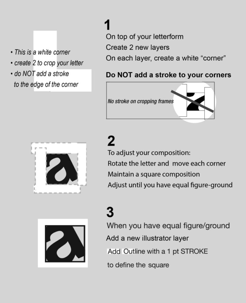
***Trick: remember how we used white rectangles to crop our compositions?
- Create white horizontal and vertical rectangles.
- Use “cropping frames” to refine your composition and create a figure/ground study.
use white rectangles in illustrator to crop your compositions
step 3. Compose positive and negative
1. Once completed, create a negative version.
A negative version is exactly the same except that it uses the opposite color.
-
-
-
- What was black will be white, what was white will be black.
- The positive and negative versions MUST be exactly alike except it reverses color
- One way to do this is to “invert” your letterform in photoshop
- Select object > Image > Invert
-
-
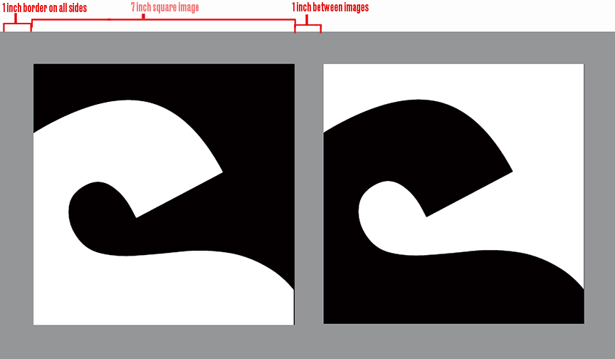
2. In illustrator, create a 7 x13″ file
Fill layer 1, with 50% black
On layer 2, horizontally place both positive and negative versions
Use a 1 inch border on all sides and and 1 inch between squares
3. Save as a layered pdf
4. When finished, save final version as a png
step 4. Name your file:
incorrect naming WILL affect your grade.
name: comd1200_F24_letterform_firstname lastname
example: comd1200_F24_letterform_amy smith
step 5. Upload your final composition to the Google Drive for grading.
All final projects must be correctly named and uploaded to the correct folder on Google Drive.
Rubric 