visual-quote-templatecdmg-1111_henriquezc_visual-quote
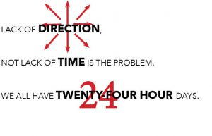
My last piece is the most simple. I bolded the most important words of the quote. i again worked with the arrows in the word “DIRECTION” and added the numerical version of “TWENTY-FOUR HOURS” to make the design just a little bit more interesting.
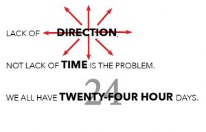
With this design I made the arrows go through “DIRECTION” more than before. I made the “24” through the words gray to bring attention to the boldness of the letters.

Here I removed the arrows from the word “DIRECTION” , I also made sure to change the numbers in the word “TIME” to add up to 24 hours.
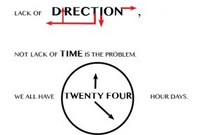
Here we have my revised version of this piece. The important words are a bit larger and in bold to show the significance. I have removed the clock around the “TIME” to simplify the design. I also changed the clock around the “TWENTY FOUR”to make it look more like a clock since there is a more round shape to it.
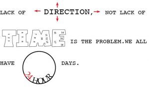
In this design I was going for more embellishment on the most important words of the quote. I worked with the arrows again in this piece and decided to make the “TIME” Bubble letters so i was able to add numbers inside the lettering.
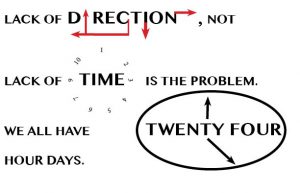
With this design i decided to visualize a sense of direction and time. I used arrows with the word “DIRECTION” to represent north, south, east, and west. The numbers around “TIME” are used to represent what a clock would look like.
