My quote is very simple for I’m a simple person. Laugh now, cry later by ice cube, who is a famous rapper known for his words. Since I wanted variety I decide to go with black and white as a first design, a picture of my self for a second design and third a color design. The reason I pick this quote was because I am a type of person who would always laugh now even though I’m sad or hurt and when left alone I will cry later.
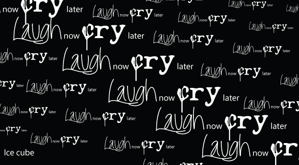
This first design focal point is diagonal from top left to the bottom right in the center of the text. The text is consisting in size with three different fronts. Then from both sides left and right the size beginnings to decrease to give off an effect towards the eye. The words are in white and the background is black because I felt this would be more of an impact then having the words in black and the background in white. My goal for this design is repetition with a little bit of alignment.
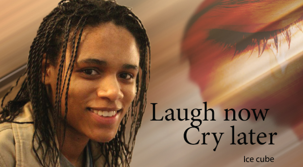
 The second design has two different images combined into one photo to create this image. The main is focus on my self as the laugh now, which was taken by friend Ronny who is a photographer and the second photo is of a girl’s eye close up crying, which was taken from the internet. (http://4.bp.blogspot.com/-BalsCvIzEZA/TgCAc71AVhI/AAAAAAAAAO8/x1SHLC1dTQI/s1600/cry.jpg). Since the main photo of me had a background, I didn’t want the focus to be away from me laughing so I blur the whole background diagonal going from top right to bottom left to give it a reflective look. To make the second picture to go with the design I use the smug tool and overlay it unto the first picture. Finally I place the text (front name) about 2 inches from my smile, so laugh and my laugh are aligned. This design is of a warm color to give the cry later a stronger impression.
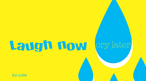
 Lastly this third design, which has a bright yellow and a light blue with white as a drop shadow for the blue. . For this design I incorporate the one-third rule to bring out the tear drop design on the right hand side. Why I choose these colors because I wanted complementary colors that give you more of a playful feeling. Since my second design was more of a welcoming and sad feeling, I wanted a little of the opposite for the last design.


