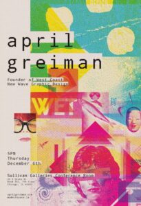
April Greiman
Christopher Cintron 12/20/2020
COMD 1112 Digital Media
American Designer and Trans-Media Artist April Greiman was born in New York, NY on March 22, 1948, and is known as One of The Best and First Designers to express Computer Technology as a Design Tool. April is not only my inspiration but she inspired the art world to use computer technology as a medium and style for art. April grew up in New York and went to the Kansas City Art Institute for Graphic Design then went to Allgemeine Kunstgewerbeschule in Basel, Switzerland for painting and design. But April’s upbringing and education weren’t the only things that April was inspired by her father was an early computer programmer, system analyst, Founder and President of Ventura Institute Of Technology, and her brother was a Meteorologist, so she was around computer technology and understood how it worked at a young age.
April Greiman’s design work was very new and unique for her time and was truly groundbreaking for the Art World. April’s style was truly remarkable and contained type layering, Shapes, Photos, Illustrations, and Color Swatches. April had a creative mind when it came to dealing with depth in her designs. She understood it very well and messed around with it a lot when layering. April Greiman Currently Works on many different projects such as Installations, Environmental Graphics, Special Projects, Branding, and Monographs. April has always had a close relationship with architecture and also worked with many architectures such as RoTo architects and Frank Gehry to produce signage. April Greiman after her college years went to LA and began MADE IN SPACE, While publishing her own projects she was also chair of a Visual Communications Programs From 1992-1994. April has a Website showcasing all her designs called Made in Space. https://www.madeinspace.la/
April Greiman’s website brings a very unique approach that blends Science, Technology, Color, Type, Image, and Space that gives her work personality and identity.
April Greiman, Insights: WET Magazine LA, 1979
https://www.pinterest.com/pin/314970567689237559/
In the Piece above April Greiman designed a poster for WET Magazine and she embraces her style perfectly. She uses the principles of design effectively while also using layering one of her greatest skills forward. April uses balance in the gird she uses for this design piece, She uses contrast in the photo layers and the negative/positive space the photos create, April uses Emphasis in the poster with some layers expressing a lot of color and shape so much that it pulls your eye, April uses unity while having white blank spaces in the piece it still feels whole by the way she organizes her type and photos. Lastly, April uses movement and rhythm pulling the eye toward certain parts of the poster.


