Christopher Brunson
Graphic Communication
Pepsi-Cola Logo Evolution
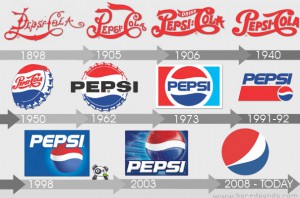
The well known company I decided to write about for this assignment is The Pepsi-Cola Company’s logo. Once called ‘Brad’s drink’, the beverage has been around since the early 1890’s and was established by a man named Caleb Bradham who, in 1898, rechristened his drink as Pepsi-Cola.
Throughout the years the Pepsi-Cola Company’s logo underwent several changes that were drastic and some familiar. Bradham’s first logo for the company was in script in 1898 and changed a bit in another revisions that included the small slogan “Drink”. Much later in 1950, a bottle cap logo from the company emerges it’s drastic change which includes the colors blue and white. This logo then followed a second revision in 1905 but kept it’s added colors into every new logo then afterwards. From 1973 into 2003, the company’s logo kept revisions of a boxed logo and similar font types for it’s name. As of today, the new logo simply has its iconed three-colored circle swirls as it resonates with everyone around the world.
Sources- http://www.boredpanda.com/21-logo-evolutions-pepsi-cola-apple-nike-nokia/
http://www.huffingtonpost.com/2012/12/28/pepsi-logo-timeline_n_2279676.html


