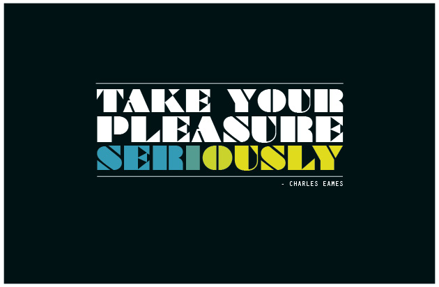
- Postcard 1
 In this postcard I portrayed Charles Eames character through the font because he used geometric shapes when he designed. The word seriously seems to change color from one end to the other this is to make the quote seem playful as well while still keeping a seriousness to it. The words in the quote are centered to create focus on it. the font colors are white and bright colors to create contrast with the background. The text is all aligned to create a solid area where the quote sits in.
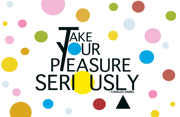
 - Postcard 2
 In Postcard 2 was inspired by the shapes and colors Charles Eames used in his designs. Primarily his 1953 Vitra hang it all coat rack, which has circles that are different sizes and colors. The black triangle makes the quote playful which is also a shape that was used by Charles and Ray Eames. I placed emphasis on the word seriously by making the it larger than the rest of the quote. The text is also in black because the other elements of the quote are in color. This helped create contrast in the quote. The letter T extends to connect with the letter Y because the word is take, I decided to use its meaning to “take” part of the Y and make it have a double meaning. I’ve also exchanged the letter o’s in the words “your” and “seriously” to make the circles be part of the text instead of just the surrounding.
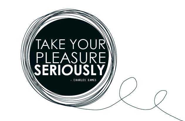
In this Postcard I decided to base it of of the first two to keep a relationship with the first two quotes. I kept one circle instead of many circles and made it black to contrast with the white font. I interpreted this quote to mean that what we feel is a passion of ours rather than work we should take it seriously and make something out of that to reach goals and dreams we have. The word seriously has an oblique o to contradict the word serious. The text here is alos aligned with each other to create an area that sits in the circle. The “take your pleasure” are in a regular type face while the word seriously is in a bold font to emphasize the word.
- Postcard 4
 In the last Post card i change the 3rd quote by replacing the swirls around it with triangles. The triangles were inspired by the 1st quote which has 1 black traingle this has plenty. It also has the same concept as the first one where the circles disperse and fall off the page. The triangles are closer together around the circle and become loose at as they disperse.


