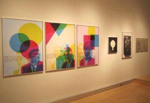
The exhibit at the AIGA (American Institute of Graphic Arts) We the designers reframing political issues in the Obama era was about the way graphic designers use design to express political issues and get messages across. This exhibition focused on the reactions that the 2008 elections caused when the first black president of the United States was elected. The exhibition at the AIGA had many interesting pieces that had all the elements that make apiece successful in getting a particular message out. The posters created a visual language that translated into text color and imagery.

Lucinda Hitchcock American, b. Japan 1961 Making Black 2011 Ink jet prints on archival paper 33×46 in each http://www.aiga.org/we-the-designers/
In Lucinda Hitchcock’s pieces titled Making Black she used cyan magenta yellow and key (black). This allowed us to see the overlapping areas with other images in it. Multiple images could be seen giving us multiple perspectives while looking at it. As well as giving us an insight how colors in print work. The imagery was controversial political figures in the past and present of world history. These figures were chosen to represent the different views the American public had on the election of Barack Obama our first black president. Where these colors overlap creating the color black, fragments of Obama’s face can be seen. This poster is effective in the way the imagery creates interesting forms and objects. The colors are bright and reference to color theory that designers use to produce print work. Teaching both their craft and pointing out the insecurities and thoughts of the American nation.

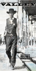
Daniel JasperAmerican, b. 1961The Uncanny Valley 2011Collage using George W. Bush eraNew York Times newspaper pages, gesso,screened prints32x65 in.http://www.northeastern.edu/wethedesigners/
The Uncanny Valley by Daniel Jasper Obama is seen as a lone wolf of western mythology. This was a topic as Obama has been described as being detached from the American public. Putting a mathematically correct image over a still of Gary Cooper from the film “High Noon” created the Obama in the poster. This was a representation of Obama having something unfamiliar and different that was hard to figure out without knowing the process. The image was printed on a New York Times newspaper, which gave it a rugged feel, and character to the image that it wouldn’t have had f it was printed on regular paper. The grays and blacks have an old feel to it as well as texture from the newspaper. The font they used was a slab serif that gave it an old American western feeling, which complimented the imagery. Because it was also a still from a movie the poster also had a look of a movie poster with the name being placed at the bottom like an actors name would.

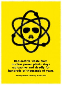
Mirko llicAmerican, b. Bosnia1956Daniel YoungAmerican, b. 1941Nuclear Energy2010Silkscreen printGlow in the dark ink22.5 x 30.25 inhttp://www.northeastern.edu/wethedesigners/
In the piece Nuclear Energy the whole piece is a bright yellow immediately grabbing the viewers attention. The contrast between the yellow and the black makes the type clear and legible. The sans serif font is bold and centered in the bottom of the page. The smaller text at the bottom gives the poster a serious look; the image of an atom that looks like a skull supports the message of radioactive waste. The image fills half the page making it the biggest part of the poster. Then is the text, which is bold, then the small text this configuration supports the type hierarchy and allows easy flow of the eye. Its simple and clear using only to contrasting colors black and yellow for impact and legibility. It goes from big to small allowing contrast within the text creating different weights. The print was printed in glow in the dark ink that allows it to be seen in the dark adding to the character of the subject as well as giving it a fun element that is well suited. The poster is also symmetrical making it balanced.


