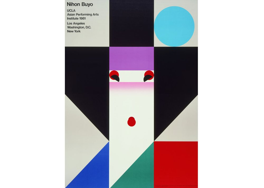
Nihon Buyo
Seminal Japanese graphic designer and Muji co-founder, Ikko Tanaka, made this poster in 1981. The artist was known for his experiments with blending Japanese traditional aesthetics with modernism, as seen here in the poster for the Nihon Buyo, a performance by the Asian Performing Arts Institute. Tanaka also designed works for large corporations such as Issey Miyake (a close friend) and Mazda. An expert in symbol play, the artist’s work was also displayed at the World Expo in 1985, and helped to redefine the world of graphic design.
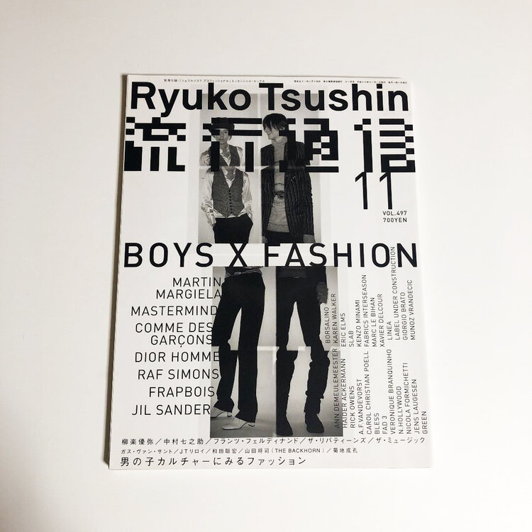
Ryuko Tsushin
Ryuko Tsushin – David Carson of Japan?!
THE 90s
Before music, my main obsession was fashion, namely avant garde and punk inspired high fashion. As a teenager, I worked 3 different after school jobs (making coffee, baby sitting and tutoring) to save enough to afford the labels I loved. I had a notebook where I’d record my earnings alongside a “wants list”. I worked hard and saved hard. My dream was to become a fashion illustrator so I practiced drawing religiously too.
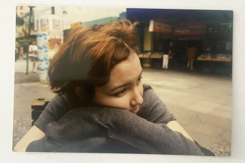
In retrospect, a 16 year old wearing head to toe Jean Paul Gautier and Comme des Garçons, sipping champagne at Zambesi parties must have come across as quite pretentious. But really I was just an obsessive weirdo doing my own thing without a care about how I was perceived. The appeal for me was genuinely the artistry and aesthetic of the garments. If anything, some of the vapid yet arrogant things about high fashion culture was why I moved away from it, and immersed myself in the music scene instead.
Around this time, my nana and aunt in Japan would regularly mail my favourite fashion magazines like Ginza and So-en to New Zealand. There was a huge stack of “Ryuko Tsushin” mags under the coffee table too – I think one of mum’s friends left them with us.
90S/EARLY 00S RYUKO TSUSHIN MAGAZINE + KAZUNARI HATTORI
“Ryuko” means “Trend” and “Tushin” means “Bulletin”. The final issue of Ryuko Tsushin fashion magazine was published in 2007
Looking back on these amazing fashion magazine covers, I think, “YES, that’s what the 1990s and early 2000s looked like”. A bit cyber punk, a bit grunge, somehow both minimalist and maximalist simultaneously.
There’s currently a bit of a resurgence in 90s style graphic design, and although some of these designs are super interesting in their own right, many are definitely more of a re-imagined version of the 90s/early 00s, rather than an accurate representation. That era wasn’t as chaotic and in your face for the sake of being chaotic as some of these interpretations would suggest. There was a harmony and subtlety in 90s design, even within the busier compositions. To me these Ryuko Tsushin cover designs sum up that vibe.
The Art Director for Ryuko Tsushin was award winning AD and GD, Kazunari Hattori. As a teen in the 80s, Kazunari dreamed of becoming an Illustrator, but upon learning about a job called “Graphic Designer” started following that path. He began his career in an agency before going freelance, and working on a wide range of iconic campaigns, including for Kewpie mayonnaise’ Kewpie Half.
https://www.behance.net/search/projects/?search=ryuko%20tsushin
Katsumi Komagata
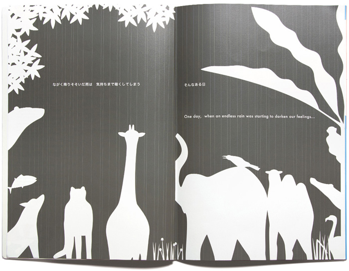
Katsumi Komagata was born in 1953 in Shizuoka, and studied Graphic Design at Nippon Design Centre. He founded One Stroke in 1986, which began as a graphic design studio and later expanded into children’s book publishing after the birth of his daughter. Katsumi is now world-renowned for his exquisitely crafted books.
In this post, Katsumi talks about his beautiful new picturebook about colour, ‘When the Sun Rises’, which is published by One Stroke, and for which Katsumi was awarded a Special Mention for Lifetime Achievement in the 2016 Bologna Ragazzi Awards.
Chris Wu
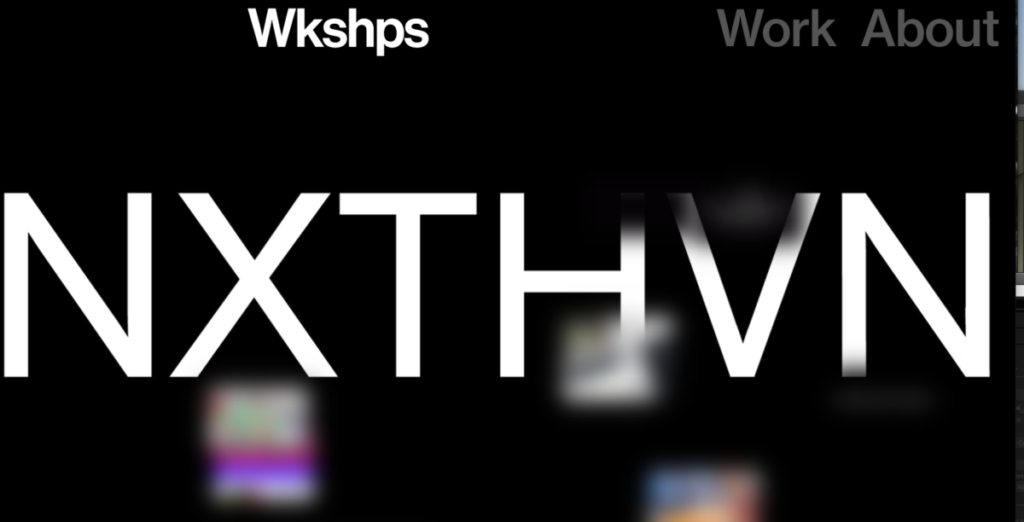
Chris Wu is a New York based art director and designer working in art direction, advertising, branding, and type design, creative communication, and graphic design.
Chris runs a design studio based in New York and Berlin called Wkshps.
DALeast
DALeast is a Chinese artist whose unusual paintings, which are sometimes hundreds of feet across, can look 3D and as if they were created out of thousands of tiny metal shards, but in fact they have been spray-painted onto a flat surface.
Background and Style
DALeast was born in Wuhan, China where he has been making art since he was three; ‘I worked on everything when I was in China – painting, sculpture, installations, synchronizing performance, and digital art. He studied Sculpture at the Institute of Fine Arts.
Animals are his main subject matter. His animals are typically depicted in two disconnected parts, often disintegrating at the center or falling away at the sides. Within every piece of DALeast’s art, a pop of color observed in the background brings his subject to life. This allows him to focus on the intricacy of his technique while delivering his final product. The use of fractured imagery and contrasting backgrounds serve to give his art a breath of energy and soul that can sometimes be lost in art with a more somber subject matter.

Choi Sulki and Choi Sung Min
Graphic designers working around Seoul, South Korea. They met at Yale University where they both earned their MFA degrees. After working as researchers at the Jan van Eyck Academie in Maastricht, they returned to Korea in 2005 to start their own practice. Since then, they have created graphic identities, promotional materials, publications and websites for many cultural institutions and individuals. From 2010 until 2013, they worked as graphic designers of the BMW Guggenheim Lab, an ambitious project jointly initiated by the Guggenheim Foundation and BMW, for which they designed an interactive identity system driven by online public participation.
Na Kim
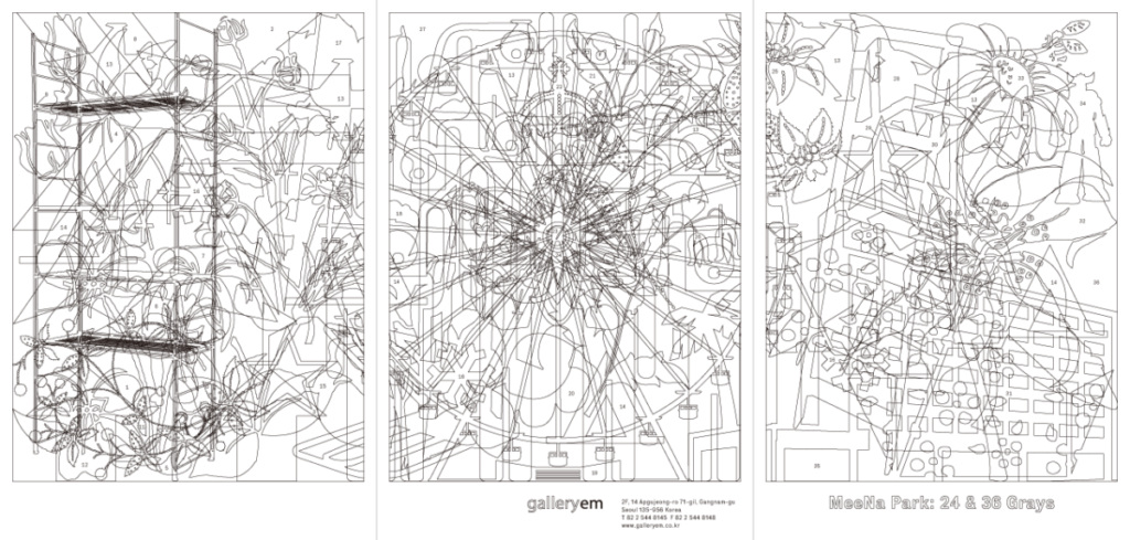
Na Kim is a graphic designer based in Seoul and Berlin. After studying product design and graphic design in Korea, Kim participated in Werkplaats Typografie in the Netherlands. Kim is currently running the collective platform, Table Union in Berlin. Na Kim’s design practice as a system engages without putting limits on the field of graphic design. Kim is taking a methodology to collect objects and events found in everyday life and rearrange them into new order and rules, and ultimately expand design literacy. Besides many other projects, she was responsible for the concept and design of GRAPHIC magazine from 2009 till 2011 and has initiated series of projects based on her monograph, SET since 2015. She has held solo exhibitions, such as Bottomless Bag (2020), Black and White (2019), Red, Yellow, Blue (2017), SET (2015), Choice Specimen (2014), Found Abstracts (2011), Fragile (2006). Besides, Kim has been a curator for Brno Biennale, Chaumont Festival, Seoul International Typography Biennale, and Fikra Graphic Design Biennial. Kim also worked on projects with COS, Hermès, ÅLAND, and many other clients, and Kim’s works been invited to international exhibitions at MMCA, SeMA, V&A, MoMA, Milan Triennale Museum, Die Neue Sammlung, etc. Na Kim has been a member of AGI since 2016.
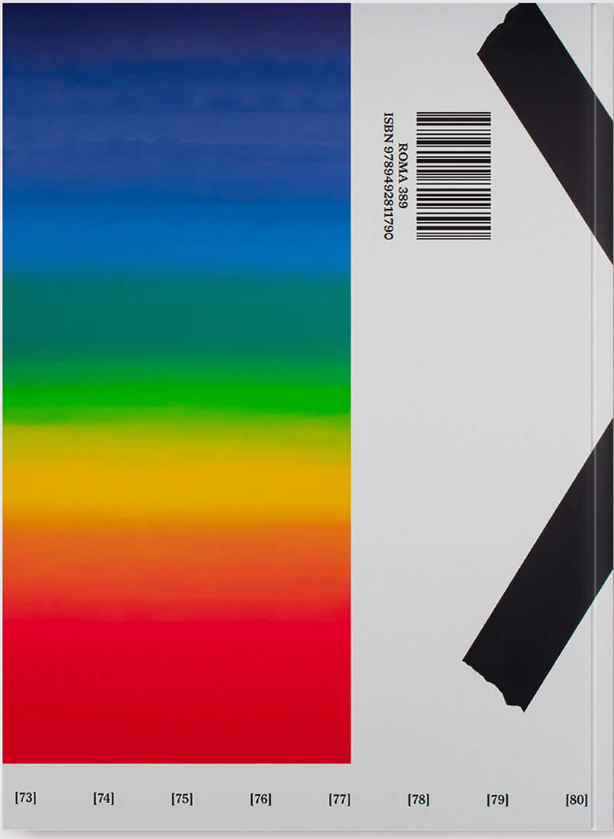
Sabum Byun
Co-Founder & Creative Director
Of the company PlusX
And motion designer based out of Korea
Jaewan Yu
Experience
2020 – Today. BRENDEN, Graphic Designer
2016 – 2020. NAVER, UI Designer
Featured
- Featured on Graphic Design—Behance.net
- Featured on Graphic Design—Behance.net
- 100 Daughters and 10 Mothers, part of the Typojanchi 2017: Mohm
- Across Borders exhibition, part of the Barcelona design week ’17
- CA Issue #230: Please Pay Attention Again, Published by CA Korea
- Featured on Behance.net
- Featured on Graphic Design—Behance.net
- Type Hybrid: Typography in Multilingual Design, Published by Victionary
- CA Issue #218: Please Pay Attention, Published by CA Korea
- People Who Speak by Their Works: Interview—W/C, Published by G Colon
http://cargocollective.com/jaewanyu
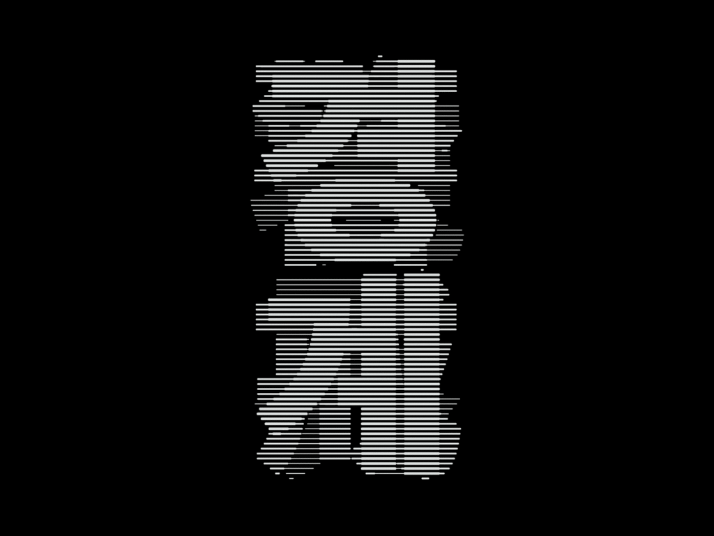
Cheolhong Kim
I am A graphic designer.
i love typography. most of My design skills are based on it.
i personally insist that design has to deliver something and the most efficient way to communicate is the letter itself.
with the conception of design, I cover most of the communication design field including Motion Graphic, Typography, Brand Design,
package design, editorial, poster, and so on.
My practice is clearly orienting to typography and
I pursue close collaboration with my clients for high-quality and impactful results.
