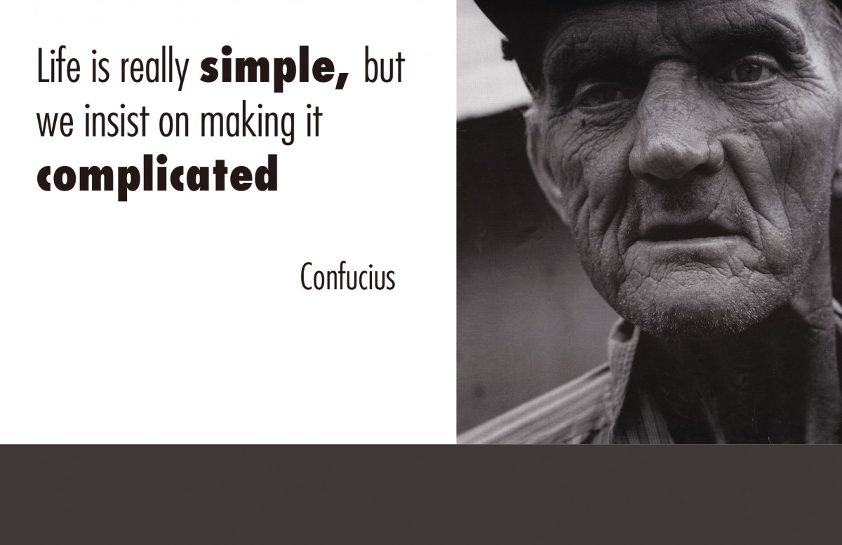
My quote is “Life is really simple, but we insist on making it complicated “by Confucius who was a philosopher of Chinese history. His philosophy emphasized on personal and governmental morality,etc. The reason why I pick this quote because we often got a thousand of solutions when run up against of difficulties, but we usually pick the hardest way. We like to make simple things complicated. This quote teaches us that sometimes when we encounter problems, we need to look at it at different angles, don’t push ourselves to a dead end.
For this first design, I decided to use a diagram to emphasize my concept. It is a simple triangle with Point A, B and C .In the triangle, we have two ways to reach the ending point A from the starting point B. The first way is directly from B to A which is a simple way. The second way is from point B topoint C then finally toward point A. This design also applied to the quote thatI choose. Don’t complicate things , sometime the simplest way is the best way.For the color, I pick the red in the middle to separating the left of dark and the right of lightbecause I want to give people a sense of contrast from the background. For the text, I chose Bradley Hand ITC as primary typeface because I wanted to show that it was personal, like handwriting and I also hightlight the two words which are simple and complicated to point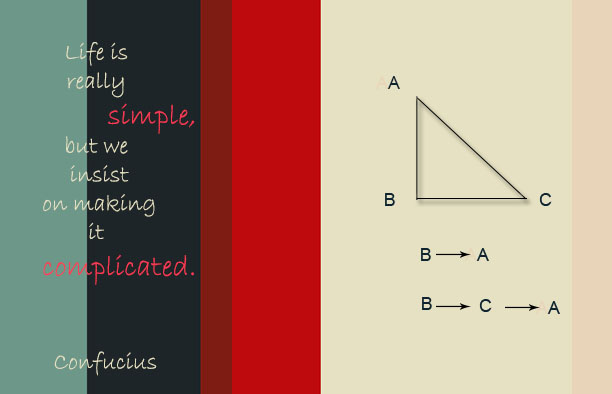 out the topic.
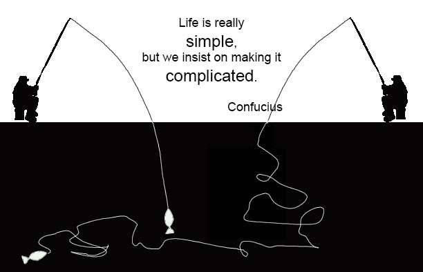
The second design focuses on comparison of the two fishermen whoe both catch fish but using different time and energies to again emphasize the quote that I choose. We often choose the harder way to solve problems and to reach our goals. In the left fishmen,I only use a simple line for the man to catch fish to show that he use a simple way to reach the goal. On the contrary, I use some messy curves to express the right fishmen who is spenting a large amount of time and energy to achieve goals which is the complicated way.For the major color of the, I choose the most contrast color which is black and white, because I think they represents simple and complicated.
In the third one, the photo that I use comes from the picture collection in mid manhattan library.And the text I use Futura Light.