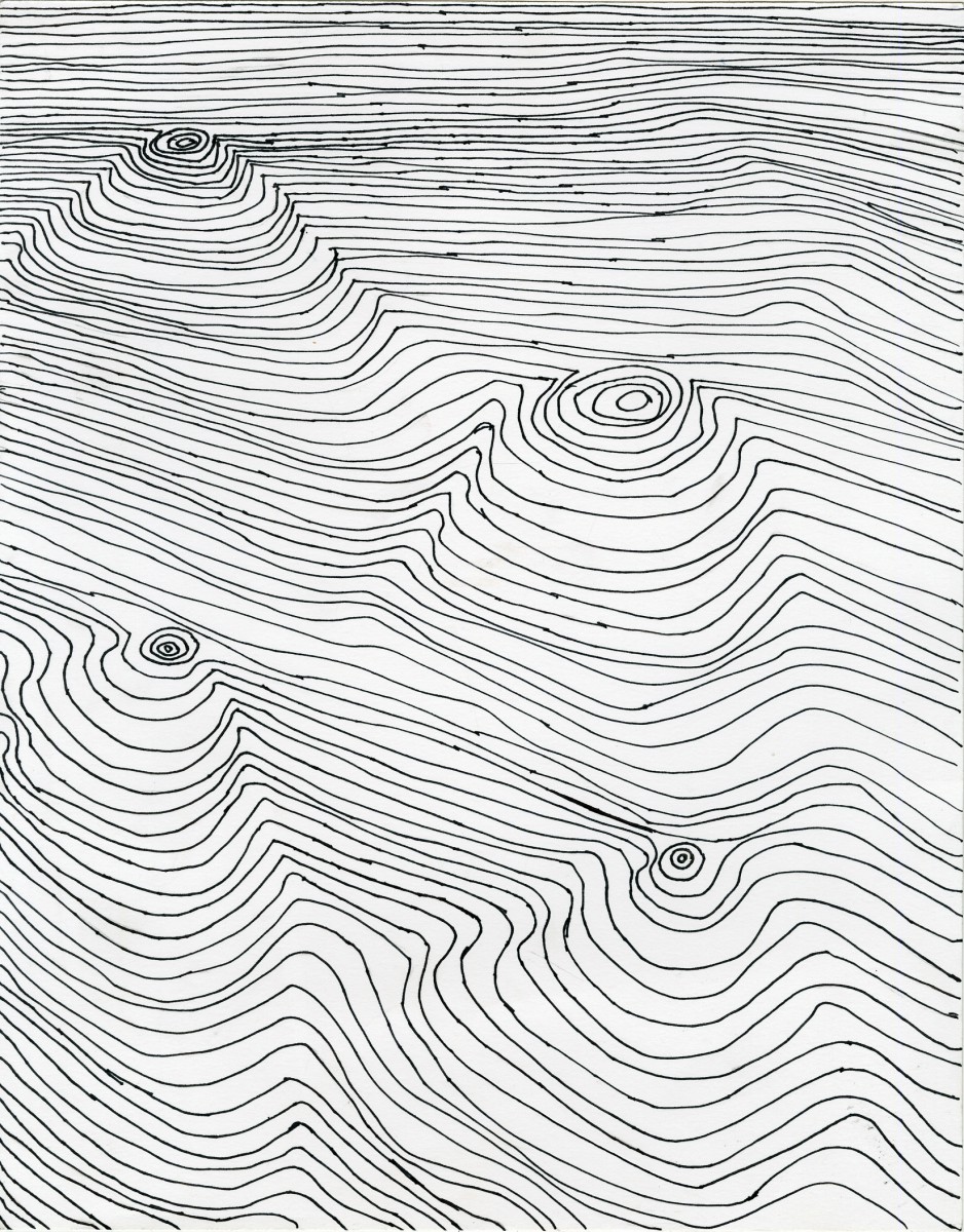
This is Project #1 in this course.
While preparing for project #1 “Project #1 Line/movement” the entire class had to create about 12 thumbnails that shows parallel lines with movement.This took me back to my 7th grade art class. Back then during a lesson we had to figure how to draw wood. Immediately when I read the requirements for Project #1 I knew I could use my past skills. At first I didn’t get the project but when i read it over so many times I understood it.
I wanted to do something that is seen a lot but my own. Instead of making so many circles I only did a few. What I did was I played around the space between each line. I started with little space between the lines. Towards the middle where the circles starts forming a drawing of parallel lines.I’m lucky enough to go with my first option which ended up working.
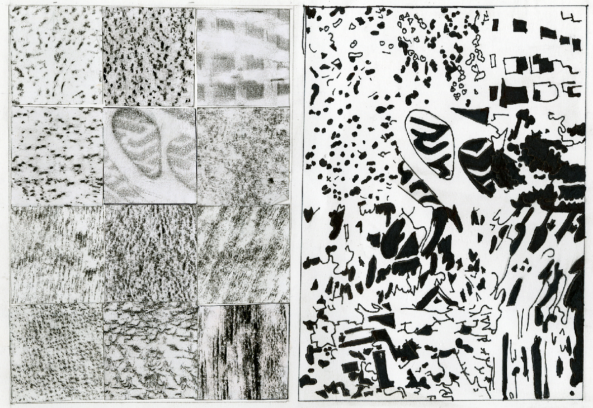
This is Project #3 in this course.
During the preparation of project #3 “TEXTURE/ FIGURE/GROUND, 50/50/b/w and PATTERN “ the class had to rub down anything and everything with a texture on it. The instructions on the assignment followed “ No letters, words or pictures or symbols such as arrows” The rubbings had to be done with only black crayon. From our 20 rubbings we had to pick and choose 12 to use for the final project. This project was one of the most confusing because the final project set up. The measurements around the art piece are 2.25’ on the vertical margin and 2.5’ from the top margin. Yes the measurements were in front of my face but I didn’t know what was what. This was the most difficult part for me to figure out due to the fact of my struggles with measurements. I learned a lot of new little things during this project. Depending on what pencil you use during the transfers with tracing paper you will get better results .This skill with tracing paper, become a daily thing for the other projects. Lastly but not least I had to chose what black and white figures I wanted to chose for my 50/50. The 50/50 rule was basically half black an half white within each texture.
Over all this was a fun and exciting project. I seriously didn’t realize what I was doing with preparing for this particular project.The results was nothing what I expected them to be. If I was to do anything different with Project #3 I would get better textures.
![]()
This is that last project “Mapping a shirt logo in Photoshop”
While doing this project I thought to myself “ How am i gonna start with my logo ?“ I’m not that experienced when it comes to illustrator. I have been attending another course Raster & Vector, which has given me knowledge of both: photoshop and illustrator.This project is a learning experience to place any type of logo on a shirt opened on photoshop.
On the assignment sheet that was given to the class, step by step were printed to make it clear and understandable. A logo with the individuals initials was asked for. I added hearts around my initials cause I found it a challenge making the heart shape on the program illustrator, but now I have got the hang of it. The only thing I struggled while working on this project was with was the last step on the assignment sheet and the logo making part on illustrator.

