Project Overview
This project consisted of two distinct parts, each designed to showcase our ability to conceptualize, develop, and execute brand identities and digital advertising campaigns.
Concept & Mood Board
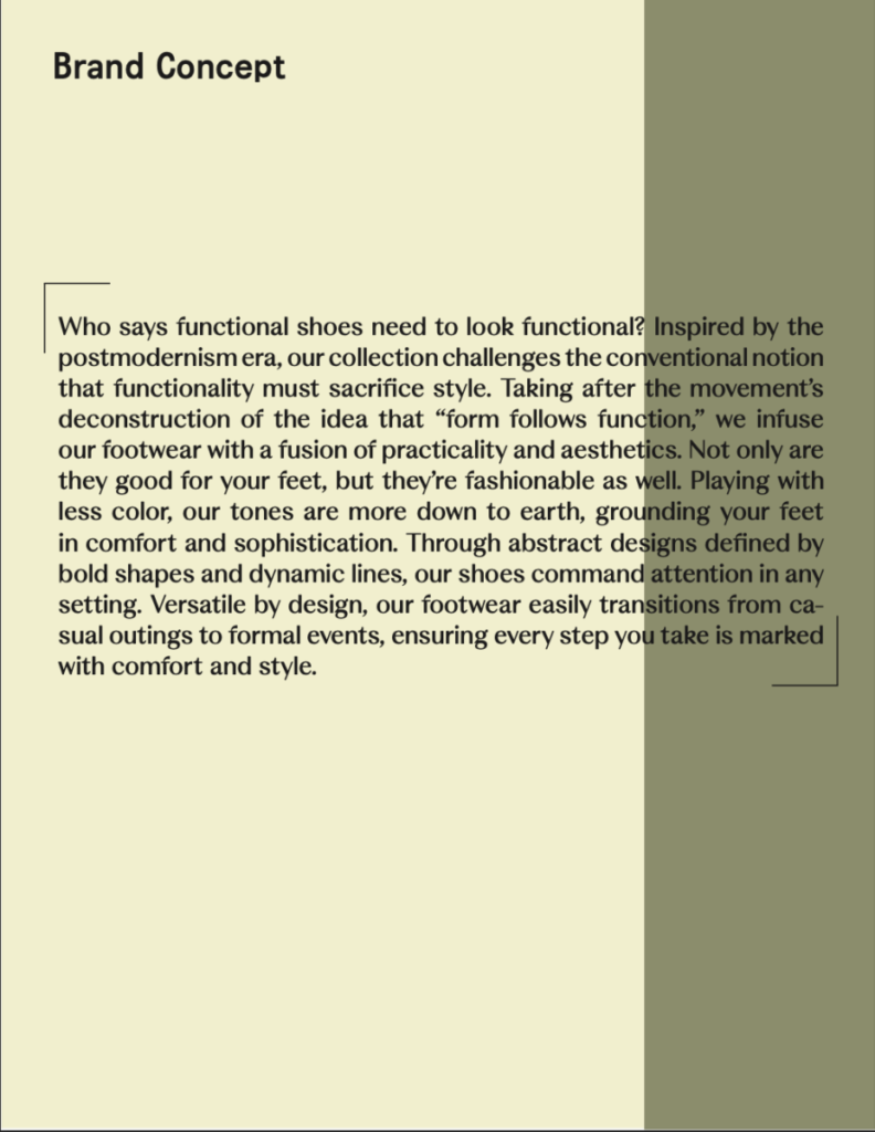
In the first part of the project, we were given complete creative freedom to invent and bring a fictional brand to life. This involved a comprehensive branding process. We started with an initial idea and developed it into a fully-fledged brand concept. This involved brainstorming sessions, market research, and identifying a target audience. We curated a moodboard to visually represent the brand’s aesthetic, including inspirations for colors, imagery, and overall feel.

Brand Wordmark
I designed a unique wordmark/logo that encapsulated the essence of the brand, ensuring it was versatile and aligned with the brand’s personality.

Typography Overview & Hierarchy
We established the typeface and typography for the brand, ensuring it complemented the brand’s overall aesthetic and was suitable for various applications.


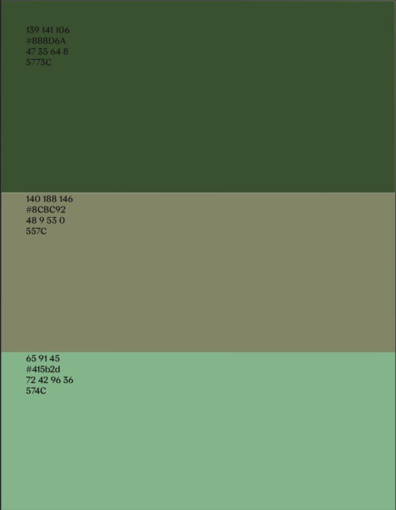
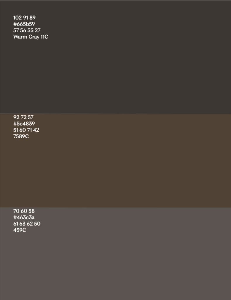
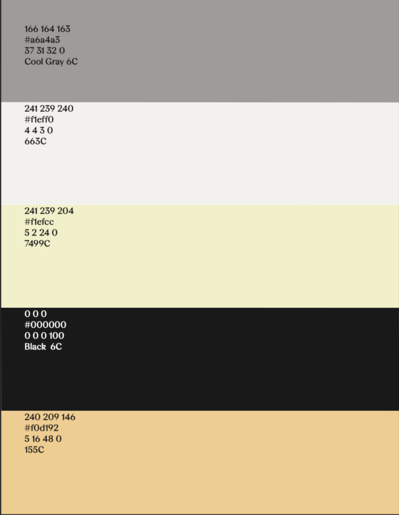
Color Palette + Hierarchy
We selected a color palette that conveyed the brand’s identity and created a color hierarchy to guide the use of colors across various brand materials.

Hero Images
Working in collaboration with a classmate, we produced hero images for each other’s brands. This collaboration involved AI generation, editing, and applying our design skills to create compelling visual narratives.

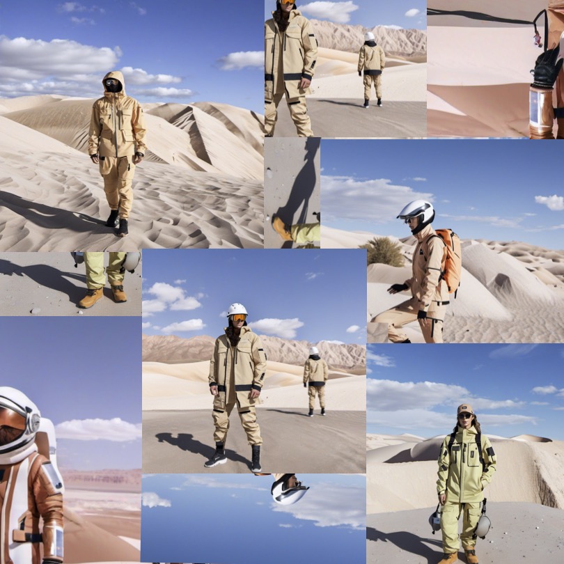
In the last 4 images, I showcased the overall concept of my client’s brand. Drawing inspiration from sci-fi and solarpunk references, as well as workwear and high fashion, the brand encapsulates a high-fashion, technical line designed for life on the
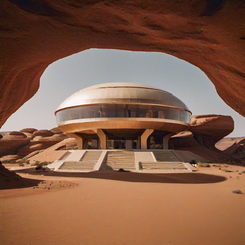


Martian surface in the not-too-distant future. These images highlight the innovative blend of practicality and style, merging futuristic elements with contemporary design to create a visually striking and conceptually cohesive brand identity.
Digital Adversiting for an Established Brand
For the second part of the project, we chose an existing brand created by one of our classmates and created a digital advertisement that adhered to the brand’s style guide.
Brand Selection & Style Guide Adherence
I selected Brew’d Black, a caffeinated tea brand known as an alternative to alcohol and other caffeinated drinks. I studied Brew’d Black’s style guide meticulously to ensure the advertisement was consistent with their established visual and verbal identity.
Ad Creation & Design Rationale
Using design software, I created a digital ad campaign that included visuals, copy, and layout. The ad was tailored to Brew’d Black’s target audience and marketing objectives. I provided a rationale for the design choices, explaining how they align with Brew’d Black’s values and goals.


