Category Archives: Academic Examples

Effective Behavior Poster

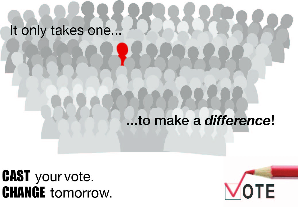
The Effective Behavior poster I created is a poster on the topic of voting. I wanted to target this poster towards young adults because once citizens reach the voting age of eighteen; they often do not register or participate in the voting experience. This is due to the fact that man people feel their vote doesnā€™t count or itā€™s a waste of time. I decide to use a crowd of people with one figure standing out, and the phrase ā€œIt only takes one to make a differenceā€ in order to relay the message that the reader can be that one person that becomes a tie breaker and that every vote counts. I also added the words ā€œCast your vote. Change tomorrowā€ so the young adults of today can feel that their vote can make a change.

Visual Quotes


This quote is a saying by Mahatma Ghandi. I chose to signify his work as a civil rights activist by putting extreme emphasis on the words ā€œLiveā€ and ā€œLearnā€. I also used these words as key points throughout the quote. The quote conveys the importance of living life, and gaining knowledge.

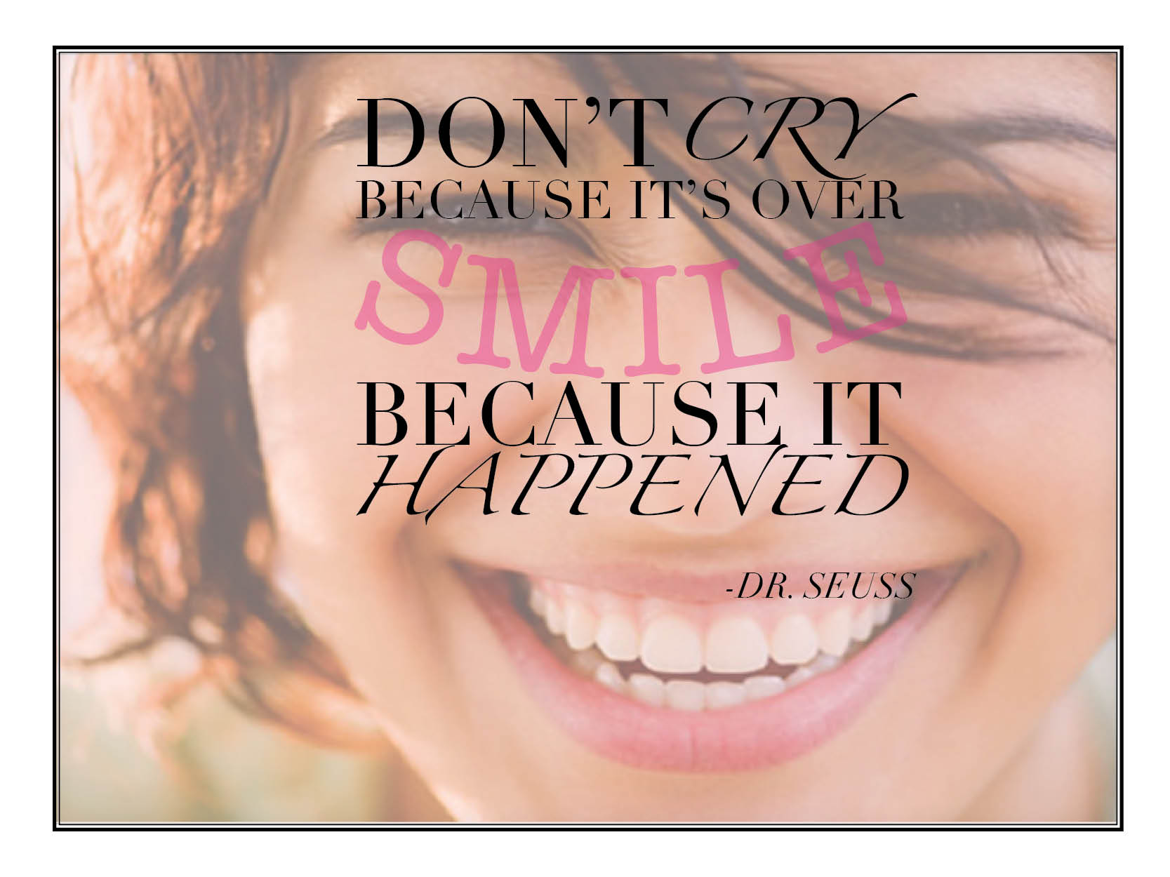
This quote is also by Dr. Seuss. To communicate the essence of smiling and happiness, I used the type on path tool in InDesign to shape the word smile into an arc. I also used a font with high contrast so the words would be more dominant than the visual, which is a backdrop of a woman smiling with a light layer of pink over her.

This quote is by Dr. Seuss and I believe this quote captures the whimsical part of nonsense and fantasy, with the funky display type. The picture of a pink sheep with a unicorn horn, and rainbow sky as a backdrop also add to the whimsical theme.


My Logo

The logo I designed for my e-portfolio is composed of a Japanese koi fish and text. I chose the Japanese koi fish because it represents strength and perseverance which I consider to be one of my many characteristics. I also have this image tattooed on my back so it resembles a part of me. I chose to color the fish with light hues of white, pale red and pale orange, because Iā€™m a light-hearted and gentle person. The text is in Trajan Pro because I like the elegancy of old-style typefaces. I also decided to color the box a light blue to resemble water. For the text, I used my first and middle name – not my last name ā€“ because I wanted to fill in the space of the box and my last name is too short for that.