Visually Enhanced Quotes
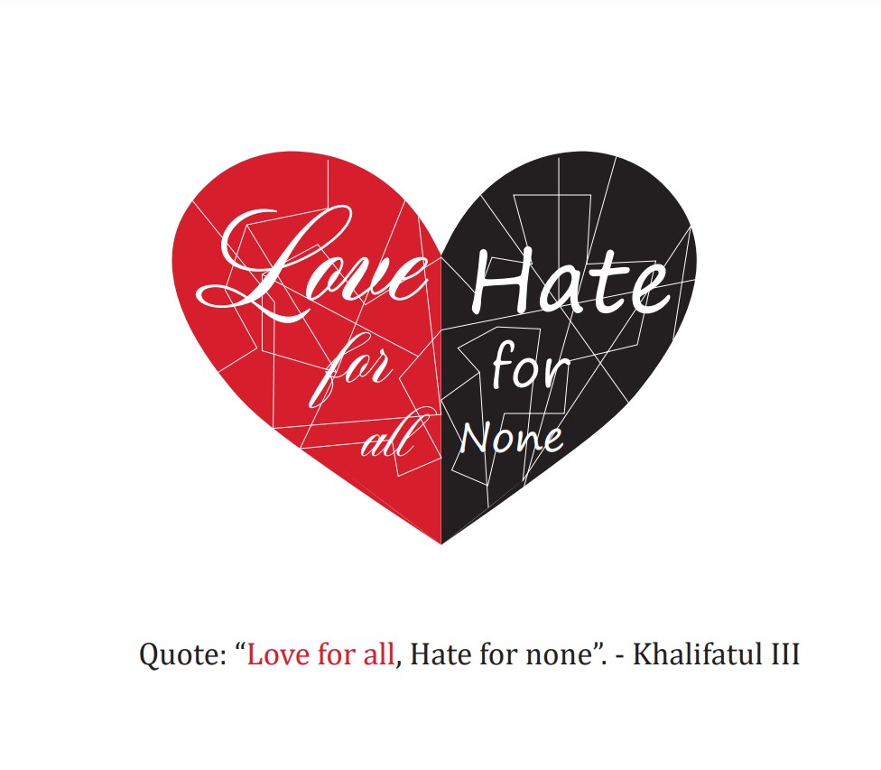
Explanation: I chose this quote because of its message. We should all spread love and not hate, since this world is full of bad people. Which is why I made a heart to show love but one side is red and the other side is black, meaning that even the hate can turn into love if everybody is willing to share their love with others

Explanation: In this logo I tried going for a heart that was shattered but healed back. I used red and black to contrast the love and the hate. I used a fancy typeface for love and more of a regular/basic typeface for hatred since it is something bad and dark. Lastly added a few lines with a 0.25 stroke in the back to give the idea of a shattered heart

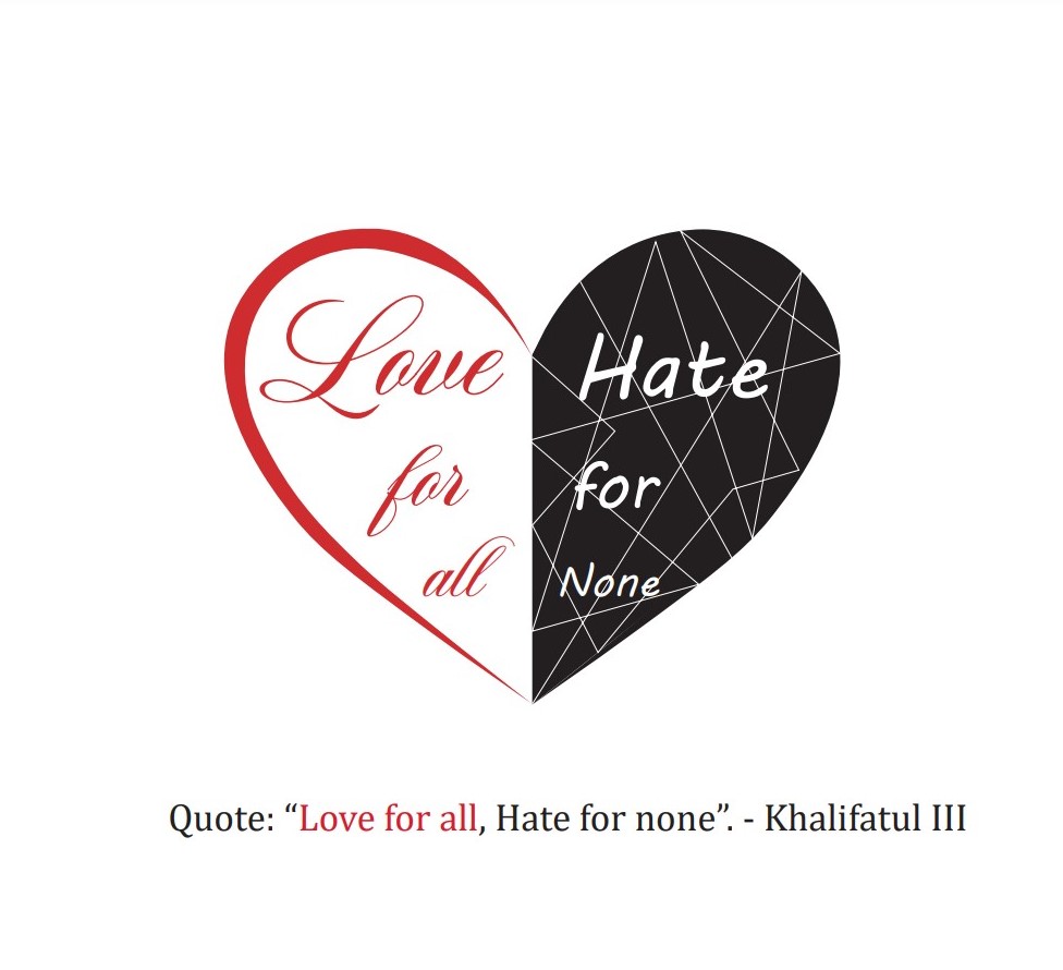
For this logo I decided to go for a shattered side of the heart which is the hate, to give the idea of how hate breaks everything apart. For the “Love” side of the heart I left it white to give the idea of love being a good thing, White is the opposite of black, just like love is the opposite of hate.
Personal Logo


