The video project was a easy assignment for me because I have been video editing for many years now. I am a 3D animator now but I still have to use Premiere to edit my animation when its finally finished. Music and fight sounds are what I add to the animation in Premiere.
The Nassau County Museum of Art is a museum that is actually a mansion from the 1900s. It is 3 stories tall and has an exhibition called Blue. The color blue is one of the most popular colors and appears across all art forms. Blue can tell a story and a feeling. Blue can mean night or it can mean cold. Blue also gives off emotions like sadness. This exhibition has artworks that use blue as the main color to tell their story.
Huxley’s Guide to Switzerland:

Huxley’s Guide to Switzerland is a painting done with acrylic on a canvas. The artist’s name is Christopher Winter. It is 35.5 x 27.5 inches and was made in 2011. I really love this piece of art. The most beautiful looking art out of all of them in my opinion. The color blue was masterfully used, especially for the mountains in the background. I love how the mountains go from light to dark. I do not understand the story behind it but it looks emotional. The two characters floating above the water is a beautiful sight.
Buddha Mind:

Buddha Mind is a 2019 artwork created by Bettina WitteVeen. It is on C-print and plexiglass. It is 22 x 22 inches. I think this is a very cool looking piece of art. It is not the most exciting piece of art but I like how powerful the blue is here. This piece kind of looks like that negative filter except it’s dominated by blue. I also like the white and how it looks like beams of light being held down by the buddha. Almost as if there’s a huge light behind it waiting to be released.
Beulen Birne [Blugly Pear]:

This artwork was made in 1934 on paper with gouache. The Dimensions are 8 ¼ x 8 ½ . I honestly really don’t like this artwork. It seems pretty boring to look at no offense to the artist. You know sometimes you see a piece of art in the museum and you don’t understand why it’s there? That’s how I feel right now looking at it. I think its the style of it that I don’t like.


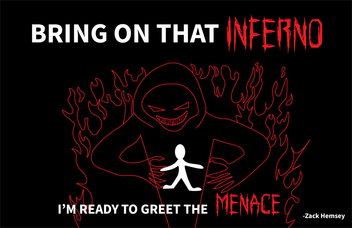
Greeting the Menace Visual Quote
For my visual quote I chose a lyric from Zack Hemseys “Greeting the Menace”. The song is about a man who did some horrible things in his past. As the years passed he began to change his ways for the better. But someone from the past comes to take revenge on him. One of the last lines in the song is “If this is what it takes to serve as my life’s penance, bring on that inferno i’m ready to greet the menace”. He’s saying that he’s ready to die for the acts he’s committed. For each design I wanted to have the guy who comes after him look like a demon of some sort. I did this because the way Zack describes the thing that comes after the main character is very scary and almost not human.


INDEX.HTML
<html>
<head>
<meta chrset=”utf-8″>
<title>Animation Text</title>
<link rel=”stylesheet” href=”style.css”>
</head>
<body>
<div class=”container”>
<span class=”text1″> Ariel Esposito</span>
<span class=”text2″>Animation</span>
</div>
</body>
STYLE.CSS
*{
padding: 0;
margin: 0;
font font-family: sans-serif;
}
body{
background: #000;
}
.container{
text-align: center;
position: absolute;
top:50%;
left:50%;
transform: translate(-50%,-50%);
width:100%;
}
.container span{
color: white;
text-transform: uppercase;
display: block;
}
.text1{
color: red;
font-size: 60px;
font font-weight: 700;
letter-spacing: 8px;
margin-bottom: 20px;
background: black;
position: relative;
animation: text 3s 1;
}
.text2{
font-size: 30px;
color: red;
}
@keyframes text{
0%{
color: black;
margin-bottom:-40px;
}
30%{
letter-spacing:25px;
margin-bottom: -40px;
}
85%{
letter-spacing: 8px;
margin-bottom: -40px;
}
}
https://www.youtube.com/watch?v=n7bw1ZbWyuc
This video has terrible quality because it has a max of 240 pixels which is bad for big screens. This video just hurts my eyes.


