
Aleksandr Cekalins
Professor Nicolau
Course Experience: The Analysis of the Experience of Visual Perception
When I first came to this class, I did not expect much to be learned. I expected mostly a history lesson on what kinds of art was made in the past centuries. I also expected it to be more of a take notes type of class instead of a hands on experience class. It was until the first day of class that I have realized that it’s completely different.
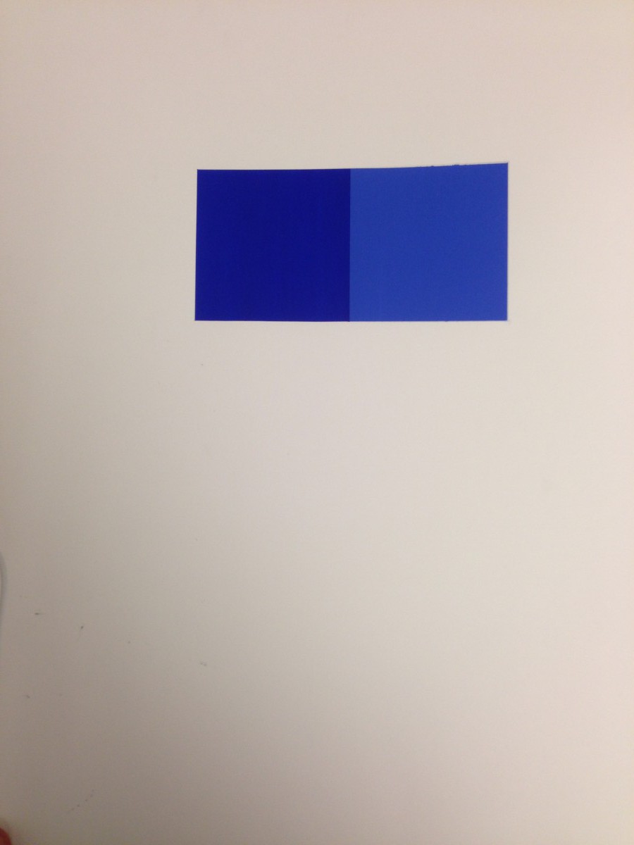
On the first day when we first came to class, we were given a vocabulary worksheet. We learned words like perspective and illusion. Later during the course, we took those words that we have learned and we started using it in the shapes that we drew. For example, most shapes had the same amount of space from top and sides, but sometimes a shape looked as though it was too far to one side than the other. There was an illusion created.
As class days passed by, we later started discussing many pieces of art that was created on magazines for advertising. We saw how many were unsuccessful or successful. We also saw how the colors of furniture has to flow with the rest of the room, or else it becomes too much of a vocal point in the room. As we learned from the magazines and our professor, if the ad doesn’t grab our attention to buy the object, it is considered unsuccessful.
What stuck with me the most for this class are two sayings. One of those sayings is “Less Is More.” It is true that when too many objects are in something, your eyes are everywhere but the local point. The other thing that stuck with me is that pictures should not look like they are falling off a page. It has to stand solid on the page, and not have your view on the whole page.
.

Aleksandr Cekalins
Graphic Design Principles
ADV1100

