Choose an image – it could be something you’ve found online or one you have taken. In a comment, add your image and write alt text that will allow someone to imagine the image without seeing it. The way you write the alt text may differ depending on the context of the image.
Author: Bree Zuckerman
Now that you have finished the module, you can practice what you have learned by taking this short quiz. Start with Question 1. You can navigate between the questions using the “Next” and “Back” buttons at the bottom of each question.
Enjoy!
Which of the examples below is the most optimal way to share a link to a course resource?
- Please read the following for our next class: https://accessibility.umn.edu/what-you-can-do/start-7-core-skills/links
- Please read this for our next class.
- Please read everything in the Links section of the Accessible U website.
Click to view the answer
3. Please read everything in the Links section of the Accessible U website.
This example illustrates the most accessible way to format the link. It includes context for the link, and describes what readers can expect.
The first example with the URL is not accessible for screen readers, which will read the entire URL text aloud. It is also harder to read and scan for sighted readers. The second example provides readers with no context for the link and where it will take them.
Pick one resource that you plan to assign. In a comment on this post, practice formatting it as a descriptive hyperlink, as you would on the final version of your O.E.R. In your comment, you can enclose the link text in brackets or quotes to indicate which part would be a link.
Tip: Use best practices, as described in the Make hyperlinks accessible section.
Click to view suggestions
A few effective examples of link formatting are:
Read: Video Captions Benefit Everyone, by Morton Ann Gernsbacher, in the journal “Policy insights from the behavioral and brain sciences.”
Read: Gernsbacher, Morton Ann. “Video Captions Benefit Everyone.” Policy insights from the behavioral and brain sciences vol. 2,1 (2015): 195-202.
Read: Gernsbacher, Morton Ann. “Video Captions Benefit Everyone.” Policy insights from the behavioral and brain sciences vol. 2,1 (2015): 195-202. [Full text]
Imagine you’re participating in a seminar and need to finish the assigned readings to prepare for the seminar discussion. You don’t have access to a computer and need to finish the readings on your phone.
You will need to read the page called “Quick Guide to OER for Teaching & Learning” on the OER program site. Using a mobile device, please go to the site, navigate to the page, scroll through, and read some of the content.
In a comment on this post, describe your experience navigating to these pages. Was it easy? Did you encounter any access or ease of use barriers? What would it be like completing the reading on your phone?
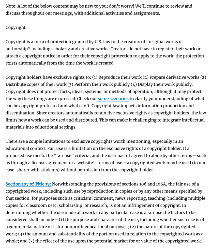
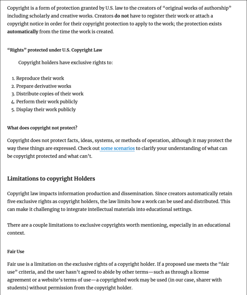
Review the images below and choose the one that you find the easiest to read and scan.
Click on each image for a larger view.
Click to view the explanation
The second example uses headings and chunking to break up the text.
Using headings creates a logical structure that helps readers scan a page to better understand where to focus their attention.
Breaking text and media in smaller sections (or “chunks”) makes scanning easier for users and can improve their ability to comprehend and remember information.
What is the best way to add headings to a Word doc or your OpenLab site?
- Change the text size.
- Make the text italicized or bold.
- Use the styles for headings included in MS Word or your OpenLab site’s page and post editor.
Click to view the answer
3. Use the styles for headings included in MS Word or your OpenLab site’s page and post editor.
Using headings styles is necessary for screen readers to properly navigate among different sections. It can also save you time by applying any style changes across all headings in your document.


