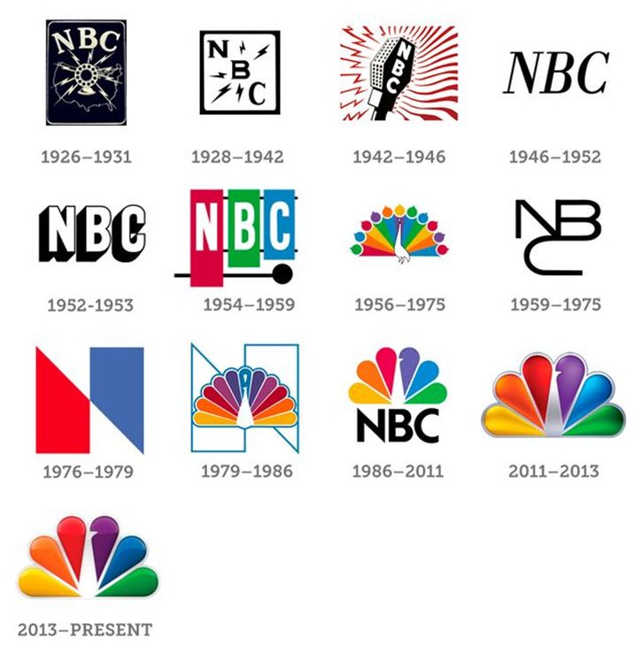
NBC Logo History
NBC stands for the National Broadcasting Company in which it was founded in 1926 by David Sarnoff. NBC is one of the oldest major broadcast networks in the United States. This company owns 13 popular television stations, plus an affiliate with another 200 stations.As of today, everyone knows the famous peacock logo, it took several years and around 9 different logos for NBC decided on one that really helped them with marketing.
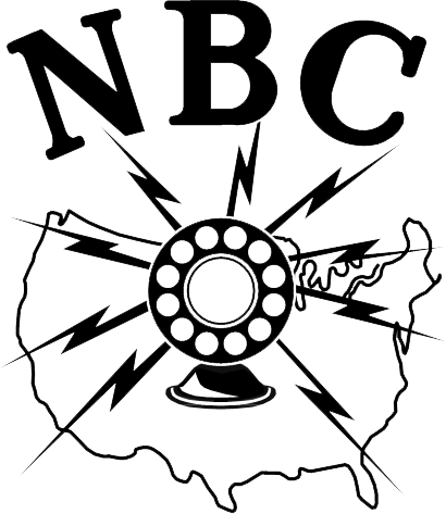
In the beginning, NBC didn’t have a logo but once visual branding became important to business branding, they had to create one. The early logo designs for NBC had a meaningful thought process behind it. During the 1930’s NBC dominated the radio network. The first logo represents how NBC was all about radio. The logo design was a radio microphone with lightning bolts and a US map outline
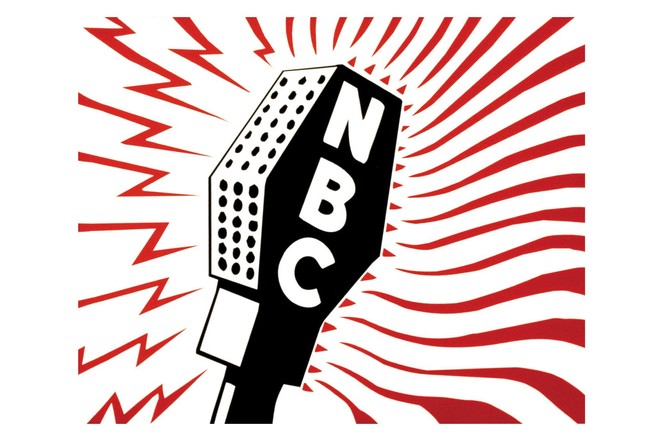
Another version of this design was made in 1943. This logo was more refined. The 1943 logo had a microphone surrounded by lightning bolts and waves. This wave represents radio networks and television networks. Another meaningful design was made in 1954. A stylized xylophone and mallet were introduced, symbolizing the NBC chimes.
NBC logo, 1954
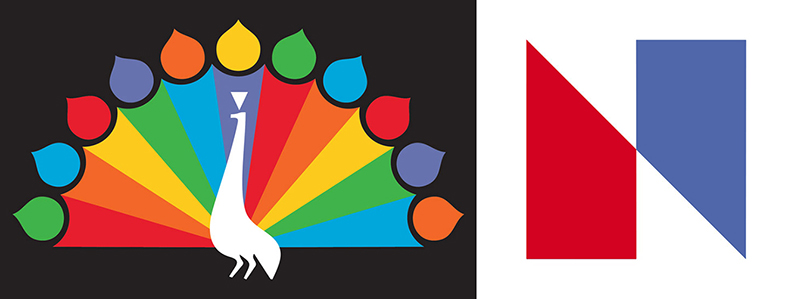
As the years went by, the evolution of people switching from radio to television was moving on. So NBC had to upgrade too. NBC was the first company to sell television with color. For people to buy more television sets, NBC came up with the peacock logo with a lot of colors for the viewers to get introduced to color technology. This peacock logo was created by John J.Graham, Herb Lubalin of Sudler, and Hennessy in 1956. The logo included 11 feathers with six colors, maroon, orange, yellow, green, blue, and violet. On top of the feathers, it had teardrop shapes to resemblance more actual peacock feathers. But this peacock logo didn’t last long in the air.
A logo that was very controversy was the 1976 logo, “ Trapezoid N ”. NBC paid $750,000 to have this logo designed by Lippincott and Margulies. But the logo was identical to the Nebraska ETV logo that NBC was sued by them. To keep the “N” logo NBC had to pay $855,000 to Nebraska ETV.
In 1986 the peacock logo came back more refined. This modern peacock was designed by Steff Geissbuhler of Chermayeff. Instead of having 11 different colors of feathers, it was reduced to 6 colors. The teardrops shapes were gone too. The “NBC” was under the logo with a Futura font.
Even though the NBC logo changes from a microphone design to a peacock, then to a “ snake logo”, then to an abstract N, the peacock logo found a way to come back to life. NBC stay with a simple and refine peacock logo with color because it helped NBC to stand as a leader in media technology. The colors on the peacock have a significant. Yellow for news, red for entertainment, orange for sports, blue for the network, purple for stations, and green for productions. The beak of the peacock is facing the right to signifying that the network is polling towards the future. This peacock logo is well recognized and“It is so successful because NBC has spent a long time building its brand. It is also popular and easy to recognize because of the bright colors and the distinctive look.”
Bibliography :
- Admin, Joe – LMW. “A Look at NBC’s Logo and the History behind It.” LogoMyWay Blog, 13 June 2017, blog.logomyway.com/nbc-logo-history-behind/.
- Clarke, Billy. “NBC Logo Design History and Evolution.” LogoRealm.com, 21 Feb. 2018, logorealm.com/nbc-logo/.
- “NBC.” Logopedia, logos.fandom.com/wiki/NBC.
- “a History of the NBC Logo.” Abagond, 14 Dec. 2017, abagond.wordpress.com/2017/12/12/a-history-of-the-nbc-logo/.
- Stark, Tony. “The NBC Logo.” Logaster, 6 Nov. 2018, www.logaster.com/blog/nbc-logo/.

