The class took a day to visit the Museum of the City of New York. During this field trip, we had to walk around all exhibits on each of the three floors of this Museum. While looking through these exhibitions, we have to choose three artworks from each exhibition. The report will be about the tree artwork you have chosen.
Once I enter the museum, one thing that caught my eyes was lights strings hanging down, right on the center of the entire wall. The first exhibition I went to was the “City of Workers, City of Struggle: How Labor Movements Changed New York”. This exhibition was based on how Labor organization had impacted New York and the struggled they had faced during serials years. Labor organizations had to fight to have equal pay, equal working rights for both women, men, and immigrants. One artwork I like from this exhibition was a sign, tributing to Mexicans workers.
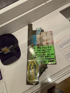
Reproduction of a sign in tribute to Mexican delivery workers, who were lost on 9/11
Since I’m Mexican, I can connect with this artwork. It has the Mexican flag and also it has the Virgen of Guadalupe ( Virgin Mary) placed on it. This sign was a tribute for the immigrants’ workers that lost their lives on 9/11. This is an effective workpiece because of its composition of the two main icons that, We Mexicans are most proud of. Even though the typography is almost unreadable, its bright neon green background helps it stand out more. This artwork is relevant to the exhibition because immigrants were treated poorly at work. Even to this day immigrants are still fighting for equal rights in labor.
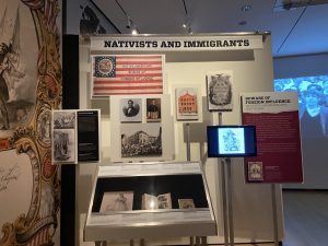
 Nativists and Immigrants
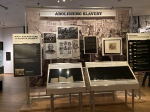
 Abolishing Slavery
These two artworks are in the “Activist New York: Ongoing” exhibition. This exhibition issued about social activism in New York City during the 17th century until the present day. these social activism issues range from civil rights, wages, sexual orientation, and religious freedom. These works are well-composed. I like how they have photos, art pieces, and audio arrange as a collage. Each new topic was color-coded which help out more the typography to be readable. The size was big enough to look at, even the typography was bold and big enough. This artwork is related to the exhibition because it shows the process and the main concept that the activists were fighting for.
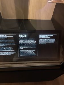
Lastly, the last exhibition I visited was the “NY AT ITS CORE: 400 years of NYC history”. This exhibition is based on the most important dates and the most talk about issues that NYC has lived through. Of course, 9/11 was one of the harsh days that NYC had to go through. Were NYC had lost more than 2,700 lives. The sign was the sign from the World Trade Center PATH STATION. In this exhibition, the room was dark with few protectors lighs going on the play. Since the walls were black, the typography was all in white. This is effective because black and white go together and white type is more readable with a black background. Like the first exhibition, I went to the artwork were sort into a collage composition. 9/11 will be remembered during NYC history forever and ever because it was one of the most impacting events that NYC had to suffer.

 9/11/2001

