My Academic Samples
In our Graphic communication class, we created a visual quote by taking a quote and creating a visual to express it. Guidelines we used to create our visual quote was to choose one quote and from that, create visuals using only Typography and pictures in and each one must be different.
The quote i decided to use and i thought would be appropriate for this project is
“A picture is worth a thousand words.”-Napoleon Bonaparte
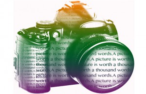
This is my first concept – When creating this one i thought a camera would best fit the beginning of the quote “A picture” the camera representing taking a picture and the text within the camera would represent “is worth a thousand words” because of the constant repetition of the words.
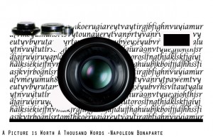
My Third concept is much like the first one but this is my final one. I took the idea of the camera being the picture and filled it with text very much appealing to the eye. I made this one cleaner and better to see and really understand what the quote means.
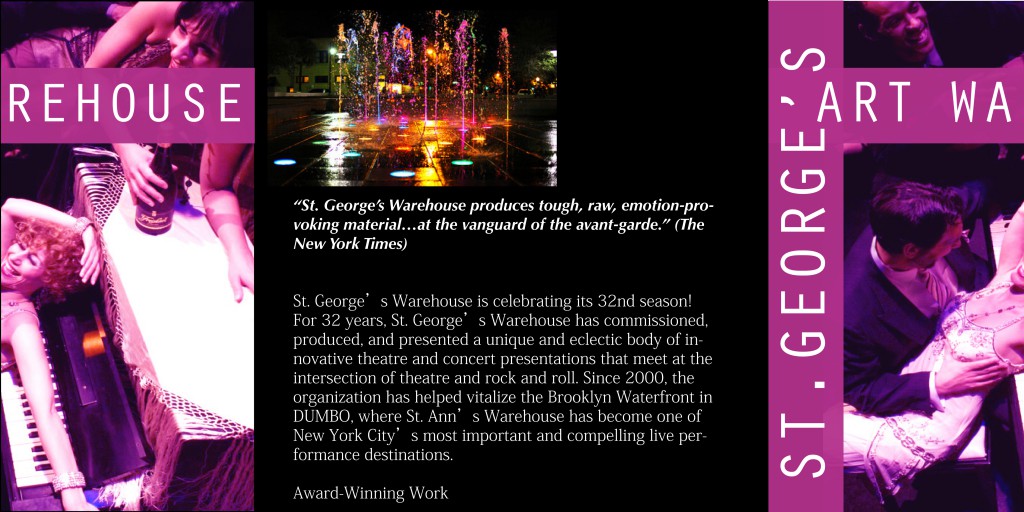
My WareHouse Brochure:
This in the front page and the middle is the back when folded you can really see how this Brochure is put together.
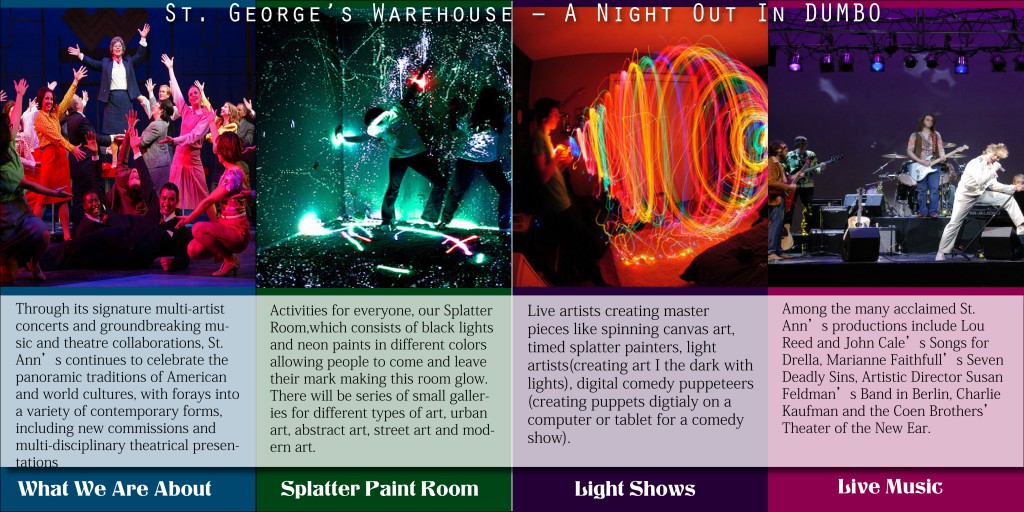
This is the inside page spread of the brochure-
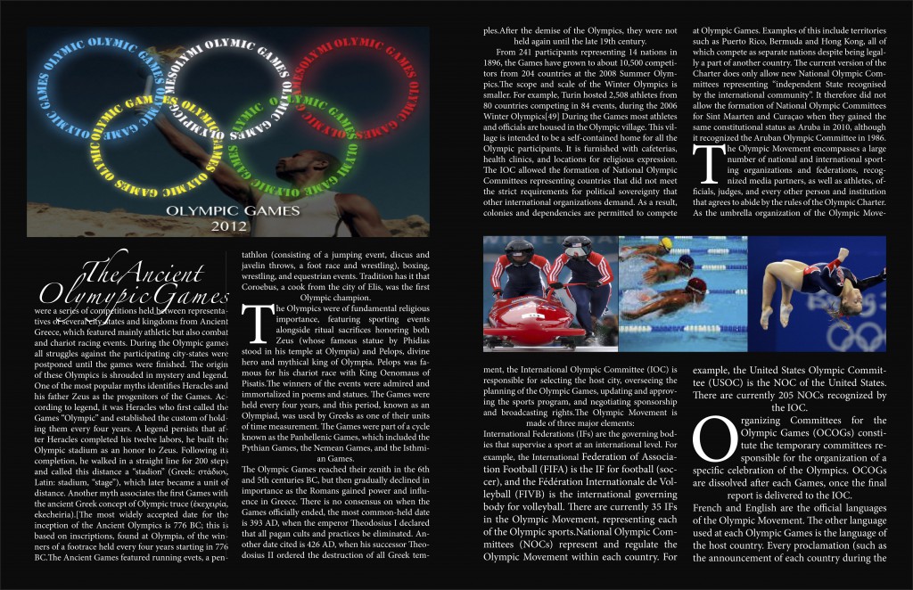
This one is an Olympics magazine spread-
This is a logo i created for a london magazine-
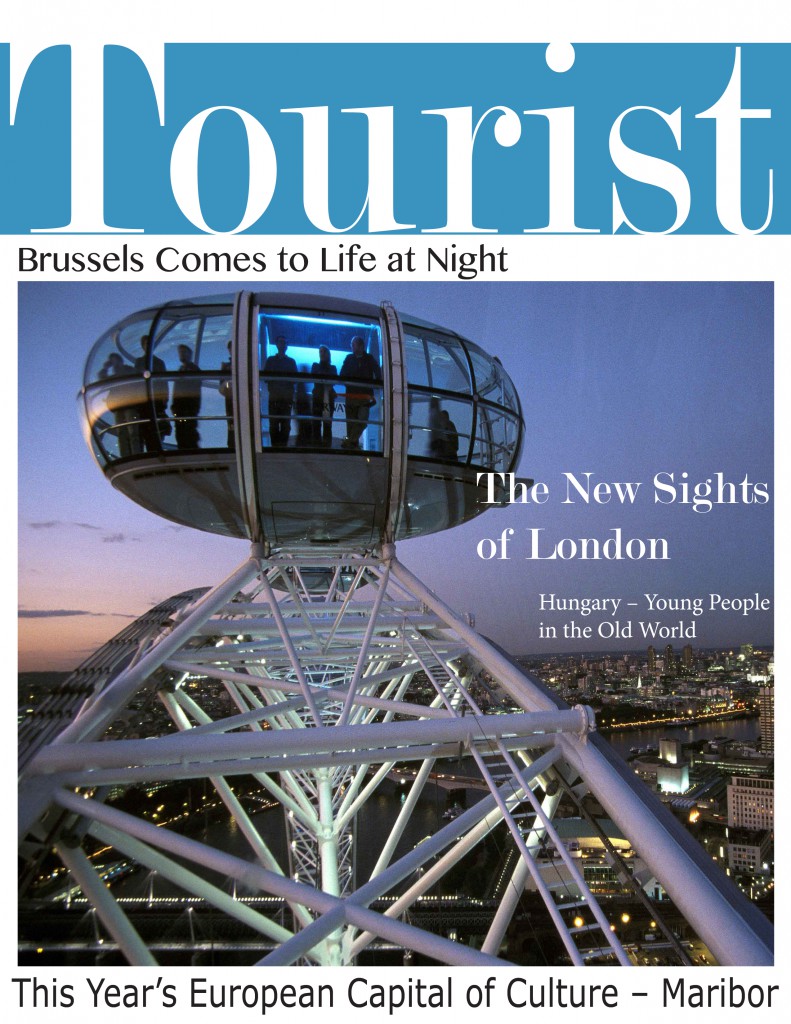
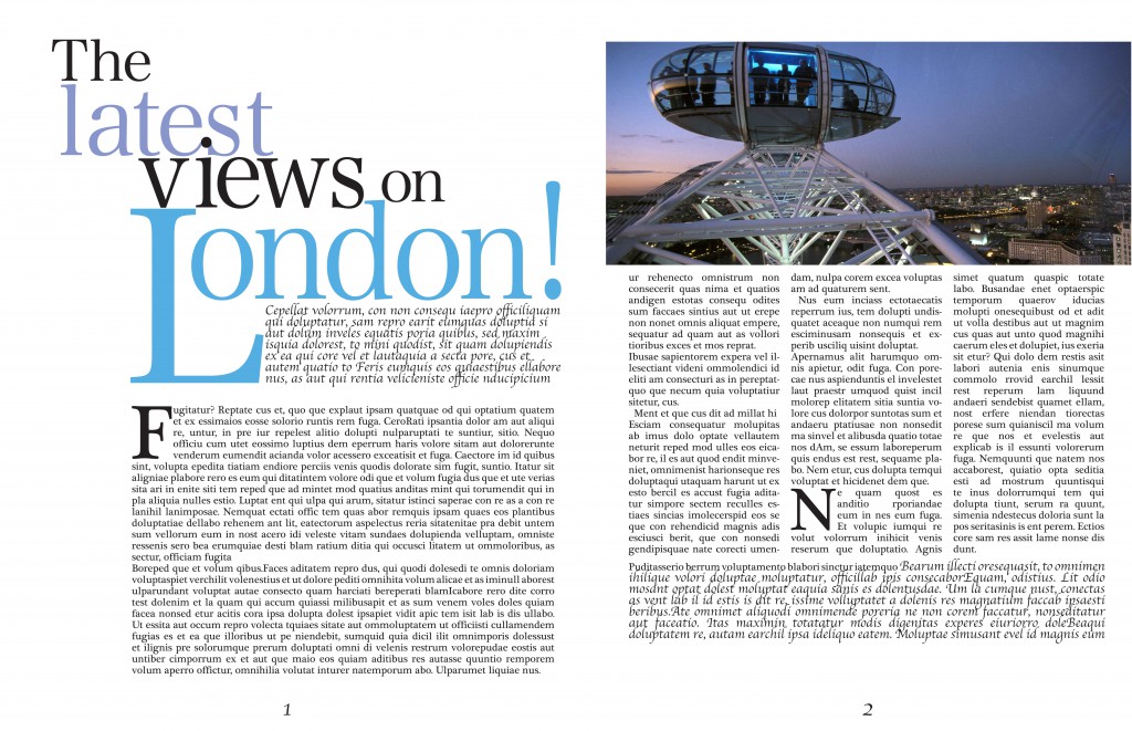
This is the Cover for a Tourist London magazine and the spread page-
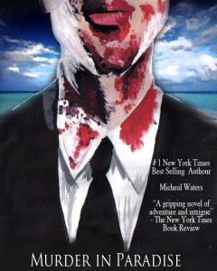
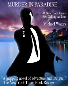
Two samples for a book called “Murder in Paradise”-
Book cover #1
Book cover #2
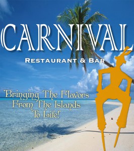
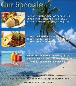
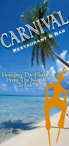
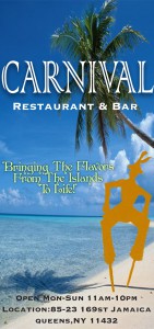
Carnival Restaurant flyer and Banners
This is the front of the Restaurant flyer –
This is the back of the flyer-
I also created two banners-

