This week, after meeting with my supervisor in a video call, I started looking into the Shop the Village campaign. I was basically creating the same deliverables for Shop the Village that I created for ITFC but this time I had a full branding deck that was created by a designer group that the company had hired. I had a late start to the project on the first day because I did not have all the assets needed to duplicate the look from the brand deck such as the typography they used and the svg for the created logo for the event. That was sorted out at the end of the day after my supervisor emailed the designer group for the assets.
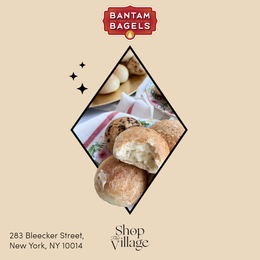
The first thing I started on for Shop the Village was the business promos, just like for ITFC. The company only just started to promote the event so there wasn’t many businesses that signed up. I started on a draft for the template which I created on Adobe XD. I tried to use elements from the logo to create the first draft for the promos because I thought that would give a more cohesive look to the campaign. However when I presented the draft for the promo, my supervisor rejected the idea because it looked too much like a flyer. They told me that I should just use large images since the most engaged posts on Instagram are just images and not too much text.
I was a little disheartened to have the draft rejected since I thought it was a good idea. However when I took her suggestion into consideration for the next draft, I realized that having a larger image made more of impact versus when I cropped the image to the shape of the logo. I decided to use the colors from the branding deck on the contact information at the bottom of the promos so that way it would work with the rest of the deliverables I would be creating in the future to match the campaign look. The other deliverables I worked on this week was just small edits to the Safe City Safe Streets promo package and the Hidden Charms of Chelsea tour flyer.


