Living in NYC as a Graphic Designer – Curse or Blessing?

Being a graphic designer living in NYC can be both a blessing and a curse. New York City is a wonderful place to pursue a graphic design career, we are surrounded by advertising every where you could imagine; the subway, parks, shopping districts etc. I love observing and criticizing all the advertisement surrounding me, it fuels me and inspires me.

google

The other day I was waiting for the subway A-line Brooklyn-bound as usual heading home, as soon as I got in the cart I noticed all these weird looking speakers in a very pleasing color palette reading “Get unlimited music from Google”. I was engage into these ads right away (part of the reason was because these ads very literary EVERYWHERE), I couldn’t look anywhere without seeing these ads (good job Google Play). This is what I mean when I say that living in NYC as a graphic designer can be both a blessing an a curse, even though I really enjoyed looking at these ads the first couple of times I encountered them I soon started to hate the idea of getting on the subway and encountering these Ads.


Simple ways to improve Typography – Part II

Avoiding Bad Color Choices

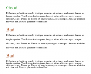
Color is a very important tool when it comes to Typography design and when creating readability. If you’re using a color that’s too close to the color of your background you may have a hard time to read the type. At the same time, if you choose colors that are very different in contrast you may get an uncomfortable solution.

Here’s an example:

Bad color choices, typography mistakes – Kacy Summers

Tips to keep in mind (Courtesy of Llene Strizver)

  • DON’T tint type that has thin strokes.
  • DON’T drop out or reverse type that has very thin strokes.
  • DON’T set lengthy amounts of text on colored, tinted, or black backgrounds.
  • DON’T use a color copy (ink jet, laser proof, etc.) to select colors for print.
  • DO consider how web color will appear on all monitors.
  • DO maintain high contrast for optimal readability in all media (print and web).

Guest post: Legibility on Street and Road Signs

David W. Dunlap/The New York Times

When I was invited to write on Typellustration, I had the immediate idea of discussing the importance of legibility on street and road signs, most specifically in New York City. Just by passing by a few neighborhoods in the Big Apple, it’s possible to see different typefaces being used in various ways to identify street names.

A New York Times article by David W. Dunlap explains why it’s not uncommon to see more than one layout on a single street post. With the intention of unifying the style of street name and road signs all over the United States, the Federal Highway Administration now demands that all signs follow a mixed-case pattern. Since over 239,000 street names is such a high number to be handled simultaneously, the update has been done gradually. It will take several years until the old style completely disappears from the streets.

The typeface of choice in New York was Clearview, which has a large x-height (distance between the baseline and meanline of a letter), making it very legible from a distance. That is crucial in street and road signs of any kind, that have to be read by people who, many times, will only be able to glance at them. In the case of drivers reading road signs, it’s a matter of safety that a typeface is easily read. Clearview does the job just fine, and has been used in many other states as well.

Other aspect of the typeface Clearview that makes it so legible is its humanist sans-serif quality. It stands in the middle of the classification of serif and sans-serif fonts: it features a bit too much of prolongated strokes to be considered sans-serif, but not enough to be considered a serif font. That slight connection between letters helps the reader understand what’s written without having to spend much time looking at it; and that’s exactly what has to be observed when choosing a typeface for street and road signs.

This was Andie Lessa for Typellustration.

Simple ways to improve Typography – Part I

Leading – What is Leading?

Leading is the key to readability; Leading is the space between the lines of type in a body of copy. When used correctly leading helps the reader to follow the type easily and overall improves the look of a block of text. There are many factors that affect leading such as: typeface, measure, case, type size etc. An useful rule is to set leading 2-5pt larger than the type size, depending on which typeface you’re using.

Here’s an example:

01


Simple ways to improve Typography – INTRO

When it comes to Typography there are many different terms that define it; Typography is not only about picking a nice typeface, selecting a font size, or deciding whether you want your type to be italic or bold. In this series of posts I will explain key typography elements that every designer should familiarize himself/herself with in order to further improve their Typography design.

 Part I: https://openlab.citytech.cuny.edu/typellustration/2013/11/16/3-simple-ways-to-improve-typography-part-i/

Just When I Think I Am Done..

-2

So much to do so little time! Don’t we all just wish we had one of those magical clocks to stop time at our command? I sure do..
Being a graphic design student is no joke; you may be working on a thousand different projects at the same time and that’s when time management (something I have yet to conquer) comes in. I have always struggle to manage my time and finish things on time mainly because I am a perfectionist and I’m never satisfied with my work. So just when I think I may be done with a project I noticed a single little thing that may bother me and BOOM here I go again.. just when I think I am done…