For our first assignment in COMD 1167, we were tasked with looking without our own neighborhoods to see what sorts of type faces influence our visual design language that we see everyday and how that affects us. I live in a urban-suburban part of the Bronx, where most of the streets still have houses, but not too far away are the main streets and apartment complexes. Around half of the pictures I took were from my immediate neighborhood, with the rest stretched out towards the main street.
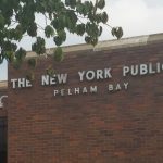


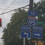


Several people in my neighborhood work for companies that use small and large vehicles for moving supplies back and forth, and I had no trouble snapping a few pictures. The ADT, and 1-800-Pack Rat were displayed in sans-serif type faces, whereas the Cort furniture truck used a serif font. Smaller signs in my neighborhood, such as the for sale real estate signs, a school sign for the Villa Maria Academy, a sign for the Providence Rest nursing home, the bus stop, and i95 signs were also in sans-serif. There seems to be a trend of curtness for information that needs to be immediately communicated, whereas brands and imagery that use serifs perhaps don’t need to be taken as frankly.
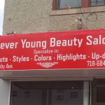
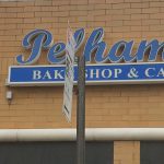
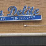
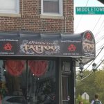
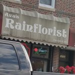
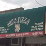
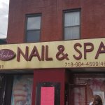
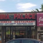
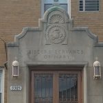
The trend continues in most of the storefronts on the main street. With the exception of the goofy and cartoonist tattoo shop, the majority of shops were divided by serif and sans-serif, wherein beauty salons and bake shops had used serif type faces, other restaurants and businesses all used sans-serif. This does bring up a question: are current businesses that use serif fonts, despite whatever business associations they may have, more courageous for choosing to have more of an identity than those who opt for the modern but seemingly played out sans-serif type faces? I don’t know the answer, but it was disheartening to see too few businesses and locations that used serif fonts, as they bring about a charm and warmth that sans-serif fonts don’t have.

