Project Description:
In my Spring 2024 semester at Pratt Institute, I took Digital Design. Our assignment was to create a brand of our choice, as well as design a logo, packaging, and mockups. I chose do do my brand on bar soap, as well as liquid soap, and named it “Laving Aura”. I named it that because “Laving” means “to wash” or “to bathe” and I wanted people to have a refreshed “aura” after they used it.
Process:
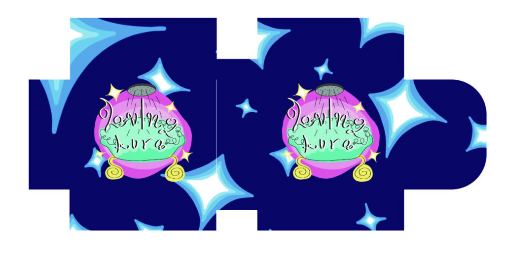
Since I already had an idea of what I wanted my brand to be and already had a name for it, I immediately started sketching ideas for a logo design. It was originally going to be the title in front of a starry night sky to give off that magical theme, but since the brand is about soap, I felt like that sketch didn’t portray that. After thinking for a while, I had the idea that I could play with the typography of the title. So I turned the dot above the letter “i” into a shower head, then I drew a bathtub in the background to really show this is a product used for bathing. But I also wanted it to be fancy since “laving” and “aura” sounded like fancy words, so I made the title more calligraphy-like and added stars in the back to make it “shiny” and “fancy”. To make the product even more fancy, I decided I would use the color purple for the packaging since purple is a “royal” or “expensive” color.
Sketches:

Logo Designs:
The first logo is what it looked like originally, the colors used for the bathtub used to be paler. After showing my professor, he recommended that I made the bathtub colors darker so the words could stand out and be more readable. The second logo below is the result of that. The third image below is the background I designed for the logo. Since the theme I was going for was a “sparkly” brand of soap, I made the background look like a night sky filled with stars.
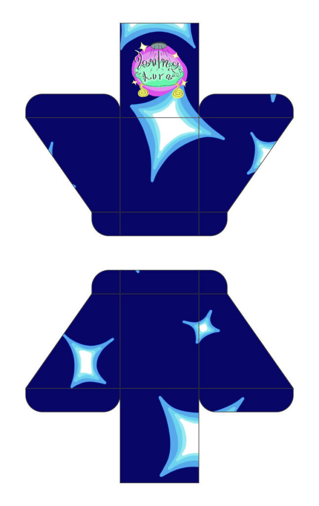
Packaging Designs: