For my visually enhanced quotes project not only will I go through each quote and give my personal thoughts on, but I will also include a breakdown of what techniques I used. There were some challenges that came up when creating these enhanced quotes and I hope revisiting them in this style would help me for future assignments/projects.
1.
Starting off with what I may consider to be my weakest visual quote, but still has effects and notable techniques that I admire. My goal in this one is that the viewer could notice the gradient effect used as a way to set up the quotes and realize that the text itself is based on the color. I became aware that the quotes couldn’t be too similar to the gradient because they would become illegible and difficult to see. Therefore I had to use a darker color of each side of the gradient to have the effect I was looking for. I considered this quote to be my weakest out of the three due to the color choice, it in fact has no correlation to my actual quote so it just feels like it’s there just to look visually pleasing. One aspect of this quote that should be noted is its typeface choices; the first line uses a square-y and capitalized format that represents my restriction towards the thought. While the second line is a lot more expressive and is meant to be more free-flowing to align my personality.
2.
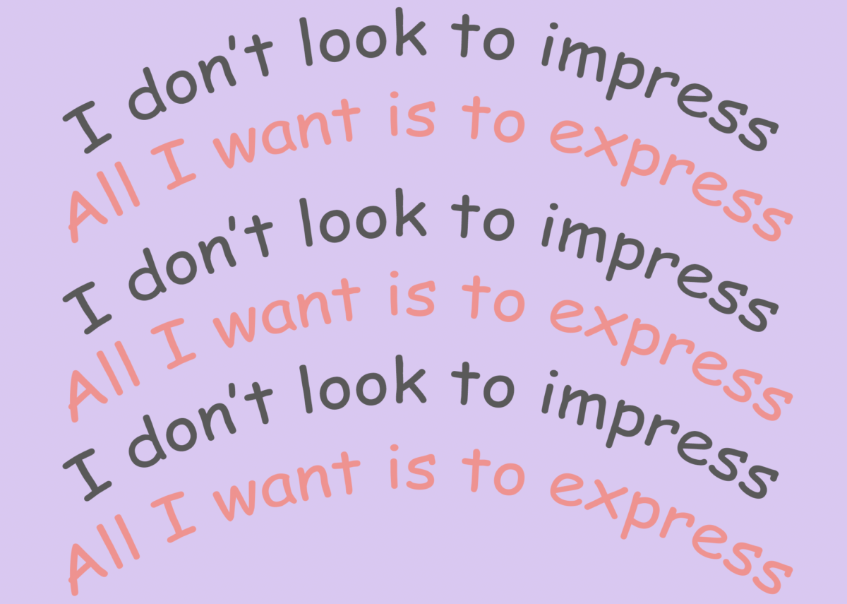
Moving on to my favorite pick but not necessarily the best; here I was exploring techniques such as repetition, color contrast, and angled type-lines. Out of my three quotes this was the most enjoyable to do since it included so many techniques that were all helping me reach my point of interest. The repetitive lines over and over again act like a voice constantly reminding me who I am. Notable feature from this quote was its color choice. There are no heavy bold colors and they all lean towards a more neutral color-way which helps it stay balanced. I decided to experiment with an angled typeface to see what techniques I can later use to create the quote and it helped me develop the thought of using repetition to make a unique quote.
3.
To move on to the finale, what I consider to be the best interpretation of the quote I used in all ways of color, typeface, size, use of space, and technique. The font stays the same throughout the whole quote even though it may not look like it. I used the size of the font as a way to help me elaborate my quote, for example the smallest word in the quote (impress) is lowercase to symbolize the value the actual word has and hopefully the reader could read over it without even realizing it. In contrast, the largest word being EXPRESS is not only capitalized and largen but its given color and form to attract the viewer’s attention to reinforce the importance the word has to the author. The goal for the color choice was due to the fact that they are complementary since it adds even more attention to the yellow instead of the lowercase white font the rest of the letters use in the enhanced quote. But I didn’t stop there, I decided to give the word form and dimension. Before I talk about the method I used to give the word EXPRESS dimension, I should mention there is an easier method. I just decided to take my method because I wanted to keep the quote itself sleek and simple. So what did I do? I copy and pasted the word on top of itself twice as new layers and the layer in between is the same as the background color. There are many reasons why I believe this quote is my best one but that doesn’t make it perfect. Throughout this visually enhanced quote project I experimented with many different techniques to create a visual that I thought would best suit the quote. All enhanced quotes have different uses of tools that I recognize as unique and something I can reference for my future works.


