Chewy.com Ad Campaign

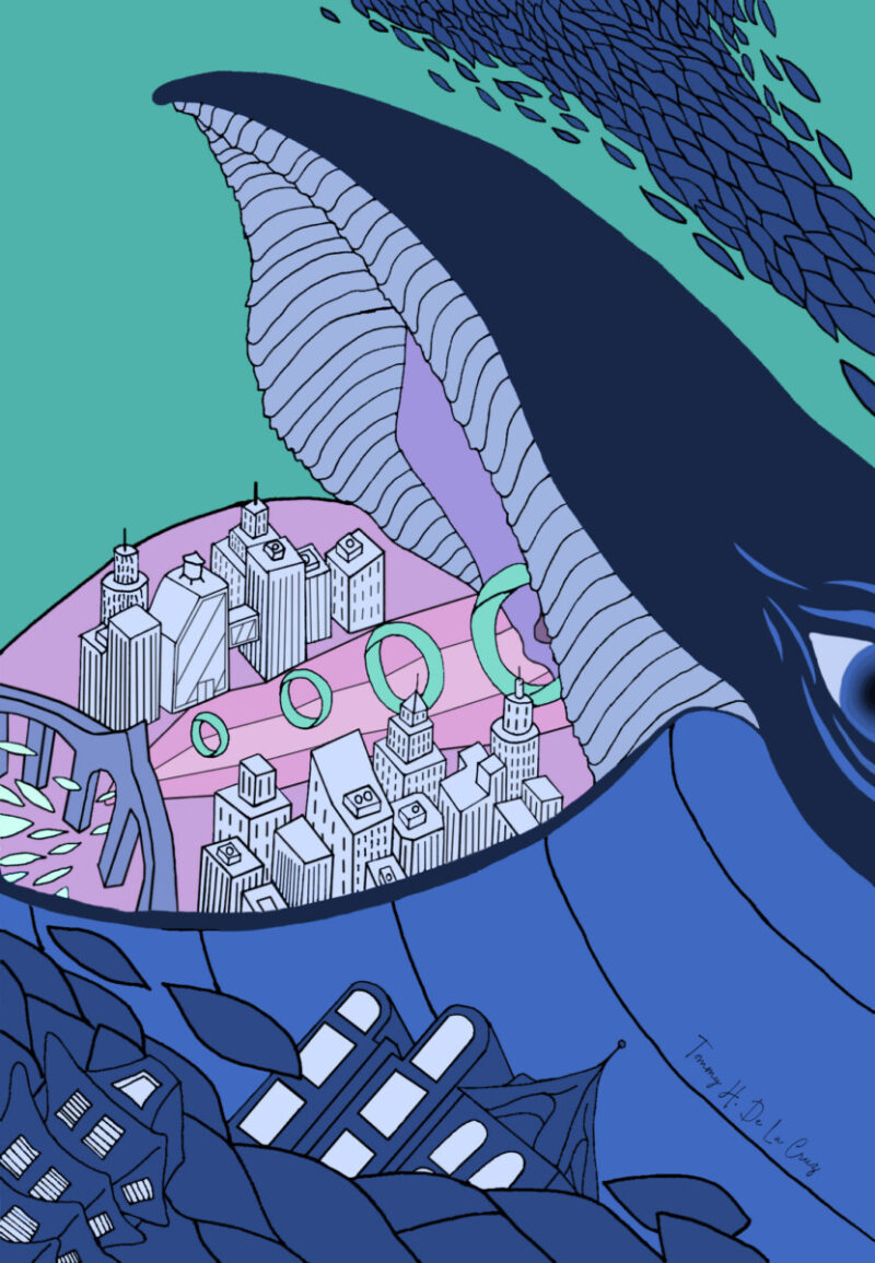
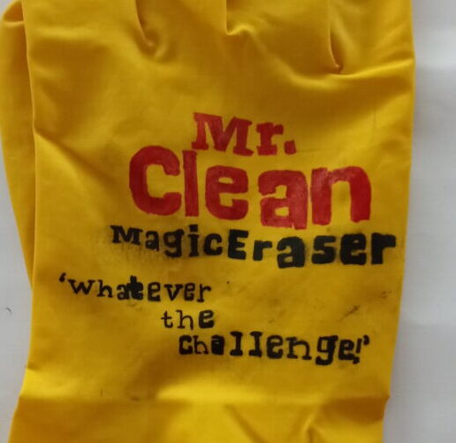
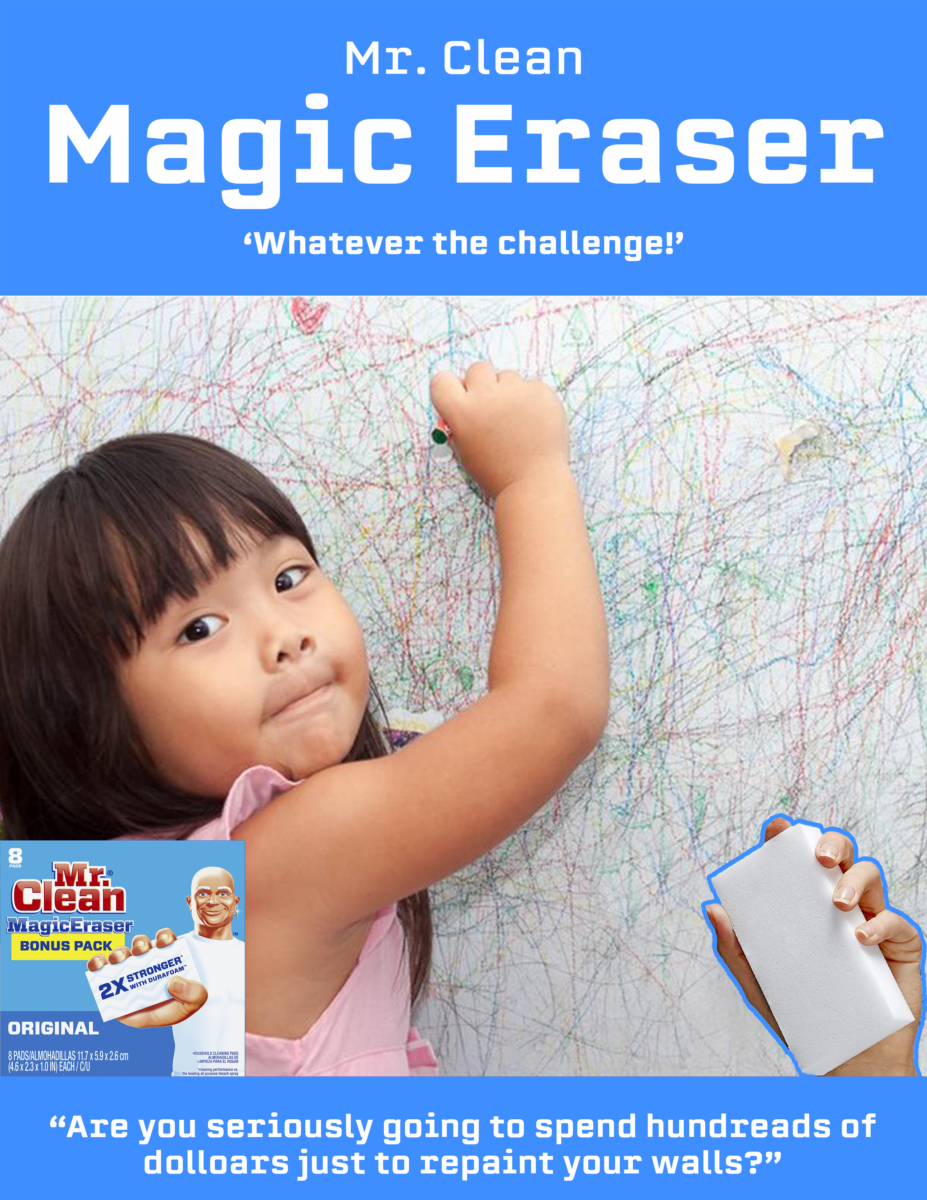
In my Communications Design 2300 course we were assigned to make an ad campaign for chewy.com. Before every project we had to make a strategy statement, unfortunately I was unable to find it. However, this ad campaign replaces the head of people living their daily lives with our beloved pets.

PET PEEVE POSTER

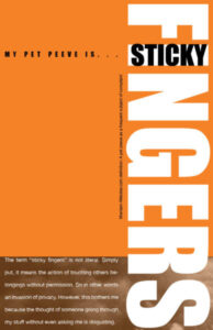
Another one of my projects for my Type and Media II course was centered around our pet peeves. My pet peeve is “sticky fingers”, when a person touches someone’s personal belongings without the owner’s permission. As far as the poster goes, we have the creative liberty to make any layout only using type and images.

Expressive Type: Limitless

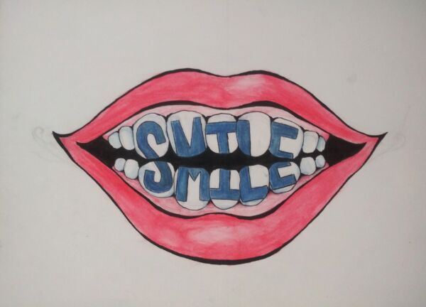
The following assignment after the very limited Expressive Type, was a version where we had the liberty to choose how we express our own words. I chose smile and decided to take a manual approach by painting it.

Expressive Type

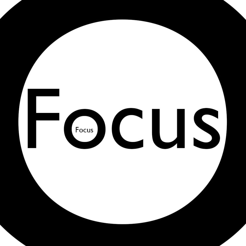
One of my projects in Type and Media II was to pick from a selection of words and show what they mean only using their letters. We started off with sketches and then finalized our ideas in one of the Adobe programs.

Final: Personal Flag

This project was the last assignment from my Graphic Design Principles II course. The purpose of this assignment was to create our own flags that represents our values, personality, and ambitions.

Value Portraits

Reflection: The process to completing this project is one that I know will help me become a overall better designer and artist. The first assignment was to create a portrait of my hand with just the use of lighting. This is where I started to explore the use of highlights and shadows to create appropriate contrast. After completing my hand portraits, the next assignment was to take self portraits and convert them into posterized black and white images. This assignment was fairly similar to the hand portraits, however when I begun taking photos the difference in value-scale was clear. My self portraits had high contrast, which I think helped me make my grayscale in my palette. Making my final portrait was stressful because I didn’t really have a method I could follow. Only after a certain amount of time I had consistency and a proper grayscale. I used the rule of thirds on the top right section of my self portrait where my left hand lies. This definitely gave the viewer a focus point that will attract them. I’m happy with my final product, and even if I wasn’t, this project gave me a lot to think about the next time I’m doing something like just taking a photograph to creating my own piece of art.

(IF YOUR HAVING A HARD TIME READING THE PICTURE)

Value Range Research: While taking the portraits of my hand, I wanted to have consistent detail and varied lighting at the same time. I begun with taking multiple pictures of different form and source of lighting. Taking pictures of the way I held my hand helped me learn what were the best ways to bring the most detail, out of my portraits. When I changed the source of lighting, I realized how drastic lighting can effect my photos. Now that I look at my pictures, I can see the calmness and warmth from my narrow value light to the intensity and isolation that my narrow value portrait brings.

Thumbnail Project Process

Reflection: Throughout the making of this project I learned new knowledge on different ways to look at the design process. While making my Mind Map I had to express things about me that inspires curiosity while little to no limits to my imagination. Therefore I went all out and drew to my heart’s content, almost forgetting that I needed to express some of my thoughts in words as well. The next part of this project I had to choose only 3 of my thoughts and go on by making logo type sketches. In this part I went trough a lot because of all the limitations that were required. Every time I had an idea of what my thumbnails will look like I wasn’t able to do them or I just didn’t like it. Once I had most of my thumbnails down I had to choose a total of six from all the sketches, refine it and ink them. I feel like this was the part of the project that I learned from the most. To go through that whole process of filling a background or outlining different sections all over again was something, I feel like, is crucial to be good at when doing graphic design.