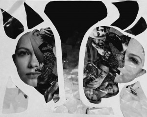
This was probably one of the most time consuming and head wrecking project that i have completed in this class. However that process made the final product all the more satisfying. Basically this project targeted the 2 different aspects in color contrast, which are basic gradation and texture. The two were separated and I felt adventurous enough to spread them out in a format where they look as if they are scattered or bleeding through the page. The texture portion of things mainly consisted of black and white landscapes as well as lots and lots of faces, making it seem very much like an abstract art piece, more than a concentrated project and i am very proud of it.
sezan khan's ePortfolio
A City Tech OpenLab ePortfolio


