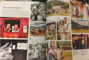
10. Potential to grow

Over all I have enjoyed my internship learned from Mr. Concha. I am not just here to learn, and here to improve and hopefully gain the experience that leads me to the next part of my career. You might find you don’t necessarily like a particular part of a job that you thought you would really love. That’s all part of the process.

On the other hand, you might find you really love something you never really paid much attention to, until dove right into it. For example, I was on the fence about websites for a while until I realized it was fun and exciting they are to work. You never know until you actually try it out.

The design process is a journey of lessons in things that work, things that don’t and many other insights behind the scenes you don’t often get to learn in school, failure might be seen as negative word, but in the broader sense its how you learn to move on to better work and better things.

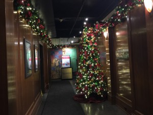
Thank You for you reading and Happy Christmas!IMG_1277

9. Pull a Quote

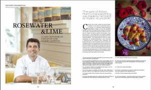
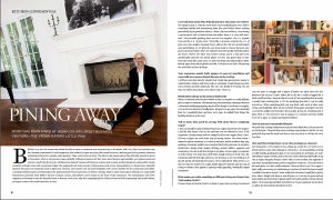
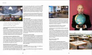
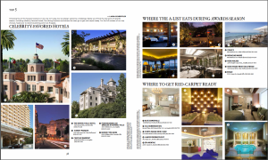
This week I did “Kitchen Confidential” and “Top 5” session of the magazine. This is interview session for the chef and the restaurant. These pieces are different than the fashion layout because text is much more than images. The balancing between images and texts is important; I don’t want readers feeling boring when they are reading. When I was designing I quoted a sentence out of the long text, it might be the other way to keep the readers’ attention. Screenshot 2015-12-05 01.31.29Screenshot 2015-12-05 01.30.52Screenshot 2015-12-05 01.31.07Screenshot 2015-12-05 01.31.43

8. Willingness to learn

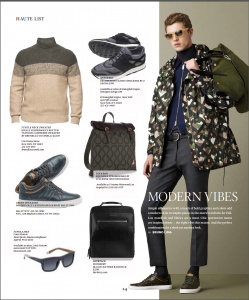
This week I was working on the December issue for New York and Miami. New York City as the fashion icon, thus sometime the fashion report from New York could be overlap for the other cities.As the same, my Art Director is going to send me a large file, but this time he wants me to be more creative and do my own design. Before the design I read all the text, make sure I have every thing in file: text, images and captions, if there is missing text or one of the item don’t match the caption, I need to report to the supervisor immediately; he needs to contact the editor to send me the correct one. We are working with one of Miami designer, there is one page we are going to publish in both New York and Miami, but there is missing boutique information for Miami, so we need to email the editor to update it right away.

We want to finish this session before Thanksgiving, so I designed couple versions of the layout to get his proof. He also gave me some suggestions if was he will designed like this or that, and drew out for me, and was really helpful for drawing ideal on the paper, will have a clearly thought on the design. Attached is a November issue for Miami, Los Angles and San Francisco I was working in past 2 months.

Screenshot 2015-12-05 04.05.25 Screenshot 2015-12-05 04.04.10IMG_1447Screenshot 2015-12-05 04.03.17


7. Logical Design

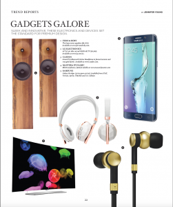
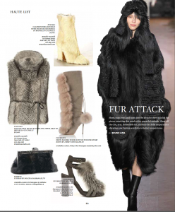
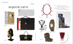
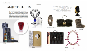
This week I designed at the gift page, we categorized “what is haute”. It is editor’s gift choice for this month. Right now I can designing more faster than the beginning. I have designed the first pdf1, they like it pretty much: text is align, placement of items are right. Mr. Concha suggested me I can tried to put the bright items on the same side. Yes, I did again(pdf2), and can see the difference between these two pieces, is better than pdf1, because they are metallic color, so put them in the same page is right, and others are soften items.

From this design, I have learned need to think logically when doing design; because I am leading the reader into the content, and they should enjoying on their reading. Known how to categorize the components and  elements is the key in design.Screenshot 2015-12-05 01.18.31Screenshot 2015-12-05 02.54.12


6. Learning on the job

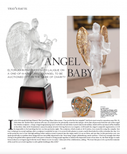
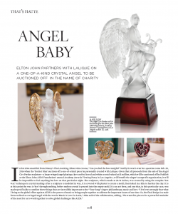
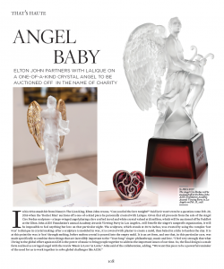
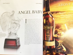
“What is Haute,” is about the latest party or event held in the city.This time was the charity party for sculpture designer Elton John in LA. I received the file with all these images you see on the PDF, he told me still not sure what was the editor wanted, created some versions for it first, but make sure the crystal angel was the main image. But after all, on the magazine, they took out everything away  just keep the crystal angel. This is how magazine, real world works, sometime you do a lot, designed many versions of it, but in the end, it is not your designed at all. What you think is good ideal, may not end up being what you had expected.

Screen Shot 2015-11-29 at 8.49.41 PMScreen Shot 2015-11-29 at 8.49.31 PMScreen Shot 2015-11-29 at 8.49.23 PMIMG_1453 copy

5. Day in The Life LA

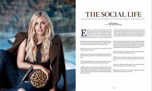
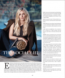
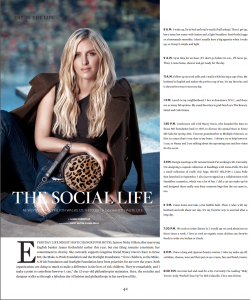
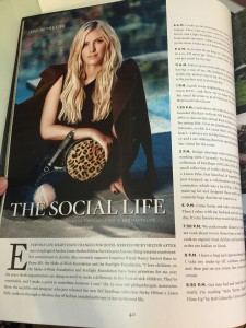
This time I did the other layout design for personal interviewed; in the magazine they called it “Day In The Life,” and that was a single spread page, but I did few versions for it, take a guess with one will be printed on the magazine.

Screen Shot 2015-11-29 at 8.12.22 PM

pdf1

Screen Shot 2015-11-29 at 8.12.13 PM

pdf2

Screen Shot 2015-11-29 at 8.12.04 PM

pdf3

IMG_1452

pdf4

They choose the second one, they looked similar, but I changed the color of the title on the upper left, and dropped the shadow for the header, it was more legible than others.

4. You Need a Coffee Break

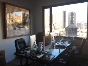
I go to the internship every Thursday and Friday, we don’t have dress code, and our attire is as comfort as well. We have open workspace for 6 people, 2 offices in the back. I start work from 10:30 am, but not end in the same time, it based on the work, the first day work I was end by 7pm, the Art Director and Copy Editor we worked for some designs and we had to finished it on the day, so I tried my best to fix and designed it, the good thing was they both satisfied with it.

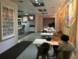
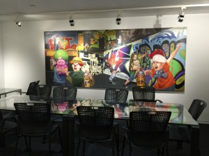
On the ground flood, there is a cozy and nice café, and it is open to public. My lunch time is around 1-2pm, usually I like to finish everything and go to lunch. During the lunch break, the cafe it is very busy, but on the other side, there is a quite empty room for public meeting or for personal working.

My first intern day wasn’t easy at all. My Art Director and me left in the last. Exhausted but I did and learned a lot. I think was a good started. Working is never easy, and working time is very intense in real life, so if you want to go further in this career path, you need to get ready and be prepared for anytime.

IMG_0991

Office

IMG_0441

cafe

IMG_0440

meeting room

IMG_0445

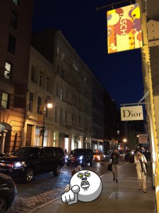
Greene Street

3.The hurt for the internship begins

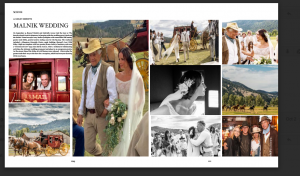
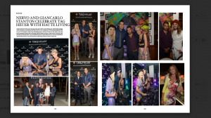
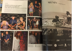
This time I did the “Scene” layouts, that was bunches of images of some commercial events, parties and some lifestyle from Miami and Los Angles. There were many images, but not used all of them. Then I need to read all the text, content, and high light the priority images. This was the first time I handle so many images, it took me very time to be done 6 pages layout. My supervisor pointed out I didn’t scale the images proportionally. He needed to rescale it all. I was feeling bad about this, but I also learned it was not easy to do images placement, next time I will double checked  it carefully, this is what a professional designer should be noticed.

Screen Shot 2015-11-29 at 7.15.51 PM

pdf

Screen Shot 2015-11-29 at 7.36.04 PM

magazine

Screen Shot 2015-11-29 at 7.16.08 PM

pdf

Screen Shot 2015-11-29 at 7.36.16 PM

magazine

The are the PDFs and the final print out on the magazine, after the designer done with the page layout, the Art Director will finalize the last step: add the commercial page.


2. Landing my first internship

My Art Director briefed about the basic functioning of the film again, his name is Greg Concha, our job is designed and managed all the layout for entire magazine, we have Miami, los Angles, San Francisco and New York issues for different cities, and published once and on the last week of the month. Mimi Lombardo is Managing Editor and Fashion Director at Haute ­Living; we worked together for the fashion layout.

I found this internship from one of the student post from the blackboard, I was interested after I saw the post, later on sent the email and made the called to the Art Director. Luckily, I had the in-person interview right after Monday (called on Friday). During the interview we had a comfortable talked, Mr. Concha went through the magazine and the position was about. I showed him my portfolio from the lab top, talked about I was interesting working at the magazine. We had a fun and happy talk about 20 minutes long, and I will start in the next coming week.

 Day 1 Work

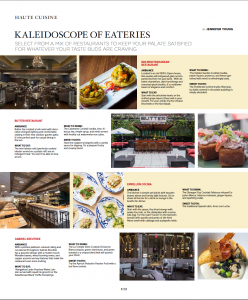
First I need to install all the fonts will be used for the magazine, and coming next was to design the food page for New York. I can say I was a food hunter, so I was pretty happy to do this page. We had our original images and text; my job was to design the layout for fall restaurants and food page. Screenshot 2015-11-28 20.12.23
We use Email to transfer the files basically, due to the file are very large, we use the online transfer tool called “We Transfer,” this one is free to use, could send the files up to 2 GB and also could send it to multiple emails at the same time.

In this design, Mr. Concha sent me images in the big files, I need to update all the information and images, and also need to keep the layout as the similar design as previous issue. Attached was the first work I have done.

You can check out these amazing restaurants; they are romantic hangout suggestions in the New York City for this fall.♄