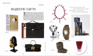
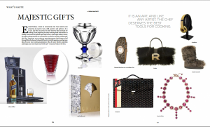
This week I designed at the gift page, we categorized “what is haute”. It is editor’s gift choice for this month. Right now I can designing more faster than the beginning. I have designed the first pdf1, they like it pretty much: text is align, placement of items are right. Mr. Concha suggested me I can tried to put the bright items on the same side. Yes, I did again(pdf2), and can see the difference between these two pieces, is better than pdf1, because they are metallic color, so put them in the same page is right, and others are soften items.
From this design, I have learned need to think logically when doing design; because I am leading the reader into the content, and they should enjoying on their reading. Known how to categorize the components and elements is the key in design.


